A little history: where did the tiffany color come from?
If you saw in the photo a pleasant color of a mint shade in milk with hints of blue, but did not know what color it was, then you admired the Tiffany color.
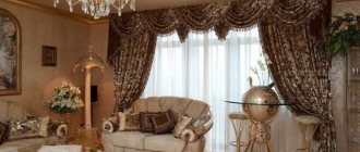
He’s so lovely in his shades PHOTO: homester.com.ua
in 1837, a little-demanded color seemed interesting, which combined the features of gloss, sophistication and perfectly set off jewelry. And so it happened: all their products are sold in a box of a company color with a white ribbon.
Traditional boxes from the company PHOTO: ru.wikipedia.org
But the founder’s son went further and applied these shades to interior decor: he created amazing glass lamps that are still ready to decorate any interior today.
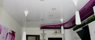
This color does not make the room dull and boring PHOTO: weareart.ru
Origin of Tiffany color
This tone owes its origin and name entirely to the legendary jewelry brand Tiffany. This company was founded back in 1837 by Charles Lewis Tiffany, as well as John F. Young and JL Ellis. The partners opened their first store in Manhattan, and then it bore a long name according to the names of its owners - “Tiffany, Young and Ellis”, but in 1853 Charles Tiffany became the full owner, and accordingly renamed the brand “Tiffany & Co”. The company's signature corporate color is turquoise, and this palette is a registered trademark. In the HTML code it is called #0ABAB5. Tiffany chose this color not by chance, since in his opinion, no other palette combines a share of coolness, sophistication, tenderness, chic and aristocracy. It is in these turquoise boxes, tied with a white satin ribbon and bow, that the products of this brand are sold. Many believe that the company produces exclusively jewelry; in fact, they sell a wide variety of items: porcelain, silverware, crystal, perfume, stationery, watches, leather goods.
This is how the Tiffany brand box is designed.
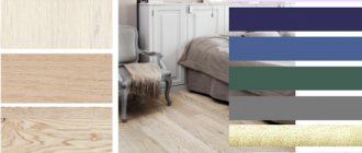
What colors does Tiffany go with?
This palette is actually very friendly and works great with the following colors:
- White;
- Black;
- Soft pink;
- Beige;
- Yellow;
- Orange;
- Red.
Characteristic features of Tiffany style:
- Notes of simplicity and chic;
- Not cluttered with accessories;
- Feeling of spaciousness in the room;
- A friendly combination with both pastel colors and bright colors;
- Fashionable furniture with a touch of classics;
- Vintage interior items;
- Large mirrors in massive frames;
- Stained glass decorative elements;
- Wooden floor in warm brown tone;
- Forged decorative items.
Application of color in interior design
This tone can act as the fundamental owner of a space; this is when walls or furniture are decorated in this wonderful color. But it can also serve as an interesting accent assistant; in this case, diverse interior items, or simply decor, are immersed in the turquoise palette.
In the case of the walls, of course, they can be completely painted in Tiffany color, but you can also just highlight one or two walls; in any case, the room will look fashionable and incredibly fresh, and this is exactly what you want to achieve when renovating a house, don’t you agree? !
To avoid the feeling of coolness in the room, dilute the turquoise color with beige shades - this could be one or two of the walls, furniture upholstery, carpet on the floor, golden-colored accessories.
The interior looks very noble in a turquoise palette, complemented by various items in a chrome tone. These can be the legs of tables, coffee tables, door handles, a faucet in the kitchen, the base for a bar counter, the legs of dining group chairs and the bases of bar stools, and of course lamps, chandeliers and fixtures.
It's funny that this style looks great both in a strict embodiment, with laconic shapes and lines, and complemented by cute ruffles, feminine lace and other things.
If you want to add a touch of color to your decorated room, feel free to use accenting yellow, orange or red tones. But remember, there shouldn’t be too many of them; just use red sofa pillows and the interior will instantly transform.
Tiffany color: pictures and descriptions of shades
How would you describe the tones you saw? Those who looked at it called the color elegant and at the same time fresh, light and aristocratic. It combines perfectly in the interior with wood and metal elements: the result is an exclusive decor of any direction.
Delicate tones PHOTO: design-homes.ru
More muted tones PHOTO: weareart.ru
Some people still cannot determine whether this color is closer to blue or green. Well, this is a tough question. It’s better to see photo examples for yourself and draw conclusions. But designers describe it as pale blue with a hint of green.
It is quite difficult to describe the color of TIFFANY in words. This is an amazing magical color, the contemplation of which brings aesthetic pleasure.
More than one hundred and seventy years have passed since the first store under the Tiffany banner, Young and Ellis, was opened in New York, Manhattan. Three young people, taking out a loan of $500, decided to start
selling stylish and fashionable items. Luck was with them, and within a few years the company, now called Tiffany & Co, began selling jewelry. The head of the company was Charles Lewis Tiffany. To make the products of his brand memorable, from the first years of its activity he came up with brand attributes. Thus, jewelry purchased in his store was packaged in pale blue boxes with a white ribbon. Gradually, this complex, multifaceted turquoise shade acquired the name of the fashion house.
As you can see, the world-famous company gave its name to this shade. But why did Charles Tiffany choose turquoise color for packaging his goods? Just a good marketing ploy. In the mid-nineteenth century, this shade was very fashionable, as was silver jewelry. A universal fascination with the sea, the freshness of rain-washed foliage, an excellent combination of color with the moonlight of a precious metal.
If we say that it is soft blue, it will be wrong. Turquoise? Incomplete truth. Prussian blue? Not certainly in that way. Aquamarine? Closer, but that’s not it either. Maybe aquamarine then? Or, on the contrary, a mint shade? The color palette from Tiffany can be very diverse. The manufacturers themselves call this shade sky blue, but maybe this is due to the emotional poverty of the English language? In fact, the Tiffany color is some kind of celebration of the soul: like a sip of cold fresh water on a hot afternoon or bathing in a crystal spring. But behind this color there is a clearly balanced and thoughtful concept. The two primary colors, blue and white, are introduced into their derivative shades: silver (white gold), crystal (diamonds). A small addition of basic green adds a mixture of morning freshness and natural naturalness.
Tiffany color goes perfectly with lavender and lilac. This color works great on chiffon and silk fabrics. You shouldn’t dress in one shade of Tiffany color from head to toe. Let the clothes be light turquoise, and the shoes, belt and other accessories in aquamarine or mint shades. This color does not like the proximity of red: with it it fades, turning into a dirty bluish color.
Photos also do not always convey the richness of its shades. One thing is clear: two primary colors took part in its creation - green and blue, which belong to the cold palette. Therefore, Tiffany goes well with all shades of blue and green.
Tiffany color is often used in room decor. Photos of living rooms and bedrooms, decorated banquet rooms demonstrate this. Recently, it has become fashionable to have weddings in Tiffany color.
Tiffany color code: what is its unique hex code number
Copyright is reserved for the tiffany color under registration number PMS 1837.
If we take the hexadecimal code - hexadecimal triplet cod, there we will find the marking #OABAB5. It's between shades of blue, green and some red. On the RGB scale (r, g, b) – 10, 186, 181, on the HSV (h, s, v) – 178, 95, 73.
As a result, we get these beautifully painted things PHOTO: tomdom.ru
Who suits it
It is quite difficult to describe the color of Tiffany in words. Photos also do not always convey the richness of its shades. One thing is clear: two primary colors took part in its creation - green and blue, which belong to the cold palette. Therefore, Tiffany goes well with all shades of blue and green. Those girls who have eyes of this particular color simply need to have several Tiffany-colored items in their wardrobe. Blondes should give preference to pastel colors. This will make them even more feminine, and their skin will visually appear softer. For hot brunettes, rich shades of Tiffany are suitable: aquamarine, turquoise. It is worth taking into account the color type of your appearance. For spring personalities, those tiffany shades that contain more green will suit them. Beige, blue, pink and gray combinations will suit this refreshing mint outfit. Summer girls will look great in dresses of rich turquoise color. Muted, pastel shades are suitable for winter-type young ladies. And autumn beauties will suit the combination with pink or orange flowers.
How to get tiffany color in paints
Despite copyright, using such a beautiful shade in the palette is not prohibited. You can find exactly the tone that will make your interior perfect. To do this, you need to mix the base blue and green colors, but not in equal proportions: if you add a mute white or light gray tone, you get a delicate paint. To acquire a rich shade that goes into turquoise, take green, blue and a little yellow: the tone is muffled with white.
The process seems difficult at first, but soon everything will work out PHOTO: ru.wikihow.com
But for true Tiffany, only blue paint with green pigments is suitable: you can use cyan, ultramarine, azure or cobalt.
First, cyan and greens, obtained from a mixture of blue and yellow, are applied to the palette. For blue you need to take 2 parts, and for green from 0.5 to 1.5 parts. They take very little yellow.
Advice! Prepare the right amount of paint at once, next time the shade may be different!
Use of color in the interior
Tiffany color will be appropriate in almost any room of the house or apartment, and not just where there is water. Its similarity to seascapes will give the room a clean, light and incredibly fresh look.
In the living room
The whole family traditionally gathers in this room and welcomes guests. When choosing shades for the hall, you should take into account the opinions of those living in the house, although Tiffany, as a rule, is liked by the majority. It is better to decorate the room with calm, neutral tones, making them the background. Using delicate blue-green tones, they create interesting accents that will radically transform the space. Such details include poufs, covers for sofas and armchairs, and curtains. If you get bored with such a range, it will not be difficult to change it.
In the kitchen
You can introduce Tiffany into the kitchen interior in different ways. It is allowed to paint the walls, lay out bright tiles on the kitchen apron, and decorate the facades of the furniture. In the latter case, mint-white sets look great, in which Tiffany is combined with white and looks elegant. For a calmer version of the headset, you can use a light gray shade instead of white.
Glossy finishes in the kitchen fit well into modern styles, such as high-tech. For country interiors, it is better to choose matte surfaces, wood, and externally aged materials. Household appliances in Tiffany color are an original choice, although they are not easy to find. Blue-green hues are believed to slightly reduce appetite, which will be beneficial for dieters.
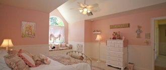
In the bedroom and nursery
Tiffany in its delicate variations will give the bedroom a feeling of romanticism and charm. The turquoise palette is an excellent solution for a marital bedroom or a little princess’s boudoir. In a boy’s room, it is better to use darker shades of turquoise in combination with gray, coffee, orange, chocolate, and burgundy.
In the office
The invigorating notes of mint will not hurt in a room where a person will work regularly. But don’t be too zealous, otherwise the office will turn into a romantic place, which should not be allowed. Despite the use of such a rich color, strictness should be observed in shapes and lines. All accessories should be simple and prim. Figurines, vases, lamps, organizers, rugs - this is an acceptable list of details that will serve to accentuate different areas of the office.
In the bathroom
Tiffany color looks organic in the bathroom; it is suitable for decorating walls, floors, suspended or panel ceilings. There are brands that produce a whole line of tiles of similar shades (for example, Cersanit), from which it is possible to create original combinations. Tiffany is also suitable as a color for furniture, accessories, sinks, textiles, brush cups, and laundry baskets.
What is the difference between tiffany and mint colors: expert answer
We can already describe Tiffany in more detail: shades of heaven, fresh greenery, even a little pure ice, everything is woven together. This is the perfect color to incorporate into decor.
Unobtrusive tones in the interior PHOTO: design-homes.ru
For some reason it’s easy to choose accessories and decor for this color scheme PHOTO: design-homes.ru
Now let's compare it to a mint tone:
Mint tones are much greener PHOTO: wiki.wildberries.ru
Color Features
The Tiffany color owes its name to the jewelry company of the same name, which began using a delicate shade of turquoise in the packaging of its products. Cool turquoise color creates an atmosphere of freshness and relaxation. It is ideal for creative individuals, helps to escape from problems, relieve nervous tension and express their fantasies.
The soft turquoise color is ideal for small kitchens. It makes the room visually larger, more spacious, brighter. Designers recommend using Tiffany color in large quantities only in those kitchens whose windows face the sunny south. Otherwise, the room will turn out to be too “cold”.
What does Tiffany color go with: suitable tones
The question of what colors the Tiffany color goes with is important for those who are designing their home or apartment. Experiments may result in a unique interior design; don’t be afraid to try!
What about compatibility with white and pastel shades?
This is definitely a suitable tandem; all the colors will adequately complement and set off each other. It will make a wonderful backdrop for a sleeping space or for living room decor. White itself will become a kind of frame for such a delicate shade.
Pleasant and affectionate combination PHOTO: roomester.ru
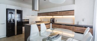
Nice looking kitchen PHOTO: pinterest.com
White also serves as edging PHOTO: styldoma.ru
Two shades created for each other PHOTO: roomester.ru
Subtleties of contrasting combinations with brown, black and green
To achieve contrasts, you need to boldly include rich Tiffany tones in your design. As a pair, purple, black, brown and deep green will suit him.
Unobtrusive contrast PHOTO: happymodern.ru
For contrasting combinations, you should choose rich tones PHOTO: folksland.net
Quite unusual combinations PHOTO: folksland.net
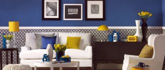
What is Tiffany color and what to combine it with?
This is a bright and at the same time very gentle shade of blue that can refresh the decor of a living room or bedroom without drawing attention to itself. Beautiful cool turquoise can be chosen both as an accent color and as a background color. Wallpaper and furniture sets of this shade look beautiful and unusual.
Of course, you shouldn't use too much turquoise in one room, just like any other color. It is best to choose several shades to decorate your home, so the room will look more harmonious. Greenish-blue looks best as decorative elements; this shade is convenient for highlighting the necessary details. In the living room, you can use turquoise curtains and sofa cushions, while for the bedroom, a bedspread of this shade, complemented by matching capes on chairs or poufs, is well suited.
Bedroom interior in tiffany color
Tiffany color in the bedroom interior
Bedroom in tiffany color
Important! Too much blue in decor or decoration will make the design too cold.
To avoid “overload”, turquoise must be diluted with other shades. The following colors go best with it.
- White. This combination is considered harmonious and fresh, despite the contrast. Turquoise and snow-white decoration and decor will set the mood for peace and quiet, and in the hot summer they will noticeably refresh the room. However, you should not overuse cold colors in rooms where there is little sunlight - they will seem cold and lifeless.
- Blue. The most successful option, since these tones are related to each other. This design primarily relies on turquoise as the background, while blue plays the role of accent. These are textiles, furniture compositions, vases, etc.
- Green, light green or mint. You can choose one of the presented options or several together with blue. It looks fresh and very spring-like.
- Light blue. This option is best used in decorating a bedroom; for a living room it is too calm a color scheme.
- Pink. A very interesting combination, especially popular abroad. Most often it is used to decorate a girl’s nursery.
- Yellow. But for a child’s room belonging to a boy, you can combine turquoise and bright yellow or orange.
- Red (scarlet, brick, etc.).
Tiffany color in the interior of the room
Kitchen in tiffany color
A very bold approach to the color design of a room, which will be appreciated by creative individuals who love non-standard solutions. However, red should be selected very carefully; their share should not exceed more than 25%, otherwise such a design will be tiring for the eyes.
In addition to the above tones, brown and beige go well with turquoise.
See alsoTerracotta color - what is it? Photo
In which interiors does Tiffany color dominate?
We have to dive into the study of suitable interior styles where Tiffany shades can be implemented.
Mediterranean style
Where there is more blue in Tiffany color is in the Mediterranean style. Simplicity of lines and natural sea colors, reminiscent not only of the sea, but also of its shore with shells. To get a chic stylistic environment, wood and stones should be included in the interior. Tiffany will emphasize freshness, turning the atmosphere in the room into a breath of gentle breeze.
You shouldn’t mix too many colors PHOTO: roomester.ru
Several more colors will make good partners: olive shades, blue, azure, terracotta and white.
Mediterranean design suits terraces, bathrooms and kitchens.
Calm and soulful country and Provence styles
Country and Provence style wood in any of its forms is beautifully decorated in a Tiffany theme. These include accessories, any decorative elements, and furniture. You can use this paint for ornamentation, artificial aging of some decorative element, or painting furniture.
You can take a shade closer to green or blue PHOTO: 100lustr.ru
In bathrooms and toilets this is also a suitable color PHOTO: dizainvfoto.ru
Modern interior
You can decorate the interior of modern styles in different ways and technologies. This green-blue shade goes well with absolutely all finishing materials.
You don’t need to use any special bright splashes, everything will turn out stylish.
Coffee with milk tints this color well PHOTO: dizainvfoto.ru
Color in furniture, textiles and decor
The color chosen as an accent color must appear in the interior at least 3 times. This is necessary to unite the disparate elements of the ensemble into a single whole. If turquoise curtains are chosen, they should not look like an alien element in a gray or white interior. Therefore, it is necessary to select accessories of the same shade for the curtains - decorative pillows, a blanket, a floor carpet. Turquoise furniture looks impressive in a calm, neutral environment. A Tiffany-colored sofa or cabinet will gain maximum expressiveness against a white or gray wall. You can buy a turquoise dressing table or nightstand, decorate the furniture with a soft blue napkin, or place the notorious jewelry box on it. Photo frames and mirrors of the same color, lamps, and flower pots look great. An aquamarine laptop sleeve will add a touch of cheerfulness to your workspace. It will help the technical device fit perfectly into the interior and also protect it from mechanical influences.
Tiffany colors are used not only for ordinary interiors in residential apartments. This is one of the most popular shades for decorating wedding halls. Tables decorated with soft turquoise tablecloths combined with snow-white plates and crystal glasses on gilded legs look simply magical. Another option for decorating tables is to use turquoise dishes, wine glasses, napkin holders, and vases. The shine of the cutlery and the delicacy of snow-white flowers make the picture truly fabulous and luxurious.
The commitment to a single color scheme can be seen in every detail - from invitations and cards for guests, flower garlands and balloons, to the bride's dress and wedding limousine.
Tiffany color in the decoration and decor of different rooms
In the decoration, you can consider Tiffany-colored wallpaper for the walls, and choose furniture of this color palette as decor. Let's explore design options for furnishings.
Living room and study
Here the color scheme is arranged in such a way that Tiffany is the main one. But other colors, which will dilute the main tone, will set the overall atmosphere. In general, we admire and notice the subtleties of the design idea.
PHOTO: dizainvfoto.ru
PHOTO: homester.com.ua
PHOTO: m.yandex.ru
PHOTO: m.yandex.ru
PHOTO: weareart.ru
PHOTO: happymodern.ru
Bedroom and children's room
The bedroom does not require bright accents or flashy colors, so pastel colors can always be a companion to the main tone. You can also use light coffee colors and shades of green. Bed linen should also not look inharmonious.
For a child’s room, you can use either muted tones or, conversely, rich ones.
PHOTO: design-homes.ru
PHOTO: dizainvfoto.ru
PHOTO: archidea.com.ua
PHOTO: m.yandex.ru
PHOTO: folksland.net
PHOTO: design-homes.ru
PHOTO: yandex.uz
PHOTO: president-mobility.ru
Kitchen and bathroom
The kitchen and bathroom are rooms with their own requirements for the quality and characteristics of finishing and furniture.
If the room is small, do not overuse color, leaving only islands of accents in the form of accessories. But the impression will not be complete if you do not make sure that each cup is in harmony with the tone of the interior.
The bathroom will surprise you in that the color of the walls changes slightly with different lighting conditions. It is better to choose a tile of a different tone. In this case, it will not merge and spoil the effect.
PHOTO: dizainvfoto.ru
PHOTO: yandex.kz
PHOTO: dizainvfoto.ru
PHOTO: yandex.kz
PHOTO: dizajninfo.ru
PHOTO: pinterest.dk
PHOTO: santa-keramika.ru
PHOTO: archidea.com.ua
Rooms for different purposes in Tiffany color
Bedroom
If you want to get a calm and peaceful bedroom interior, immediately say no to flashy shades. Combinations of Tiffany with white, beige or brown will suit you. However, we would not recommend completely abandoning interesting details. Hang 1-2 pictures with bright colors and place a contrasting lamp on the bedside table. Just a few touches - and the bedroom will look completely different: fun and lively.
Photo: homedit.com
Photo: donpedrobrooklyn.com
Photo: donpedrobrooklyn.com
Photo: desenho.ynccf.net
Kitchen
If you don’t know what color to choose for the kitchen facade or finishing materials, be sure to take a closer look at Tiffany. Cabinets, a tiled splashback, chairs, an island or dishes are just a small part of what will look stylish in the kitchen space.
For the most daring, we recommend a combination of blue and red. Burgundy, smoothly flowing into tomato, looks good on the surface of cabinets or open shelving. In this case, the decoration of the room should be neutral: white or beige.
Photo: homedit.com
Photo: freeinteriorimages.com
Photo: hgtv.com
Photo: hgtv.com
Bathroom
What could be better than blue in the bathroom? That's right: tiffany color. It seems as if it was specially created for this room, as it evokes thoughts of the azure water of the Mediterranean Sea. To add variety to flat surfaces, choose brick-shaped or scaled tiles in turquoise shades. White, brown, and beige will suit it as companions. Creative individuals may gravitate toward yellow or orange colors.
Photo: homedit.com
Photo: impressiveinteriordesign.com
Photo: freshome.com
Photo: meni.onedecor.club
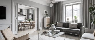
Living room
Here Tiffany can be used as the dominant one, since usually the living room is the largest room in the apartment. Tiffany looks most harmonious on textiles (carpets with geometric patterns, decorative pillows, curtains, furniture covers), lamps, paintings. Color combinations in the living room are limited only by your imagination and common sense. So, fantasize and bring your ideas to life.
Photo: simpleinterior.com.tw
Photo: thegolfclub.info
Photo: donpedrobrooklyn.com
Photo: impressiveinteriordesign.com
Tiffany color in furniture and textiles: let’s place accents
Furniture of this color refreshes and softens the perception at the same time. The decor will beautifully highlight the rest of the room, but you should choose the right companion color.
Graceful harmony PHOTO: mebelnadom.ru
Wooden surfaces painted Tiffany PHOTO: design-homes.ru
Textiles in the form of pillows, bedspreads, curtains in Tiffany design always give a feeling of spring and some kind of freshness. Textiles are well complemented by lamps, paintings, and indoor plants.
Spring beauty all year round PHOTO: dizainvfoto.ru
Transparent fabric will look more advantageous PHOTO: domshtor.ru
We remember that we create comfort!
The role of stained glass in the Tiffany style
Stained glass is a beautiful and luxurious detail that instantly transforms the look of a living room or bedroom. Stained glass elements are made in different sizes, ranging from full glass partitions and windows, to inserts in cabinet fronts and lampshades for bedside lamps. A real stained glass window is made of glass, however, this design is fragile, heavy and very expensive. In modern interiors, the most popular are stained glass films, which can be applied to windows, glass surfaces, etc. Here are the main advantages of such stained glass windows in the Tiffany style.
Glass is a heavy and traumatic material; if such a structure falls on a person, serious injuries can occur.
PVC film weighs nothing and is easily applied to any smooth surface. Stained glass windows do not tolerate high humidity well, while polymer films can even be used for bathroom decor. When using film in the bathroom or kitchen, it is worth considering an important advantage - steam does not condense on the surface, and, therefore, there will be no unsightly smudges. Stained glass in the ceiling decoration will look original and stylish, for which you can easily choose stretch fabrics. If you install lighting inside, the effect will be even more stunning.
Using stained glass canvases in the bathroom has its advantages - the film is not afraid of water, and in case of flooding from above it can withstand the load. Film stained glass windows are easy and quick to install. PVC fabric does not fade over time, is easy to clean from dirt, and is not afraid of water. Such tensioned stained glass structures can be of any shape, and their installation is carried out quickly and without unnecessary dirt. In addition, PVC will cost much less than its heavy glass counterpart.
Beautiful room design in tiffany color
Room design in tiffany color
Room design with tiffany color
Tiffany interior color scheme
At first glance, the Tiffany style in the interior is impractical due to its color scheme. However, if you combine it correctly with other shades of the palette, you can get a lively and independent interior.
The dominant Tiffany color in the interior is turquoise. With its help, you can not only focus attention on important elements, but also decorate the overall environment in an interesting way. With the participation of such a tone, in the summer the room will acquire a slight coolness, and in the winter it will emphasize the festive New Year's atmosphere.
The following tones go very well with turquoise and blue:
- silver;
- brown;
- golden;
- snow-white;
- cold pastel options: light gray, sky blue.
Tandems of turquoise and rich menthol, blue, emerald, burgundy, and rich blue look very good.