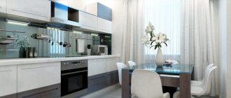
Combination of orange with other colors in the interior
The warm, rich tone has adopted the properties of red, so it cannot be the only one in the room. When decorating, shades from a bright range must be combined with other colors in the fittings, with the set, when choosing a furniture design. Successful combinations do not irritate the psyche; they become a continuation of the modern room.
Pastel
A neutral shade range visually mutes the richness of orange. Delicate creamy will add a touch of airiness to warm tangerine or pumpkin cuisine. The pastel mint color on the walls looks impressive in combination with the orange panels of the set.
Those who love an active lifestyle will appreciate rich walls and beige furniture. The combination energizes and makes emotions positive. If the combination is depressing, then instead of bright it is better to use muted options:
- amber;
- apricot;
- ocher.
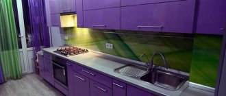
Green
The best companion for orange in the interior of the room. They combine both delicate tones and bright (acidic) colors. Designers recommend choosing 4 shades from both palettes and decorating the kitchen from the ceiling and walls to textiles on the furniture. One tone is chosen as dominant, and the rest are slightly muted.
Blue
The warm tone can be combined with a refreshing blue option. The soft blue top and pumpkin bottom help to visually expand the space of a small room. The interior looks harmonious with a checkerboard shade of aqua and peach in the background design. Dark azure is combined with juicy orange, and muted carrot with turquoise.
In the duet, orange takes on a more saturated sound. Combination with purple is contraindicated.
Red
The bold combination makes the kitchen very cozy. The glossy warm panels of the set echo the scarlet furniture and draperies on the windows. It is better to dilute bright shades with neutral gray, delicate milky or white. An excess of loud elements irritates the psyche, so staying in a room for a long time is dangerous to health. The duet with pink is too catchy and tacky.
Shades of orange
The colors of the same palette naturally combine with each other. Rich orange looks luxurious against the backdrop of delicate peach or apricot. Warm amber is combined with ocher and terracotta.
Juicy pumpkin will show its beauty with muted caramel or sea buckthorn. Rusty and mahogany are chosen as dark accents in the room.
Interior styles that go with orange
Because of its versatility and cheerfulness, it can be incorporated into many styles and designs. Orange color in the kitchen interior looks impressive and stylish.
- Modern. Straight lines, sharply defined angles and bold, vibrant hues. All this can be embodied in modern design. If desired, the palette can be changed to a calmer one. The combination of different materials looks interesting. If you make a room in soft, restrained colors, the interior will be soothing. It looks interesting together with photo wallpaper or elegant wallpaper with bright accents.
- Classic. For this style, you should choose a calm shade, discreet and not too saturated. Patterns should be discreet. The material for production is better to choose natural solid wood.
- Country - in this case, you can also successfully integrate bright furniture into the design, but at the same time focus on natural materials: wood, stone.
Design Features
When creating a harmonious interior, pay attention to the following nuances:
- Due to its sunshine, the orange shade is perfect for kitchens located on the north side.
- For a small kitchen, fragmentary use of orange in the form of individual accessories, such as curtains, lampshades or a table, is appropriate.
- Rich orange colors can adjust the layout. So, if in a long and narrow room one distant wall is decorated in orange tones, then it will visually become more square.
- This color has a beneficial effect on the psyche and prevents the occurrence of seasonal depression and mood swings.
- Orange is suitable for apathetic and indecisive people. Thanks to its brightness, it is possible to get rid of emotional sensitivity and indifference.
- Tangerine shades in large proportions should be avoided by people on a diet, as these colors cause appetite, as well as by those who are prone to excessive excitability.
- According to Feng Shui, orange has a beneficial effect on humans. It helps restore vitality, stimulate intellectual and physical abilities, and reveal inner potential and spirituality.
Choosing an apron and countertop
If the kitchen set is partially made in orange tones, you can decorate the apron area in orange. To add a glamorous and luxurious touch to the interior, a contrasting black apron is preferred.
The cooking area, lined with multi-colored mosaics, has a very original look. A glass apron decorated with photo printing will allow you to bring lightness to the atmosphere.
A black tabletop is perfect for an orange set, which will give the design an elegant and more noticeable look. Also popular colors for the base are grey, white and olive shades.
Benefits of orange kitchen design
The colors that surround us influence our mood and emotional state - a fact. Orange is one of the most active, energetic and invigorating shades. The shade has a beneficial effect not only on mood, but also on health, helping to increase the tone of the body and improve digestion.
Choosing this color for kitchen decoration has the following advantages:
- Orange quickens the pulse and seems to “warm”. In the autumn-winter period, it will not allow boredom and blues to overcome you, because with such a bright kitchen you definitely won’t have to be sad because of the grayness outside.
- It is able to normalize appetite and improve digestion processes.
- The color looks stylish and unusual, it allows you to realize all your fantasies in kitchen design.
- Depending on what tones complement orange, the interior can be either quite provocative or more calm.
IMPORTANT! There are also disadvantages to this choice. Orange stimulates the appetite, which is definitely a minus for people struggling with excess weight. In addition, a large amount of orange can prevent you from relaxing, and constant tone gradually leads to nervous exhaustion.
Positive orange curtains in the interior: color combination
The monotony of shades in a room can bore everyone, and the unusual orange color itself is very rich and bright. Therefore, there is no need to overload the room with this color. Curtains on the windows and a couple of sofa pillows are enough to create an interesting design.
Orange curtains in the interior are suitable for young, creatively thinking people who are not afraid to take risks and bring something new into their home. If the room is properly designed, the experiment will definitely be a success.
Even in cloudy, uncomfortable and cold weather, a piece of summer will warm you up in a room where orange color predominates. Designers know that different colors have different effects on a person’s state, activity and behavior. A living room or dining room in this color will promote friendly, positive communication. But, unfortunately, orange curtains also have disadvantages.
These include:
- Not compatible with all colors;
- Overshadow other interior items;
- Get bored quickly;
- Sometimes they get annoying.
Before decorating a room with orange curtains, it is best to get the approval of all family members.
What elements can be done in orange?
If the decision to add orange tones to the kitchen has already been made, then the first thing you need to determine is which details will be made in this palette. To fully reveal rich tones, a suitable tone is necessary, for example, if the furniture is bright, then the walls should be soft and vice versa.
Kitchen set
There are many options for adding orange to your kitchen. The most popular, of course, is the headset. Such a bold decision will be especially relevant for kitchens whose windows face north.
If you decide to use “orange” as the base color, you should remember about balance. If the set is bright, then the finishing is done in other colors. light colors are suitable for the ceiling and floor
- lactic;
- Ivory;
- vanilla;
- cream.
If you want more contrasting solutions, you can choose dark shades:
- violet;
- blue;
- blue;
- lilac.
At the same time, it is important to monitor the combination of finishing tones with each other. For example, the walls should be a couple of shades lighter than the flooring.
There are several options for combining orange facades:
- In a large kitchen, a combination of orange with black and a small amount of white will look very impressive.
- If the room is small, then you can use muted orange and combine it with white.
- To achieve the effect of completeness, use a combination of orange and blue colors.
- The most popular classic symbiosis is with green.
- Thanks to the selection of suitable shades and their beneficial combination with the addition of decorative elements, the kitchen is in demand among different generations.
If we talk about materials, then most often it is MDF or chipboard as the base. MDF is considered a better option, as it is produced by pressing rather than gluing, unlike chipboard.
The top coating can be:
- enamel;
- PVC film;
- acrylic;
- HPL plastic.
Acrylic is considered the best and most expensive - it has an almost mirror-like glossy surface. The most common material is PVC film. It is cheap, and if desired, you can stick a new film on top, quickly and inexpensively changing the interior of the kitchen.
This way you can also save money, since it is from these materials that modular kitchens are made, which often cost less than custom ones.
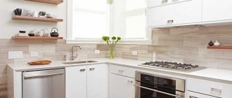
Walls
Walls decorated in sunny colors look very impressive, especially if you add wooden furniture to them. If you want to decorate only the apron with such a bright color, the background should remain white. The advantage is that greasy drops are not noticeable on the orange apron.
When decorating walls, it is better not to get carried away with rich tones, although they have one advantage: orange color increases the appetizing of dishes. At the same time, it also affects the visual perception of the room, namely, it reduces it.
This feature is useful for smoothing proportions. For example, in a narrow room with high walls, you can decorate the ceiling in orange and choose light wallpaper: in this case, the ceiling will visually lower, but the room will not look narrow.
There are two options for color combinations of walls and furniture:
- rich dark orange walls, for example, pumpkin or terracotta - require less bright furniture, for example, white, cream, pastel green, light blue and so on;
- delicate peach walls allow you to use furniture in rich colors - chocolate, wenge, bright green, blue and even black.
Most often, walls are decorated using paint or wallpaper. But not all wallpapers are suitable for the kitchen due to its aggressive environment.
You shouldn’t even pay attention to specimens made of paper, fabric or acrylic, since they are afraid of water - it will be impossible to wipe and wash them. But vinyl or non-woven wallpaper is an excellent option, because it does not absorb odors and can be washed without any problems. Photo wallpapers are rarely used, since the chance of overloading the interior is too great.
Which curtains to choose for the kitchen in an orange palette
Bright, appetizing, cheerful sunny and orange colors are an excellent solution for the kitchen and its decoration. It is not surprising that it can be chosen by both active people and optimists who lead a rather calm lifestyle. Curtains for a room in such a positive palette can be very different, and it is they that sometimes set the mood for the entire interior.
In the photo there is an orange kitchen with curtains in soft peach tones.
Orange curtains will make the kitchen interior sunny, positive, light and warm. A set in this shade will also be cheerful and bright, so the design cannot be boring, but then a question arises about choosing curtains. To prevent the room from looking overly saturated, it is important to choose the optimal shade for the curtains.
Ceiling and floor
The standard solution for the ceiling is white. Moreover, in the kitchen the shade may not be snow-white, but creamy, vanilla or reminiscent of baked milk. All such tones can be depicted without any problems by a stretch ceiling - the optimal material for the kitchen.
Of course, the best solution to highlight the orange color of the kitchen is a white floor. But the kitchen is a room with an aggressive environment, so light-colored floors are not the most practical option. Among orange tones, peach is optimal, but you can also add:
- brown;
- beige;
- grey;
- blue;
- sand.
Most often, if you want to decorate the floor with orange, tiles are used, since laminate, linoleum and other materials of this color are difficult to find. A new technology would also be appropriate in such an interior - self-leveling floors with a pattern.
The most daring ones choose glossy black flooring. Yes, it will maximally emphasize the rich colors of orange, but it will also not be the best and practical solution, because all the dust and even fine dirt will be visible on it.
Apron and work surface
If you want to decorate the apron in “orange”, then in the rest of the decoration it is better to abandon this color in favor of neutral shades. If the set is orange, then the best solution for the apron is glossy white, and it is better to avoid purple and pink.
It is important to understand that bright colors attract the eye. It is for this reason that it is important not to overdo it with them, but to correctly place accents, diluting them with other colors.
Popular materials:
- wallpaper under glass;
- wooden panels;
- ceramic tile;
- facing stone;
- they threw it off.
Images of citrus fruits, flowers, coffee and abstract drawings look great on skins with an orange border.
Appliances
On the modern market, among the variety of household appliances, you can find very unique and non-standard models made in “retro” style. This usually applies to refrigerators, kettles, coffee makers and toasters. Such models have a metallic surface, which is painted with a bright color.
It is best to place such equipment in addition to an apron or dining group in a kitchen in the loft, minimalism, pop art style. But if all the furniture is already made in orange, then you should refuse equipment of the same color.
Lunch group
The table and chairs can also be in orange tones. They probably have the greatest variety in material and appearance:
- in minimalism, orange transparent tables and chairs made of special plastic will look great;
- in a classic kitchen it can be painted natural wood;
- in high-tech style, the base of the chairs and table will be chrome, and the top part will be plastic or glass.
A combination of the tone of the dining group and the apron is acceptable.
Curtains
A bright kitchen is created to maintain a good mood and cheerfulness in the kitchen. To add coziness to such an atmosphere, you can choose curtains made of chiffon or tulle. If you want easier maintenance, then blinds or string curtains are suitable. The choice of color is usually limited to two options:
- in orange tones - in addition to peach and orange, it can be red or yellow. It is ideal if the upholstery of chairs or sofas is made in the same shade;
- in green tones - it is better to abandon bright, saturated tones in favor of light pistachio or similar shades.
In addition, the choice of specific curtains is also influenced by the overall design of the room. For example, for a rich interior it is better to choose neutral textile tones.
Corner orange kitchen
A set of this configuration will look good if you choose more subdued shades. Apricot, pumpkin, and peach colors do not create a feeling of overload. Also, a good design move would be to install a white or light gray sink in the corner. The corner parts of the headset should not be darkened or cluttered.
Small orange kitchen
Too much bright color can make an already modest room look smaller. But if you wisely use the property of the base color to bring the walls closer and larger, you can achieve the opposite effect. To do this, you need to decorate only one of the walls in similar colors.
As a result, the ceiling in the room will appear higher than it actually is.
Kitchen-living room orange
When decorating such a combined room, more restrained shades should be used. Too bright, saturated colors are not suitable for living rooms. Peach, pumpkin, mustard, amber tones will create a rather cozy and warm atmosphere in the room. Using neutral dilutions, you should wisely divide the room into working, dining and living areas.
Photos in the interior
The ideal style solution for an orange kitchen would be the high-tech direction. In addition to the red glossy facades, elements in black and gray tones are selected. With the help of bright accents, it is possible to deprive the trendy futuristic design of sterility and brutality.
Orange kitchens in a matte finish have a rather impressive appearance, especially if they are combined with a glossy floor covering. Thanks to this design technique, it is possible to increase the space in height, give it laconicism and a unique style.
In the design of the kitchen-living room, the main focus is the dining area, which is why orange shades predominate there. For the workspace, a minimal orange palette is used in the form of chairs, an apron or a tabletop. The rest of the space is done in light colors, like a map.
Stylistic solutions in window framing
Of course, you initially need to choose a kitchen design style, and only then begin to detail the project. But quite often a person goes the opposite way and decides what colors he wants to see this room in, and only then selects possible options for implementing his plans. Therefore, by determining the combination of shades, you can choose the optimal curtain options.
- Combinations of orange with neutral and pastel tones are suitable for strict classic interiors. Such curtains can be regular, shortened, or with lambrequins and additional decorative elements. In such styles you can choose bulky curtains.
- Modern technological projects most often include blinds or roller blinds. The photo shows that their color can be absolutely any, but it is better to avoid too dark solutions so as not to turn the kitchen into a bunker.
- Bright curtains harmonious with an orange tone, as in the photo below, are usually used in modern functional interiors. It is better to give preference to light translucent curtains, since their shade will already attract attention and visually take up space.
- Light-colored curtains with a pattern in the form of a small curtain are often used in rustic and retro interiors - in country, Provence, chalets. If the main tone is pastel, then the pattern can be combined with the main bright orange color.
A kitchen in orange tones is distinguished by a positive mood and cheerful character, which can be emphasized with well-chosen curtains that are harmonious with the main color shade.
Rules for combining orange
The orange color attracts housewives with its friendly energy, which is especially important in the kitchen, where the whole family gathers. The right color combination guarantees excellent results.
The plus is that orange goes with almost all colors. The main thing is to find suitable shades.
There are two "temperature" options:
- creating a fresh atmosphere by using cool tones. Warm orange can be diluted with the standard color of greenery, forming a natural and harmonious combination of colors - orange invigorates, and green calms. You can also use brighter colors - for example, blue. In any case, it is better to select tones of the same brightness and saturation - it is almost impossible to make a mistake with this option;
- creating a warm and cozy atmosphere. This option is necessary in rooms where the windows do not face the sunny side. The best tones to combine are brown and yellow. If you add a wooden floor, the kitchen will immediately become as comfortable and cozy as possible.
The most popular shades of orange for use in the kitchen:
- calm and deep terracotta, close to brick;
- glamorous pumpkin;
- warm orange;
- delicate and smooth honey;
- peach reminiscent of summer warmth;
- soft apricot;
- unobtrusive tango;
- amber gives meaning to the interior;
- charming and cozy carrot;
- catchy rusty.
It is important to choose a shade not only according to personal preference, but also not to forget about its combination with other tones. If you prioritize color schemes correctly, even the darkest kitchen will be filled with light thanks to orange tones.
Black
Initially, you may get the impression that the combination of black and orange is not for the kitchen. But if you arrange the combination of colors and lighting correctly, it seems that you will get a very effective design. This combination is at one time chosen by brave people who know how to make serious decisions, come up with ideas and have leadership qualities.
This, first of all, bold symbiosis is suitable only for a modern kitchen with a large number of glossy and shiny surfaces to suit the size. You can dilute this first atmosphere with gray, white and chrome tones.
There are two ways to combine these colors:
- predominance of black;
- predominance of orange.
In equal proportions, this combination is difficult to make stylish.
Speaking from the practical side of the issue, this combination of tones is most often reflected in the headset: dark bottom, orange top. Another popular option: black facades and orange apron.
The ideal option for such a kitchen is light walls, floor and ceiling, built-in furniture. They can, in turn, be matte white, light gray or with a slight undertone of dotted and thin streaks of steel. If you want to emphasize the main color of the shape, it can be used in switches, sockets, lighting fixtures and other small details.
Adviсe. When choosing the perfect shade, do not forget that orange on a black background looks calm and cool, so you can safely afford more saturated shades.
Lighting is an important point in a black and orange kitchen, whose policy is to refresh and bring joy while cooking. There should be a lot of it: both in the work area and in the corresponding dining group.
Green
A truly natural combination in which everyone can put their own prototypes: peach and leaves, flowers and grass, summer and sun. To maintain this positive atmosphere in the kitchen, it is better to stick to warm and light colors rather than dark and cold ones. Apricot and light green decorative shades are perfect.
In this combination of colors for renovation, it is interesting to “play” with the floor and ceiling and decorate them, for example, in a soft orange or greenish tone. But you can limit yourself to the usual completely white if orange types have already found themselves in the kitchen. To avoid changes in the proportions of the room, it is better to leave the walls neutral. Examples on the website page below.
You can diversify the orange-green dining area with bright accents, for example: dishes, a vase, a picture or other pleasant little things. You can easily use several orange tones, but among them there should be an almost dominant one in number.
Yellow
The combination of yellow and orange can be called an excellent color therapy against a bad mood, and the variety of tones of varying saturation allows you to create an organic atmosphere in any interior. This symbiosis perfectly zones the space.
Different tones can be combined even in one item, for example, curtains or sofa upholstery, with plaster. It could also be a chandelier.
Yellow and orange are strong leading colors, so you need to carefully monitor their proportions or combine them wisely. Otherwise, the invoice and projects will turn out unsuccessful. Because yellow is slightly weaker, it can be used over a larger area. For example, choose a set of sunny colors, and highlight only one wall with orange. Look, isn’t it true, the result is a strict and original style that some modern people prefer.
White
The combination with white will make the room as harmonious as possible, but will not oversaturate it. It is best to use healthy and gentle tones of orange:
- pumpkin;
- honey;
- tangerine.
But white should be snow-white without any undertones - cream or vanilla. In this case, if you want, you will get a beautiful, stylish, no-frills interior, which can often be decorated in the style of:
- Provence;
- rustic;
- Art Deco;
- loft or any other with good imagination.
You should not allow an abundance of orange color in the kitchen at home, since such an interior painting can become heavy and intrusive. It is better to make only a few elements bright, for example, a curtain, a tabletop, one wall, a refrigerator or a set of dishes. In this case, orange will fill the secrets with energy, but will not have time to get boring.
In small kitchens, orange should be used to visually change the space. This will expand the space and its decoration. For example, an accent wall will make the ceilings and patterns appear higher and the countertops wider. There are no special requirements for privacy lighting, because white gives lightness and airiness, and orange is responsible for decoration and color.
It is advisable to complement the white and orange kitchen with textiles, for example, curtains, tablecloths, coasters and towels. It doesn't have to be orange. Using a different shade will add a special touch to the interior. The main thing is to choose a shade.
Grey
In the kitchen, the combination of gray and orange is rare, but it can be considered as another possible design option for the room, on which the entire interior depends. Gray very favorably sets off additional orange tones, pistachio mutes them a little, and orange dilutes the gray monotony - the result is a win-win combination.
Popular shades of gray:
- smoky;
- graphite;
- wet asphalt.
They can be used in wall or floor decoration, countertops or chrome appliances. The gray-orange combination will look great in modern styles - hi-tech, minimalism.
Brown
Usually we are talking about noble dark wood or zebrawood, so this combination of colors is best used in kitchens in the classic, rococo and even contrasting empire styles.
The rule is: the darker the wood, the brighter orange manufacturers can afford.
But the color of citrus fruits should be used in very measured doses, for example, only in the apron or tabletop, and everything else should be in dark brown tones or with metallic shades.
Red
This symbiosis increases the temperature in the room by several degrees. It is so bright and provocative that it simply requires the use of more sophisticated neutral tones - beige, white, cream, or at least silver or gray.
If this recommendation is not followed, the kitchen will turn out to be flashy and even a little aggressive - you won’t be able to stay in it for long.
Blue
If everyone wants a more elegant and dressy option, then you should take a closer look at the blue color. Pumpkin and completely terracotta shades go well with it. Blue can be used to highlight several sections of walls during arrangement, the ceiling or floor. The rest should be decorated in white.
Kitchens in orange tones vary, but they are always positive, energetic and significantly charming.
It is worth noting that the worst combination of orange is with pink. Such a symbiosis is allowed only in the pop art style, but the use of pink must be kept to a minimum.
Harmonious palette
Not a single shade is used alone in the design; there are always companions in the interior. Orange, with its temperature, vitality and strength, takes up a lot of space in the room, so it needs to be combined with less saturated tones. But there are different shades of this color:
- pastel tone , which is closer to yellow in its notes, often serves as a background for brighter solutions;
- the rich shade of orange is distinctive in itself, but other bright colors can quite organically coexist with it, although you need to be careful with them;
- the dark tone is associated with terracotta ceramic tiles, which are often used in retro styles.
Accordingly, the brighter the main shade of orange, the less saturated the companion should be. But, surprisingly, you can choose a combination for this tone in fairly deep tones.
Curtains of this color will match orange:
- White curtains - a classic option that can often be seen in photos of both stylized antique and modern interiors. This is a positive combination that can be both quite calm and quite energetic.
You can also choose black if the decoration contains dark surfaces. This is a strict and extravagant combination at the same time. Such a duet can be very dynamic if the design uses aerodynamic curves rather than straight lines. - An overly bright combination would be red with shades of orange. But this combination also has the right to life when implemented by an experienced designer. If only the curtains and a few accents in the kitchen work area are red - dishes, appliances, etc., then the duet will be quite harmonious. It is important not to overdo it with the fiery tone.
- An organic combination of orange and yellow. The photo shows that these are similar shades in mood that will help enliven any interior. If orange is used in wall decoration, then you can use a yellow pattern and yellow curtains. If you choose orange facades and place sunny accents, then it is better to make the curtains in orange tones with yellow trim.
- The duo of orange and all shades of blue is harmonious and positive in its mood. Interestingly, the cold spectrum of blue tones is inferior to the temperature of orange, and the interior turns out to be quite warm. You can match the orange trim with blue accessories, including curtains. If the kitchen itself is in warm colors, then the dining area can be painted blue and the curtains chosen orange. The photo shows how original and pleasing this duet is to the eye.
- A duet of orange with different shades of purple will be solemn. Calmer lavender tones will mute the energy of orange and make the interior mysterious; bright lilac tones are a combination that deserves special attention. Fuchsia curtains with matching accents in decoration or household accessories will make the interior a little reckless, but cheerful.
- An organic combination of orange with shades of green. With olive or emerald green you can get a rather strict and solemn, but positive interior, and with rich herbal or salad green it can be cheerful and conducive to communication.
- Shades of beige and brown calm the orange tones in the kitchen a little. Curtains of such neutral colors will add nobility and respectability to the design. A similar duet is often used in classic interiors.