31.05.2021
634 views,
Emerald color is ideal for those people who prefer deep and warm shades in everything. This is the color of nature and precious stones. Designers have long paid attention to it and say that with its help you can create comfort, lift your spirits, talk about stability and calm down.
In a room decorated in a similar color scheme, it is easy to relax and forget about everyday worries. But when decorating, you should pay attention to a lot of nuances and learn how to combine emerald with other colors.
What you need to know about color
Nature has given the world many precious stones. One of them is malachite. It has a special magnetism. Its magic is described in ancient legends. People are sure that the disappeared Grail was made from it.
Malachite has always been used to make jewelry. In the late twenties of the nineteenth century, this gemstone became a symbol of wealth and social distinction among the Russian nobility. This explains why the color malachite began to be used so actively both for sewing outerwear and for decorating rooms.
Color of natural malachite Source jewelerymag.ru
Harmony in balance
Today, emerald in the interior is a fashion trend. It helps create bright accents. Its shades are not used for total coloring. This can make the space feel overloaded. Therefore, such a palette is almost always given a secondary role. Its use helps to complete the interior.
A bright palette is always given a secondary role Source stdibscdn.com
Not all colors are suitable as companions. To choose the right pair, it is important to consider the depth and richness of the malachite color. It is also important to remember that such an original design can only be afforded by those who are able to stay on the verge of refined taste.
Only a person with a refined taste can create such an interior. Source yandex.net
Bright and saturated shades are good as decorations and details that dilute the monochrome of the main neutral color. These could be pillows and curtains, cornices or floor vases. Hang a large emerald clock in a bright room and a completely different mood will appear. Emerald furniture looks good. It immediately attracts the eye and becomes the central object of the interior with gray walls.
Bright splashes create the right mood Source skstudia.ru
If you need to use emerald color for walls, you should give preference to its soft, muted shades. Make the floor in the same color scheme, it will help emphasize the delicacy of the surrounding environment.
Walls and floors in one delicate color Source yandex.net
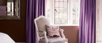
To make the overall impression of the room completely different, change the color of the floor. Then a basis will be formed that will be easy to paint, like a picture. Add purple colors to it, a little green, you get a light, airy interior, very warm and homely.
Dark walls do not put pressure, and all because their heaviness is balanced by a light floor and bright accessories Source artm.pro
See also: Catalog of companies that specialize in designing from scratch and internal redevelopment of ready-made houses
Designers consider the emerald color to be very complex - they think through the combination with other interior colors in such a way that it can fully reveal itself and help create the desired effect. So, for example, if you need to bring coolness to a hot room, use a pair of blue and dark blue with rich dark malachite. These options are only suitable for large rooms with a lot of natural daylight. They fit perfectly into all romantic styles. This must be taken into account.
An interesting combination of emerald and blue Source design-homes.ru
Psychologists say that a similar range is well suited for decorating children's rooms where positive, cheerful and active children live. The new environment will create a good mood, which means the child will always have a favorable psychological background. Green calms and relaxes, blue helps you concentrate. It is important to note that you need to use this pair in reasonable quantities and choose only calm shades.
Unusual children's room Source wp.com
Experienced designers, talking about what emerald color can be combined with in the interior of a residential building, advise trying to combine malachite with gold or silver. These are win-win options for decorating luxurious halls and living rooms made in the Empire, Art Deco, and Art Nouveau styles. Such pairs are familiar to the human eye. And all because it is often chosen by jewelers when creating expensive jewelry. Emerald and gold are made for each other.
Gold and emerald emphasize the luxury of the interior Source pinimg.com
Emerald color in the interior
What is emerald color? It is a deep, rich green with a slight, barely noticeable blue. Like other deep colors, emerald in large quantities can suppress, depress, worsen mood and physical condition. Therefore, in the interior, emerald is good in two forms: as a secondary color or as an accent .
Emerald shades
As a secondary color, emerald is successful where the main color is a light neutral color: for example, white, gray, pearl. So, for a room with light gray walls, emerald curtains will be a luxurious addition. They will not make the room gloomy, but will improve the interior.
As a secondary color, emerald color can be used in furniture elements
Emerald is excellent as an accent color. It is bright, catchy, effective. Even a small amount of emerald inclusions will create a significant color accent that will dilute the main palette and highlight its colors.
Accent apron in the kitchen
Some beautiful examples
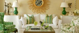
The photo shows a large living room with floor-to-ceiling windows. The decor uses different colors, showing how beautifully the colors of sea wave, malachite, bright sun and white combine with each other.
Sea wave, bright sun and whiteness - a beautiful combination of different colors Source yandex.net
See what an ultra-modern bedroom you can create using a combination of malachite and silver. Even though the central wall has a complex texture, the room seems light and airy.
Ultra-modern bedroom with beautiful bright decoration Source yandex.net
Emerald kitchen in country style with beams on the ceiling. The wood theme is supported by tall stools placed at the island with a light-colored countertop. Everything is rustic, simple, but at the same time elegant and rich.
Country style kitchen Source krovlyakryshi.ru
Briefly about the main thing
Whatever style is chosen to decorate your living space, choosing emerald color allows you to achieve elegance. With its help, it is easy to create the effect of lightness, airiness, and give the interior a romantic touch.
The color is considered complex, and it is not easy to choose a companion for it. To do this, you need to have a very delicate taste, so designers advise, when conducting independent experiments, to choose combinations that have already been tested by specialists in their work.
Emerald goes well with gold, silver, white, black, sand and beige. There shouldn't be too much of it. Otherwise, the interior will become gloomy, dark and uncomfortable.
Ratings 0
Popular solutions
Since furniture is purchased for several years, designers do not advise choosing the color of the sofa based on fashion trends.
The shade should be comfortable for household members. Compatibility with other interior items is important. The colors of sofas offered by manufacturers can be divided into three groups: neutral, monochrome and rich. The monochrome palette includes white, black and various shades of gray. These tones are always relevant and can be combined with different styles of room decoration. These colors of upholstered furniture are often chosen for offices, educational and medical institutions:
- White. Visually expands the room, so it is great for small spaces. Such sofas complement Provence, hi-tech, minimalism, and Scandinavian styles. To prevent the product from looking boring, it is complemented with bright accessories: pillows, blankets.
- Black. It is appropriate only in spacious rooms, as it visually enlarges the furniture and makes it bulky. A black sofa is in harmony with light walls and textiles in neutral natural tones - beige, copper, sand, marsh.
- Grey. Has many shades. Lighter colors go well with white wall decoration and curtains in beige, pink, and blue colors. Graphite is complemented with golden, blue-green, and coral shades. Most often, the gray scale is used in loft, hi-tech, and minimalist styles.
A palette of neutral shades is used for modern and classic styles. Brown, cream, beige, marsh, peach, pale blue, green color of a sofa in the interior has a calming effect on a person. Among neutral tones, the following are considered the most popular:
- Beige. If you have any doubts about what color to choose a sofa for your living room or bedroom, you should consider this palette. All shades from cream to sand are successfully combined with both light and dark wall decoration. This range can be combined with almost any interior. Beige upholstered furniture looks especially good with blue, emerald, and burgundy pillows.
- Light pink. Muted shades are relevant for furniture placed in the bedroom. This range makes the interior elegant and delicate. Light pink products are often chosen for children's rooms decorated in Provence style. They can be complemented with textiles of a similar shade with a floral print. Silver, gray, and blue tones are combined with cold shades.
- Brown. The ideal color for a sofa in a living room or office. Brown coloring is relevant for many styles. The main advantage of a chocolate tone is its solidity, especially if it is a leather model. When considering which color of the sofa is best suited for a beige room, you should pay attention to dark chocolate or wenge. This option will definitely not leave anyone indifferent.
- Green. Any muted shades look neutral and do not attract unnecessary attention. This is a good choice for a country or eco style room. Green upholstered furniture will fit perfectly into a nursery, suitable for boys and girls. In addition, psychologists note the positive impact of this shade on a person’s emotional state.
READ MORE: Do-it-yourself carpet laying methods and flooring technologies
The bright colors of upholstered furniture are no less relevant. A correctly selected rich shade of a sofa can become the highlight of the room. At the same time, there should not be many bright accents, otherwise it will be uncomfortable in such a room. Current colors:
- Red. Looks best with monochrome shades. Scarlet upholstered furniture will fit well into an interior with white, gray or light blue walls. If the living room or bedroom is decorated in Baroque or Empire style, a red sofa can be complemented with ebony, gilding, and carvings.
- Yellow. Sofas made in a lemon shade can often be seen in retro style. More restrained tones are relevant for classic or modern bedrooms and living rooms. A small sunny yellow sofa can become a bright accent in a nursery.
- Ultramarine. Upholstered furniture in bright shades of blue is best placed in rooms with neutral wall and floor finishes. Complementary colors are beige, yellow, gold, coral.
- Violet. To prevent a room with such a sofa from putting pressure on the psyche, the remaining pieces of furniture and walls should be light. The interior can be decorated with small accents of blue, hot pink, turquoise, and scarlet.
