Raspberry color in the interior
A modern living space should be designed in an original way and, at the same time, provide warmth, warmth, and comfort. The main role in this matter is given to the shades used in finishing work in the interior.
It turns out that the atmosphere in the room is determined by the background. Crimson colors always look stylish; they are preferred by creative individuals who are not afraid of innovative ideas. When you like this shade, you can arrange your home yourself, without turning to specialists for the appropriate services.
Combinations of crimson with other shades
Berry colors remind you of summer, evoke a joyful mood, and encourage active action.
Such qualities were well known to our ancestors - just look at the photo with royal clothes decorated with inserts in the shade of ripe berries. Crimson, available in interior design, will definitely affect the psychological mood of those present in the room, and the result of its influence will depend on the intensity of the shade and the companions selected for it.
An interior in a pure crimson shade is perceived ambiguously, so it is recommended to choose a partner for the main color. There are many such combinations, because the color of raspberries is distinguished by its loyalty. It is muted with pastel colors or other bright shades are added.
A constant companion of crimson paint is a white shade. Against its background, curtains made in the crimson spectrum look quite advantageous, especially when they are complemented by paintings in frames of a similar shade.
From the psychological side of the issue, the combination of crimson and black is considered successful. Naturally, black is given a secondary role, or it is used to place accents.
Combinations of crimson paint with mint, light green and lemon shades look stylish. The dominant role in such compositions is given to the first shade, the brightness of which gives the additional colors the magic of a neon glow. In reality, everything looks like this - objects in mint or yellow colors are placed against the backdrop of bright red walls, and the design is completed with decorative elements in white, beige and cream colors.
The crimson spectrum looks good in combination with lilac, pink and purple colors. Just remember that the listed shades belong to the same group; it is recommended to use them carefully. Make the background lilac or purple; for textiles and accessories, choose crimson.
The combination with yellow looks quite bold. The solution is so cheerful that many regard it as eccentric. But if you need a kitchen that excites the subconscious with colorful colors, take a risk.
It is believed that the combination of crimson and yellow is an excellent solution for decorating a bedroom or living room. Sometimes it is enough to complement the interior design with one large object or several small objects in a crimson shade, and yellow will begin to look different. It is allowed to use floor vases, sofa cushions, candles, lamp shades, curtains, etc. as such items.
Use in interior design
The shade is bright, looks festive, conducive to positivity. Thanks to this quality, crimson paint is used when renovating any room.
Since one quickly gets tired of the intensity of crimson paint, it should not be used in its pure form - the luxurious shade is diluted with light ones.
When working with crimson paint, remember that its color visually reduces space; in small rooms, use it in doses, in the form of decor or textiles.
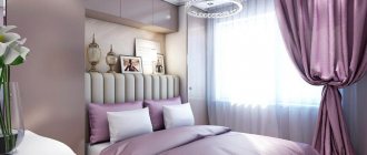
Bedroom
If we consider practical and psychological qualities, experts unanimously assure that it is bad to rest in such a room that stimulates activity, so crimson color is used here as an additional one.
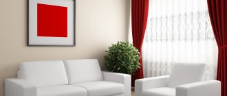
Living room
In this room there is real space for crimson shades. If you decorate wall surfaces in this color, then it is best to choose furniture in a light tone. For a classic background, a crimson sofa is most suitable.
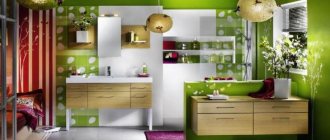
Kitchen
This color fills the space with optimism and gives it comfort. You should not overdo it with raspberry, otherwise it will begin to irritate, and you can forget about the comfortable use of the kitchen space. If you like a set with a crimson facade, the walls and other surfaces are decorated in neutral colors. A white background looks good, but you shouldn’t use it - the kitchen is considered a dirty room. Replace with gray or beige; you can also use pink.
Whatever option you choose for using crimson in the kitchen interior, try to maintain harmony in the room and not make it too intrusive.
Choose furniture in bright colors. Install household appliances in a silver shade; white models are also suitable.
Bathroom
Decorated with a combination of crimson and white, it looks fresh and seems spacious. Both shades can be used in equal proportions, but dark colors should not be added - it will feel overloaded.
Children's
When a girl lives in the room, raspberry in the design is welcome. There is only an optimistic mood in the room; children will feel good here. But remember that the specificity of the shade is such that it is better to use it as accents, and not for the main decoration. To balance the brightness of the palette, do not forget about beige, gray, and cream tones.
Bright combinations
A fashion trend is to use crimson color for accents in clothing. To go to the cinema, wear tight dark blue jeans with a lot of ripped elements, complement them with a loose fawn-colored blouse with a small, inconspicuous pattern. A bright blue fitted jacket and open sandals of the same shade will give the look a festive look, and a medium-sized raspberry clutch will serve as a bright accent and put a weighty point in a stylish outfit.
For girls with a high contrast in appearance, especially brunettes, a strict trouser suit in a rich crimson color is suitable. A closed jacket with long sleeves and skinny long trousers create a deceptive impression of severity, while the deep neckline and the combination of crimson thick fabric with dark blue suede shoes give rise to a truly sensual image. Jewelry in golden tones looks most flattering with a crimson suit.
Some of the brightest combinations with crimson produce yellow-green shades. Thus, a straight raspberry coat from MaxMara can be made even brighter by pairing it with a woolen stocking cap in a fashionable lime shade. Headdresses of grass green, emerald and mustard colors will give the same effect.
Try not to use more than 2-3 bright colors in an image, otherwise you risk looking comical.
Beautiful bright combinations are obtained by combining shades of crimson of different lightness and saturation. Thus, a soft pink cotton blouse worn under a crimson jacket goes harmoniously with burgundy trousers made of cord or suede.
Terms of use
When working on interior design, follow the basic rules for combining bright colors:
- shades of equal saturation intensity, used in the same proportions, create imbalance in the interior, and therefore one of the “companions” in any case has to be “diluted”;
- The crimson shade, which acts as the main accent in the interior design and is present in the form of a bright decor, should not have an overwhelming effect on the attractiveness of other paints used in the renovation. The sharpness of the contrast is drowned out by the white color introduced into the design. For similar purposes, they use diluted shades that easily fit into the interior design.
Wedding ideas
The color also looks stylish and modern in wedding dresses. This can be a decor or insert on the bride's dress and a matching groom's tie.
Sets for celebrations
Wedding decor in crimson tones
When choosing a crimson dress or jacket, you need to think about what you can wear it with. A difficult color, in clothes it can make a fashionista look royally luxurious. To understand what it goes with, it’s worth looking at the photo.
The overall perception of the house is mainly influenced by the color palette that was used to decorate the interior.
And although most people tend to use classic colors, experts convince us that this is completely optional.
Indeed, today there are a huge number of interesting variations that are a little bolder than the classics, but are not shocking.
For example, the last few years the color crimson has been especially popular. Despite the fact that the color is quite rich and bright, when used correctly, the room becomes more lively, but the interior remains classic.
Moreover, this color gives the room not only brightness and richness, but also grace. And who wouldn’t want the interior of their home to become more memorable?
Luxury and individuality are the companions of crimson in the interior!
Examples with photographs
In this photo you can see how beautiful raspberry-colored living rooms look, the facades of which are favorably emphasized by a neutral background of a light shade.
The next photo shows a bathroom in which crimson-colored furniture creates a festive mood.
The following photo represents the living space, in which the crimson color is indicated by textiles and other few accessories.
0
Combination with achromatic colors
- Black
This combination has become almost a classic, like the black + red tandem, but it looks more fresh and playful, as in the photo.
Whatever shade of crimson it is, such a union can hardly be called tasteless. It is perfect for both casual and sporty styles. And even business, of course, if the office does not have a strict dress code. Depending on the situation in which this combination of colors will be used, it is worth varying the intensity of the crimson color in clothes, i.e. a too bright option will not be suitable for a business outfit, but it will come in handy on vacation.
- Grey
What color goes as well with crimson as gray? They complement each other perfectly. Gray restrains the uncontrollability of crimson, which in turn sets off the gray, giving the image brightness and cheerfulness. This option is good in the autumn, when everything is gray and dull and you want something unusual.
Raspberry is a very unusual color. Thanks to a wide range of shades, you can experiment endlessly, achieving perfection in unusual color schemes.
You can watch even more options for combining crimson color in the video selection: