What color of walls, floor and ceiling should I choose?
For a pistachio-colored kitchen set, you should carefully select the palette of finishing materials.
Ceiling
It is best to stick to classic white: the texture can be matte, satin or glossy. The latter in the form of stretched PVC fabric or panels is especially good in small rooms.
If the design of a pistachio kitchen involves imitation of rural life, pay attention to the wooden beams. They will add a special charm to your kitchen design.
Walls
There are two possible ways: to “dissolve” bulky furniture or to emphasize it. The dissolution effect is achieved thanks to the precise selection of tone-on-tone shades: pistachio wallpaper in the kitchen or paint allows you to achieve a seamless, uniform surface.
In the second situation, the choice of color depends on the size of the room: in kitchens more than 10-12 sq.m. Dark walls are allowed - brown, graphite, even black. Please note that dark shades in the kitchen are impractical - they will have to be washed more often, so materials should initially be selected with high abrasion resistance.
For small-sized ones, naturally, the best choice would be a light color scheme: white, beige, Gainsborough, pastel. It is not forbidden to make one of the walls an accent wall - bright or dark.
Advice! If the set is combined: only the bottom is pistachio, and the top, for example, is white - in order to “dissolve” the top row of cabinets, the walls should also be snow-white.
The photo shows a rustic kitchen
Floor
Kitchen flooring should be non-slip, dirt-masking, easy to clean, and resistant to washing and abrasion. Therefore, when choosing tiles, pay attention: no gloss or deep tones. Laminate, linoleum or PVC with a beautiful wood texture are also suitable: specks are not visible on such surfaces and they go well with pistachio cuisine.
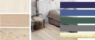
Color combinations
As already mentioned, pistachio can peacefully coexist with many shades, and with some of them it forms a very stylish pair. Let's look at a few successful combinations.
Pistachio with white
The interior, in which these two colors dominate, has a calm, natural atmosphere, since universal white can softly set off even a rich variation of pistachio, letting even more light into the room.
You can often find two options for using this combination. In the first case, one or more walls reflect a walnut shade, and the furniture is painted white. In the second, it’s the other way around, and this solution is more preferable for small spaces, as it allows you to visually expand the space, while creating a variety of colors.
Pistachio with blue
This pair usually does not act as the main color scheme due to the richness of the final design, but is harmonized with neutral inclusions. In the interior, it is often embodied in elements adjacent to each other, creating a lively, natural atmosphere.
It can be a sea or pastel shade - pistachio will form a successful combination with any of them. The success of the “union” lies in the fact that one color belongs to cold tones, and the other to warm ones.
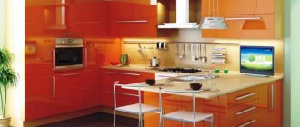
Pistachio with yellow
Yellow will only emphasize the presence of this shade in the composition of pistachio. As a result, even a few details with such color scheme will make the room sunny and very warm - an ideal solution for houses whose windows face north, letting in little natural light during the day. Bright wall cladding will help enhance the effect, but this is a very bold design option.
Pistachio with brown
Brown can be presented as an independent color or as a finishing material - wood. The second option demonstrates a wide palette of not only textures, but also tones, among which it is worth giving preference to warm ones. They go better with pistachio, emphasizing its natural origin.
In the interior, it can be used to decorate walls - then the wooden set will stand out well against its background. The color can act as a textile, for example, for upholstery. This is a great combination that suits the classic style.
Pistachio with pink
A memorable pair is formed by the natural pistachio color with the less natural pink. You can achieve an interesting effect by playing with their saturation. For example, pastel varieties can coexist in any embodiment: partitions, furniture, decor. And saturated ones must be added carefully, balancing with white.
What curtains are suitable?
Although a pistachio kitchen in the interior attracts attention in itself, it still requires additional decor in the form of textiles. The most important attribute in this category is curtains.
Avoid using flying light tulle and curtains in the kitchen - they look incredibly gentle, but are dangerous (especially in apartments with gas stoves). In addition, they are impractical - they get dirty quickly and require frequent washing. Therefore, roller blinds or Roman blinds, as well as blinds, would be more appropriate. They are less dirty, and during cleaning they just need to be wiped with a damp cloth. Cafe curtains will harmoniously suit a pistachio kitchen in the Provence style.
As for color, it all depends on the chosen range: blackout is not required here, so the curtains can even be white. If the combination is chosen to be more contrasting, let them emphasize the additional color: brown, yellow, red, purple.
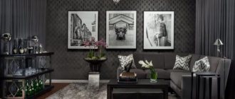
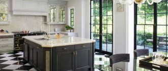
The photo shows a classic interior with brown accents
Pistachio color in the kitchen interior
To make sure that this not the most trivial shade is more suitable than others for a particular kitchen, studying its characteristics, pros and cons, as well as considering options for use (as the main and auxiliary tones) will help.
Color characteristics
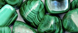
Pistachio is characterized as warm, light and airy, and is sometimes called the shade of young foliage, indicating a spring mood. You can get it by mixing two colors in a certain proportion: yellow and blue-green. Different styles of interior design use pistachio as a base tone: Provence, classic, hi-tech, loft, retro, country, etc.
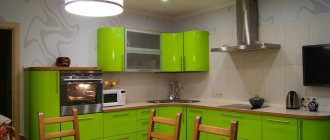
Light green kitchen-living room in neo-classic style
Regardless of the lighting, this color remains virtually unchanged. The subject remains equally intense and positive.
Advantages and disadvantages of use
The shade has many advantages, but most often designers mention the following:
- ease of combination with most other colors;
- looks equally attractive on glossy facades and deliberately rough-cut wood, wallpaper and tiles, suspended ceilings and linoleum;
- helps to relax and recharge with a positive mood, according to psychologists, does not tire the eyes;
- visually gives volume to the room and does not “steal” light, so it is used as the main one in dark rooms, and auxiliary in light ones.
The disadvantages of color include the following:
- cannot be used as a basis for a monochrome interior, since without color additions the situation in the house will be pale;
- soiled - all dirt is visible against its background, so the kitchen will need to be cleaned frequently.
The lack of light is almost not felt
Pistachio as an accent or separate color
Designers claim that green shades can be introduced into the interior in any quantity. They are used as a background, for furniture facades, and also as decorative accents. A large amount of pistachio color will make the atmosphere airy and light like spring.
The color of the apron emphasizes the country style of the room
Accents may vary. For example, pistachio tiles on a kitchen backsplash. It will look even brighter next to a light or dark set. A lamp of this color will make the interior play differently in a restrained palette.
In a retro-style kitchen, a refrigerator with a pistachio frame is an original detail that sets the tone for the entire setting.
Shades
This color has several shades, which are very popular in the decoration of various interiors, not just kitchens. You can choose according to your taste: light, yellowish, dark, with a beige undertone, almost green. The middle one has the highest saturation: it is closest to spring foliage.
Medium pistachio U-shaped set
Which countertop and backsplash are suitable?
Pistachio-colored kitchens go well with almost any countertop: a white set will look gentle, a wooden set will look natural, and a black set will look extravagant. Therefore, style is more important than color when choosing a work surface.
Cozy kitchens in a rustic style are best complemented by a countertop made of natural wood or its imitation. For classics, white marble or acrylic is more suitable, but if you want something more contrasting, choose gray or black stone.
In the photo there is a light pistachio kitchen without handles
It is appropriate to make an apron for a pistachio kitchen under the countertop, or choose a plain tile or glass. Tile format - any. From small hogs or hexagons to large-sized porcelain tiles.
If you choose a bright or dark accent in addition to pistachio, the backsplash is exactly the place to use it. Glossy yellow or blue solutions look impressive.
What styles is it suitable for?
The use of pistachio color in the interior is not justified in all styles: for example, for minimalism or high-tech it is better to choose something more neutral.
But for classics, including modern ones, kitchens in pistachio tones are an excellent alternative to boring beige or gray.
Yellow-green is also often used in rustic styling: Provence, with its floral prints and carved fronts, is especially good in pistachio. And in country style, the shade of green harmoniously combines with natural wood.
Don't be afraid to use complex shades: they attract attention, add personality and help you find yourself in your interior.