SHARE ON SOCIAL NETWORKS
FacebookTwitterOkGoogle+PinterestVk
White color is a classic of the genre in kitchen interior design - stylish, fashionable and attractive. Despite many positive characteristics, nevertheless, disputes arise about the practicality and excessive sterility of such kitchens, especially if white not only dominates the design, but actually fills the space. This article will tell you what a pure white kitchen with a white countertop should be like in terms of aesthetics and practicality.
A white kitchen with a white countertop looks stylish and attractive
What does white color give to the interior?
Small kitchen in classic style with island
White color visually enlarges the room, adds purity or solemnity, pristine fundamentality or peace. It has no shades. This is an extremely pure color. It is universal and matches other shades. It has always been and remains out of fashion. And the design is created around it. In addition it becomes:
White is ideal for small spaces as it increases space
- A good background for furniture, decorative elements
- Gives the interior elegance.
- Indispensable for rooms facing north, for lower floors with limited natural light.
- Creates interesting duets with other colors.
- Such headsets suit different styles.
- Gilding of parts helps create a classic interior.
- This calm color does not irritate over time, unlike this year's super fashionable colors.
- It is very calming, which is important in our hectic world.
Checkerboard black and white tiles can transform any interior
The kitchen needs an addition that will provide visual variety. Curtains, lamps, tiles of the kitchen apron and floors, accessories of a different shade. You don't have to choose a bright option. For these options, you can choose one color with varying depths of shades.
Blue details on white reveal the deepest
There are small nuances that help prevent the room from turning into a hospital ward. Using them you can make the interior soft or festive, noble or calm, fashionable or peaceful:
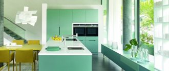
Pastel turquoise gives an airy feeling
- Ivory;
- Baked milk;
- Pearl (various shades);
- Beige;
- Matt cotton or parchment;
- Ashen;
- A hint of milk cream;
- Unbleached fabric.
The trendy solution will be matte gray in a white room.
Do not use white in its pure form. Add other shades to dilute it. But do not introduce more than three nuances so as not to lose the attractiveness of whiteness.
Stylish white kitchen with white countertop: design features
A white kitchen in any era will be stylish, fashionable and modern. White color is traditional for many polymers and artificial wood-based materials. Since the kitchens in many apartments are small, no more than 6 square meters. m, then it is desirable that multi-colored kitchen interior items - cabinets, dining tables and chairs - do not hide the room. The concept of “white” often implies soft shades of gray, brown and some other colors, which can harmonize with each other, making the interior varied, but at the same time perceived as white or whitish.
- How do a white kitchen and a white countertop go together?
- White oval table for the kitchen: complementing the interior
- White glass table for the kitchen: practicality of the material
- White kitchen with dark countertops: stylish and contrasting
- White kitchen interior (photo)
How do a white kitchen and a white countertop go together?
The design of any room involves the use of whitewash, whitewash or white water-based paint. The upper part of the walls above the wallpaper and the ceiling are whitewashed so that these areas reflect as much light as possible, evenly illuminating all areas of the room. “White kitchen” implies the use of white kitchen furniture, a white refrigerator and a white countertop on which food is cut before cooking. This kitchen comes with a white dining table and chairs.
In addition to the classics, a white kitchen can be found in high-tech, country and Scandinavian styles
Benefits of painting and decorating your kitchen white:
- White color does not hide the size of the room, as multi-colored objects do;
- White color and whitish shades combine with each other without problems;
- Decorating the kitchen in white and in a light style gives it a beautiful, well-groomed look; it becomes clear that this room is looked after and maintained in the necessary cleanliness;
- A white table and chairs create an impression of sophistication;
- Shiny nickel-plated dinnerware looks extremely elegant on a white table.
Of course, the whiteness of the kitchen, white cabinets, dining utensils and chairs can be stained even by small splashes, so it requires careful care and a lot of labor to maintain cleanliness, but this also has the dignity and advantage of white color - the owner is taught responsibility and discipline .
A white kitchen requires frequent cleaning and more careful care.
There are a large number of different headsets on the market in white and light grey, light green or light brown.
The white countertop can be presented:
- Bright white or grayish plastic with a glossy surface;
- Cream colored MDF board with marble texture.
In this case, the entire kitchen will be designed in the same style and will not cause visual disharmony or thoughts about the owner’s bad taste. Maintaining whiteness is also not easy, because pure white tends to get dirty over time. The smallest splashes of fat and kitchen soot settle on all objects, dust particles stick to them, as a result of which the surface darkens and loses its gloss. Smoking in the kitchen also does not help maintain whiteness.
When decorating a kitchen in white colors, you need to take care of lighting. It should be sufficient so that the white color looks exactly like white, and not grayish-dirty
To care for a white countertop, you only need special degreasers. It is absolutely unacceptable to use alcohol, white spirit or acetone to wipe white surfaces. Any abrasive cleaning powders and aggressive gels used to remove bacterial contamination from sinks and toilets are also contraindicated here. Tables and chairs, as well as dinner trays and bread and vegetable dishes, should be treated in the same way.
White kitchen with white countertop (video)
White oval table for the kitchen: complementing the interior
The round table is suitable for a small room and can accommodate a maximum of 4 people. If you need to seat more people at the table, then the best choice here is an oval dining table and chairs with semicircular contours. An oval table combines the advantages of rectangular and round tables - it is more spacious than a round one and does not have right angles, which are perceived negatively by many superstitious people.
The white tabletop of the dining table can do without oilcloth or tablecloth: just serving is enough
The power structure of the table can be designed in dark colors
Oval tables are made of wood or plastic. In almost any case, the surface of the table is shiny and glossy. Such a table does not require a tablecloth (otherwise why a white table at all?); you can only cover it with small napkins for common and individual tableware.
Oval tables are often folding or sliding, with shaped legs. The chairs are made in the same style; the round and rounded contours of the back and legs should be in harmony with the shape of the table legs.
White kitchen design (video)
White glass table for the kitchen: practicality of the material
Kitchen furniture can be made not only from opaque wood or plastic, but also from transparent or translucent glass. This is already a modern or avant-garde design option.
A glass table has its advantages over a plastic or chipboard table:
- Being transparent, it “frees up” space for the eye that is usually hidden by opaque tables;
- It creates the impression of “lightness” or “airiness”;
- Unlike plastic or wooden tables, glass is so hard that it is practically impossible to scratch or pierce it;
- The glass table cannot be damaged by any household aggressive liquids or hot dishes.
For the production of glass furniture, especially durable tempered glass with a thickness of at least 1 cm is used, which can withstand almost any load.
Even if you manage to break such a table into pieces, it will be absolutely impossible to cut yourself with them
Despite the fact that fingerprints or any liquids on a glass table will be immediately visible, you can safely place a glass table in the kitchen; it will fit into almost any interior. The glass table may not be transparent, but with matte curly inserts or a special ornament. Glass with certain additives creates the impression of dark water.
White square patterns on the glass table create the visual illusion of napkins. You can wipe a glass table, just like any glass surface, with a special degreaser.
If the kitchen is designed in light or white colors, then we can recommend a glass table painted with white paint around the perimeter or a white matte table in which white pigment is introduced into the glass already at the production stage. There are round chairs made of transparent plastic with flexible backs that imitate glass. However, chairs are not made of glass, since it does not tolerate bending deformations and is not designed for heavy loads.
What styles does it correspond to?
This color is universal and can be used for any modern and classic styles. It is great for isolated rooms and rooms with an open plan. But each style has its own characteristics:
This color is universal and can be used for any style.
Baroque. Lush, fashionable style for large spaces. Tables, shelves with details covered with gold or silver, decorated with rods, garlands, and order elements.
Rococo. Easier style. For romantic natures, stylized shells are added to the decorative elements of the Baroque style.
Classic. Strictly shaped furniture with moldings that frame relief inserts. Elements with exquisite carvings. Hanging cabinets with milk glass doors. The objects are massive.
Modern classic combines elegance and practicality
Romanticism. This style uses a pearl shade. Handles and decorative elements with floral motifs.
Provence. It is this style that cannot be imagined without light furniture. Fragmentary decoration with craquelure (artificial aging) is used, glass doors with wooden frames.
High tech. Kitchen with glossy facades and metal elements. It is laconic and complements classical furniture well in studio spaces. This combination of different styles emphasizes the functions of different zones.
With glossy facades and metal elements, red makes the interior more expressive
Modern. Can also be used for this vibrant style. Asymmetrical elements and floral patterns of light-colored sets are complemented by bright lamps with stained glass designs. This style accepts asymmetry, smoothness, and fluidity of lines.
Neoclassicism. Solid furniture without complex expensive elements. Brings solemnity and fundamentality to the room.
Wood is a warming element in a bright kitchen setting
Minimalism. Laconic accessories, without pretentious elements. Almost different materials can be used to make headsets. Looks good in houses with a standard layout.
Country. Although this style is considered bright rustic, this color becomes a kind of background for wall decoration, bright curtains and lamps.
Eco style . An interesting combination gives color and fragmentary inclusions of light green or beige tones.
Wooden furniture and a living wall made of plants - this is eco style
We play wisely
This color is difficult to beat in oriental interiors: Indian, Chinese. Some modern interiors: pop art, kitsch are also difficult to combine with the kitchen in its pure form.
For a kitchen with a small area, such furniture is an ideal option. Do not overload a small area with bulky items. Convenience and freedom of movement are important. And in large ones, miniature cabinets and tables will “get lost” and create the feeling of a doll’s house.
For a small room, white furniture is ideal
White color “changes” the boundaries of the room. However, it must be diluted with other shades. For a classic interior, use gray in its pure form or light blue, green, brown with the addition of gray. In this case, the illusion of historical antiquity is created.
A massive wooden table in the middle of the room is an excellent element in country style
What colors can be combined with a white countertop?
White color allows you to freely experiment with the design of facades and colors of buildings. The classic option - a white countertop in combination with dark facades - looks just as impressive as a black countertop in a white kitchen. But this list is not limited to contrasting compositions.
For example, a white work surface harmonizes well with variegated glossy facades and rich colors of the kitchen apron. This combination of shades makes the appearance of the kitchen interesting, modern and stylish.
One of the main questions: should the countertop be glossy, or will a matte white finish be more appropriate? On the one hand, gloss adds more volume, but this solution is not very suitable for variegated colors. The matte surface looks very modest, but at the same time it looks more harmonious.
A win-win option is considered to be a combination of a white work surface and facades with contrasting wenge and mahogany colored cabinets, or less pronounced dark tones of cedar and American cherry. But you need to approach the choice of kitchen appliances wisely, giving preference to metallized cases with dark inserts.
Another advantageous solution is to decorate the kitchen countertop not in pure white, but with a faint pattern. Another good option is artificial and natural stone with marble stains or dotted inclusions. This texture will help hide scratches and cuts and fit more naturally into the overall visual look.
If you want to decorate your kitchen in light colors, you can offer three options:
- The facades of the upper tier are glazed in the English style with carved decorative frames.
- Pastel colors of cabinets and facades: in a gray kitchen, a white countertop will also look very impressive.
- Create accents against crisp white furniture with a contrasting backsplash, flooring or kitchenware, such as dark or brightly decorated dishes.
The main rule: the furniture set must look harmonious against the background of the interior of the room. It makes no sense to build in white furniture when finishing with natural wood, if the walls are covered with wallpaper with vintage prints or if the room has visual zoning that crosses the line of the facades.
Features of the arrangement
The kitchen is considered a work room. Therefore, we cannot do without ergonomics. Tables and cabinets should be comfortable, roomy, located at a convenient height, and accommodate the necessary furniture and equipment.
Standard. Work furniture is installed along one wall. For convenience, it is necessary to separate the sink, oven or hob with a work surface. In this case, it is more convenient to cook and put away clean dishes. The kitchen is conventionally divided into working and dining areas.
Work furniture is installed along one wall
Corner. The white color and L-shaped installation visually change the idea of the shape of the room. Makes long ones cozy. Allows you to use a wall with a window.
Ostrovnaya. The use of island structures is not due to fashion, but to convenience. This element includes a hob, sink and helps define the boundary of the kitchen for apartments and houses with an open plan. Guarantees free movement and facilitates kitchen work.
U-shaped. Suitable for rooms with bay windows, elongated rooms and those combined with a balcony or loggia.
The island is a very fashionable and practical element
Any type of arrangement does not overload the room. The set seems to dissolve and is an addition, not a basic accent. This is what is needed for additional space.
It is necessary to provide space for a dining group. The size of the table depends on family preferences and habits.
The table in the kitchen, the place where the whole family gathers for a meal, is selected according to your preferences
Design of a modern corner kitchen with a ceiling. The trick is cabinets of different depths!
Let's take a concrete example and look at a corner modern kitchen with a ceiling in more detail. The kitchen is custom made in size 2350x2750 mm. Smooth facades of the “Prestige” category were used for the facades. The upper cabinets up to the ceiling are made in two levels - the bottom row of cabinets has a standard depth of 300 mm, but the top row is one with a depth the same as a kitchen pencil case of 600 mm. The set is made in two colors: Prestige Jasmine and Stone Gray. The combination of such colors is ideal, as they can easily be combined with wood, marble, glass or other finishing materials. These colors work well with additions to just about any color in the kitchen!
Of course, in a modern kitchen, most of the appliances should be built into the kitchen units. In the photo we see a built-in dishwasher, oven, stove and microwave. The free-standing refrigerator is recessed into the plasterboard wall and is matched to the color of the kitchen interior. The advantage of a freestanding refrigerator is its significantly greater capacity and price.
In the kitchen, all tables use a system of full-drawer tandembox profile drawers - which is very convenient to use. The apron is made of solid pieces of porcelain stoneware. The main advantages of such an apron are its low cost, huge selection of designs and durability. The table modules are equipped with Gola (Italy) mortise profile handles.
Now let's move on to the upper cabinets of the kitchen unit. As described earlier, they are of different depths. Kitchen fronts without handles. Antesol cabinets have a TipOn opening mechanism.
The method of opening the cabinets is mezzanine and hinged, as can be seen in the photo below. The top row of cabinets has the main advantage - it's capacity! They are able to accommodate twice as much as ordinary cabinets due to their depth. Typically, such cabinets are used to store items that are rarely used, such as seasonal items. Or, for example, let it be baskets with alcohol or dishes for preparing holiday dishes.
A stone countertop with an integrated sink is practical and durable.
The kitchen set seems to be recessed into the wall, merging into a single whole, only the work area stands out. The design of a modern corner kitchen with a ceiling is very stylish, functional and unusual!
Plenty of storage space + a modern look for many years to come. However, a ceiling-to-ceiling kitchen in this design will cost about 1.5 times more than an identical one without deep mezzanines, since in fact you are buying another row of cabinets with additional mechanisms.
Call a surveyor
Kitchen catalog to the ceiling: prices and photos
Calculate the price of a kitchen according to your size
In this video you can see in more detail a corner kitchen set with cabinets up to the ceiling:
Internal filling
Pay attention to the insides of cabinets and tables. Shelves, magic corners (for corner cabinets), grids, hangers, holders, roll-out shelves and baskets help organize the storage of items and make kitchen work easier.
A white kitchen with a cozy seating area near the window will attract many guests.
Before ordering furniture, think about what equipment you use. Make a list, include the dimensions of the multicooker, coffee machine, toaster, etc., these features will help designers develop functional furniture for your needs. If the room is small, hide all accessories and dishes in cabinets as much as possible. Sugar bowls, salt shakers, and kitchen sets left in sight visually break up the room and make it smaller.
Place small accessories on surfaces if you want to visually reduce the space
Stylish fittings
In small spaces, the kitchen can be pure white with contrasting fittings that match the chosen decor direction. Complement classic options with curly handles that match the style. For high-tech use nickel-plated options. Furniture in Provence and country styles is complemented with gilded handles. Small floral designs. Minimalism corresponds to laconic options imitating wood.
Stylish metal lamps above the table will provide a lot of warm light during dinner.
An interesting effect is achieved by using the same fittings in the hallway, living room and kitchen. These items are not striking, but they perfectly unite small apartments. Door handles are located at a convenient height. Otherwise, you will have to get objects out using stools.
It is beneficial to use the same fittings in the hallway, living room and kitchen in a small apartment
White kitchen design with black countertops: 5 tips and 28 ideas
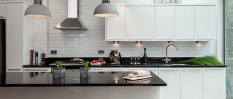
A white kitchen with a black countertop is a bold decision at first glance. Such a contrast immediately catches the eye, but for some, the combination of these colors will seem inappropriate for the kitchen because of their severity and coldness.
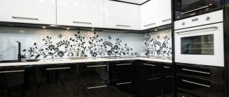
White kitchen with an abstract pattern on the apron
Snow-white interior design with dark chairs to match the work surface
In fact, well-placed color nuances create a completely different idea of the interior in black and white.
Dairy kitchen with black countertop in a classic interior
Matte facades are an attribute of a classic kitchen. Light furniture in combination with a dark apron creates an optical illusion of expanding space.
A black countertop is a minor detail that can set a different tone and create a different impression of the interior. It all depends on what colors you added, besides black and white, what style was chosen for the kitchen, what decor was used in the design.
A selection of kitchen design ideas with a dark countertop in the video:
Types of facades
Above we looked at various styles that are often used for interior decoration. For historical styles, facades with a matte finish are used, decorated with patina, craquelure, moldings, rods, and carved elements. The legs are ornately shaped.
The ornately shaped legs on the table give the interior a bit of a vintage feel.
Modern ones use glossy surfaces that correspond to the dynamics of life. The reflective effect helps to make the room appear larger. Decorative elements and bright kitchen accessories help diversify the composition.
Snow-white glossy surfaces - absolute cleanliness and spaciousness
Think about the practical side. A large number of decorative items, protrusions, recesses, and open shelves will have to be constantly rubbed. Considering the large amount of soot, you will have to work hard to get rid of grease and other stains.
Island work surface and dining table at the same time
What materials are used
Manufacturers offer expensive and budget headsets. The price depends on the material, size of the furniture and quality of fittings. Those who like to frequently change the appearance of their home can opt for inexpensive offers made from chipboard or plastic. For those who prefer quality and high reliability, options made of natural wood, tempered glass, MDF, which is decorated with veneer of expensive tree species, are suitable).
Warm combination of wood and white surfaces
What materials are suitable for a white countertop?
Laminated particle boards are only suitable as a temporary solution. This option is designed for 1-2 years of operation with the prospect of subsequent replacement.
Plastic has the least resistance to thermal and mechanical stress among other materials; in addition, it very readily absorbs dyes contained in some products.
Natural stone is a more interesting solution, because it has many advantages: minimal absorption, resistance to mechanical damage and strong heating, preservation of appearance for decades. However, this material also has its drawbacks: high cost, difficulty in transportation and delivery to the upper floors. In addition, not every piece of furniture can withstand the weight of such a tabletop.
However, the most balanced option for making a kitchen countertop is artificial acrylic stone. Durable and lightweight, environmentally friendly and plastic, this material is suitable for any interior. And although cuts and scratches can also accumulate on the acrylic surface, artificial stone can easily be polished, during which all flaws are quickly eliminated.
Kitchen finishing materials
To prevent the kitchen from turning into an operating room, add color accents to the room. Panels, laminate, and wood-look tiles go well with white. It is enough to introduce an iconic plinth for the floor and connect the table with the kitchen apron into the bright interior.
Wooden parquet in the kitchen? Special coating that protects the surface from moisture and dirt
If you want to keep the color pure, order a set that has colored side walls. Variety is guaranteed and color is preserved. In any case, a small room should not have more than three different shades. Otherwise, the color “chaos” will begin to irritate.
A small room should not have more than three different shades
This is a recommendation for those who like to often change the world around them. Buy inexpensive chairs. It is enough to choose a different color and the overall appearance of the interior changes. Curtains give a similar effect. They can be purchased for different seasons or significant events.
Chairs in bright colors change the overall look of the interior
Tips from cleaners
There is a myth: a white kitchen with a white countertop is difficult to clean. Practice shows that this is not so. Stains and dirt are visible on surfaces of a different shade. And black color does not become a panacea to make the life of the housewife easier. And the stains are visible on both white and brown countertops. Timely cleaning and high-quality materials at hand work wonders. What do professional cleaners offer?
Wipe the surface with a dry cloth to avoid streaks.
- Use quality detergents and fiber cloths.
- Remove dirt immediately; stubborn stains are difficult to remove.
- After cooking, wipe worktops with a dry cloth. This will rid the white surface of streaks.
- Detergents must be suitable for the material.
- Do not use abrasive products on furniture. They create micro scratches, which increase over time and spoil the appearance of the headset.
- Once every 2-3 months (depending on kitchen work), do general cleaning.
A powerful hood will save you from a lot of hassle when cleaning
Don't forget about the technical issue. Install a powerful hood and you will rid your furniture of greasy soot and dust. When washing furniture, don’t forget about the sink, stove, and appliances. If you don’t wash the oven inside and the multicooker outside, dirt will transfer to light-colored furniture.
White color refreshes the interior
The features that white color has become irreplaceable. It refreshes the interior, makes it bright, and allows you to create the necessary mood. Using these tips, it’s easy to combine:
- Selected style.
- Accessories.
- Decorate other surfaces to create an attractive interior.
How will a white kitchen with a white countertop look?
This question is being asked by more and more people who want to design their kitchen in an original and expressive style. Many people think that such an interior will be too “sanitary”, but this is not at all the case.
With the right and competent approach, the design of such a room can surprise you and your family members.
Let's move on to looking at photographs of possible color combinations for a white kitchen with a white countertop.
In fact, there are quite a lot of them, but we will focus on the most interesting and noteworthy projects.
The completely white interior looks simply cosmic. The dominance of this color in all elements of the room creates some kind of futuristic atmosphere.
That is why such projects can be found when decorating a kitchen in a high-tech style. Of course, the total hegemony of white must be diluted.
The best option would be black or dark brown.
As you can see in the photo, black decorative elements look great against the background of the dominant whiteness. You are free to choose the color, but you must agree that black is a classic.
Also, “coffee with milk” with metallic looks very original and modern.
Here's another interesting example. Here you can see a whole palette of colors from different interior elements. One can only praise the designer for such a beautiful and harmonious project.
You look at this project and don’t believe your eyes. It seems like it's unreal or from some movie.
In fact, this is a real project of one of the apartments in New York, the kitchen of which is decorated in an ultra-modern style.
Oh how wonderful these pendant lights look, don't they? Amazing combination and a very cool design move.
Only the facades of the set and the white tabletop provide more space for the play of other tones.
Compared to the previous version, the obvious contrast of the floor covering is striking.
It is through such a design move that one can, so to speak, bring sharpness to such a room. The dark floor emphasizes the perimeter of the kitchen and enhances the contours of the furniture standing on it.
A work surface made of such marble looks good, noble and very solid.
If the kitchen is large and has a so-called “island,” then one part of the countertop can be made in approximately the same color as the parquet board.
On the island, set the surface to white. This solution can often be found in loft-style interiors.
Marble countertops are very popular for projects like these. Notice how well the high chairs made of dark wood and black leather fit in.
And this is a real kitchen project in one of the Moscow apartments. Unfortunately, due to insufficient lighting in the room, it appears beige in the photo.
But this is a clear example of the implementation of such a design within domestic spaces.
The countertop and facades are white, but there are many other colors. This option can be found in large studio kitchens, where the space allows the designer to “walk around”.
Such projects look original and, of course, deserve your attention. The main thing in such concepts is not to turn a white kitchen into one with only elements of this color.
Let's look at possible design examples.
For example, here is a simple option. As you can see, the top section and work surface are white, and the bottom row of drawers is black.
Another interesting concept is shown in the photo - a good combination of gray-brown walls, light floors and white and white countertops.
Red tones immediately enliven the interior. Pay attention to the knobs for adjusting the burners on the stove - even they play up the burgundy color.
Continuing the theme of red motifs, let's look at the charming design of such a kitchen-living room.
In fact, this can only be implemented in a house or a very large apartment. But perhaps the very concept and approach to design will help you find the zest that your project is missing.
You probably noticed the role played by household appliances and an apron. Sometimes it is they and only they who act as a kind of “rebels” who oppose the primacy of white.
In conclusion, I would like to say a few more words. Agree, there are quite a few noteworthy designs that prove that such a kitchen can look different.
Much depends on the style you prefer, as well as your financial capabilities and the area available for renovation.
Such a kitchen is no longer a curiosity; it has a number of its admirers and more and more designers are offering clients their unique sketches.
If you are looking for the best worktop material, read our guide to choosing a kitchen countertop.
