Psychology of color
(source design-seeds)
The perception of beige is complex and ambiguous. Beige is considered the color of stagnation - there is no emotional coloring. Simply put - none.
But beige is not as simple as it seems. He is multifaceted. Calms, carries quiet, warm and calm energy.
Since beige is the color of natural landscapes and wildlife, it is associated with a natural, simple, natural state. People who prefer beige to other colors are soulful and harmonious people. In any life situations they strive to maintain neutrality.
Such a natural color in the interior eliminates aggression and relaxes. It is neither warm nor cold, but the atmosphere is soft and gentle. When the lighting changes, the perception of the room changes: in the twilight everything looks mysterious, and in bright light it looks solemn and festive. Beige can expand or reduce space depending on the shade.
What colors does it go with in the interior?
Let's first understand what is meant by beige in design. Beige is called differently: sand, cream, caramel, cappuccino and ivory, biscuit, wheat. And everyone is right.
It has many shades and halftones:
Therefore, beige is a godsend for the designer; it can be combined in the interior with both neutral and bright colors:
Beige-brown interior
Brown is a related shade of beige. Therefore, the combination of these colors is natural and calm. Beige-brown will visually enlarge the space and make it lighter. For contrast, dark brown shades are added to the interior.
It’s easy to play with brown on different textures of wood, silk fabrics, stone or brick, and leather.
The beige-brown combination is suitable for classic, elegant bedroom or living room interiors.
Gray-beige interior
In the English-speaking environment, this combination is called “grey” (grey + beige). It is quiet, self-possessed and able to “cool down” the room.
In order not to get a faceless and dull interior, you can add bright spots: yellow, turquoise, coral shades.
There is no dominance in the “gray + beige” tandem - the shades dissolve into each other. To enhance the mixing effect, colors are alternated: gray pillows are placed on a beige sofa, a bed in gray tones is covered with an ivory-colored bedspread.
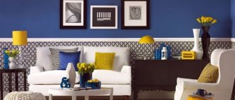
Beige-blue interior
Beige is warm, and blue is cool. The colors complement and balance each other. Beige is the main color, and blue is a bright addition.
In the living room, this could be a blue armchair or a small rug in front of the sofa. In the bedroom, such an accent can be a headboard or a curtain. In the kitchen there are dining chairs, dishes or a refrigerator.
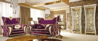
Beige and purple interior
Calm and smooth combination. Beige muffles the light coming from violet and “powders” it a little.
Two options for using two colors:
Even distribution of beige and purple. For example, decorating the walls in light beige tones + purple furniture (dining chairs, countertops and kitchen units or dark eggplant curtains). Or, purple walls with an abundance of beige decor and light furniture.
Accents on purple details: lampshades, prints on furniture, carpets, vases, separate bedside tables or tables, etc.
Beige-pink interior
Light and light pink shades can reduce the level of aggression and tension.
An experienced marketer knows that if you want your products to sell like hotcakes, put them in pink packaging. Pink evokes a sweet tooth and is associated with candy, cakes and candy. Therefore, beige-pink is an ideal option for the kitchen and will help improve appetite. Those who are losing weight should avoid this combination in the kitchen and use it in the bedroom.
Pink as an additional color is a romantic mood, and as a main color it is relaxation and rest.
Beige-yellow interior
Yellow is the color of sunlight, warmth and light. Like the sun, yellow warms, invigorates, energizes and lifts your spirits. Beige dilutes it and prevents the interior from “overheating”.
Don't get carried away with yellow, let it be a bright accent. We follow the color formula: primary color 60% + secondary color 20% + accent color 10%. (In the absence of a secondary, the ratio is 80%-20%).
Make a white and beige interior original
When creating an interior in white and beige tones, you need to remember that the line between luxury and impersonality, sophistication and boredom is very thin. How to prevent mistakes?
- A two-tone interior will never look stylish unless you add one or more bright colors.
Where to use them? In detail! This could be an eye-catching pillow on the sofa, a stylish vase on the table, an original painting or print on the wall, accent curtains on the windows, etc. - An aquarium with fish will bring the interior to life in the truest sense of the word. If you do not want to have pets, then pots with house plants or cut flowers in a vase will become an attractive accent.
- Another cool idea to diversify an interior designed in pastel colors is to decorate one of the walls with photo wallpaper, bright stickers or imitation brickwork.
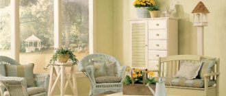
Beige in the living room
For intimate family gatherings and fun meetings with friends, beige is a suitable option - it will suit everyone and will not irritate anyone. It is important not to overdo it with the relaxing and calm influence of beige.
Here the beige shade can be used with other colors:
- with blue (if you need to create a fresh and light interior)
- yellow (if you want to fill the room with warmth and sunlight)
- with red or burgundy (for luxury and elegance)
- pistachio (if you want to refresh the interior)
- brown (if you need to emphasize nobility)
Beige in the living room is suitable for classic style in the interior, Provence, country, minimalism, modern. When using color, you should adhere to several rules:
If the walls are beige, then it is better to make the floor dark. The same situation applies to furniture.
We give preference to monochromatic wall decoration, and use color accents in furniture, textiles, and decor
We zone using warm multi-level lighting (lamps, floor lamps, chandeliers, sconces)
Furniture made of valuable wood and rattan will fit into a beige living room. Stone or wooden parts made from raw material, metal trim or jewelry made of bronze, copper, and silver look atmospheric.
Textiles - only natural materials: linen, silk, wool. For curtains it is better to use heavy fabrics. They should contrast with the shade of the walls. Designers prefer plain curtains, for example, walnut color or with floral patterns.
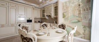
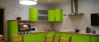
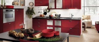
Beige in the kitchen
Creamy cappuccino, cream pies, honey cake, vanilla and cream - this delight is associated with the beige color in the kitchen. Beige here is a good choice for a “tasty” interior.
Since the color is neutral, it can be safely used on any surface: floor, walls, ceiling. Furniture and furniture can also be in beige tones.
To avoid turning your kitchen into a monochromatic creamy stain, you can:
- choose different shades of beige: dark below, light above
- add bright colors: red, burgundy, brown, purple. Such accents can be in the set, furniture, dishes, accessories
- choose lamps with warm light: with cold light, beige surfaces will look dirty white, lifeless. And so, beige will be more caramel, tastier
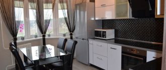
- combine kitchen furniture with metallic-colored appliances: beige appliances with walls and furniture of the same color will look dirty and untidy
Let's take a closer look at kitchen furniture.
The set is the face of the kitchen; special attention should be paid to its color. Light top, dark bottom is a practical solution, since the lower facades of the sets get dirty faster.
Cappuccino-colored sets look noble, as well as in combination with brown, burgundy, and purple. You should be careful with green, blue and dirty gray - too much with these colors, and the beige kitchen will seem untidy and dirty.
Beige and brown kitchen design is a classic option. For example, beige is diluted with chocolate, using the latter in an apron, wallpaper and curtains. Wenge color is combined with natural materials - this is country, eco-style, Provence.
When choosing a gray-beige interior, metal, steel materials and glossy surfaces are used. This palette is typical for high-tech style.
Burgundy and red kitchen furniture or lower facades are a modern and retro style. In the first case, gloss and textured finishes on beige walls are used. In retro, the design can be openwork, and the set can be matte, using classic decor (moldings, milling, patterns). Openwork can be wallpaper, curtains, dining set.
Blue and turquoise combined with beige are suitable for an interior in the Provence style. Wallpaper and curtains with floral patterns are appropriate, the color of which can match the shade of the set. A Provence style apron is most often covered with tiles with a similar pattern.
Beige color in the interior: how to skillfully decorate the interior
If you want to perfectly plan the color of the walls when decorating interiors in beige tones, you should use color combinations from professional painting palettes. Before making a final decision when decorating interiors in beige tones, be inspired by photographs of various interiors in the shades of colors in question.
Pick a few favorites. Combine shades with each other, placing certain colors in your imagination on separate walls of the interior. To make it easier for you to choose the best shades for interior design with beige, cream and brown, consider combinations of neighboring shades in the color palette.
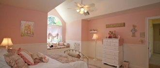
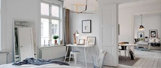
Beige in the bedroom
Since beige carries a quiet and calm energy, it is a godsend for the bedroom. It is cozy here and everything is conducive to relaxation.
To prevent the bedroom from turning into a faceless beige spot, you can use several shades of beige, while introducing different materials, textures, patterns. This way the walls, floor, furniture and textiles will not merge with each other. Close in color, they should be different “to the touch.” For example, a sofa can be velvety, and a blanket can be fluffy.
You can mix beige with different colors. Ideal formula: beige + natural partner of beige (brown or gray) + bright color. From bright colors we take blue or green - a light, calming, relaxing atmosphere. Red, orange and black can also be in tandem with beige, but the main thing is not to overdo it and use these shades as color accents.
Furniture for a beige bedroom should not blend in with the floor, walls or carpet. It is better if its color is several tones darker than the background. An effective technique is to decorate the wall at the head with wooden finishing materials. These can be wall panels, solid parquet, laminate.
The beige color visually increases the space - you don’t have to be afraid of bulky furniture - surrounded by a light background it will seem lighter and more elegant than it actually is.
Pros and cons in the interior
pros
- versatility (combines with almost all colors)
- the perfect base for any style and color
- choice for every taste and color from 50 shades of beige
- visually expands the space
- makes the room brighter (which is a double plus for dark rooms without access to the sunny side)
Minuses
- boring, banal and neutral (for some)
- requires increased care (gets dirty quickly, dirt is clearly visible)
- be careful with animals and children (see point above)
Beige is a rich and friendly color. That's why they love him. Beige is a rare case when it is very difficult to spoil the interior with it - its ideal compatibility with other colors will provide a lot of opportunities for experimentation. And here is the ideal formula for a non-boring beige interior = bright accents + metals (bronze, brass, copper) + patterns and different textures.
Beige color in the interior: determining the finish
If you want to create a calm, subdued atmosphere in beige interiors, try using monochrome shades. You'll achieve this by selecting different shades of the same color from a specific triangle of the palette wheel - like a slice of pizza, the colorful "triangle" will show you a ready-made selection of colors. Pastels will give the effect of spring lightness, brighter colors will add an impression of sensual richness.
We then have to bet on two opposing colors (within the selected triangle from the color palette) plus a third, freely chosen. This set will give the impression of a dynamic, fashionable interior.