The meaning and features of color
A mint shade is a combination of blue and green; the intensity of the mint shade depends on the predominance of one color or another. The resulting mint is not directly related to the color of the mint leaves.
A variety of mint can be considered menthol, turquoise in a light shade, sea foam color and light pistachio.
Like the entire group of green shades, mint has a positive effect on the psyche, induces relaxation, and has a beneficial effect on the functioning of the visual organs.
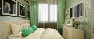
The photo shows a bedroom interior with green and purple patterns and white ceiling beams that add depth.
Features of mint color and who it suits
The soft green shade with a blue undertone was given the name “mint” by someone. For many, the question remains, what does mint, which has a dark green color, have to do with it? Perhaps this is a tracing paper from the English 'mint'. This name does not imply the plant, but the products in which it is included, for example, milkshake, chewing gum.
In addition, the association can be based on sensations: mint is refreshing and gives a feeling of pleasant coolness. The color of the same name evokes the same emotions.
Combination with other colors
Grey-mint
Gray-mint is often found in the interior; gray is the background for the mint shade. Used as an unobtrusive combination for the kitchen, living room and bedroom.
White-mint
This combination gives a cool combination in a clean Scandinavian and modern interior.
The photo shows an interior with uneven walls, one of which is painted mint. The absence of curtains and white walls make the room brighter.
Beige-mint
The interior looks balanced, often complemented with white or black.
Brown mint
The interior combines coziness and brightness, suitable for a combination of wood and wall painting. The combination of chocolate and menthol makes a modern interior unusual.
Mint-peach
Like beige, it combines airiness and bright color. Pastel mint looks unobtrusive but bold.
Mint yellow
The interior looks harmonious and quite bold, bright yellow warms the room, and mint cools it down.
The photo shows a living room in mint yellow with mint armchairs, a sofa and textiles.
Mint pink
Suitable for a girl's room in Provence or shabby chic style. For the walls, you can choose a combination of pink flowers on a mint background.
Mint lilac
Mint-lilac and mint-lavender are suitable for bedroom interiors in pastel shades. The color of lavender and light foliage will remind you of flowering valleys.
Mint purple
Must be used carefully due to the dark undertone of the purple. It is better to complement the mint interior with a small amount of lilac.
Mint color in clothes: 50 looks for every taste
Let's welcome summer in mint color! From year to year, this color attracts the eyes of fashionistas. How to wear this color correctly? What colors to combine with? And is it suitable for everyone? Let's find out! Mint color is a shade of green, generously diluted with blue. Its shades: light turquoise, menthol, mint ice cream, pistachio, sea foam, bright turquoise. They give our wardrobe freshness, lightness and peace. Stylists claim that mint color is universal and suitable for any type of woman: dark-haired representatives of the fair sex should choose a light, desaturated, soft, whitened shade; fair-haired people, on the contrary, need to choose brighter shades of mint, shimmering with turquoise and tending towards emerald. Mint color is suitable for both daytime and evening wear. Don't try to compose your look exclusively from mint shades. If you are not a professional stylist, it may turn out boring and inappropriate. Play with colors - this will give the image dynamism and individuality.
Mint - brown (beige).
When choosing this combination, you need to remember the rule: the brighter the mint, the darker and deeper the companion (brown, beige) should be.
Mint - white. Do you have a desire to charm others? Pay attention to the combination of mint shades with white. By wearing mint-colored trousers, a skirt or shorts and complementing them with a white T-shirt or jacket, you will undoubtedly attract the admiring glances of the stronger sex.
Mint - gray. Gray color also goes well with shades of mint. However, when choosing it as an addition, do not forget to keep the gray as light as possible, otherwise the image will turn out heavy and boring.
Mint - black. Black will help you reveal the beauty and depth of mint color. Emphasize your waist with a black belt - this will add brightness and expressiveness to your mint dress.
Mint - pink. Shades of mint and pink go perfectly together in one look. When choosing this combination, remember - the darker the skin, the more muted the shades should be.
Mint - yellow. The combination of mint and yellow is considered one of the brightest and most harmonious. It delights fashionistas and inspires designers. By choosing this look, you will feel unique and fantastic!
And that's not all... You can combine mint shades with other colors. They will look quite advantageous in combination with blue, orange, shades of purple and other unexpected colors. The only limitation here can be your sense of style and your imagination. Get inspired, experiment, make your image bright and unique!
Photo in the interior of the apartment
Kitchen
In the interior of the kitchen, the set or walls can be mint; when choosing a mint set, it is better to make the walls beige, white or gray. The walls can be painted or use vinyl textured wallpaper that is not afraid of moisture. The apron can be selected in white, black and brown.
The photo shows the interior of a modern island kitchen with matte wooden facades. The mint gray mosaic and gray and white flooring match the steel appliances.
Living room
In the interior of the hall, only curtains and textiles can be mint if the room is small. For a marine style, mint wallpaper and beige-yellow decor are suitable. Mint color will make the interior cool while maintaining an airy feeling.
Children's
In a nursery, mint goes well with pink, blue, white and gray. The walls can be striped or patterned. Plain mint walls are combined with light and dark wood colored furniture.
Bedroom
In the bedroom, mint creates coziness and relaxation, cools the room and promotes easy awakening in an atmosphere of pastel shades. A classic bedroom is recognizable by plain or patterned wallpaper and luxurious furnishings.
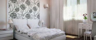
The photo shows a bedroom with plain walls and a classic set with candelabra bedside lamps. Flowers are a bright accent in a room.
Bathroom
In the bathroom, mint cools and at the same time reflects light, making the room brighter. Moisture-resistant panels and tiles are suitable for finishing. In an area where water does not reach the wall, you can use plaster and vinyl wallpaper. Combines with white floors, gray and yellow decor.
Features of mint color
First of all, it should be noted that the shade itself has practically nothing in common with mint. It is not that green, but rather has similarities to pastel blue, aquamarine, aqua and turquoise.
As for sensations, mint color gives lightness, softness and peace. In addition, it makes any room visually more spacious and bright. Therefore, it is often chosen for the design of small apartments or as a contrasting color for the interior of a house. By the way, unlike other shades, mint color is quite calm and can be chosen for every room, from the kitchen to the corridor.
The next thing worth noting is the combination of mint color with different shades. Of course, it looks most advantageous with shades of white and beige. This combination will make the room look very fresh and clean.
Mint color is often used as an accent. For example, apartment interior items in black and white. It looks really very stylish. And of course, mint color goes perfectly with the entire pastel palette.
Style selection
Classic
In a classic interior, mint monochromatic walls are combined with plaster molding, a high white ceiling and parquet boards. If bright upholstery is used, it should be repeated in curtains or lambrequin.
The photo shows a spacious classic two-tone bedroom with thick curtains, a soft panel and a bed. To darken the room during the day, plain Roman blinds are used.
Minimalism
In a minimalist interior, striped walls or painted walls with geometry are suitable. Wallpaper can be textured, decorated with framed paintings. Large patterns and combinations of more than three colors within one room are unacceptable.
Provence
In the Provence style, mint can be the main color; it can be painted and slightly shabby furniture, walls made of clapboard or with floral wallpaper. Gray tulle with mint frill or white and mint cafe curtains will decorate the room.
Country
Country style is combined with light and dark shades of brown and beige. The rustic style is decorated with pillows, covers and blankets, textiles and curtains in a mint shade.
Nautical
The marine interior combines a pastel cold palette: blue, light blue, turquoise, green and mint. The walls can be wide striped, single-color, the curtains repeat the pattern on the pillows. The tulle is chosen to be light and translucent.
The photo shows a nautical-style kitchen with a mint splashback, an island and an open cupboard.
Finishing walls, ceilings and floors
Walls
For the walls in the bathroom, tiles, plaster, latex paint, vinyl moisture-resistant wallpaper are suitable; non-woven and paper wallpaper, paint, and a combination with brick or stone are used in living rooms. Photo wallpaper will become the central decor for one of the walls.
Floor
Parquet, dark oak laminate, rosewood, and walnut are suitable for the floor. White, gray boards and tiles also go well with mint.
Ceiling
It can also be mint, with a fresco, covered with soft panels or wallpaper. Stretch ceilings and plasterboard construction are suitable for the living room and bedroom. In the kitchen, it is better to whitewash or paint the ceiling white.
Furniture selection
Bright furniture in any room will become a point of interest; when choosing mint furniture, you need to take into account the shade of the walls (they should not match), or make the walls white.
The sofa can be upholstered in brocade, jacquard, linen, or decorated with a pattern or lines. Curved backs are suitable for classics, straight frames for modern style.
The photo shows sofas in mint color in different shades that match the carpet in a modern living room.
Chairs are used in the kitchen, children's room and living room. A solid wooden office chair can be painted in mint color, then it will suit the bright interior.
The chair most often matches other upholstered furniture, maybe like a cocoon, mini-sofa or leather chair.
The photo shows a green bedroom with a mint chair with soft armrests and a deep back.
A wardrobe for clothes or books, a secretary, a kitchen cabinet can be without doors, with glass inserts or a compartment type.
Decor and textiles
The paintings are suitable for the living room, office and bedroom, wide hallway. Depending on the style of the room, the image will be appropriate (abstraction, ships, painting, reproduction).
Curtains and tulle are selected according to the type of fastening (eyelets, loops) and the quality of the fabric (natural, synthetic). The length and type of curtains (thread curtains, drapes) also plays a role. Gray, white, scarlet, beige and brown colors are suitable for mint walls.
Pillows as the main decor of the bedroom should echo the curtains or carpet. They come in different shapes, with ornaments or fringes. The carpet creates warmth for the feet and acts as a bright accessory for the living room, nursery, and bedroom.
The rug can be dyed or have a design applied to it.
The photo shows a studio apartment with space zoning, where in the living room area the carpet is combined with the walls.
Mint shades
Mint color has a significant number of shades, but experts distinguish several basic tones:
- Menthol;
- Light turquoise;
- Pistachio;
- Sea wave tone.
It is believed that mint color is between warm and cold tones and depending on which they are combined with, the overall color palette depends.