Deciding on a color: what are pastel shades?
Most often, the concept of pastel colors is associated with all shades of beige and gold. Refined and noble tones remain the most popular among designers:
- powdery;
- pearl;
- lactic;
- ivory;
- champagne;
- shade of coffee with milk;
- caramel, etc.
But any color can be turned into pastel. To obtain the required shade, white color is added to the base. Thanks to the depth of white, the resulting tone remains rich and full, without losing its complexity.
Pastel palettes cover all the colors of the rainbow. The spectrum of the shade, like the base color, can also be cold and warm. The first includes variations from purple to green, the second includes tints of mustard, golden, muted copper and powdery pink.
When choosing a color scheme for decorating the interior of an apartment or house, take into account the size and purpose of the room itself. For example, the design of a spacious living room welcomes cool pastel shades: lavender, dove-blue or soft olive. The first gentle tone is especially organically woven into the decoration of the hall, made based on Provençal country.
Pastel: combination with other colors
The combination of romantic colors with white remains the most popular. This combination visually makes the room more voluminous and gives it a certain solemnity.
Another win-win way to harmoniously combine a pastel shade with another is to choose a tone from the same range as a second color, but with greater or less intensity:
- olive goes well with green and rich light green;
- caramel finds its continuation in brown;
- dusty coral is perfectly complemented by salmon and other shades of orange.
When choosing a pastel shade as the dominant one in the interior, do not forget to focus on tables of harmonious color combinations.
The combination of all pastel shades is almost limitless. This range perfectly coexists with both related shades and contrasting bright colors, which act as design accents and at the same time emphasize the delicacy of soft tones.
Living room in pastel colors
When decorating a room with windows facing north, you should take a closer look at the warm shades of pastel. Soft peach, cozy brown or sunny sand will gently fill the room with warmth, making up for the lack of light in the room. But such colors can visually reduce the space, so in a small room use warm tones with caution.
Mint with neon echoes, turquoise, noble gray, exquisite pearl or muted pastel ultramarine are suitable for spacious living rooms located on the south side of the building. Here, cool pastel shades will balance the abundance of light and fit harmoniously into the interior.
To reduce the dominance of pastel colors, dilute the interior with bright colorful highlights. Furniture and decorative items in rich tones will attract attention and become the center of the interior composition. You can diversify the living room design in a similar manner by using bright decorative pillows for the sofa, ceramic vases and flower pots, contrasting curtains, floor lamps or sconces.
Color selection
Pastel pink
An incredibly delicate and light pastel tone is associated with powdery rose petals. Soft pink wallpaper looks good in the interior of a children's room for girls, a bedroom, a living room and other rooms in the house.
Pastel yellow
Positive sunny unobtrusive pastel tone. It will look harmonious in the interior with neutral basic colors such as white and beige. Pale yellow wallpaper will brighten up a room whose windows face north.
Light peach and light coral
Tones that are close to each other will add color to the interior and make it brighter. They will look harmonious with turquoise and blue colors. Peach will be harmonious as the base color of the walls. Coral tone is more suitable as a bright accent.
Pastel lilac and lavender
Soft purple goes well with white and gray. The ideal wallpaper tone for decorating a living space in a classic or Provence style, the design will be fresh and cozy.
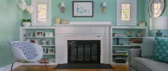
Pastel green and mint
Pastel green walls not only look refreshing, but will also have a positive effect on the psychological side of a person. Mint is a suitable option for an interior in the style of shabby chic and Provence; green shades will look warmer.
Pastel blue
Soft pastel blue will be associated with summer skies and clear water. Cool shades of wallpaper are best used for interior design with south-facing windows.
Cream, ivory
Cream pastel wallpaper is ideal as a background, it is not as bright as white and looks much softer. Both shades of pastel will be harmonious in classic and modern styles. The interior can be diluted with details of other, brighter colors.
The photo shows a minimalist ivory-colored kitchen, some of the facades are decorated with wood.
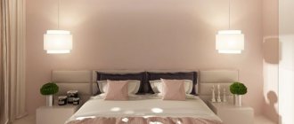
Bedroom and the charm of pastel colors
The calming effect of pastel colors is indispensable in the room in which a person spends most of his time. Evening rest and night's sleep largely depend on the environment, so the choice of colors for the bedroom should be given special attention.
Green color calms the nervous system, so its pastel shades are successfully used to create a small bedroom design. You can complement delicate olive with warm lemon. With moderate use of the latter, an interesting contrast of warm and cold spectra is achieved, which will not be flashy and depressing.
When choosing the color of the walls in a woman's bedroom, you should take a closer look at all the pastel tones of pink and the current powder color. This coloring is considered truly girlish and will evoke positive emotions among the fair sex.
The white and brown combination is suitable for couples' bedrooms. Bed linen in the appropriate color scheme will help complement the interior: choose sets with a pattern that will echo the print of the curtains or wallpaper.
Pastel colors – what are these in clothes?
A variety of pastel shades will suit almost every person. With their help, you can create various looks, suitable for both everyday activities and evening celebrations.
Among the fashionable pastel colors in clothing, one can highlight sand, ice blue, pistachio, and light coral.
It is fashionable to combine pastel shades with milky colors. They go great with white.
And even with black you can choose pastel shades, for example, caramel. Black trousers or a skirt will only set off a light T-shirt or blouse. It would be appropriate to wear a terracotta jacket with a little black dress on a summer evening.
Fashion tends to change, but in the summer color scheme of outfits, pastel colors undoubtedly remain favorites. By skillfully combining different pastel tones with each other or with more saturated colors, you can create interesting summer looks. For example, you should never lose sight of the fact that warm and cold shades of pastel colors harmonize well with each other and look natural and organic. And dresses in beige, milky and cream shades will add a bit of spring mood to your working days.
So, what are pastel colors? The short answer is that these are the primary colors of the spectrum, diluted with white.
Pastel colors for a children's room
Soft combinations of pastel shades are successfully used by designers when planning the decoration of a nursery.
This palette has a positive effect on active and excitable babies.
For boys, classic shades of blue, dove-gray, olive and an interesting combination of turquoise-brown details are suitable as the dominant tones in the room. To realize the last combination, just paint the walls turquoise and add natural wood furniture to the room. Bookshelves, a wardrobe and a bed in wenge color will organically highlight the soft but rich primary color of the interior.
Little princesses will love pink, peach, gold and lavender colors. You can decorate the interior of a child's room for a girl using a light canopy, cute lace decor on bed linen, and translucent airy tulle.
Kitchen and pastel palette of shades
The beige-brown palette is the optimal color solution for decorating the kitchen. The softness of beige is elegantly emphasized by the warmth of the chocolate tone. These colors are appropriate not only when choosing tiles or kitchen facades. A golden-beige refrigerator, a caramel-brown oven or a microwave oven will also harmoniously fit into the interior and serve as a “highlight” of the final decoration.
Light colors when planning a kitchen design visually enlarge a limited space. If your kitchen does not have a lot of square meters, play up the compact area with a dominant pastel tone:
- pearl;
- dairy;
- olive;
- violet.
The light color scheme is quite difficult to care for. But this drawback is fully compensated by the elegance that noble pastel colors bestow on the kitchen.
What combinations should you avoid?
Remember: pastel colors in the interior are beautiful and fashionable, but not always simple. Avoid strange combinations in your apartment - for example, orange or bright red accessories will not go well with pale pink shades. The color scheme must be verified and accurate. Your apartment should not become a field for experimentation - ideally, the house should be distinguished by the integrity of its image.
If there is room for doubt, it is better to consult a designer or look at catalogs of ready-made designer interiors.
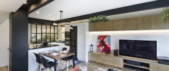
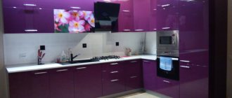
Bright kitchen-dining room in pastel colors
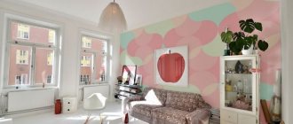
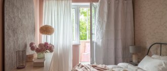
Original living room in pastel colors
Pastel shades for the bathroom
Light and delicate pastel shades fit harmoniously into the interior of the bathroom. The abundance of white items allows you to appropriately combine other colors, complemented by a white color scheme.
A bathroom in blue tones remains a classic example of the implementation of pastels in a design project. Textiles and lighting will help refresh the cold spectrum: you just need to choose towels and soft sets of carpets with long pile in a rich warm color, for example, peach. Soft green is also appropriate in the bathroom. Tile of two shades from the same palette is organically complemented by a floor in a neutral tone, for example, light gray. You can emphasize the special style of the room with the help of glossy stretch ceilings in the same bluish shade.
Turquoise and mint are another win-win color scheme for the bathroom. In addition to tiles, textiles and accessories can also be selected in this shade:
- toothbrush holders;
- towel holders;
- shower curtain.
Total look in pastel colors
It’s not difficult to choose all the wardrobe elements and accessories in pastel colors: the delicate shades combine perfectly with each other, making the look airy and romantic. Such a calm image will be the most memorable among many monochrome ones - softer, gentler.
Emporio Armani, Spring-Summer 2018
Pastel colored furniture in the interior of the apartment
Furniture sets are a continuation of the design, and therefore must correspond to the style chosen for the room. Modern materials used for upholstery of upholstered furniture allow you to choose any exquisite color of the pastel palette and put a harmonious point in creating home decoration.
In spacious rooms with light walls, sofas and soft corners in mint, turquoise, muted ultramarine, lavender and violet shades are appropriate.
Furniture in peach, whitish coral and salmon tones harmonizes with wall decoration in both white and warm pastel shades. You can complement the set with decor and textiles, which can be made in contrasting colors.
Having implemented a new design through renovation, you don’t have to part with old furniture that no longer fits into the interior due to mismatched upholstery color. Sofas, armchairs, chair seats and banquettes can always be altered in a furniture studio, saving money on the purchase of a new set.
Harmonious and calm pastel colors easily transform the interior of even a compact one-room apartment. Wall decoration, furniture color, tulle and curtains, paintings and unusual decorative items in these shades help create a unique cozy environment, the serene aura of which will protect the peace of homeowners.