What to consider when developing a coffee shop design
The interior of a coffee shop depends primarily on the format of the establishment: for example, the decor of a classic coffee shop will look out of place in an express coffee shop. It is important to take into account the main modern trends so that your point does not look strange, and the design of the coffee shop does not seem carelessly hastily planned.
Choice of concept
The choice of concept is related to the format of the point:
- a classic full-fledged coffee shop is characterized by a neutral, restrained atmosphere, the exception is when the establishment is opened thematically for a specific target audience;
- a mini-coffee shop usually contains a minimum of furniture - it is assumed that visitors will not stay here for long - wood, brickwork, and frosted glass are used in the design;
- coffee islands are made of plastic, metal, wood, or a combination of materials - a complex design for the format is not needed, the main thing is that the appearance of the island does not differ too much from the surrounding environment (for example, in a shopping or business center).
Main trends
It makes no sense for coffee shop owners to chase fashion trends, otherwise the design of the coffee shop will have to be changed every year. It is enough to adhere to the main trends when decorating a room, focusing on the needs of a typical representative of the target audience:
- decorating a coffee shop in traditional styles is a universal option if the establishment is frequented by students, office workers, and families with children: several tables and chairs, sofas, soft lighting;
- imitation of Russian folk style - suitable for visitors over 35 years old, although it may also be of interest to young people under 30: massive tables, chairs, themed decor;
- a coffee shop as American films portray it - an option for students and office workers: high chairs and bar counters;
- deliberately simple atmosphere, when the design does not attract attention - in such establishments visitors of any age and income level feel comfortable;
- carefully thought-out design, consistent in the same style - for connoisseurs of a special atmosphere.
Equipment for a mini-coffee shop
To open a coffee shop, you first need professional equipment, thanks to which the aromatic drink will be perfectly prepared. A good car can cost tens of thousands of rubles. Even used equipment is expensive, but new equipment can “eat up” the entire budget of a young entrepreneur.
Choosing a coffee machine
We have collected models of coffee machines that are suitable for businesses of different sizes.
Siemens EQ.6 s300
Case material: stainless steel + plastic. Built-in coffee grinder. Four recipes for making coffee. Five grinding levels. Simultaneous preparation of two servings. Seller – M.Video. Price 46990 rub.
More about the model
DeLonghi ECAM 22.110.B
Case material – plastic. Five recipes for making coffee. Possibility of using 2 types of coffee: ground and beans. Simultaneous preparation of two servings. Seller – M.Video. Price 24990 rub.
More about the model
lCD Espresso
Automatic coffee machine with touch control. Capacity for preparing 16 cups of coffee. Case material – plastic. Seller – AliExpress. Price 36910 rub.
More about the model
Saeco HD8928/09 PicoBaristo
A compact premium coffee machine that allows you to prepare a wide variety of drinks. Prepare two cups at the same time. Ten degrees of grinding. Seller: Eldorado. Price 54999 rub.
More about the model
Philips EP1220/00
Equipped with a touch screen. Max. pressure 15 bar. Power 1500 W. 12 grinding levels, coffee strength control. Ability to cook two servings at a time. Seller: Eldorado. Price 27999 rub.
More about the model
PHILIPS HD8649/01
Power – 1400 W. Pressure – 15 Bar. The volume of the water tank is 1 liter. Lots of settings for making coffee. There is a built-in coffee grinder. Seller: Citylink. Price 18510 rub.
More about the model
Leading coffee suppliers are willing to rent out their equipment at a reduced rate, and sometimes free of charge, in exchange for an agreement for the exclusive use of their products. Moreover, they will help with merchandising, that is, they will provide the outlet with advertising tools and materials that clearly prove the unique quality of their product.
Other commercial equipment will also be needed: displays, a small refrigerator for making ice coffee in the summer heat and storing food, a counter, chairs and other necessary things.
Styles
The interior of the coffee shop does not provide for restaurant solemnity, but too modernist solutions will be inappropriate - guests may get tired of the bright decor. Therefore, pure classics and modernism, of course, are not prohibited, but they should be used with caution. Other styles - in the middle between classic and modern - can be implemented without fear.
Provence
The recognizable elegant style of French coffee shops: cozy textiles, an abundance of small decor, live plants, mostly pastel colors.
Modern
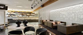
Unusual furniture, unexpected dark colors for the ceiling, simple lamps - this is a modern style. As part of the modern style, any bold ideas are implemented; calm colors are used: white, black, gray. Individual bright details are used as an accent.
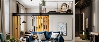
Loft
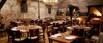
Loft is a style that combines emphasized roughness of forms and clarity of lines. Shades characteristic of the style are old wood or metal, emphasis is placed on details, for example, on imitation of a wall destroyed to the brick.
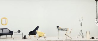
Minimalism
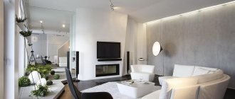
The design of a coffee shop in the style of minimalism is an environment without unnecessary objects, especially convenient for small spaces. When implementing a project in a minimalist style, they use white, complementing it with beige, gray, and brown colors.
Oriental
Oriental style - maximum zoning of the room, creating a sense of privacy for guests, colorful textiles, upholstered furniture with oriental designs. You don’t have to be afraid to overdo it when creating an oriental style: oriental carpets, candles, stained glass windows will also be appropriate.
High tech
A high-tech coffee shop is reminiscent of the set of a science-fiction film: the appropriate furniture and decor are selected. High-tech is difficult to implement on your own - you will need at least a little experience or the help of a designer.
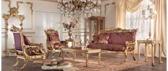
Classical
It is not worth recreating a classic, restaurant-like atmosphere in a coffee shop - guests with low incomes will feel uncomfortable. But it is permissible to use elements of the classical style in the design: for example, put massive wooden tables, soft sofas, Viennese chairs.
Minimalism and asceticism
The Japanese style is characterized by harmony and some impersonality: only the necessary furniture, maximum free space, equipment camouflaged from visitors. The style is dominated by pastel colors - white, beige, light yellow; black, gray, and muted red are added for accents.
Clarification: the main difference between Japanese minimalism and asceticism and simple minimalism is the use of exclusively natural materials.
Eclecticism
Eclecticism allows for a mixture of any styles. To avoid being overloaded with details of different styles, when decorating a coffee shop in an eclectic style, use no more than five colors and a minimum of pretentious decor.
The main features of minimalism in the interior of a cafe
- The presence of geometric shapes. Minimalism does not allow smooth curves and curls, only strict and straight lines. Geometric shapes are used both in decor (patterns on the walls) and on furniture.
- Zoning of space. The cafe can be divided into several zones (dining area, bar counter, dance floor). Since in minimalism it is not advisable to use partitions or other objects that could serve as a distinction, there is a way out - to use multi-level lighting. As an option, you can also use fabric partitions that will not create a cluttered atmosphere.
- Lots of free space. A minimum amount of furniture, accessories, a lot of light - this is what you need to reproduce minimalism in your establishment. At the same time, the furniture should be simple; light wood, plastic, glass, and metal are suitable materials.
- Color palette. Minimalism is characterized by the use of light shades (white, beige, ivory, sand) combined with dark lines.
Interior decoration of a cafe in a minimalist style
Designers recommend using natural materials in a minimalist style, which will emphasize the simplicity and laconicism of the entire interior with particular precision. A certain roughness in finishing is also welcome: untreated wood or stone, the presence of plaster. Paintable wallpaper will help you create an interior that is not overloaded and at the same time vibrant.
Despite the fact that minimalism is a minimum number of accessories, creating an interesting design solution while following the principles of style is very simple. Use cork walls; they will look especially harmonious near the bar counter. They will create a cozy and warm atmosphere in your establishment.
The ceiling and floor should not attract attention, so it is best to use light paint or a suspended ceiling for the upper part of the room, and laminate or tiles for the floors.
Interior design for a cafe in the style of minimalism: where to order and how much will it cost?
Minimalism will fit well into the interior of a small cafe, where the free space does not allow you to go wild. For high-quality execution of all design wishes, it is best to turn to specialists in their field.
Energy-Systems designers have been developing design projects for any premises in various styles for many years. To order a design project for a cafe in the minimalist style, call or leave a request. The online calculator below will help you calculate the cost of this service in a matter of seconds.
Online design cost calculation
External design elements
Signage and storefront are the main elements of exterior design that attract visitors from the street.
Signboard
Even if you really want to attract attention to the coffee shop, try not to use flashy colors in the design of the sign, or dilute the bright shades with more restrained ones. Potential customers who are tired of advertising may miss yet another flashy sign and are more likely to notice a simple sign with unusual details.
Slightly brighter colors can be used on the sign of a street coffee shop; only calm colors are suitable for decorating a sign for an establishment in a shopping or business center.
Showcase
According to marketing research, the windows of small coffee shops attract visitors as effectively as ten to twenty years ago. The main task of a shop window is to demonstrate to potential clients the cleanliness and comfort of the establishment; the design of a shop window should be approached as responsibly as the design of a sign.
Updated interior of a small coffee shop C25PLUS from TBDC
Updated interior of a small coffee shop: decoration of the guest room
New concept
The interior of the small coffee shop C25 CAFÉ (former name) has undergone significant changes. The establishment appeared among the alleys and alleys of the bustling eastern district of Taipei more than twenty years ago. Specializing in coffee and light snacks, this place serves office workers and shopping-weary city dwellers as a cozy haven from the hustle and bustle where they can take a short break and relax.
The coffee shop owner hopes his experience will allow him to take the place to the next level based on an original concept. The idea was that regular visitors would be able to enjoy company time in a relaxing atmosphere. The name was changed to C25PLUS.
As the designer of C25 CAFÉ, TBDC (Taipei Base Design Center) began to develop the project in terms of the functioning of the café, its relationship with neighbors, a new corporate identity, spatial organization and furnishings.
A decision was made about what the new premises would look like and what impression the coffee shop should make on visitors in all aspects of their interaction with the establishment, in addition to “style” and “appearance”.
A restrained palette allows the eyes to rest
For TBDC, the most important task was to help the client effectively use resources and properly organize financial control through design and layout. However, the room is located on the ground floor of a thirty-year-old building: the columns and beams, as well as the low ceiling and lack of lighting created significant obstacles when it came to “having a good time.”
Project implementation
To begin with, the authors took care of the appearance of the establishment and its relationship with the interior. For the exterior decoration of TBDC, perforated iron plates in a rich gray color were used. They are installed at different angles, which completely changed the position of the coffee shop relative to the rest of the building.
According to the project, the sign and external lighting were selected in such a way as to create a visible contrast with the surroundings both day and night. Thanks to this, the C25PLUS inscription is visible from a great distance.
Stylish exterior of the C25PLUS coffee shop
Large windows allowed the atmosphere of the interior to become part of the appearance of the coffee shop. Passers-by can see everything that happens inside and draw conclusions about the mood there. In addition, this innovation solved the problem of lack of lighting.
The interior of the room is visible directly from the street
TBDC did not draw a clear line between internal and external space. Pleasant daylight from the windows and the logo at the entrance are all that separate the interior from the street. When decorating the ceiling, its volume was reduced to the maximum possible minimum to expand the space and save money for the customer.
TBDC tried to expand the space and make the room brighter
A re-planning of the premises was carried out, the designers turned the shortcomings into advantages and organically integrated them into the interior. Several types of tables are designed for different numbers of customers so that the coffee shop can meet the needs of customers at any time.
Tables are designed for both large and small companies
All these measures to improve the interior will make visiting the establishment as comfortable as possible. The style chosen by the designers not only contributes to the efficient use of space, but also satisfies the customer’s desire to expand and popularize the C25PLUS brand.
A few exclusive coffee shop design details
interiorscafe.ru
Coffee shop layout
The layout of a classic coffee shop includes several rooms and functional areas:
- area for making coffee and other drinks;
- kitchen;
- a hall or several halls for guests;
- technical premises: warehouses, bathrooms, staff rooms.
It is enough to maintain the design of the drinks preparation area and the guest rooms in the same style.
Clarification: in a mini-coffee shop it is enough to equip an area for making coffee, a small hall for visitors, and a minimum of technical premises. The format of coffee islands usually does not imply the layout of additional rooms.
In our anti-franchise proposal, we will develop a design for free and help you choose the format of your establishment. To learn more and receive a business plan, fill out the form below.
Turnkey project implementation
What does a coffee shop design project include? This is the design of two important zones:
- dining room for visitors;
- technical area: toilet rooms, wardrobe, waiting area.
If we look in more detail, the development of the project consists of several key points:
- formulation of the main technical task. It can be presented by both the owner of the coffee shop and the designer;
- sketching sketches with drawings and 3D visualizations. The customer evaluates the proposed options and then chooses the most optimal one;
- work with a plan, a clearly drawn up scheme of actions with technical documentation. At this stage, all possible aspects are considered up to the final installation of the necessary equipment and furniture.
Only after approval of the detailed plan can we proceed directly to action. Therefore, project development is the most significant stage in the design of a turnkey coffee shop.
A turnkey coffee shop is one of the best offers from InspireGroup. The original design from the leading employees of our company will not go unnoticed. Why should you entrust repairs or a process such as finishing a coffee shop to us? Because a professional team will work with you. We have been honing our skills in transforming coffee shops and other entertainment venues into something modern and quite unique for 8 years of continuous work. We will translate our creative ideas into an individual approach to customer requests and the creation of an original design.
We recommend that you study 2 honest and useful articles - which we wrote from the heart, at your request. Believe me, they will help expand your understanding of the issue:
How much does it cost to open a restaurant (cafe) on a turnkey basis Example of a working finished design project
Author's design project for a coffee shop
We guarantee 100% results! Be sure to use the services of our professional team - and you will receive a fully equipped room with individual design solutions, ready to receive visitors. The work of InspireGroup is highly appreciated by our clients. You can easily see examples of successful design of coffee shops, bars, clubs and entertainment centers (that is, photographs of completed projects) on the website.
Creating an original design for a coffee shop is a process that requires a serious approach and constant monitoring of all its stages. If you want virtually all your ideas to be brought to life, you should turn to professionals. Trust us - and your coffee shop will turn into an atmospheric and very attractive place where there will be no shortage of visitors. Hurry up to order a coffee shop project design from InspireGroup!
The cost of developing a coffee shop interior design
The exact cost of the project depends on the scope of work, the selected materials and the features of the future brand. Approximate prices are calculated in the following range:
| Design work | Cost per sq. m |
| Design development | From 1000 |
| Design supervision and packaging | From 500 |
| Kitchen and bar technology | From 350 |
Photos of finished coffee shop projects from Inspiregroup
We bring to your attention photographs of coffee shops where our company’s design project was developed and implemented. More detailed information about the projects can be obtained from our managers or viewed in the company’s official Portfolio:
Chain coffee shop Millefeuille
European cuisine Address: Mytishchi, shopping center "Red Kit" Total area: 180 sq. m Seats: 118 Opening: 2014
Decoration Materials
Ideally, natural materials are used for interior decoration of a coffee shop: wood, brick, stone. But the purchase of expensive natural materials does not always fit into the budget, then you can choose a less expensive finish: PVC panels for walls, plasterboard for ceilings, tiles for floors.
Decorative plaster can be applied to plasterboard ceilings - this way the coffee shop will not be associated with a government establishment. If the budget allows and the chosen style (modern, high-tech), thin light panels with text, logo, or design are used for decoration.
Color design of the coffee shop interior
Often a coffee shop is chosen to sit comfortably with friends or work in a relaxed atmosphere, so it is advisable to decorate it in light colors. to expand the space. But it doesn’t have to be something white; you can dilute light colors with paints, wood, and greenery. You can choose one wall in a coffee shop that will stand out in the interior - it could be a wall with a pattern or small decorations.
Decoration Materials
Modern coffee shop design begins with the decoration of the room. You can use natural materials or their imitation. For example, brick or wood will look expensive, but it will also cost a lot, so to save money, you can replace the brick with PVC panels, and the wood with chipboard.
It is better to make a high-quality floor in a coffee shop and not skimp on materials, since laminate and linoleum will wear out and look unpresentable in just a couple of months. The ideal option is a self-leveling floor or tiles in the color of the interior. This flooring is easier to clean and looks aesthetically pleasing.
The main purpose of the ceiling is to expand the space of the coffee shop; it can be painted or covered with plasterboard.
Furniture
Furniture in a coffee shop should not “fall out” from the overall style, and - no matter what design style you choose - the convenience of tables and chairs is important for visitors. If the coffee shop is small, bulky furniture will get in the way. Choose light, compact tables and chairs (except plastic ones, which are strongly associated with being too cheap).
Clarification: in establishments that operate mainly in the “coffee to go” format, it is better to avoid installing upholstered furniture - regularly delayed visitors will certainly reduce profits. In classic coffee shops, where the price tag is higher than in small shops, upholstered furniture, on the contrary, will come in handy.
Pay special attention to the design of the bar counter - it is the counter that guests who have just entered see. If space allows, install several refrigerated display cases so that visitors can view the assortment of the coffee shop.
Color design
The main rule of color design for a coffee shop is the absence of too bright colors that tire the eyesight. The exception is specific styles that require bright colors, for example, oriental style.
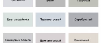
In other cases, it is better to stick to a calm color scheme: natural shades of wood, pastel colors. Bright colors in the color scheme of a coffee shop are acceptable for placing accents.
Lighting
Lighting is important for attracting visitors no less than comfortable furniture and a clean room - both too bright light and very dim light can scare away potential customers. Try to organize local lighting of tables with soft diffused light and the same soft lighting in the corridors (if corridors are proposed).
Spot lighting in cafe design is used in the area where the bar counter, shop windows, and counters are located.
Decor elements
The decor of the coffee shop corresponds to the chosen style and general concept:
- velvet curtains, woolen carpets, silk tablecloths - classic style;
- vintage lamps, ceramic vases, paintings with French landscapes - Provence;
- unusual lamps inside and outside, graffiti on the walls, shelves with decorative cans of coffee, fruit, bottles - modern style;
- a lot of wood, rail mechanisms, light installations - loft.
Universal decor options that suit any style: cotton tablecloths and napkins, curtains in subdued colors, paintings and posters that fit into the overall concept of the coffee shop.
Mini coffee shop design
Implementing a complex style in a mini-coffee shop, where people only come to drink coffee and sometimes have a snack, is not easy. But you can use the basic ideas of high-tech or loft style in the design of the establishment: make an imitation of a brick wall, install spotlights, a neon sign. Another almost obligatory element for a mini-coffee shop is a slate board with menus and prices written in chalk.
Design for "coffee to go"
It is especially important for a coffee-to-go establishment to be noticed. You shouldn’t paint the island in all the colors of the rainbow, but you can use elements of different styles that attract attention:
- minimum decor, bright lighting - minimalism;
- curved counters, two-tone interior - retro elements;
- wood, brick, metal - loft;
- emphasis on non-standard lighting - high-tech;
- design using folklore motifs from a particular country at a particular time (for example, Britain in the 1920s).
The best ideas from designers
Examples of truly custom coffee shop design:
- Coffee bag in Kosovo. The semicircular walls, burlap as decoration, and coffee beans scattered everywhere really create the feeling of being in a sack.
- Mocha - Mojo - a coffee shop in India is designed based on Lego constructors: the halls of the establishment are divided into blocks of different colors. The colors are pure, without impurities, according to the fashion of the sixties of the last century.
- A coffee shop in Panama imitates outdoor recreation as faithfully as possible: live plants, themed 3D wallpaper, furniture in the shape of tree branches.
- London coffee shop DreamBags-JaguarShoes seems to be similar to other similar establishments. But the uniqueness of the coffee shop is in the lighting; the atmosphere changes when the light changes: monkeys, wild animals, and tropical plants appear on the walls.
- The design of the Portuguese coffee shop Poison d'Amour contains only two colors - white and black: white furniture and counters, black ceiling, walls, floor.
Even if you don’t have your own ideas for decorating a coffee shop or are afraid of making a mistake with the concept, borrow the design principles of successful establishments in your city. There’s nothing wrong with using someone else’s successful experience, and you’ll have time to add your own touch of originality when your coffee shop becomes popular!
Minimalism in the interior came to us from Japanese culture. Of course, we didn’t appreciate it right away, as we were used to a busy space and a large number of items. But if you clear the rooms and let in a lot of light, you can breathe easier, your mood and well-being improve.
Minimalism means simplicity in everything. Now it can be found in almost any style. Its main features: the use of geometric shapes, laconicism and monochromatic shades.
Decorating a restaurant or cafe in a minimalist style is much easier than doing it in your home. Because at home we have a large number of things that need to be put away somewhere. To do this, you will need cabinets and chests of drawers of rather large dimensions. The layout of traditional Japanese housing includes niches in the walls. But for a catering establishment, this style is simply a godsend. Its advantage also lies in the fact that it does not require a large amount of material investments to create.
At the same time, a cafe or restaurant in the minimalist style will not look like a canteen in Soviet times. Even simplicity can have luxury if you properly decorate the room, choose furniture and make accents.
What is better to design in this style:
- cafe;
- cafeterias;
- fast food establishments;
- bistro;
- dining rooms
Before creating an interior design, you need to decide on the position from which further actions will proceed. The first thing to start with is choosing a color. It should be remembered that the effect of free space can be achieved by using light colors in the design. These can be both warm and cold shades. The main thing is to stick to monochrome - use black and white colors with one shade. For example, an interior with black and white trim and red furniture will look good.
As already mentioned, minimalism is simplicity. The same applies to furniture. Therefore, when choosing, remember about geometric lines and open space. For an elite establishment, comfortable chairs with soft upholstery, neutral colors and a strict shape are well suited. They will look great in rooms of any size, and especially good on a summer area.
For a small cafeteria, rattan furniture is a good option. In this case, no other accessories will be needed, since such furniture can advantageously emphasize the design feature.
Tables should be as simple as possible. They can be round, square or rectangular. Table supports should not have a complex design. An excellent solution would be metal products. Furniture should be arranged so that there is free space between it.
For finishing walls and floors, it is recommended to use only natural materials: wood, glass, brick, etc. Wallpaper should be abandoned. It is very good if the room has high ceilings, as this is one of the distinctive features of this style. Gray and black shades will help highlight the midtones. You can zone a room using multi-level lighting.
