Specifics
Burgundy color is a combination of red and brown, and looks quite rich and sophisticated. It lacks the lightness and simplicity inherent in light red tones. It should also be noted that this shade is associated with power, strength and maturity, making it an excellent choice for ambitious people.
If you decide to choose a burgundy kitchen, you should be prepared for possible difficulties when arranging the interior. Despite this, this tone looks good with a fairly wide range of shades for walls. Moreover, the final effect depends on the aspirations of the designer.
It is also important to consider the placement of furniture and lighting features.
Color combination in a burgundy kitchen
Burgundy is not an easy color to match. It harmonizes only with a certain set of shades, and even these shades must be selected with care, otherwise the interior risks coming out tacky and too catchy. It is important to know what colors burgundy goes with.
Glossy burgundy kitchen set
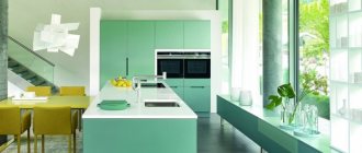
Burgundy kitchen in high-tech style
Burgundy color goes best with white, beige and light shades of pink. For example, burgundy wallpaper in the kitchen or a burgundy apron will perfectly complement beige curtains and a white ceiling, as well as a set in noble pastel colors.
Chrome-plated refrigerator in a burgundy kitchen Burgundy wooden kitchen in country style
But green and burgundy should be combined carefully and carefully. These tones create a strong contrast, so it needs to be diluted with creamy and milky tones and/or wood.
Burgundy cabinet furniture in a country style kitchen
Wood colors, especially light ones, go well with burgundy interior items. For example, wooden furniture will harmonize perfectly with burgundy kitchen curtains or an apron, creating an elite duet.
Country house kitchen with burgundy island
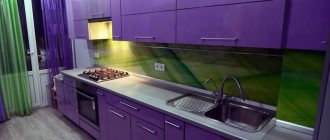
Burgundy color contains shades of blue, so blue and burgundy go well together, creating a cooler atmosphere than delicate creamy tones. A good solution for hi-tech lovers. This interior can be complemented with black glossy details (for example, an apron) or glass elements (for example, a glass tabletop), against which burgundy looks not only solemn, but also modern.
Burgundy kitchen harmonizes well with monochrome colors: black, gray, white. These shades favorably highlight interior items, which are given a strong emphasis with the help of burgundy color. A white and burgundy kitchen looks both cozy and luxurious.
Burgundy cuisine is not only elegance and severity, but also emphasized luxury, royalty, power and grandeur, so burgundy color goes well with silver and mother-of-pearl shades. An interior in such colors will create a feeling of nobility, prosperity and dignity of the owner or hostess.
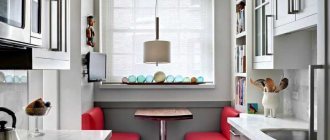
Burgundy interior of a small kitchen
Burgundy furniture in the kitchen Burgundy kitchen in a minimalist style
A kitchen in burgundy colors is perfectly complemented by elements of a dark chocolate shade. This kitchen design fits perfectly into the definition of “chic”.
Disadvantages of burgundy kitchens
This color version has the following disadvantages:
- the tone is dark, therefore it helps darken the room;
- the need to carefully think through color combinations.
Relationships with other colors
The burgundy shade is a complex tone. To compensate for this, it is better to use it in combination with warm, light colors, especially if there is only one small window opening in the room (in other words, if there is a lack of natural light).
Placing the headset in a dark area against the backdrop of dark walls can lead to a visual reduction in the volume of the room. It is recommended to use as a partner for furniture in burgundy shades and walls in cream tones.
The following burgundy color combinations in the kitchen interior are also fashionable:
- with gray;
- with white;
- with brown;
- with yellow;
- with gold.
It is important that there is not too much burgundy. Even if you are a rabid admirer, try not to overdo it. Use this tone only to emphasize the nuances of the room’s design - this way you can add individuality to it.
Which style is best for a burgundy kitchen?
In burgundy color you can decorate a classic kitchen. In this case, furniture sets made of MDF or wood are suitable, which will look very good. This may not be the most classic solution, but it will make your kitchen very original.
Those who love country style may think that burgundy is not the best solution. But this is not true at all. If you choose furniture in this shade with an aged effect, and complement it with the right accessories and decorative elements, everything will be harmonious.
Details in the form of fabric bedspreads, tablecloths with cute prints, aprons and small arrangements of dried flowers are suitable for this style.
Styles such as hi-tech and minimalism can also benefit from using burgundy. In this case, you can replace matte textures with shiny ones, add steel and chrome, as well as the most modern and functional household appliances.
In fact, you can experiment with burgundy in any stylistic decision. It is only important to maintain a single concept thanks to the details.
Burgundy color leaves unlimited possibilities for experimentation. By using it wisely and successfully combining it with other tones, you will achieve a stunning effect, and your kitchen will no longer be just a kitchen.
It will become a model of style, a luxurious and at the same time cozy room, a stay in which can immediately have a positive impact on your mood and emotions.
Rules for using burgundy color in the interior
When using a burgundy shade in a kitchen interior, you should adhere to a number of rules:
- If the kitchen is small, burgundy should be present in its design in a minimal amount.
- You can achieve a visual rise in the ceiling if the furniture has glossy facades.
- The optimal color partners for burgundy are cream, white, gray, light blue.
- The best decor is silk or velvet textiles, leather, plastic or glass elements.
Style directions
Below is a list of styles that allow the use of burgundy color in the interior:
- Art Deco;
- glamorous;
- Bohemian;
- romantic;
- Arab.
Note!
- Blue color of the kitchen - ideas for combining blue color in the kitchen + 130 photo reviews with decor options
Turquoise kitchen: TOP-150 photos of fashionable turquoise kitchen design ideas + reviews of stylish interiors
Light green kitchen - TOP 130 photo reviews of light green kitchen design and decor. Features of the style of furniture and decor in the interior
Positive and negative sides of burgundy color
Despite the originality and beauty of burgundy color in kitchen interior design, there are still many of its advantages.
Burgundy color has powerful energy. It combines bright and festive moments, and also creates coziness and tranquility.
Practicality is one of the main features. Since burgundy is a non-staining color, it will be a great find for any housewife.
Note! Apron for the kitchen - which one to choose? Review of the best design options (90 photos)
After a busy day at work, it will be pleasant to spend time over dinner in a burgundy-colored kitchen, as this shade has a calming effect on the nervous system. Here you can recuperate and just relax.
But remember, excessive use of this color can turn all its advantages into disadvantages, such as.
Visually reduces space. In rooms with a small area, it is better to use it in some details rather than on large surfaces.
Using burgundy in an unsuccessful combination with other shades can make the kitchen gloomy, faded and gloomy, and if there is not enough lighting, the interior will be a failure.
Design solutions
The interior design of a burgundy-colored kitchen can radically change the idea of a given location. Furniture can be made:
- Made from natural wood. The main disadvantage of such headsets is their high cost.
- From MDF. Such furniture is produced with one of two types of facades - glossy or matte.
- Made from acrylic. Acrylic sets are popular due to their glossy surfaces and chrome fittings.
You should also take a closer look at aged furniture. It echoes the country style, but in this case you will have to add textiles, ceramic dishes, and wicker items to the decor.
Pros and cons of burgundy cuisine
Burgundy is the third most popular shade that most people choose. White and beige colors come first. A burgundy kitchen has both pros and cons.
- The color itself has a calming effect on the nervous system. In addition, it is not able to stimulate appetite, like red.
- The burgundy color is not easily soiled, which means grease stains and other contaminants will not be very noticeable on the facades.
- The color looks very expensive, burgundy can elevate even the most modest kitchen.
- Burgundy has many shades, it can adapt to any interior and lighting. Burgundy also goes well with many other colors.
But along with all the positive aspects, there is one minus. Many owners of small kitchens are afraid to use it because it makes the space even smaller and adds gloom to the interior. Indeed, this color can eat up space. But this happens because burgundy is incorrectly combined in the color palette.
Choosing a floor covering
In theory, a white floor would look amazing in a situation like this. In fact, this color scheme is impractical, since any contamination will immediately be evident.
Designers recommend choosing flooring in beige, green or gray. A tile that matches the color of natural stone is ideal. Parquet or laminate is also appropriate.
Examples
The ensemble with a set with a glossy burgundy facade, a white countertop and an island looks most advantageous. In this case, it is desirable that the walls, floor and ceiling are boiling white. Unfortunately, only a clean person can afford to have such a kitchen. In practice, such a solution is extremely irrational, since it requires daily cleaning.
One of the variations of the burgundy-white-black combination, when wine tones play a dominant role in the furniture, there are a couple of pull-out cabinets, black hanging shelves and a white island. And all this against a snow-white background. In this case, it is recommended to put a dark laminate on the floor.
The combination of burgundy and silver looks great with light walls, island and countertops and dark burgundy cabinets. It is also better to keep the floor in a silver color, as well as household appliances.
When striving for a more neutral color combination, the tone of ripe cherries should be diluted with a beige or milky color. In this case, the colors of the headset will seem more consistent.
Note!
Purple kitchen - nuances of using purple. Modern kitchen design ideas with photo examples- Gold-colored kitchen: 110 photos of the best ideas for decorating a gold kitchen. Selection of furniture and finishing materials in suitable shades
- White kitchen: features of using white color, choice of interior style. Fashionable kitchen design ideas with photos of the best examples
A burgundy-colored kitchen is unusual and stylish. Not everyone can afford it. If you nevertheless decide on such a design, then be careful in choosing color combinations.
Color combination
The most important thing if you choose burgundy is to successfully combine it with other tones. It can be combined with both classic monochrome and other contrasting tones. Let's look at the most popular combinations.
Burgundy and white
White color is characterized by the ability to emphasize the characteristics of those shades that are next to it. With white burgundy it will look even deeper, more multifaceted and rich.
White is suitable if you want to visually expand the space, make the room lighter and airier, or connect several colors together.
A good option is a burgundy kitchen set and white walls as a background. This is the perfect choice for a classic style.
Countertops that imitate marble look interesting, for example, white ones with burgundy-colored veins. Often the contrast of white and burgundy is used to create a room in the spirit of high-tech.
Perhaps a two-tone white and burgundy kitchen looks a little boring, but that is not the case at all. By playing with bright details, you can change the concept of the room, making it either playfully funny or modestly solemn.
Advice! The interior can be diluted with bright textiles, indoor plants, and fruits, which will make it more fresh and lively.
Burgundy and black
You need to be careful with the combination of black and burgundy. If you combine these two colors as the main colors, you can make your kitchen look gloomy and uninviting, and it will also look much less spacious than it really is.
In this case, you can go another way. Take burgundy and white as the base shades, and let the black details act as accents. The result will be quite elegant and surprisingly luxurious.
Without a light color in the set, it is better not to use black and burgundy together for any room.
Burgundy and gray
Gray and burgundy are an elegant and aristocratic combination. If you want to use these two colors as your main colors, keep the gray very light, almost white. And other light details will not hurt in this case.
Dark gray color should be used according to the same principle as black - dilute with gray details a combination of burgundy and some of the light shades.