What does the coming year have in store for us in the world of interior design? What style will be at the peak of popularity? We bring to your attention a selection of the most promising interior solutions that will definitely find their fans in the new year. Let's look at the subtleties of fashion trends, the secrets of unusual color combinations. We have selected a photo gallery of the most interesting and creative design ideas. You can take your time to look at the photos and find the ideal options for arranging a practical, safe and attractive room.
White kitchens
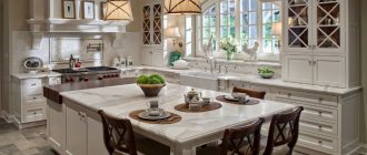
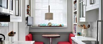
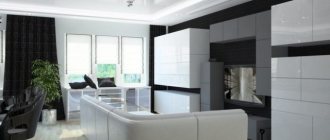
White color does not concede its position due to its versatility. Along with black, gray and natural wood textures, it is used in most modern room interiors. The easiest way to match the white glossy or matte facades of a kitchen unit is to choose additional color accents, decorative elements, and household appliances.
This design makes the room lighter, more spacious, creates a feeling of cleanliness and perfect order, which is clearly visible in the photographs presented. The only negative is that any dirt is clearly visible on white surfaces, so you will have to try hard to clean it.
Sunny and warm yellow – fashionable interior colors of 2021
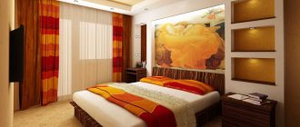
Yellow is the color that reigned supreme at the 2021 Interior Design Show. It appeared not only – as has been customary for several seasons – in accessories, but also on the walls of rooms, kitchen fronts and even the upholstery of living room furniture. The choice of Tikkurilla, one of the largest paint manufacturers in the world, was Lemonade H300.
It is an optimistic, warm and gentle, muted shade of yellow with visible brown additions. As brand experts explain, this color is associated with the first rays of the sun in the morning, immediately after dawn. Thanks to this, it can add comfort and a positive attitude to life.
The institute that believes yellow in particular will be in charge by 2021 is also WGSN, a color trend forecasting company. Its specialists pointed to a strong, warm, earthy shade of Mellow Yellow as one of the key colors, which can be called a shade of retro mustard yellow or bleached ocher.
Metal in the interior
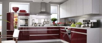
Metallized furniture facades are in favor. If earlier metallic was used in the high-tech direction, today it is used to decorate a wide variety of interiors. The designers also paid attention to the noble shine of golden brass accents, which gives the room a rich, respectable look. The photo shows a stylish design of a modern kitchen:
Dream kitchen design
The kitchen design options from this point should not even be attempted without a large budget and drawing up a design project. But individual chips can be spied.
In many ways, the kitchens in the pictures look beautiful and expensive thanks to luxury materials: stone, stone veneer, parquet on the floor, solid wood on the facades, natural wood on the tables and bar counters.
But there are 2 ideas that can be transferred from a dream kitchen to a real design:
- Designer lamps. Now there are many copies that are simply similar to Italian and other expensive ones, but which are made in China or Poland. Moreover, they are often not inferior in quality - globalization has a positive effect on the “spread” of design.
- Bold, dotted color accents. The last paragraph is entirely devoted to color.
For example, we divide the photo into 2 groups:
- Kitchen design is based on expensive things and cannot be repeated on a budget.
- Interesting kitchens with unusual ideas from ordinary materials
Expensive:
Interesting:
By the way, we are in:
Interesting colors
I usually write: make white kitchens, make them light, don’t use bright colors, and especially dark ones because they are also impractical.
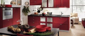
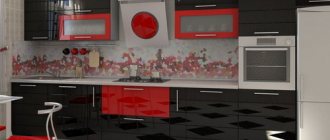
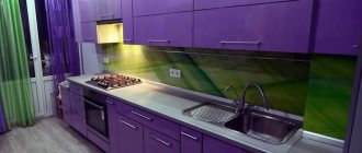
And for good reason: brightness in the interior = risk . But at the same time, this is a simple and free way to create an unusual kitchen design. 2 photo examples where unusual accents made the renovation very interesting:
Let's look at 2 types of colors that I usually do not recommend, but before that I strongly advise you to understand my material about the combination of colors in the interior - without this, the probability of errors will tend to 100%.
There I explained why using pure color in furniture and decoration is a bad idea. But unusual dirty ones and their shades are an interesting solution.
Cold
For a while, pure blue kitchens were all the rage and they were terrible. Although the potential of shades is huge.
Add black and get a dark blue kitchen:
A non-standard kitchen design idea: solid wood facades painted in a non-neutral color while maintaining its texture (veins, knots, etc.).
The blue turns out very fresh:
But my favorites are blue with the addition of gray and green and going into shades of dirty mint and dirty turquoise. Despite its unpopularity and non-obviousness, this design solution for the kitchen is quite safe in terms of the chances of error.
But a very risky solution is green cuisine. This color looks very different in the sun and without it, so I would not recommend using it in a room where there is a lot of natural light - the result will be unpredictable.
Modern household appliances
Another mandatory attribute of the kitchen of the future is an interior filled with ultra-modern appliances and electronics, which can be controlled remotely through smartphone applications. And also “smart” hoods that independently select the mode, depending on the saturation of the air with vapors and odors; climate control; equipment that can prepare a full dinner before family members return from work or school.
And, of course, various little things that make life easier: a household waste shredder in the sink, a wine cabinet, cutting boards with electronic scales.
Kitchen interior in minimalist style: features
Minimalism style in the kitchen interior
Characteristic features are:
- restraint, conciseness;
- simplicity of design;
- functionality;
- minimum decor;
- color monochrome.
The interior of a kitchen in the minimalist style implies the absence of bright, saturated colors, patterns, and designs. Colors used:
- white;
- gray;
- black;
- blue;
- brown cool shades.
The walls are without patterns, even, smooth.
Lighting is used by arranging a variety of lamps, using lighting for kitchen units and ceilings.
Furniture should be chosen with smooth facades and built-in appliances. Its color should be combined with the shade of the walls - be monochrome, or vice versa, emphatically contrasting.
The dining group is laconic and strict. Light glass and wooden tables and comfortable, functional chairs look good. Decoration is minimal. Wall clocks, paintings in simple frames, vases with large plants are suitable.
