Basic rules for choosing colors
When choosing a color scheme, it is important to base yourself not only on your own preferences, but also on the rules of color composition. Here are the main ones:
- Of all the colors used in the interior, only one (maximum two) should dominate.
- combining two dominant colors is not an easy task, and only professionals can handle it correctly.
- the main tone simply must be in harmony with the other colors of the interior.
- if several shades of the same color are used, it is advisable to limit yourself to two, maximum three. Otherwise, the space will visually disintegrate.
Advantages of green (lime) color in interiors
Green. What is it associated with? With the greenery of the meadows, with the first blossoming spring leaves. And it is from this association that the main property of this color emerges - to have a calming effect on the human psyche.
But green is different from green. The most pleasant shades are those that are diluted with yellow - the so-called light green colors.
The main advantages of green shades, including light green:
- Color is not defined as feminine or masculine.
- Standard green is neither a warm nor a cool color - it is as neutral as possible.
- Light green predominantly tends to favor warm colors.
- Perfectly matches almost any style of the room.
- If you don’t want too intense a color in the room, you can always dilute it with white, resulting in very delicate shades.
Combination with various shades
This is a fairly bright, expressive shade that goes harmoniously with all calm tones. It is worth considering the most successful combinations.
With pink
This tandem looks very impressive. It can even be found in nature. For example, a forest meadow with flowers and the sunset over it. Accordingly, in this way it will be possible to create a spring, incredibly fresh atmosphere in the room.
With grey, beige and white
The combination of gray and light green in the interior is considered one of the most successful. When using these tones, it is possible to achieve maximum harmony. The following shades can also be used when creating a design:
- cream;
- beige;
- snow-white;
- steel;
- anthracite.
Thanks to such shades, light green looks brighter, but does not become overly saturated.
With orange
This tandem helps fill you with positive energy and lift your spirits. Both tones are light and bright, but at the same time differ from each other in temperature. Light green belongs to the group of cool shades, while orange belongs to warm tones. They can perfectly complement each other, allowing you to highlight a bright palette.
With purple and lilac
When using these colors, it is possible to create a very extraordinary design. You can use both dark and light purple tones. Lilac will not be able to beat the richness of light green. It acts only as a successful addition to the main tone.
With yellow
Also considered a successful combination. These shades are close to each other and are associated with a spring morning, when the sun has just risen and illuminates the grass dotted with dew. You can use not only a bright yellow tone. Its subspecies such as mustard, wheat or gold are appropriate.
With turquoise and blue
These shades combine perfectly and allow you to create a cold but pleasant palette. In such an environment you can find peace and relax. This solution is suitable for a wide variety of premises. For example, such a tandem can be used in the bathroom, kitchen or living room.
Disadvantages of green
Perhaps the only disadvantages of green are:
The fact that it requires careful selection of companion colors. Not every shade will go well with it.
Green should not fill most of the space, or even less the entire space - this will cause visual fatigue of the room.
What shades and colors does light green go with?
In order to get a harmonious combination of light green color in the interior, you can also use the following shades:
White is the perfect companion for green.
The second ideal combination is light green and the color of natural wood, and this can be the color of trees of various species, from the lightest to deep brown.
Warm yellow shades, orange, coral red tones.
Complex colors that include grayish and brownish tones are also suitable - gray-blue, champagne, vanilla, soft terracotta.
Light green in the rooms of the house
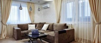
This color is suitable for decorating every room. It will bring light and a charge of positive energy into the living room. However, they should not overload the room. Light green should be generously diluted with white. Then the living room will feel airy and comfortable. Against this background, splashes of pink and leopard print look impressive.
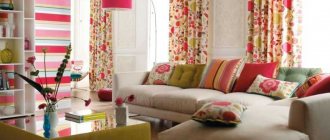
Light green goes well with bright, rich shades. In the living room, an original solution would be to combine light green with hot pink and turquoise. In such combinations it is necessary to add white accents.
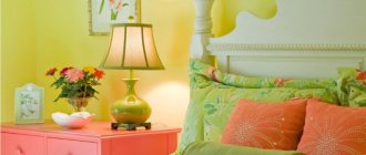
Light green will create a sophisticated and gentle atmosphere in the bedroom. To achieve this effect, you need to diversify it with warm tones of pink. In the bedroom, light green in combination with dark shades looks impressive. To prevent the interior from looking too aggressive, you need to add “naive” notes to it, for example, a polka dot pattern. This color scheme looks especially appropriate in African style.
A light green kitchen will be juicy and appetizing. In this room it can be combined with white, gray, brown, blue, yellow and green.
In a light green bathroom, it is necessary to organize good lighting, otherwise this color will turn into a swamp and create an uncomfortable, cold atmosphere. In such a bathroom, unusual accessories of bright colors are appropriate. This will create a colorful, extraordinary interior that will energize you in the morning and set you up for positivity in the evening.
A cheerful light green color is as appropriate in a nursery as in any other room in the house. Here you can use bold combinations of light green with orange, blue and cherry. Their tandems are generously diluted with white, which creates a cozy and cheerful atmosphere. Your child will definitely like this room.
Light green cuisine
Salad cuisine is easy to implement in the simplest way. To do this, you can use three main and win-win options:
White ceramic tiles on the backsplash and floor. Light green kitchen furniture, the facade of which is made of plastic coated with a shiny or matte film.
Hydraulic Rescue Tool - Main FeaturesWave color in the interior: 55 photo examples of revitalizing the environment
- Do-it-yourself Wilo pump repair
Light green kitchen apron made of ceramic tiles or plastic panels. The facade of kitchen cabinets can be white, wood, pink or another color that matches.
The light green color of the kitchen in the interior can be realized using textiles. At the same time, everything else in the interior should be as neutral as possible.
In order to better understand the principle of designing any type of room using a certain color scheme, you can familiarize yourself with a variety of photos demonstrating the light green color in the interior.
Suitable stylistic directions
It is extremely important to choose the appropriate interior style. Light green shades can be used in various directions. In this case, the most successful options should be considered in more detail.
Classic
The interior in this direction is characterized by the use of pastel, light shades. As a rule, the main color is snow-white. It goes perfectly with a wide variety of colors, but it looks especially elegant in tandem with light green.
Modern
This stylistic direction is characterized by functionality and restraint. A minimum of decorative elements is used. There should be nothing unnecessary in the room. It is extremely important that the room is free, not cluttered with an abundance of furniture and decor, or unnecessary things. Each piece of furniture is chosen strictly taking into account its purpose.
Light green shades fit harmoniously into this style. They act as bright accents and complement an already sophisticated interior.
Country
Country music is characterized by soulfulness and maximum democracy. In this style, the choice of suitable shades is of particular importance. Preference is given to natural tones. The furniture is made from natural materials. This style also uses a lot of textiles. Excessively bright, neon and contrasting colors should not be used.
Loft
The style is distinguished by a combination of a variety of architectural solutions. Stylish pieces of furniture are used here. The walls are finished with brickwork. The ventilation system remains open. This design looks quite bold, but incredibly stylish. With the help of light green color, the interior is filled with freshness and a pleasant, calming atmosphere is created.
Photo of light green color in the interior
Read here Interior in brown colors: ideal home design 180 photos
Did you like the article? Share 
