Brown color in the interior is the personification of comfort, safety and coziness. Designers consider this color to be as indispensable as basic white. According to Feng Shui, brown belongs to the element of earth and symbolizes staticity and constancy. Psychologists claim that it has a calming and relaxing effect.
Important! Brown is not spectral, it is obtained by mixing green and red or orange and blue. Therefore, it is best combined with natural, natural shades.
Brown has many shades that are completely different from each other. According to the palette proposed by Pantone, there are 195 of them. The most popular are:
- Chocolate.
- Red-brown.
- Coffee.
- Walnut.
- Coffee with milk.
- Red-brown.
- Cognac.
- Caramel.
- Terracotta.
- Wenge.
Dark shades of brown give the room a touch of mystery and look more luxurious. They must be used following color rules, since visually they reduce the size of the room.
For poorly lit rooms, it is recommended to choose light brown, red and red-brown tones - they will make the space more cozy and cheerful.
For interior decoration, use no more than 3-4 shades of brown. Emphasize different textures, designs, patterns. With brown it is very easy: untreated or varnished wood, leather, natural and artificial stone, wallpaper and tiles that imitate natural textures, wicker elements.
Rules for using brown in the interior
Many consider brown to be a classic warm tone, but it also has cool shades: wenge, taupe, dark chocolate, etc. Such tones are recommended for use in well-lit large rooms. In small rooms - perhaps as accents.
Light shades will help expand the space: coffee with milk, golden brown, milk chocolate.
Nuances of using brown color in the interior
- This is a neutral tone that does not seek to attract attention or dominate. It can be simply a background for another color in the decor, or a fundamental element.
- Brown is considered a natural color and is therefore well perceived by human vision. An interesting fact is that no matter how much brown there is around us, we practically do not notice it. Psychologists say that a brown interior promotes decision-making and has a calming effect.
- Brown is a universal color. Along with gray, white and black, it is considered basic, as it can be combined with almost all shades.
- Brown “loves” multi-level lighting and a variety of textures and textures - this makes it look more rich and interesting.
- An interior designed only in brown tones may seem boring and faceless. We need bright accents.
Flooring materials in brown shades
Nowadays floor coverings are made from different materials. Traditional are parquet, natural processed, painted boards. Among artificial ones, laminate and linoleum are used. Tile tiles are produced in brown tones. Each product has its own characteristics and can be used in premises for a specific purpose.
Parquet
Parquet is made from natural wood. It has a presentable appearance thanks to natural shades. After flooring, it is coated with a special varnish. When dry, the product reliably protects the boards and gives them a noble dark brown color.
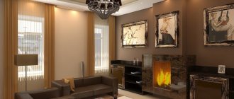
Natural board, color and shine create a feeling of luxury. The interior of a living room or bedroom with such a floor looks elegant and rich. Dark brown parquet goes well with light walls, snow-white ceilings, furniture and textiles of any shade. Forged objects and accessories, fireplaces with brickwork or stone trim look great on it.
Laminate
Lamels made from natural and artificial components are a modern material. The dark brown floor of them in the interior is slightly inferior to traditional parquet. Laminate has excellent external properties. It retains the natural relief, and artificial shine and tone allow you to imitate the natural pattern of the floor covering.
This material in dark brown tones is laid in living rooms, bedrooms, and children's rooms. They decorate dining areas in kitchens. It looks attractive in any interior and harmoniously combines with other furnishings.
Linoleum
Synthetic roll coating has remained popular for many years. Manufacturers produce products in various colors. Canvases in brown tones with imitation parquet are especially in demand. A floor with a pattern of natural boards looks noble.
Thanks to its characteristics, dark brown linoleum can be laid in any room. They cover floors in living rooms, schools, kindergartens, and offices. External beauty, sophistication of brown colors, unsurpassed practicality are the main advantages of this material.
Tile material
Ceramic tiles are an indispensable product for rooms with high humidity. If the interior design requires the use of a dark brown color on the floor, you can choose a coating of this shade. Tile in the tone of chocolate or natural wood is an excellent solution for finishing bathrooms, kitchens, corridors, and bath rooms.
If desired, you can purchase wood-look tiles. This will allow you to imitate natural wood, which is excellent for flooring.
Flooring made from any material of a rich dark brown color avoids monotony. This floor never gets boring. It has a good effect on the psychological state of the inhabitants of the house. It can evoke feelings of warmth and comfort.
Using brown color in different interior styles
Classic style
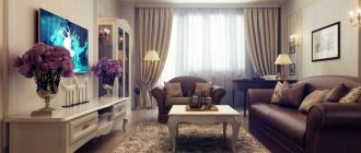
Designers say that most often reserved people prefer brown interiors. Brown looks very noble and expensive, so it is indispensable in a classic interior. It is important to choose natural materials! Plastic (even if it imitates wood) is simply inappropriate. Accessories in white, orange, beige, burgundy, and black will help “dilute” the severity of brown.
Country
Unlike classics, where glossy and varnished surfaces dominate, it is better to use matte shades in a country-style interior. Use 2-3 shades of brown - this way you can visually adjust the room and place accents. Deliberately rough shapes, more natural untreated wood, checkered and floral prints - this is the “recipe” for the perfect country style.
Eco style
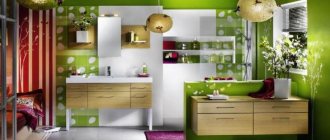
Cozy and as close to nature as possible. Brown can be accompanied by grassy, salad or olive green, white, beige, orange. Accents made of wood, bamboo, natural stone and other textured materials will help give the interior volume and expressiveness.
Minimalism
A good solution for a room of any size. Choose cool shades of brown. They go well with sandy yellow, beige, gray, and turquoise. Use no more than 2-3 shades, the emphasis should be on visual expansion of space and functionality.
Japanese style
The Japanese live in harmony with nature, so when arranging the interior they use only natural shades and materials. Raw wood, wicker mats, bamboo, simple decorations are the attributes of this style. Try playing with contrasting shades of brown.
Scandinavian
The leading role in this style is given to white and beige, but brown is also present. You can make the interior more catchy by adding a chocolate shade or wenge, or you can visually soften the interior by choosing walnut or coffee brown. Focus on deliberately rough and untreated surfaces.
Loft
Brown goes well with grey, white and beige, which are the basis of this style. Rough boards on the floor, wooden beams on the ceiling, furniture - the role of brown is accentual, but it gives the room a special coziness and warmth.
Victorian
Rich and catchy style. To pair with brown, you should choose gold, beige and burgundy. You can use 2-3 shades of brown (for example, coffee with milk and wenge), delimiting them with moldings. It is better to choose glossy shades rather than matte ones - they look richer and more interesting.
Combination of brown with other colors in the interior
The good thing about the brown palette is that it does not differentiate, but rather combines different shades into a single whole. The huge advantage of this color is its combinatory nature and versatility; it is compatible with almost all shades.
Table of successful and unsuccessful combinations of brown
| Brown + | Recommended Styles | Design tips |
| Beige | Classic, Baroque, Victorian, Loft | These shades belong to the same color palette and balance each other. The interior is pleasing to the eye, and you can diversify it with bright accents. |
| Orange | Eco-style, Modern, Oriental | Use orange as accents. It goes best with dark shades of brown. |
| Red | Country, English style, Japanese | These are related colors. If you don’t like bright red, choose muted tones - wine, burgundy. |
| Green | Eco-style, Minimalism, Ethno, Oriental | This interior promotes relaxation and looks as natural as possible. Choose natural shades of green - pistachio, olive, salad. |
| Blue | Marine, Country, Mediterranean | The highlight of this interior is stylish prints. Both brown and blue are an excellent backdrop for interesting furniture and accessories. |
| Grey | Loft, Minimalism, Fusion, Scandinavian | It is important to choose a darker shade of brown so that the surfaces do not merge. Don't be afraid to use supporting colors. |
| White | Modern, High-tech, Provence, Eco-style | Brown and white are a light and contrasting tandem. Use several shades of brown. |
| Pink | Shabby chic, Provence, Pop art | To prevent the interior from being too glamorous, use complex shades of pink - ash rose, fuchsia, carmine. |
| Turquoise | Provence, Minimalism, Marine style | Use 2 shades of brown or choose a secondary color. Turquoise makes the interior moveable, while brown makes the interior static. |
| Unsuccessful combinations of brown | ||
| Violet | The interior turns out gloomy and depressing; you don’t want to be in such a room. | |
| Acid shades | They don’t go well with natural brown; they need a light neutral tone. | |
Where should you not use brown?
All rooms that are associated with intellectual work should not be decorated in this color scheme. Since a brown tone will cause absent-mindedness and distraction of thoughts from work.
Read: Purple walls: options for use in interior design and decoration tips (125 photos)A person in such a room will always turn his thoughts to material goods, including, for example, food consumption.
The best ideas for combining brown with other colors in the interior
Many people think brown is a dull color, but they just couldn't find the right pair for it! Brown color goes well with different representatives of the color palette:
- Neutral shades (these are background colors - white, beige, gray).
- Contrasting colors (against its background they look even brighter).
Brown and blue
Brown is a rather static color, while blue gives the interior mobility and expression. To prevent the room from seeming too gloomy, use a third color - turquoise, beige or white. Matte shades of blue look more interesting - they add a touch of mystery and nobility.
Brown and white
This is a classic combination, but choosing a sterile white color is not recommended. Note creamy, milky white, ivory. You can add dynamics to the interior using voluminous textures and bright accents. White should dominate, the ideal ratio with brown is 60:40.
Brown and green
Green and brown are a combination that is as close to nature as possible. Such an interior has a beneficial effect on the nervous system and promotes relaxation. Bright herbaceous shades will help make the room more expressive, while olive and marsh shades will make it calmer. Green can be both an active color and a soft background color.
Brown and gray
Gray color often acts as a background for brown furniture. It creates a light and pleasant contrast and does not bore you with an abundance of colors. Bright accents or voluminous textures - prints, 3D panels or tiles, imitations of brickwork, wood, concrete - can add sound to the interior. To prevent the room from seeming bulky and heavy, avoid massive furniture.
Brown and beige
For designers, this color scheme is considered a win-win option. Brown and beige are wonderful partners that complement each other. Beige brings light and softness to the interior, brown – static and a certain brutality. This tandem is good even without bright accents. Accent walls, panels, and textured finishing materials will help make the room more expressive.
Brown and yellow
Yellow is one of the brightest colors in the palette, so it is important not to overdo it. But it brings a “piece of sun” even into the darkest rooms! If you want a calmer interior, choose mustard, canary and orange-yellow. Bright lemon and sunny yellow are best used accentually. White, olive, blue, gray, and beige harmonize with this combination.
Brown and red
Considered a traditional English combination. It is important not to use a lot of red, otherwise it will create an oppressive impression. Calm shades of red - marsala, mahogany, carmine, burgundy - will help soften the interior. Red itself is a rich color, so there is no need to use an abundance of prints and textures.
Brown and pink
This combination may seem unexpected and a little childish, but it is important to choose the right shade of pink. This is a romantic and relaxing tandem, which is considered beneficial for the nervous system. Faded shades of pink look more noble, bright shades like fuchsia or purple-pink bring a touch of joy and revitalization to the interior.
Brown and black
A controversial but stylish combination. Your task is to choose the right shade of brown (focus on a light palette) so that the room does not turn into a dull box. It is very important that the room has several light sources and proper zoning. If desired, you can use bright accents - white, yellow, orange, red, beige.
5 advantages of brown color in the interior
- Naturalness. Brown is appropriate in any room; it brings a touch of comfort and warmth. The brown interior will appeal to people of all ages!
- Many shades. If you wish, you can decorate the room only in shades of brown, and it will not be boring or dull! The palette is very wide: from coffee and caramel to wenge and red-brown!
- Practicality. Brown interiors do not lose their attractiveness for a long time and are easy to maintain. However, we must not forget that dust is more noticeable on dark floors and furniture.
- Versatility. Brown can be both a wonderful background and a catchy accent! It goes well with warm and cool shades. Even novice designers are unlikely to make a mistake!
- Always in fashion. This color surrounds us everywhere, we’re just so used to it that we hardly notice it. This is an excellent solution for both modern and classic interiors.
Combinations with brown
Brown color goes very well with soft light tones. In order to get light brown walls, you should add a little milk.
The walls are dark brown, worth adding chocolate. To create a bright picture, you should try pink or turquoise.
For example, chocolate walls and a milky turquoise floor. You can look at the photo of brown walls in more detail.