Brown color in the interior of rooms is associated primarily with furniture, flooring and other wooden household items. It so happens that sawn wood has different shades of brown. But most of our everyday objects are made of wood.
The color brown and its shades influence the emotional state and has a direct connection with the subconscious, it belongs to warm colors and occupies an intermediate position. It is chosen by people who are self-confident, financially independent, and firmly on their feet. These are conservatives who value traditions and family values.
About interior design
The color brown has about 200 tones and shades, which gives designers a wide field of activity and flights of imagination when decorating rooms. Using vertical stripes of light brown tones in small rooms increases their height.
Did you know that there are 195 brown tones registered in the Pantone palette. Each tone is assigned its own digital number. There are two more color palettes RAL and NCS. However, there are fewer shades of brown.
Design styles and directions
For different styles, certain color combinations are selected. But, for example, the combined use of any shades of brown with white and green tones will organically fit into any style direction.
- Classic - here the use of brown colors is very widespread. If you need to emphasize this style, you definitely can’t do without a brown tone.
- Retro styles also constantly use all tones of brown.
- Country and other rustic styles are based on an organic range of all shades of color in their design. The naturalness of this tone fits into them very harmoniously.
- Loft , as a technological style, makes excellent use of the richness of shades of dark chocolate or light coffee.
- High-tech - the use of these paints in this style is usually decorated with appropriate details.
Styles and trends change in accordance with the fashion for them. But all tones of a given color constantly find a “place in the sun” in many of them.
In what rooms can brown be used?
A large number of tones and shades makes it possible to use brown in all rooms of the apartment: hallway, living room, bedroom, children's room, kitchen, bathroom. A wide field of activity for the use of brown color by designers in the design of: restaurants, pubs, cafes, office premises, train stations, ship cabins. Having studied the rules for combining colors and shades, designers can create compositions that satisfy any taste and customer requirements.
Combination rules
Proper use of green in the interior seems quite difficult, but all problems are solved by its dosed dilution with brown. Any variety of shades of green can be combined and decorated using a huge palette of light and dark tones of brown:
- it is not necessary to combine cold colors with cold ones, and warm colors with soft ones;
- if the homeowner’s taste is that the appearance of the items is attractive, you can safely create your own combination of colors in the kitchen interior;
- using brown in combination with green, a person opens up a huge creative space for himself;
- this combination of colors allows you to make the style unique, but if you try to decorate the kitchen in a modest or monochromatic manner, it will take a long time to achieve a favorable result;
It is advisable to adhere to the rule: when there is variety in the use of the brown palette, it is advisable to add a green tint only from a thoughtfully chosen cool or soft color. If the interior has a large number of shades of green, you can give up a large volume to the brown color, using any tones.
Original interior in Italian style
- When it is not clear what shade to dilute a complex combination of green, you need to pay attention to the reddish one, emphasizing it with warm kitchen lighting;
- when the room becomes oversaturated with brown, you can use the color of a fresh apple;
- if an abundance of brown is used in the kitchen, especially its dark shades and for finishing large surfaces, in most cases the kitchen interior turns out dark;
- a dark interior can be diluted with the help of small elements, but it is rarely possible to create a bright and festive atmosphere in the kitchen, since such a room will seem more solid. For example, a grass mat on the floor against a background of dark parquet boards.
Read how to arrange a kitchen according to Feng Shui rules on
See how to fit green and wenge into the interior:
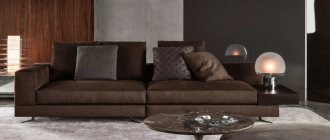
Chocolate
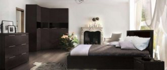
Dark brown shades are best suited for large, well-lit rooms. There should not be a lot of it, so as not to prevail over light tones. Even very dark walls in combination with white stripes or spots have a calming effect on the human psyche.
A large number of shades of chocolate color from milky to black are used by designers to accentuate attention. Using rich colors, chocolate walls, floors, ceilings, and furniture will become the center of the main composition. When designing, it is necessary to take into account that the chocolate color is close in its spectrum to black. It absorbs light. Therefore, rooms decorated with chocolate shades require good lighting. This can be artificial or direct sunlight.
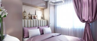
Chocolate shades are combined with: pink, orange, yellow, green, blue. To emphasize depth and richness, neutral white color is used. Like brown, it is most often used in the following rooms: living room, bedroom, bathroom.
Dark chocolate, almost black, typical of African and Oriental styles.
What colors go well with brown?
The brown color used in accessories should always be combined with another color, otherwise you risk monotony in the interior. Furniture in wenge color, or maybe just pillows, curtains and ceramics are brown and this is how you need to “break” the colors. Walls of different colors, as well as simply colorful accessories and decorations, are ideal for this.
What colors go well with brown? It is worth combining it with colors from a light palette, preferably with the so-called “earth colors”, but also with stronger colors: shades of yellow, orange, red, coral, powdery pink, green (mint, pistachio, khaki), blue and lavender. Brown also looks great in a duet with white, cream and light beige. It should be combined very carefully with gray and black!
Combination of brown with other colors in the interior
Brown goes well with achromatic colors: black, white and gray with all shades. These neutral colors are used as background colors. In contrast, to highlight certain design details, contrasting colors to brown are used. Contrast is the brightness and saturation of a certain color. For example, a contrasting color to brown can be red, but not pale pink, green, but not light green. Color contrast is used in Art Deco, Avant-garde, Kitsch, Pop Art,
Combination of gray and brown
Gray color is neutral in relation to other colors and shades. He can only create the background and never plays the main role. Thanks to its neutrality, it does not put pressure on the eyes and allows them to rest. Brown spots of furniture and other interior elements stand out perfectly against the gray background.
When designing an interior design, you should keep in mind that gray comes very close to black. Psychologically, a person instinctively rejects everything that comes close to black. The overwhelming presence of gray can have a depressing effect on the psyche. Therefore, designers try to dilute the gray color with brown. This could be a picture in a brown frame or other interior elements that stand out against its background.
White and brown
White color reflects the sun's rays and, as it were, expands and enlarges the space. Narrow stripes of white floor and ceiling plinths and trim outline the contours of the room. White walls create a feeling of cleanliness and sterility. Against their background, all shades of brown look great, from light tones to dark, chocolate shades turning into black. However, do not overdo it with white, so as not to create the feeling of a hospital room.
White color also has its own shades. When designing, preference should be given to white with a cream tint.
The combination of white, brown and black in the interior of the dining room
Beige and brown
Beige color is chosen by calm, confident people who love solitude. Designers choose its shades for the background. Very often people subconsciously choose it to decorate their bedroom. It goes well with brown and its shades: baked milk and ivory, etc. A very good combination with dark brown doors or furniture. Designers often use smooth transitions from bright beige to sandy or light brown.
Blue and brown
The color blue has a positive effect on the human psyche in bright and deep colors. There shouldn't be a lot of it. The main purpose of blue is to dilute brown tones and midtones. Psychologists say that blue color has a calming effect on the central nervous system. It’s not for nothing that everyone wants to go to the blue sea in the summer.
Blue and brown
The nobility of blue has been preferred since ancient times. This color is most loved by creative people prone to deep experiences. They love peace and solitude for reflection. Blue and its shades have the ability to increase space and are used in both large and small rooms.
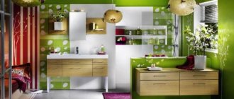
Green and brown
Green color and its shades symbolize nature and have a calming effect on humans. Light green tones visually expand the space. It can be used as a main one with the addition of brown. It can be the main thing in the interior and there is no need to try to diversify the room with different shades of green. It is the brown color, having many different shades, that will dilute the greens. Most often this color is used in the interiors of the bedroom and living room.
Red and brown
Red color in combination with brown is inherent in natures with leadership traits. They are tenacious and persistent in achieving their goals. People who choose red have a dynamic character and do not sit still. This color stimulates their physical and emotional strength.
Shades of red-brown combinations are characteristic of eastern peoples in the design of their homes.
Red as the color of victory was respected in the Middle Ages in the chambers of royalty. Luxurious apartments with red shades are still in fashion today.
Brown is a related color to red and burgundy, pink and lilac shades go well with it.
Pink and brown
Pink is a diluted red. Its property is to reduce and neutralize aggressiveness and promote relaxation. A room in pink tones creates a feeling of comfort. Relaxing in pink apartments allows you to forget about anxious thoughts, relieves worries during mental crises, and increases your optimistic mood. Medicine claims that pink color lowers blood pressure and heart rate. There shouldn't be too much pink. Its main task is to dilute the dominant color into zones.
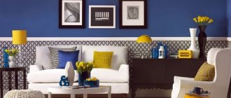
Yellow and brown
Yellow turning into gold and brown in combination with blue are characteristic of classic and modern styles. It does not tire, but rather stimulates the central nervous system. The interior in yellow tones activates mental activity. It is best suited for decorating children's rooms in combination not only with brown, but also with other colors.
Brown is the most versatile color and goes well with almost all colors. It can be both main and secondary in interior design.
Variety of shades
The richness of the shade range in this case can satisfy any taste:
- Classic tone;
- Sand;
- Walnut;
- Chocolate;
- Coffee;
- Wenge;
- Chestnut.
A variety of shades in one room is a good solution.
And this list is far from complete. These shades reflect the naturalness of colors and closeness to nature.
It can be selected for any room:
- The dark brown interior of spacious rooms will be very suitable if they have sufficient lighting. Rich dark tones are perfect for emphasizing individual furnishings in a room, or highlighting individual architectural details. If you make this background the main one, then light furniture, plumbing fixtures, and decorative elements will look great on it.
- Light coffee tones are well suited for small rooms. They will make them more voluminous, visually expand the space, and add airiness to it.
- Shades of milk chocolate finish will create a cozy and relaxing atmosphere.
The natural beauty of these shades is reproduced in many natural materials:
- Wood - here you can see the whole palette of these colors: from light, slightly brownish tones, to dark chocolate, almost black.
- Stone - having a variety of inclusions, this material also amazes with a variety of coffee and sand tones. The relief of the texture only complements the beauty of the material.
- Fabrics - each type of textile product in brown looks different: delicate silk, fluffy velvet, gabardine relief. They are used not only in finishing furniture, bed linen, and curtains. You can use the fabric to decorate walls, accessories and various decorative elements.
- Leather has a magnificent shine if it is made in dark colors. The light tones of this material look very elegant. They will look great against a contrasting background of walls or floors.
- Glass, mosaic, and stained glass are perfect for use in this color scheme.
- Metal - a combination of shiny or matte metal parts with dark chocolate colors is successfully used in high-tech style. But the classic design also welcomes these elements.
The combination of brown color in the living room interior
By varying different shades and color saturation, you can achieve a stunning effect in the design of the room. In addition to using it in decoration, furniture and various accessories in brown tones are also used.
Photos of interiors in brown color
Brown combined with cool colors: blue and green
Blue and green are calming natural colors. When combined with brown in the interior, they create a feeling of natural harmony and balance. This combination is perfect for people who value comfort and tranquility in this hectic world.
Also read: 30 green kitchen design ideas