General palette and accent
Not everyone understands what color accents are in the interior. These are paints and their shades, which are used in very measured doses in order to dilute the monochrome of the overall palette or support the theme of contrast. Let's say the walls in the bedroom are painted a warm ivory color, the ceiling is simply whitened, creating a calm overall tone, and then it is diluted with bright splashes in the form of a blue rug thrown on the floor or a light curtain of the same color hung on the window opening.
At first glance, it seems that diluting the overall palette is quite simple: to do this, you just need to add a different color to the interior design. But only an experienced designer knows how to choose the right one. The overall effect will depend on the choice. There are universal combinations that help achieve the desired result.
The combination of soft shades helps create a gentle, muted interior Source avatars.mds.yandex.net
First - warm and cold colors
Interiors that have a common palette - sultry, hot tones of peach, orange, yellow, red, terracotta - look beautiful. Dilute them with cool shades of blue, green, purple colors and get the perfect picture. The photo shows that blue color accents in the interior emphasize the warmth of the atmosphere and, at the same time, slightly cool its ardor.
Combination of warm and cold colors Source avatars.mds.yandex.net
Second - additional colors
Back in the nineteenth century, the French artist Eugene Delacroix invented the “golden triangle,” which made it possible to systematize all shades of the spectrum. On the top of the corners he placed three main colors: red, yellow and blue. On the edge I placed the colors that are formed when two primary colors are mixed. For example, if you mix blue and yellow, you get green.
Changing the proportions of colors when mixed gives new halftones. Later, artists drew a circle around the triangle and laid out the entire palette into many shades. So, in order to bring life and energy into the interior, you need to use a color that complements the overall scheme as an accent. It will be located in the circle below, opposite the main one.
Color wheel with shades Source medmarketing.ua
Studying this diagram, it becomes clear what color the accents in the green room should be (purple or red). This choice is considered bold, so it is more suitable for decorating living rooms, playrooms, and dining rooms. But in the bedroom you should avoid such decisions. Here it is better to use the following color combination principle.
See also: Catalog of house projects for which painting is used for decoration
Third - paints selected by analogy
Such combinations are considered ideal for creating a calm, measured atmosphere. Here, as an accent, a color is chosen that is in a circle next to the color of the general palette, the background of the interior, or next to its second companion. So, for example, in a peach-colored bedroom, textiles in berry shades may appear. They will not disturb the general harmony and will not disturb the peace. Therefore, this is the best solution for decorating rooms intended for relaxation.
Peach and berry shades Source assets.metrolatam.com
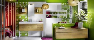
Fourth – a bright spot on a neutral background
Most of us like monochrome interiors, made in calm neutral colors (shades of sand, cream, white, gray). Any bright color will suit them as an accent. This design option is usually chosen by lovers of minimalism, Scandinavian style, and hi-tech.
With little effort, each time changing the color of bright colors, you can create a new mood. The photo shows how the white interior with bright accents of orange-red colors transforms and becomes more expressive. The background dominates in number, but it is the second companion that takes the spotlight. It creates the atmosphere of languid autumn.
You can introduce several colors into the design of a room at once. It is important that accents of different tones combine with each other in terms of saturation and brightness of colors. Pale blue goes well with lilac and pistachio. But it doesn't go well with the dark purple shade.
Bright colors on a neutral background Source roomester.ru
See also: Catalog of companies that specialize in facade materials and related services
Color accents in the interior
It's easiest to highlight something with color. You need to choose the most noticeable option for a given interior and add just a few elements of this color so that it becomes an accent rather than an auxiliary one.
However, it is not always worth looking for a bright color. After all, the room itself can be quite saturated: green, blue, purple. Then the accent will be white or any light pastel shade. The main thing is to choose a contrasting color compared to the overall color of the room. You can also enhance the effect if the room is dominated by cold shades, and the emphasis is on objects in warm colors, or vice versa.
Color can be used to highlight some of the furniture, textiles, decor, and lighting fixtures. For example, in a gray room put a yellow vase on the table, around the table there are chairs with yellow walls and in the picture there are panels in the same color scheme.
Approximate proportion of colors in the interior:
- 60% main;
- 30% additional;
- 10% accent.
To attract attention, you need to choose a color other than the main one. Otherwise it will be an additional tone, not an accent one.
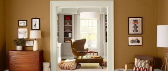
How to maintain balance
The Golden Triangle helps you learn how to combine primary colors and their shades with each other. But there is one more rule that allows you to create harmonious interiors. Designers know that the general palette and background for further design should occupy 60% of the space in proportion. He is the undisputed lead singer. Usually they paint walls with it. 30% is a companion to the main color. Usually it is a light or dark shade. And only 10% is allocated to bright accents in the interior.
If this formula is applied to the composition of the output look of clothing, then 60% is a jacket, 30% is a shirt, 10% is a tie. If we can transfer this principle of distribution to the design of living space, it will become as comfortable as possible.
Ideal color ratio Source yandex.ru
What are accent colors for?
Accent colors are so called because they highlight certain details. The first, and most obvious, is a call to action. Conversion action is what you want to get from your visitors, so encourage them to do so. CTA elements should be noticeable at first glance. Typically, a navigation menu occupies the top position on a website, allowing visitors to easily navigate the site. Colors can enhance the exposure of a menu. Using a primary color here is dangerous because it will blend with most of the page. Therefore, an accent color is very useful here. Many users go to the site to search for contacts.
Therefore, it is advisable to place contact information in the header and highlight it with a bright accent color. Also use the power of typography - information should be typed in a larger font. If you have a background photo gallery with scrolling arrows or a scrolling site navigation, you need to prioritize your scroll buttons. By highlighting them with color, you make it easier for users to access your web page. Game and interactive interface elements on the site are used to attract the attention of visitors. They influence the user experience and behavior of users on a website. Whatever you're creating (original shapes, animations, original captchas in the form of a quiz or small game, etc.), it would be ideal to do it in your accent color.
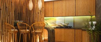
Where, what to place
Various objects can act as accents. Usually these are dishes, figurines, pillows, photo frames. This may include carpets, pieces of furniture (poufs, armchairs, headboards, chairs, parts of kitchen facades).
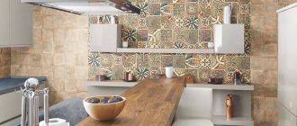
One of the four walls in the room, all of it or just part of it can become an accent wall. Usually such bright accents appear in the interior of the living room (a television zone or an area is highlighted, next to which upholstered furniture is then placed). In the kitchen, a kitchen apron often acts as an accent.
You can highlight something with a different color using fabrics (curtains, covers, bedspreads, tablecloths, napkins). Their color should be chosen at the stage of choosing the shade of the walls, floor and ceiling. But even after renovation, if you want to completely transform the space in a short time, it’s easy to buy bright bedspreads, pillows and blankets, curtains and carpets for the room. They will fill the room with comfort, create a positive atmosphere and distract attention from stale renovations.
Apron in the kitchen as accents Source avatars.mds.yandex.net
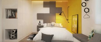
Bright colors in textiles
The interior of the apartment is made in various styles. Bright colors can sometimes help to dilute a restrained design so that it sparkles with new colors. Those who are not ready for radical changes are advised to pay attention to textile products. They will help create different moods and do not require special expenses.
view album in new window
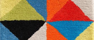
In a room decorated in neutral colors, multi-colored rugs, rugs, and pillows will look great. When creating bright accents, you need to pay great attention to detail. In a monochromatic bathroom or kitchen, you can use multi-colored towels, potholders, shower curtains, etc.
Particular attention should be paid to curtains. They are selected depending on the style of the room. But at any time, textiles can be replaced with brighter colors, depending on your mood.
view album in new window
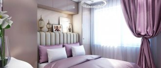
A multi-colored carpet can become a bright spot in the living room or bedroom. When choosing a textile product, you need to pay attention to the fact that its color is close to the style of decoration of the room. Colorful sofa cushions, blankets and bedspreads are appropriate in the living room. In the bedroom, quality bedding will help add color.
view album in new window
Briefly about the main thing
Color is the basis of the interior; it can decorate it and make it comfortable to live in; it can create an atmosphere in which a person cannot stay for a long time. Therefore, the choice of palette must be taken extremely responsibly. Typically designers use two rules for this. One is the volume distribution fraction. According to it, accent colors are allocated 10% of the overall format. The second is choosing companions using a circle. The best combinations are created by tones that are on the opposite side of the chosen color palette.
Ratings 0