» Pink colors » Hot pink color and combination with it
Hot pink is not a spectral color, but it can be extremely bright in its medium light value. Like any bright tone, hot pink amazes with its expressiveness and glow, which sometimes causes irritation. Regarding truly cold colors (such as blue, white), it is closer to warm, but in the line of pink shades it leans towards the cold side of fuchsia. Fuchsia, in turn, comes from purple. Hence the meaning of bright pink, as feminine royalty, patronage, self-confidence, at the same time inflated self-esteem, and also the lack of objectivity that pink as such carries.
In nature, such coloring practically does not occur, which suggests that it is a cultural product. It’s not for nothing that hot pink is often associated with the glamorous trend of advanced youth. This desire for novelty, the desire to stand out, to lead, advises a fragile psyche and viewing everything through the prism of limited experience. However, it is possible to use this tone meaningfully, and not at the call of an impulse. Color focuses attention on itself, making you feel protected. It also provokes sexual sensations, which is good for show business. The ability to correctly evoke the right emotions is an art, and hot pink is a powerful tool for this.
The combination of hot pink in palettes
bright flower
Flowers are one of the sources of bright colors, including pink, but its perception depends on the quality of lighting. Hot pink with a purple border is a magnificent embodiment of a harmonious natural combination. The composition also includes such shades as white-lilac, fainting frog, thunderstorm, dark chestnut.
Rose gold oxfords
Shoes, like a work of art, are designed to captivate the imagination. Such oxfords look festive, you won’t be ashamed to go on stage in them, and the chic combination of glowing pink, discreet gold and burgundy color is impressive even without the wearer of this item. The palette is supported by colors such as white-gray, light yellow-beige, yellow-brown, golden chestnut.
Pink fog
It is unlikely that you will see such a picture in real life, since it is a product of the imagination of the artist and photographer. Of course, the sunset rays reflected in the fog will give it a pink glow, but it will not be as intense. The unreality of this phenomenon gives the picture a distinct color aesthetic! The range is created in the following tones: carnation, hot pink, purple-pink, berry, wormwood, eggplant, black.
tree flower
This palette is also a product of creative perception and color processing of photography. This is a strong contrast of warm hot pink and cool blue-green tones, everything else is supporting details. The combination is made up of light grey-green, light blue-green, hot pink, fuchsia, golden chestnut, indigo and black.
Combination of pink and classic shades
Pink is a complex color, so it does not go well with all shades. Let's list the most interesting and successful options.
See alsoPartitions in the interior as a method to correct the errors of an unsuccessful layout
Pink-black
The most popular bow among famous designers. In the last 10 years, this combination has become a classic. A little gilding would be a great addition. Perfect contrast is achieved by contrasting colors. Black symbolizes seriousness and maturity. Pink - lightness and serenity. By combining these two colors, the image will be bright and provocative; thanks to the dark shade, the woman will not look like a teenager.
Combination of pink with other colors in the interior
Modern apartment design in pink combined with other colors
Room interior in pink color
Pink color in the interior in combination with other shades
Apartment design in pink combined with other colors
See alsoHow to apply mint color in the interior
Pink-white
Also a favorite solution among many designers. Both shades are associated with childhood, little girls, and innocence. The combination of pink can be complemented with silver and ivory. In this case, shoes, sandals or a handbag can be white. This color scheme is often used to decorate clothes for babies, children's cosmetics, and toys. But even a girl over 20 can afford this combination in her wardrobe. Most often these are summer, lace items. White is the background, pink is the drawing.
See alsoCreating a “masculine” interior
Pink-red
Artists know that in order to get pink, you can lighten the red, so they can safely be called analogues. The combination of these two shades will be successful if the red is very rich and the pink is warm and light. To prevent the image from being too flashy, it can be diluted with accessories in gray, beige, and white colors.
See alsoHow to make a staircase an interior decoration for your home
Pink-beige
A traditional solution that can be used daily. Can be complemented with an ashy shade.
See alsoFloral wallpaper in the interior: new design trends
Pink-blue
You can add cream or silver details. This combination of pink color is characterized by comparison with spring, youth, and romance. Incorrectly selected variations will look childishly ridiculous. It is better if there are three of them in clothing items.
Combination of pink with other colors in the interior
Modern apartment design in pink combined with other colors
Room interior in pink color
Pink color in the interior in combination with other shades
Apartment design in pink combined with other colors
See also Canons of contemporary style in the interior
Pink-brown
For clothing, brown shoes, trousers or a sweater are suitable.
See alsoHow to apply yellow color in a modern interior
Pink-blue
Two rare and contrasting colors. They look especially good in festive outfits. Classic blue goes well with pink and gray.
See alsoInterior of a country house: which style to choose
Pink-lilac
The right combination of pink in this case can make the image magical and alluring. Suitable for creative, unique individuals. Warm shades of lilac look especially beautiful with pink.
See alsoAquarium in the interior of an apartment and house
Pink-gray
Goes great with silver.
See alsoThe originality of the Spanish style in the interior
Pink-yellow
This combination of pink creates a very feminine look. It represents youth and innocence. To make the combination a little more serious, you can dilute it with details of blue, green and brown.
Pink-lilac
A very peculiar combination that needs to be diluted with details of classic shades: white, black, beige, gray.
Combination of pink with other colors in the interior
Modern apartment design in pink combined with other colors
Room interior in pink color
Pink color in the interior in combination with other shades
Apartment design in pink combined with other colors
Pink-green
This combination of pink color is characterized by a fresh and romantic image. The woman looks very feminine and airy. When combining these two shades, the main thing is not to overdo it with the brightness of pink. For example, combine warm colors with warm ones (pink-pistachio), cold colors with cold ones (salmon-herbal).
Pink-orange
The combination of these colors is not suitable for everyone. Only daring, self-confident people will decide on it. Not a single summer collection of famous designers is complete without this combination. It can be further diluted with black, white, and red.
Pink-red
For this combination of pink, they are suitable for festive, shocking outfits. In everyday life, only pale pink + burgundy contrast is used. To make the look more calm, you can add white, blue, or gray accents.
If you place accents correctly, the pink color can be diluted with brick, yellow, green, and blue.
You need to be very careful with pink accessories. The brighter they are, the smaller the decoration should be. When choosing, designers recommend giving preference to raspberry, light pink and powdery shades. It will be enough to match the hat with a bracelet; pink sandals or shoes do not need any addition, as does a bright belt.
Despite its tenderness and frivolity, pink is suitable for women of any age, the main thing is to choose the right combination.
Combination of hot pink with other colors
Hot pink color combines richly and brightly with other colors. He can choose to pair with the same vibrant colors as himself, or maybe paler ones - then we see a bright contrast. Dark shades look just as good with it, but neutral tones that do not argue with the shade, but calmly give it primacy, are especially attractive and noble.
The combination of hot pink and pink is a range made up of shades of the same color. Additional pink tones will help the main one increase its expressiveness, achieve vibrant shine, volume, and place accents. The palette consists of carnation, sunset pink, fuchsia, purple pink, and crimson.
Combination: bright pink and red , significantly shades the latter. This tone may look like a cool shade of scarlet: this is the result of their comparability in brightness and the presence of the red spectrum in hot pink. There is also a slight warm-cold contrast. The range lies in the tones of coral red, port, ruby, bright burgundy, and wine.
Hot pink and orange combine to create a striking, fashionable pair that is designed to surprise with its warm-cold resonance. The shades can be of the same brightness and lightness, but it is advisable to dilute them with neutral tones, for example, white. Consider paring for a base tone: light peach, coral orange, burnt orange, red-orange, red.
The combination of hot pink and yellow is light, rich, frivolous. This festive combination maximally emphasizes the feminine expressiveness of the main tone. The palette includes pale yellow, sunny yellow, corn, bright gold, amber.
The combination of bright pink and warm green could be called natural, but it is exaggeratedly bright for nature. The composition includes light green, chartreuse, light green, moss, and pine needles. The combination is expressive due to the proximity of hot pink to red, which is complementary to green.
Hot pink and cool green are a colorful combination based on the difference between cold and warm. Through it, a sense of balance and harmony is achieved. The combination includes neon green, jade, mint, emerald green, malachite.
The combination of hot pink and blue is similar to cool green, but this pair is more pronounced in its contrast: blue is the coolest shade. Rich, pure tones of blue successfully support the main color, for example, paired with aquamarine, bright blue, turquoise, blue-violet, indigo.
The combination of hot pink and purple also applies to combinations with similar colors. The contrast of the pair lies in the difference in brightness and lightness of the colors. The main tone glows against a background of purple shades. The range is composed of blue-violet, lilac, purple, red-violet, and grape.
Hot pink and brown are a combination that reduces the flashiness of the first: shades of brown add elegance and harmony to the couple. Contrast is based on the difference between bright and complex, muted colors. The composition includes camel, yellow-orange, red-brown, chocolate, and dark chocolate.
Hot pink and neutral are combined in a contrasting combination of saturation and lightness. Tones such as white, gray, black are an ideal pair for very bright tones, of which hot pink is no exception. Consider combinations with creamy, papyrus, light gray, anthracite, black.
Shades of pink in the interior
Shades of pink in the interior can have a wide range of implementations. Particular attention should be paid to salmon and coral tones. They have an additional range of orange and brown colors, allowing you to create a noble and dignified appearance for any room.
In the design of the new generation, they occupy a leading position and often become the main color scheme in an apartment or house. Carmine or carmine tone is a combination of brown and red. It is he who has richness, style, depth.
Quite often, “he is a welcome guest” in interiors where English, European or French classics are present. A house designed in an antique or retro style must have this tone in its design.
Pink color in the interior can also be represented by variations of fuchsia or cherry, which will very well decorate the interior where a large family lives with different generations and views.
They can be diluted with pastel and even cold shades without any problems. They will allow you to correctly highlight the main rich color and make it the main color accent throughout the house.
Girls' or children's rooms can be decorated in pink, which resembles the color of sakura petals. Not only bedrooms, but also offices, dressing rooms, and boudoir spaces would be appropriate.
There are also shades with a lilac tint that resemble the color of lavender. This shade will be an excellent solution for decorating a bedroom, living room or kitchen. He is very calm and pleasant to perceive. An excellent combination with it would be yellow and white.
Ultra pink color and its combination
This shade of hot pink borders on purple. It can also be described as the coolest bright tone of pink. All shades of hot pink will lie between this tone and the main one. They are like two poles of possible extremes. Surprisingly spectacular, luminous, unforgettable. Ultra pink is a demanding tone. Everything should be perfect in what it was placed on: satellite colors, shape, skin tones. Any shortcoming against its background will be noticeable, but if everything is of the highest standard, then everyone will notice and appreciate it.
Combine ultra pink with sakura, orchid, classic red, peach, fiery, orange-yellow, apple green, kelly, bright blue, blue-violet, violet, grape, bronze, white-cream, anthracite.
Combination of pink with other colors
Most people associate the color pink with little girls, frills, and cute trinkets. But, if you look at it more broadly, the shade of pink is quite complex, as it has many variations. All of them, when combined correctly, can look quite impressive. One shade looks cold and noble, the other warm and gentle.
There is an opinion among psychologists that people who have pink items in their wardrobe are very vulnerable and impulsive individuals. According to mythology, the goddess of love Aphrodite loved him very much.
Combination of pink with other colors in the interior
Modern apartment design in pink combined with other colors
Room interior in pink color
Pink color in the interior in combination with other shades
Apartment design in pink combined with other colors
Hot pink color in clothes
Bright pink in clothes and does not suit everyone. In addition to the fact that it is catchy and elegant, it also has negative sides: it makes the tone look fuller and enhances skin defects. Therefore, you should be very critical of yourself in choosing it, so as not to harm your appearance. This shade is suitable for representatives of the “spring” and “winter” color types. Their clear skin tones will not spoil the brightness of this shade, but on the contrary, it will emphasize the warm skin tone of “spring” and the contrast of appearance of “winter”. This shade is definitely festive. It is unlikely that you will be understood if you wear a piece of clothing to work. It tones, excites, encourages active action. In clothing, it symbolizes self-confidence, leadership and femininity.
Combination of pink color in the interior
In order for this tone to perfectly decorate the room and set a special mood in it, you need to delicately and correctly select a range of other colors that will be appropriate and harmonious in tandem. What colors does pink go with in the interior ? Let’s take a closer look.
- Grey. The most competent and stylish color that can balance with any pink shades. It is quite delicate and stable, which allows you to create a win-win design option for absolutely any functional room. Living rooms and bedrooms for teenagers of both sexes will be very successful.
- Green. You can combine these two colors in absolutely any combination and technique. At the same time, green can be absolutely anything - from mint to pine tones. The finished range allows you to combine absolutely any room, diluting your combination with milky and pastel tones.
- Turquoise. This color is the most successful combination of blue and green. The color of the sea will complement any pink motifs in the house. Most often, their duet is used when decorating a room in modern, retro or classic style. They can be complemented by a chocolate tone, which will perfectly highlight these two bright accents in the room.
- Brown. With its help you can emphasize only some shades of pink, but the main thing is to find the right color combination. Sometimes corridors and living rooms are decorated with such unions. In the bedroom they will look quite rough and aggressive.
- Designers very rarely try to put blue and blue in one combination. This happens only in cases where the design lends itself to a children’s room in which both a boy and a girl live. At the same time, they try to dilute their duet with green, gray or white to visually harmoniously connect them with each other.
- Black and white are classic neighbors of all pink tones. However, in order to avoid the “confectionery shop” effect, they must be complemented with one, or maximum two completely different tones. However, white should not be taken literally. A good solution for the neighborhood would be: milky, pearl, beige.
- Red color is not the best solution for those who want to diversify the pink color scheme in the room. Both colors are quite close to each other in visual perception, so you should combine them quite carefully, going through many options for the final design.
Wardrobe selection with hot pink
A stylish bright contrast is achieved with a combination of hot pink and black.
And if you add white to this pair as part of the border pattern, the effect will be amazing.
Gray softens the contrast, but brings the main color to the fore.
White in combination is freshness and lightness. Such a couple improves mood and creates an image of infallibility.
Beige gives style to a bright, sometimes even vulgar color.
Brown supports color.
Combinations with red and orange will be exotic and elegant.
Yellow enhances hot pink. The combination is intense and eccentric.
Blue, like the color of water, refreshes the main color and gives it tenderness.
Green - enhances the saturation of the tone.
Blue - adds severity.
Soft pink tones smooth out the harshness of the main shade and add more femininity.
Purple makes hot pink “glow against its background.”
Where is pink most appropriate?
Bathroom
Quite often, various shades of pink are used in bathroom decoration. True, in this case, the best addition to pink would be a lilac, peach, light raspberry or gray-blue shade. Decorating the bathrooms with mirrors would also be a good idea.
Note: the pink color in the decoration of bathtubs gives the skin a special, pleasant tone, which means you will want to look in the mirror again and again.
Pink color in the bathroom
Kitchen
Pale pink color is no less popular in kitchen design. Such a wall interior is conducive to soulful tea parties and increases appetite. In addition, pure pink appliances and kitchen furniture are ideal for a retro-style kitchen - the result will be a very “joyful” and “lively” kitchen.
Pink color in the kitchen
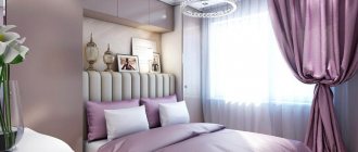
Bedroom
The color pink and its various shades would be quite appropriate in the bedroom interior. And if you choose a pink color close to peach or muted ash-pastel colors (for example, not bright wallpaper), even a man will be happy to live in the bedroom.
Pink color in the bedroom
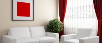
Living room
When it comes to decorating a living room, the best combination is pink and lavender. A delicate pink shade of the walls in combination with mint will give the room a bourgeois pomp, but quite moderate. If you add gray-blue tones to pale pink, you can get a very feminine room.
Important: the use of pink in combination with orange will fill the living room interior with the energy characteristic of Indian style.
But still, the most optimal solution is to create a general background for the living room in a cold, light pink color, complemented by furniture and accessories in warm shades, for example, gray-white, brown or beige-cream. And vice versa, if the wall design is made in rich shades of pink, then the furniture and decorative items should be different - light, light coffee or white.
Pink color in the living room
Accessories
When decorating the interior of a bedroom, living room or kitchen in pink, of course, you should not forget about various accessories. Here, by the way, the choice is not limited - soft pink decorative items will ideally complement absolutely any room, no matter what style they have. An interior in light pink tones with original textiles will look very advantageous: white and pink bedspreads, curtains, rugs, etc.
Pink paintings and other interior decor
A pink accessory will easily refresh even the most seemingly “uninteresting” room.
When decorating the interior in a pale or pure pink color, it is not at all necessary to make it the main color. Sometimes it is enough to use pink shades as additional accents.
Pink dining room accessories
Interior with different shades of pink Pink elements in the office
Hot pink in the interior
Choosing this color for the interior is a bold move. However, in skillful hands it can become a stylish solution, especially in a modern interior with a coloristic twist. The one-basic rule for its use is moderation. Neutral shades are always added to it: white, beige, gray. A good addition would be soft purple tones. By painting the wall bright pink, you can advantageously place interior items or accessories against its background, which will emphasize their shape (with an advantageous difference in lightness) or their colors. For example, green against such a background will be very juicy, yellow will fill the entire setting with sunshine, beige and gold will shimmer with luxury. We should not forget about the irritating influence of this tone on the psyche, so it is worth seriously weighing the pros and cons. The color is suitable for rooms intended for relaxation.
VIEW COMBINATIONS WITH OTHER SHADES OF HOT PINK (click on color)
Pink color in the interior of an apartment - features
Our generation has long grown up with a clear imposition of labels, stereotypes and frameworks, according to which this or that phenomenon has already formed the opinion of society. This also applies to pink in general. Now it is the embodiment of something girlish, tender, childish.
The concepts of masculinity and strength are completely incompatible with it, according to the majority. Is pink only a color for young girls' and girls' bedrooms? Let's take a closer look, is this really so?
Pink takes its base from red. That is why he is able to carry positive energy, tenderness, warmth and comfort. Psychologists say that such a range can have a beneficial effect on the human psyche, calming him down without causing aggression or anger.
Therefore, you can safely use this color in your home without fear for the overall harmony and aura of friendliness and love of your room.
The color will be appropriate where people spend a lot of time together - with family, significant other or friends. With him you can forget about any troubles and conflict situations.
Pink will also not hurt in a children's room, no matter whether it is a small child or a teenager. It will create a feeling of protection and tranquility in the personal space of the little resident. At the same time, you should not definitely discard pink tones only when decorating a girl’s or women’s bedroom.
With proper design, it can easily be played in small quantities in absolutely any room of an apartment or house.
You should not categorically perceive pink color in the interior in the spectrum of a “Barbie doll house.” In addition to bright and irritating shades, there are a huge number of calmer and softer tones of this color scheme that will go perfectly with any other color scheme in the house.
Today you can find a rich palette and many beautiful options for this color that will delight a person of any gender who is undertaking a renovation.