Which shade of green should you choose?
Color appears when yellow and blue are mixed, and its shades differ in the saturation of one or the other tone. At the same time, black is added to dark ones, and white is added to light ones.
Recently, rich, deep tones have gained great popularity:
- malachite;
- emerald;
- needles;
- turquoise;
- nephritis.
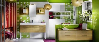
The photo shows a stylish spacious kitchen
Armchairs, sofas, poufs, headboards and other soft elements in dark velor upholstery look noble and elegant. Deep shades of green in the interior look no less impressive on visually smooth matte surfaces. You can't go wrong with contrasting white.
Light colors give a feeling of freshness, cheerfulness, and fun. Unsaturated olive, mint, pistachio, and lime are even used on the walls, but a bright green room will look too much—poisonous tones are only allowed in details.
The photo shows a yellow-green combination
A separate group includes gray-green shades: asparagus, marsh, camouflage. Complex green tones are appropriate in any interior: from classic to modern. Walls, large furniture, and textiles look good in these neutral shades.
The photo shows an example of combining different tones
Complex combination with white and green
- with a yellow-green color (2). These shades contrast in saturation. Yellow-green is similar to white-green in lightness and even tone, but due to the difference in their intensity, the eye completes intermediate colors, which, in fact, we do not see.
- with denim color (3) - a bright contrast of light and dark. By themselves, green and blue (borderline colors on the color wheel) give an unrealistic combination, also with the effect of complementing the intermediate shades. In this case, blue is much darker than white-green; they create a clear border that can be used to emphasize the shape of objects.
Add white, pale pink, bronze brown and navy blue to the mix.
The best combinations of green with other colors
In fact, what color goes with green in the interior depends on the shade of green. Let's look at the main tandems.
Interior in gray-green color
Gray is universal in itself, so it will suit any occasion, no matter what green shades of the room you choose.
A win-win rule is to combine dark with dark. Wet asphalt or graphite with emerald. And for light mint or salad, on the contrary, choose Gainsborough or platinum.
Typically, grayish walls act as a backdrop for bright greenish furniture.
The photo shows accents in a gray room
Blue-green interior
The green color in the interior in combination with blue becomes colder, keep this in mind when decorating the room. A room designed in these shades does not tire or irritate; on the contrary, it promotes relaxation and gives the eyes a rest.
Advice! Use blue-green colors in the kitchen if you set yourself the goal of losing weight or maintaining weight. This palette reduces appetite.
In the bedroom and children's room, blue in combination with pale green promotes quick sleep and quality rest.
The photo shows bright blue details in the living room
White-green color
Universal white is suitable for shades of any saturation: pure. dusty and dirty, light and dark. But it looks best in contrast with a bright or deep color.
White, like gray, becomes the background - decorate the walls and large details with it, and add accents with green furniture and accessories.
The photo shows an accent wall in the bedroom
Green with brown tones
It is difficult to find a more natural combination of green with other colors than this. Look at any tree or plant and you will see how the shades harmonize perfectly with each other.
The best duet is formed when using a complex undertone: olive, emerald, malachite, asparagus. Brown, however, is better to take dark: chocolate, coffee. But even with light beige the combination will turn out to be interesting.
The photo shows soft green kitchen facades
Black and green interior
Dramatic black enhances any other, an effect known to any artist. So if you want maximum contrast, use it as a background.
The combination with green looks exotic, reminiscent of the jungle, and repeats the colors of some reptiles. Looks great with both bright lime and grayish viridan.
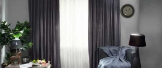
The photo shows a black bed and curtains in the bedroom
Examples with bright accents
The duet of green with other shades is dictated by the color wheel:
- The analogue combination of similar green and yellow in the interior looks bright, summer-like, reminiscent of juicy ripe fruits, and breathes of revived nature. Will fit perfectly into the design of a veranda or country house or cottage.
The photo shows a bright unusual combination of shades
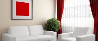
- The contrasting duet with red is energetic, invigorating, lively. If you don’t want the interior to be oppressive, use scarlet in limited quantities, it should not be enough. At the same time, do not forget that the darker the green, the deeper the red should be.
- Tandem with purple can also be called complementary. A combination with yellow-green shades - citrus, chartreuse, lime, pear - will look more harmonious.
Green color combinations in the kitchen interior
Green is very appropriate for the kitchen: it is not annoying and pleasing to the eye. The classic solution, as in the case of the bedroom, is to combine a light green shade with white. It is possible to add gray elements for a smoother color combination.
Photo:
A white and green kitchen will be in harmony with natural wooden surfaces. Decorate this interior with a combination of mint green color. Wooden furniture will also come in handy: chairs and a table. It is better to leave the countertops on a dark green set white.
Photo:
A light green interior can be complemented with bright details to create a more expressive and colorful look for the kitchen. Red expressive spots in the form of furniture or lamps are suitable. If you want to avoid oversaturation, place items with dull shades in the interior; in the photo below these are pale green curtains.
Photo:
The combination of green and black is interesting. You can use a dark glossy set, and decorate the walls in white and green. In the corner, where there are more green shades, it is better to place light wooden furniture.
Photo:
How does it look in different styles?
In the last few years, green has won the hearts of many people and has found its way into many interiors.
- Scandinavian. Noble shades of precious stones are used. Combined with white or light gray walls, as well as furniture and flooring in a natural wood shade, the result is a trendy design.
- Loft. A muted color like kale pairs perfectly with orange brickwork, which is why it is often used for furniture in industrial apartments.
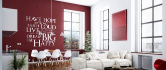
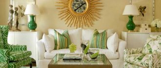
The photo shows an example of classic American style
- Classical. Adherents of the classics prefer non-contrasting combinations of warm beige and light green. Used for curtains, furniture upholstery, textiles.
- Modern. Exceptionally complex undertones, usually deepening into sea blue, matte textures. The walls, kitchen fronts, and headboards look trendy.
Green in the interior: how it affects mood
Green is the color of life and health.
I remember a cross-section of an aloe leaf - its juicy, thick, moist pulp. Grandmother made medicine from it. Anastasia Golovacheva Architect, AlexPro Studio
Green is something wild and unknown. And without this unbridled color there is no way to have a cozy home.
Blue-green interior is a symbol of constancy, perseverance and strength.
It has a calming effect on the psyche, charges with optimism, relieves irritability and invigorates. These valuable properties of green cannot but be applied in the interior.
You can hang translucent curtains with prints in the form of lush vegetation on the windows - and summer will settle in your apartment forever. Or paint the walls in a narrow dark corridor the color of a juicy apple, this will make the whole house brighter and more cheerful.
The color of pine needles, emeralds, lime and sea green: green has 367 tones in total.
Light green, pistachio, malachite, lime, olive, mint. There are many shades of green in nature! I just want to move everything into the house.
The lime color is very active - don’t overdo it, use it as accents. For example, in a bright interior, you can throw two lime pillows on the sofa. Pistachio is suitable for the Provence style in combination with lavender: it is a guarantee of a soft and original design.
Parisian passions: the most delicate style and richness of colors.
Olive gives a feeling of security. Where are you most worried? If in a nursery, then lay a warm and fluffy olive-colored blanket on the bed. If it seems lonely in the attic, then repaint the floor and walls in this area.