The color orange is not often present in the interior of modern apartments, but a few orange accents can make the kitchen cheerful and the gray bedroom cozy. Each design idea must be translated into a well-thought-out concept in which proportionality carries the main load in the overall balance. Orange is a rare color that doesn’t have as many shades as, say, green or brown; it doesn’t go well with cold colors. Therefore, if you want to use it in one of the rooms of your home, listen to the advice of our experts - colorists, psychologists and designers.
Orange is the warmest color in the designer’s palette, regardless of presentation and combinations with other tones
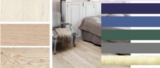
Perception of orange tones in modern interiors
Orange, like any other color, has its own associations for everyone and brings back certain memories. Many people remember the happy colors of childhood, among which, of course, there is something orange. Most likely, these are New Year's tangerines or summer apricots, bright clothes or colored candies. But orange color is applicable not only in the interior of a children's room, but also in any other room, including the hallway and bathroom, as in the photo.
This bathroom will appeal to energetic young people leading an active lifestyle.
Hallway with orange walls
When you enter a room, your gaze immediately lingers on orange objects.
Important! This color slightly distorts the actual perception of nearby objects.
In a mirror reflection against the background of orange walls, a person will seem more beautiful, fresher and younger than in reality. The same property works against the background of apricot bedroom walls, which is often used by elderly aristocrats of Foggy Albion.
Orange and green are a natural composition created by nature itself. Any shades are acceptable: olive, pistachio, mint, emerald, salad and so on
This sunny color has its own characteristics. Even if it is a “classical” or spectral color, it is used in different ways in the interior:
- in blurry tones (delicate peach);
- rich colors (tone of orange or tangerine peels);
- moderate (like citrus pulp);
- in a diluted form (with the addition of yellow, milky or beige pigment).
A light shade of orange goes well with cool blue or turquoise
Advice. Thanks to the ability to mix, use the interior paint that is available, but vary the shade by adding a different pigment or ready-made base. Blurred and diluted tones are more suitable for walls; for bright accents, you can enhance the emotion by adding red pigment.
Beige and orange are one of the most harmonious combinations. The interior looks cozy and noble
Psychologists say that this part of the rainbow spectrum, transitional from red to yellow, has many positive characteristics:
- subconsciously gives a feeling of happiness and well-being;
- brings interior objects closer visually, slightly distorting the actual size of objects towards larger size;
- draws attention to an accent wall with a piece of art with a splash of bright orange or an installation in these shades;
- warm associations, with it the atmosphere seems more comfortable, especially if there is furniture with colored upholstery;
- a painting in orange flowers in the dining area increases appetite and encourages friendly conversations;
- dosed use of orange accents in personal space helps fight depression and dark thoughts; excessive use can depress people with unstable psyches, especially in combination with black contrasts;
- The peach veil on the windows perfectly compensates for the lack of sunlight on the north side.
The duet of orange and purple is suitable only for futuristic interiors. Adding gray accents will make the environment more harmonious
Attention! Do not use a two-tone combination of black and orange in the interior, for example, in an extravagant bathroom. In nature, this is a danger signal in reptiles and insects. But this duet can be diluted with a milky or delicate beige shade.
In this bathroom, pure white color seems to be charged with the energy of orange and invigorates in the morning
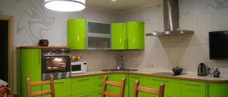
An excess of orange in the interior as the main color scheme initially activates, then tires and depletes. In addition, against the background of orange furniture in the kitchen, paler objects will be “lost.” But in a modern design, made with a reasonable use of its shades, plastic furniture and glass shelves look great. Even a small kitchen with a north window will look more spacious, full of light and air, as in the photo example.
By painting a wall orange, you will make the kitchen visually wider and more spacious.
Psychologists say that orange is chosen by extraordinary, gifted individuals. Everyone else would also do well to add a few of these accents to their interiors to make it easier to survive the long northern winter or seasonal depression. To do this, you don’t need to radically change anything or wallpaper the orange walls in the interior; it’s enough to add a few bright emotional accents to the apartment’s decor.
See also: “Fusion” style in the interior, photo.
What goes with orange in clothes?
The most popular colors that go with orange: warm blue, burgundy, brown. Color solutions with their help create excellent looks in which the clothes are in harmony with each other. There are many more colors that go with orange: turquoise, purple, green, olive, khaki, beige, pastel shades, ivory, peach, and, of course, black and white.
Orange includes red and yellow, so it harmonizes with these related colors, or rather, with their warm shades. Therefore, orange plus burgundy is a harmonious color combination, as well as very festive and bright.
Stylistic recommendations
Designers consider the orange color in the interior to be optimistic and cheerful, so it does not fit into the restrained, calm concept. Although its blurry tones in textiles or fur elements are not excluded, since its red tint is associated with fox skins.
Decorate a nondescript minimalist bedroom interior with a bedspread that imitates red fur. This is an excellent winter setting for a seasonal transformation of the environment. In the living room, add some “fur” accents in the form of souvenirs, a painting or a photo with a red-striped pet - the room will be filled with lively energy.
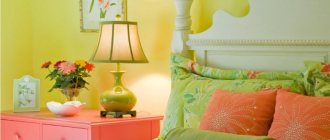
When the light comes through the orange curtains in the morning, the bedroom will be filled with a good mood and a charge of energy.
The interior of a modern style is dominated by straight lines and a single color; one of the walls can be highlighted in orange
However, there are many styles where the orange color and fur theme are inappropriate, for example, Renaissance, Empire and some historical styles.
Terracotta, as one of the warm favorite shades, will fit perfectly into country style and many ethnic interiors. A riot of colors with the participation of emerald greenery and terracotta elements is a favorite technique in Arabic-themed styles - Turkish, Moroccan. An exquisite African interior with imitation giraffe skins is unthinkable without it.
Orange bedroom in Provence style
In kitchen furniture, this color remains quite acceptable in most stylistic decisions. These are, first of all, fruit and citrus motifs that can decorate a distinctly urban kitchen interior in a high-tech or loft style, with its brickwork.
An orange ceiling will make any room unique, like this country-style home cinema room.
Eclecticism, kitsch and fusion are modern styles that rely on mixing the characteristics of different interior trends with orange walls or elements. Dosing of this range, with skillful combination with traditional companions, will allow you to avoid mistakes. For such trios and duets the following are most suitable:
- cream or white;
- light green;
- yellow-green;
- all shades of chocolate;
- beige;
- calm yellow;
- cream and caramel;
- many shades of brown;
- red wine and cognac;
- many shades of wood texture.
The black and orange combination is appropriate for the art deco style
Advice. Do not rush to experiment with cold colors unless you are convinced from photo examples that it is good. The exception is colorful textiles, without which the furnishings of a home designed based on Indian, Arab or Chinese traditions are unthinkable.
The bright facades of the orange set look beautiful in combination with white or cream wall decoration
Some people are wondering what color doesn’t go well with orange in the interior? Stylists call blue the opposite tone in the spectral circle. Many “incompatible” things can be successfully combined in eclectic or extravagant interiors, but in the classics, do not combine indigo and terracotta, shades of apricot and turquoise.
Important! Do not forget that some duets can subconsciously depress the psyche, and the living space is the place where you have to spend most of your time.
A bright and rich bedroom is an option for the brave
Professional designers manage to effectively combine it with “hostile” tones. But this connection is made successful through intermediary colors or other techniques. You can use metallic fittings, wood texture or a pale neutral wall background with an orange color in the interior - beige or pearl gray.
For lovers of avant-garde, futurism or expressionism, even acidic shades are acceptable. But it’s better to arrange bright orange lighting or decorate an interesting object, for example, a bean bag chair in a bright cover in the corner of the room. It will not tire the optic nerve if you work with your back to the object of the indicated shade.
Here orange is used as a moderate accent
Advice. In a setting, according to the principles of Feng Shui, the color orange brings freedom and creativity. Bring it to your “problem” area, be it family, children, health or finances.
See alsoAfrican style in the interior
Orange + black
Orange and black is another traditional combination. Orange neutralizes the darkness of black. And if you also add a third color to the ensemble - white - this combination will look bright, stylish and positive. Orange is not often chosen for business attire, but in combination with black it would be quite appropriate to do so. This combination looks elegant and modern.
Which furniture to choose?
Although orange furniture sets are not so often found in catalogs and on malls, buyers willingly take them apart. But this or that shade is more consistent with the decor of a room of a certain functionality.
An orange chair softens the cold and brightness of a white interior, making the room more comfortable and warmer
| 1. | Apricot | An excellent choice of furniture for a modern bedroom on the north side, the walls are milky and white. |
| 2. | Amber | A soft corner will decorate any living room. |
| 3. | Salmon | Nice upholstery for armchairs in the girls' room. |
| 4. | Terracotta | Wicker furniture for an open terrace or greenhouse with soft seats in this bloom. |
| 5. | Pumpkin | An excellent solution for kitchen facades or washable upholstery in a corner. |
| 6. | Tangerine | A cheerful color for a child's bedroom. |
| 7. | Ocher | Calm shade, the best choice for a hallway. |
| 8. | Honey | Pleasant tone for a dining room set. |
| 9. | Red (fur) | Luxurious bedspread for the bedroom or living room. |
Orange color increases appetite, so it is often used in the interior of a dining room or kitchen.
Stylish leather sofa with copper studs
Of course, these are not all the shades that could be remembered and described. If you like the motley monochromatic or leather upholstery of the sofa, buy it, but do not forget about the overall color balance. Add accessories, souvenirs, marigolds or other fresh flowers in the same range to enhance the positive.
See alsoPeach color photo
Orange shades in the kitchen interior
If you choose a kitchen set in orange, apricot or salmon color, this is a great success, don’t hesitate to buy it. The task is to decorate the kitchen with friendly colors. In priority:
- white;
- beige;
- green.
This is how orange looks in a retro kitchen
Shades of greenery can be varied, starting from light green and ending with olive and emerald. Much depends on the proportions, so if you are not sure, then do not rush to change the tiling or washable wallpaper.
Orange refrigerator
Important! The cladding of a bright kitchen set will not look good on colorful wallpaper or colored tiles. A bright background is too much; you need a calm shade, preferably white or light beige.
Orange countertop in the kitchen interior
The decor of an orange kitchen depends on the stylistic decision. If the room is in Provence or country style, you can add a decorative pumpkin in wicker baskets. In an oriental interior, elegant copper jugs and trays with juicy fruits look much more elegant.
Photo of an orange and white kitchen in a classic style
A modern interior can be decorated with panels of broken tiles, large prints or stickers with citrus motifs on plastic furniture facades.
See more successful examples of orange in the interior of the kitchen, nursery, living room and bedroom in our gallery.
See alsoGrunge style in the interior
Orange color combination in clothes
This color is more suitable than any other for color block style looks, as it combines harmoniously with any bright things. Let's take a closer look at how to wear orange clothes and the most popular color combinations with it.