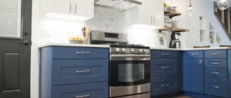
Kitchen furniture
When choosing the design for your kitchen, remember the correct ratio of the base and additional colors. Since furniture takes up most of the kitchen space, pay special attention to its colors - the final impression of the kitchen will depend on it.
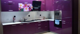
A matte set in smoky tones is considered a good solution. If you want to make your room design more glossy, use shiny surfaces. Combining them with stainless steel appliances, you can achieve a truly amazing effect.
Matte set of wooden tabletop
A popular design move is installing a kitchen island. It is recommended to make it more contrasting compared to the rest of the furniture. Another modern trend is the choice of a kitchen set without wall cabinets. This design is often used to create a Scandinavian style.
It is appropriate to purchase furniture made from natural materials - for example, wicker chairs or rattan items. A tabletop made of natural wood will complement the stylish appearance.
The versatility of the gray palette
Gray color can be more or less saturated, and can also be diluted with other pigments. This allows us to talk about the richness of its shades. Many of them, due to their originality, have gained great popularity.
The scale of light gray shades can be represented as follows:
- granite;
- concrete;
- pebble;
- lichen color;
- pearl;
- silver;
- white lead;
- smoky gray;
- vanilla.
The dark gray palette includes the following tones:
- black-brown fox color;
- twilight;
- cashmere;
- graphite;
- mineral gray;
- color of wet asphalt;
- steel (mouse, metal);
- marengo (blue with a grayish tint);
- coal-ashy.
When decorating a kitchen, most of these shades will cope with the role of a base tone. No wonder colorists jokingly dubbed the gray palette a “workhorse.” It not only serves as an advantageous backdrop for the room, blending perfectly with other colors, but also hides many design errors.
Textiles and decor
A gray kitchen does not have to be consistent in one tone. It can be diluted with extravagant flashy decor or original textiles. For more conservative interior designs, products made of wood, stone, glass, and clay are ideal. This can be not only catchy decorations, but also dishes. You can also hang an original panel in a new, but already popular food art.
For a more daring interior, textiles with rich splashes of bright colors (pillows with geometric patterns), handmade products and decorative plants of unusual shapes (for example, Japanese moss or Crassula) are perfect. Do not forget that the kitchen should be functional and practical. Any elements of textiles and decor must delicately complement the atmosphere and space, but not clutter it with their abundance.
Finishing
The choice of finishing materials for the kitchen space must be approached with special responsibility.
- Floor. The most common coatings in the interior are ceramic tiles, parquet or laminate. Linoleum is also an excellent option. Quite often, floor finishing is combined in the kitchen, for example, the work area is laid out with tiled material, and the dining area is decorated with a warmer wood covering.
- Walls. For walls, it is appropriate to use wallpaper with an unobtrusive pattern or plain canvases for painting. A rough texture will effectively shade gray surfaces, for example, brick, concrete or natural stone.
- Ceiling. In ceiling cladding, ordinary painting, stretched fabrics, multi-level plasterboard structures with built-in lighting, slats or plastic panels can be used. In terms of color, it is recommended to give preference to white shades. The light ceiling plane against the background of gray wall decoration visually looks much higher.
- Apron. The apron area in the interior is finished with small mosaics in a steel color scheme or tiles in the shade of wet asphalt. Gray cabinets will look unusual in combination with an apron lined with brick or its imitation. A luxurious solution is to use materials in the form of marble or painted tiles with ornaments.
The photo shows a kitchen in gray and white tones with an accent backsplash decorated with red boar tiles.
For doors, choose panels with a pleasant wood color, such as gray oak. These designs do not overload the interior and become an excellent addition to any design project.
Furniture ensemble facades
The tone of the kitchen set, which occupies 60-70% of the room's area, largely creates its image and determines the overall aura of the interior. A gray furniture ensemble can be made in a strict, smooth technique or decorated with carvings and exquisite fittings.
Plastic, laminated chipboard, and MDF will serve equally well as materials for its manufacture. A good move to visually expand the room would be to “flow” the light shades of the upper cabinets into the dark, rich tones of the lower tier.
The organic neighbors of gray will be a wide variety of tones of white. So, a milk buffet will be an excellent companion to a gray set. As for the tabletop, it can also contrast favorably with the furniture. A striking granite or silver pigment will make it the headliner of the entire room.
Matte or glossy - which facades to choose?
The choice of matte or glossy finish depends on the intensity of the color. Even minor dirt such as water marks will be more visible on the dark gray glossy surface of the facades, which is very impractical for the kitchen. But gloss can highlight light gray facades to their advantage and will not show fingerprints or stains.
Walls and floor
Choosing a gray color for the base of the kitchen is a more than successful option. A small kitchen or a living room combined with it - in all cases there is exactly the right shade that will turn any room into a unique design idea.
When choosing the color of the walls, it is worth taking into account the dimensions of the room - the smaller the square footage, the lighter the shade. The floor is chosen light gray if the height of the walls is small. With a sufficient indicator, a dark gray tone can be allowed.
Against the background of the general “grayness”, any color will be fully revealed. Therefore, no matter what color of furniture is chosen (be it white, lilac or dark pink), in addition to accessories and kitchen appliances, the final look of the kitchen will exceed the expected result.
Tabletop
Discreet countertops in ash or granite colors have the amazing ability to blend seamlessly with any shade of furniture facades.
What is attractive about this solution is the easy care of the surfaces and the long-lasting aesthetic appearance, since dirt hardly stands out against the gray background.
A gray countertop is a fashionable and popular solution on the way to creating a functional kitchen interior
Using a gray countertop made of artificial stone will greatly simplify the housewife’s work at home.
Advice! Considering that the countertop must be very durable, withstanding the shock loads of blunt and sharp objects, it is best to make it from stone - artificial or natural.
A modern popular material is acrylic with a wide palette of shades and patterns. Less common are cabinets with a wooden top, which requires careful handling.
A glossy acrylic stone countertop is a universal solution for any kitchen interior
Apron
The design texture is determined at the last stage of design work. It can completely blend in tone with the walls or be contrasting and bright.
The calm, monochromatic gray gloss of the kitchen apron will look organic if the room has rich decorative elements. A textured ornamental print will be appropriate in spacious rooms.
A kitchen apron made in light gray tones and complemented with bright details will look natural and harmonious in any kitchen
Considering the practicality of the grayish color, it is logical to use it to decorate an apron in a kitchen that is frequently visited by household members. The mosaic surface in a steel, expressive color scheme looks great.
A mosaic apron in a well-chosen color will help create a bright, memorable interior
What wallpaper is suitable?
Wallpaper for a gray kitchen can be of a wide variety of colors and materials. Let's look at the most popular of them.
Light wallpaper.
Dark.
Bright.
Lighting: principles of proper organization
The gray background softens the light fluxes, so several sources can be provided.
It is important to properly illuminate the kitchen work surface. For this purpose, LEDs are mounted above it, which are conveniently located under the lower surface of the upper tier of cabinets
.
LED lighting for the work area is well suited for both modern and classic gray kitchen interiors
The dining corner is easily zoned by installing a bright chandelier directly above the table. Two wall sconces or a lightweight portable floor lamp will create a subdued atmosphere.
Ordinary light bulbs above the dining table will look advantageous if they are decorated in elegant designer lampshades
With good natural light, the kitchen space can be illuminated with one or two chandeliers above the table and several spotlights above the work area
Kitchen Design
We decided to share photos of matte kitchens in which you will see how they look in various design styles.
A kitchen in Khrushchev can be matte, but in light colors. As you know, light surfaces visually enlarge the space and make the room lighter. Favorite combination of matte ceiling in the kitchen and matching matte facades. For example, a white matte kitchen and the same suspended ceiling, and glossy floor tiles.
- To ensure that the kitchen is not boring, designers like to combine a matte facade and a glossy countertop.
- For example, you have a matte gray kitchen and a glossy countertop that is a lighter tone.
- For a large, spacious kitchen, you can choose any shade of facades.
- A black matte kitchen with white or gold decor will look stylish and luxurious.
- Play with lighting. You can install diode strip or spotlights into the furniture. The more light, the more spacious the kitchen will be.
Another life hack: To ensure that the work area is illuminated to the maximum, install a glass apron and add LED strips from the inside.
Note that matte surfaces do not reflect light like glossy ones.
Which style should you choose?
We can confidently say about gray color that it will suit absolutely any interior style. These can be historical styles (avant-garde, empire, antique style), ethnic styles (English, Provence, Scandinavian) and any popular styles (country, minimalism, fusion).
The only important thing is how skillfully it is used there. So don’t limit your imagination! You can really experiment with this color.
You can safely decorate the entire design in gray, making only minimal bright color accents. You can combine other colors with gray, or use any shades to combine it as a secondary color.
But the most important thing is that you can use up to 3 different colors and up to 10 different shades in the interior. So, it will not be difficult for you to realize any wildest idea.
Colors and shades: combinations of facades and countertops
The palette of light and dark shades can be varied, so the combination cannot be called unambiguous. A light kitchen set can be white, milky, cream, beige, even light yellow, pink or pastel green. Of course, when choosing universal colors, they usually talk about a noble range of white and beige tones. They are combined with all dark shades, but the combinations are of a different nature.
White kitchen
A white kitchen is the most universal solution for any style. At the same time, this design always remains bright and rich, especially in combination with gold in a classic design or in a glossy high-tech style. The choice of shade and material for such a set depends precisely on the direction of the design and the desired character.
- Wood in brown tones will look softer. It can also be used in finishing the dining room group and other furniture.
- Modern industrial design allows you to choose a rich gray color. With this shade, a white kitchen will be quite contrasting, but technologically advanced. It can be metal or artificial stone, which is also harmonious in the decoration of the apron.
- Black tables are another modern solution that is more contrasting than all the others. This is an option for art deco and high-tech styles.
Kitchen in shades of milky and beige
When choosing a light kitchen with a dark countertop, most housewives still prefer calmer colors than rich white. Most often we are talking about the milk palette. With all the versatility of the combinations, you can distinguish the mood in the interior in different directions.
- The design of a dairy kitchen with a noble wood countertop is a discreet but stylish choice. This is a classic interior, a minimalist, and an eco-friendly option. Here you can use dark chocolate color or rich wenge color.
- The light kitchen with a dark countertop in the photo looks stylish using black - contrasting, but less aggressive than with white. This is a choice in favor of modern trends, which require both dynamism and a bright combination of shades in the absence of unnecessary decor.
- A kitchen interior with a dark gray countertop will look no less noble or modern if you choose natural stone. If you choose metal, you can design your kitchen in a loft style.
The more contrasting the design, the more dynamic the interior looks. Nevertheless, it is the contrast that becomes the decorative component of the setting.
They complement the dark tabletop in details - picture frames, if they are used in decoration, the ends of the dining set, in the contours of the dining room group, in the apron, in minor details of the set's cladding. The interior with a dark countertop and apron looks compositionally complete, without being cluttered with details and furniture.
What materials to choose
Today you can find any finishing materials in gray color. This could be a tiled wall, a dark gray backsplash, an accent wall, light gray furniture and gray wallpaper, brick, tiles, cabinets and appliances.
You can choose matte or glossy surfaces, or you can combine them. Perhaps the matte surface is a natural antidepressant; it can calm you down and set you up for new creative achievements.
In general, you can do absolutely anything you want with this color. So, to begin with, it is still better to determine the general concept and design of the interior. And choosing the necessary material in gray will not be so difficult.
Interior of a gray kitchen with a dark countertop
A gray kitchen is an ideal solution for people who value practicality and know what true elegance is. Thanks to the versatility of this shade, it is suitable for creating any interior style. In addition, gray color goes well with all existing tones (including dark ones), and serves as an excellent background for them.
Contrary to popular belief, gray color does not look boring when used correctly; it is distinguished by sophistication and nobility. Shades of gray can be used when arranging rooms of all sizes - both large and small.
Dark countertops will look great with a gray set. The set itself can be made in a variety of styles - high-tech, Provence, minimalism, rustic, and so on. The choice will depend on the material used to make this piece of furniture, the fittings used and other parameters.
The gray set is universal, as it fits perfectly into a room decorated in any color scheme. It harmonizes perfectly with countertops in black, dark gray, dark green and purple.
Choosing a dark gray countertop in such an interior is a good decision. Most often, natural or synthetic stone, chipboard, solid wood, MDF and plastic are used as the material for the manufacture of such countertops.
When decorating a kitchen in one of the modern styles, it is recommended to choose a dark gray stone countertop. In classic interiors, a wooden tabletop would look good, as well as one made from cheaper synthetic analogues of wood.
A light gray backsplash made of mosaic tiles, interspersed with olive shades, will be a universal option for arranging a gray kitchen with a dark countertop. It will go well with a set of any color and style.
In addition to mosaics, porcelain stoneware, ceramic tiles, and tempered glass can be used to decorate the apron. To make the apron look more interesting, it is allowed to make some splashes of brighter shades that contrast with the dark tabletop.
For example, you can apply a geometric pattern or floral design to a gray glass plate. A gray-black-red mosaic will look great.
Choosing a headset shape
Based on the size of the room, it is important to choose a functional type of kitchen unit according to its shape. Furniture can be linear, corner, U-shaped or island.
Angular
A corner kitchen set is the best option for a compact kitchen, where the furniture is located along two adjacent walls, in the corner there is a sink or stove, under which there is a spacious cabinet. The corner is also created using a stationary or folding bar counter.
U-shaped
A U-shaped kitchen set looks good in a rectangular kitchen, where the set is located along three walls. The window sill is actively involved here as an additional surface. The disadvantage is that the dining table must be placed in another room. Suitable for a country house with a veranda or dining room.
Linear
A linear kitchen set or straight kitchen involves placing all the furniture, oven and refrigerator along one wall. Suitable for any size room and differs in the number of pencil cases. This set looks good in any style, especially in modern high-tech. The advantage is that you can place a dining group nearby, the disadvantage is that the corner space is not used.
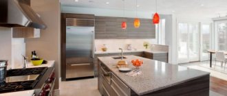
Island
The gray island set reveals its beauty only in a large kitchen, where there is a need to reduce the work space and the need for additional surface. This is kitchen furniture, which in the middle of the room is complemented not by a dining group, but by a table from the ensemble set. The island can have a countertop, stove or sink.
The photo shows an island set, where the central table simultaneously serves as storage cabinets, a work surface with a stove and a dining table.
Best combinations
Gray interior goes well with a whole palette of colors
Gray goes well with black, blue and light blue, yellow, purple, pink. Any color will look different with a dark or light shade of gray. But there are still colors that look especially good on a gray background.
White
In combination with white, gray looks very noble
The combination of white and gray is conducive to calm and is considered a classic option for the kitchen. The combinations can be varied in any way: white top, gray ones, gray walls, white furniture, gray interior and white decor, or vice versa. In any case, white will refresh the kitchen, and gray will make it more elegant.
Beige
Gray with beige looks warm
Beige, like gray, has many shades, but its warm shades look especially good with gray:
- cappuccino;
- coffee;
- coffee with milk.
Designers recommend using a third color, white, for a beige-brown kitchen.
Red
Red and gray looks very bright
Gray and red - looks very bold and catchy. Such a kitchen will seem very bright and memorable, but unlike the black and red combination, it will not look too extravagant. Gray will make her more noble. You can read about how to combine red, black and white in the kitchen in the article.
It is worth remembering that when using red and gray, one of the colors must dominate.
Green
Green adds freshness to gray
Here you need to follow a simple rule: the darker the gray, the lighter the green and vice versa . Although light mint and silver also go well together.
The more intense the green tint, the more gray tone there should be in the interior.
Gray in different styles
The versatility of gray lies not only in its ideal compatibility with other colors, but also in its ability to decorate the interior in almost any style. There are certain areas where gray is most appropriate.
Loft
A gray kitchen set with both smooth and paneled fronts will fit perfectly into the interior of a loft-style kitchen.
Dark tones look brutal. But if the kitchen is small, then you should give preference to light-colored facades or dilute the dark bottom of the set with a white top.
Metallic facades against a red brick wall. An unusual and bold combination - just in the spirit of a brutal loft
Minimalism
Monochrome gray combined with white and black creates an ascetic space that does not need to be supplemented with bright details. Its only decoration can be complex textures like wood, stone, marble and other natural surfaces. In order not to disturb the order and rigor of a minimalist kitchen, it is better to give preference to facades with integrated (hidden) handles.
Gray wood kitchen
Neoclassical
Neoclassicism in gray tones is an excellent alternative to beige traditional interiors with massive furniture. A strict gray set will be decorated with elegant classic gold handles - antique brass, bronze, forged, etc.
Room tour of a neoclassical kitchen in the video below:
Provence
Pastel shades of gray are ideal for interior design in Provence style. Dusty and slightly faded tones in combination with lavender, olive or pale pink will become a style-defining color scheme.
American style
Another modern take on a classic. The traditional design of the set with facades with frames and panels in gray color will fit perfectly into a spacious U-shaped or island kitchen.
Some features of gray
When choosing a gray color for decorating the kitchen-living room, try to give preference to lighter and softer tones that will give the interior elegance and nobility.
A dark graphite color will make the interior gloomy and make the room visually smaller, so this color should be combined with a lighter tone of gray. Or use white walls as a backdrop for graphite-colored furniture.
Arrangement of the dining area
The placement of the dining area depends on the size of the kitchen. The most popular dining room design options:
Classic table and chairs. They are usually located away from the working surface. Sometimes this part of the room is isolated using contrasting colors. There are many design options: round, square, oval, triangular, or an irregularly shaped table. It can be complemented by chairs, stools, ottomans or armchairs. A suitable solution can be found for any style and design. At the same time, a gray kitchen can
to complement
dining area “matching” or in contrasting design;
Kitchen Area. Its peak of popularity has long passed, but still this option for a dining area remains quite in demand. In some cases, its functionality is expanded by making a corner with a built-in sleeping place (for overstaying guests or suddenly visiting relatives);
bar counter. This option is popular for small studios and small families. In large apartments, the counter is sometimes made an independent element in addition to the classic dining area;
wide window sill. Another popular option for miniature kitchens. This solution will not only save space, but will also allow you to admire the view from the window while eating. In some cases, such a kitchen table is made folding or sliding;
on the island. This solution, on the contrary, is suitable only for large kitchens. In this case, the dining area is moved to the island in the center of the room. This “dining room” looks simply grandiose. Moreover, it can be multifunctional (combined with a bar counter or work surface).
When choosing a layout, it is worth remembering the free approach. Any option will seem unsuccessful if the sofa or chair blocks the passage to the sink, and the bar counter prevents you from opening the refrigerator door.
Advantages and disadvantages
A kitchen in gray tones looks elegant and stylish, combining chic and sophistication in equal measure. Let's look at the most popular smoky color combinations to make your kitchen design eye-catching and delightful.
Beautiful and festive kitchen
Gray is considered the favorite color of many designers. It helps furniture and decorative elements open up and stand out, focusing attention on form and texture. Imagine that you are looking at a red bedside table - you will only remember a bright, saturated spot.
However, if you start looking at a piece of furniture of this color, then pay attention to the attractive shape and other details.
Design ideas for your design
Designer interiors
A Baroque style kitchen allows you to combine both wood and glass in the furniture. Cabinets with small glass inserts will look incredibly beautiful. Baroque style is appropriate for large and bright kitchens.
Give preference to wooden furniture finishes and natural stone countertops. The same techniques can be used in country style.
For a studio apartment, the kitchen and living room are always done in the same style. A kitchen in a classic style would look out of place, but a room in the Provence style would look out of place. Also, all furniture should resonate with each other and create an overall holistic picture. Combine two, maximum three shades in such a room.
- Straight and clear lines, without roundness or bulges - the best matte kitchen for loft and high-tech styles.
- Unlike high-tech, in a loft you can use almost the entire palette, the main thing is to correctly combine the shades with each other. So don't be afraid to experiment.
- A kitchen set in the Art Deco style will truly become an art object. Please note that art deco does not accept flashy shades. Everything should be restrained, but tasteful.
- Matte facades can be matched to any stylistic decision of your kitchen.
If your kitchen is designed with an island, opt for a glossy countertop and make the rest of the table matte. Thanks to the gloss, the kitchen will not look boring, but stylish.
But pay attention to the fact that the material is durable and of high quality. If you want to save money, then soon your countertop will have to be thrown away and replaced with another.