In which interior styles to use
Copper, brick, honey, carrot and other shades are suitable for interior decoration in the following styles:
- Loft;
- Vanguard;
- High tech;
- Country;
- Minimalism;
- East style.
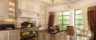
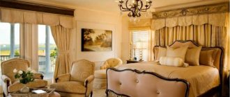
Classic, Rococo, and Empire styles do not like orange.
In which rooms is orange appropriate?
This color suits any room:
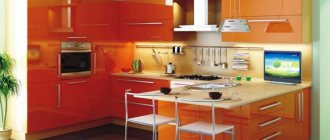
- Orange color is often used in the kitchen interior to make the environment more homely, warm, and cozy.
- The bathroom, decorated in orange tones, energizes and invigorates. A good option for those who need an extra boost in the morning to wake up. Tangerine, pumpkin, and peach shades are a common choice for children's rooms. The color of joy, carelessness and irrepressible energy comes in handy here.
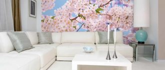
- You can use orange color in the interior of the living room to create a comfortable homely atmosphere, conducive to long gatherings and communication.
In what rooms should I use orange?
Based on the description and psychological characteristics, orange color is appropriate in the interior of a common room - hallway, living room, office, kitchen. You will create an environment conducive to interesting conversations, creative activity and positive emotions. Bright orange is the perfect accent, while calmer shades are a wonderful overall background. Its simplicity is deceptive.
To create a harmonious interior, you need to know a few rules:
- bright orange and any other neon shade do not go well together, it is very tiring for the eyes;
- dilute large areas with ornaments, paintings, drawings, and floor vases. Completely orange wallpaper quickly tires, and then only causes dull irritation;
- in small rooms, use it only as an accent;
- Due to the orange color, you can harmonize the volume of an elongated narrow room with a high ceiling by painting it or the floor
Related article: Decorating rooms in lilac - combination rules.
Consider the location of the rooms. On the southern side, orange in excess causes a subconscious feeling of overheating, or even suffocation. If the room is sunny, this color will visually fade, and at sunset it will take on an ominous bloody hue. In cool rooms with windows facing north, it will help warm up those who often get cold, and the room will become bright. Orange curtains or lampshades on floor lamps contribute to this. This color in its pure form will not suit you if you are creating a setting in the classicism, empire or rococo style. Use muted terracotta or ocher.
On the contrary, it is appropriate in rooms designed in the retro style of the sixties, Arab East African ethno, art deco, minimalism, avant-garde, futurism, hi-tech, country, pop art.
Use unpainted wicker furniture, handmade mats and rugs made from natural fibers, autumn arrangements of dried flowers and leaves, and baskets with fresh fruit as additions to the room design. Pay attention to the floor vases in all shades of beige and brown.
Typical mistakes when working with color
Despite the positivity it emits, orange can cause discomfort if used incorrectly. Avoid the following mistakes:
You don't need too much orange, especially small objects and details. This color attracts attention, and if present everywhere, it creates a feeling of “accent overload.”
In sunny and hot rooms it is better to use cool shades: the orange palette will only “raise the temperature”, which can cause discomfort in the warm months of the year.
For small rooms, only light colors are suitable: carrot, brick or copper can visually “eat up” the meters in the room.
The only thing worse than the above is choosing the wrong color combination. For everything to work out, remember what colors orange goes with in the interior. Let's look at the 5 most successful combinations.
Orange color in the interior: main aspects
The amount of orange in the interior
The main use of orange in the interior is accentuation.
That is, it is less often used for painting walls and furniture, but more often for accessories, textiles, etc. The introduction of orange accents creates the desired effect - it makes the room more cheerful, warmer, more active, etc., but without having to worry about the pressure of the walls and the irritating effect. Orange is also used to decorate large surfaces, but here you need to be careful not to cross the line between “invigorates and warms” and “irritates and tires.” Play with shades of orange, combine it with others - and you can enjoy all the benefits of orange in the interior
The power of orange relative to other colors
Orange tends to displace all colors
That is, when entering a room, a person will pay attention to orange objects - be it walls, furniture, carpet on the floor or accessories. The more orange, the less noticeable the color of objects of a different color
This needs to be taken into account. If you want, for example, to make an accent in the living room with your beige upholstered furniture, do not overuse the room with orange decoration - paint only one or two walls this color, and place the sofa against a wall of a different color (for example, gray).
Orange color in the interior: in what rooms and styles is it appropriate?
The classic design rule says that orange is good in rooms such as the kitchen, dining room, children's room,
office (home office). Orange is not suitable for rooms where you relax and unwind, for romantic bedrooms, or for rooms that are too bright and hot.
Room styles in which the color orange is most often used: retro mid-20th century (60s style), country, minimalism (including Japanese minimalism), ethnic style (oriental, Mexican, etc.), art deco, avant-garde, pop -art. Classic, Empire, Rococo do not accept orange, but the use of terracotta shades obtained by mixing orange and brown is quite acceptable.
Orange color in the interior as a design tool for correcting room deficiencies
It is worth using orange color in the interior of rooms whose windows face north. Where it is almost always dark and cool, orange will compensate for the lack of sun and create a joyful mood. By the way, sometimes it’s enough to hang orange translucent curtains on the windows - and a dark, cold room will immediately be transformed.
Since the orange color, as mentioned above, tends to visually bring objects closer, you should not use orange to decorate walls in small rooms. This property of orange can be used to visually correct the volume of a narrow and tall room. The orange ceiling will visually lower, causing the walls to visually expand.
With white
White is too calm compared to orange, but when two colors coexist in the same space, the result is a rich, fresh and expressive interior.
It doesn’t matter what is orange and what is white – furniture or walls. This combination is suitable for a bathroom, minimalist kitchen, or a teenager’s room.
Palette combination rules
orange wallpaper in a country style kitchen interior
Orange wallpaper in the living room interior can take on an elegant look if you choose the right color palette. What colors will look chic?
White color. It will help tone down the intensity of orange and prevent it from dominating the home. Peach, carrot and orange colors go well with it.
Black color. For modern design, the combination of black and orange is ideal. Designers especially like to use it in high-tech and minimalist styles.
However, black can steal the spotlight, so choose the shade and location for painting carefully.
plain orange corridor
Brown or woody. These colors are natural, so they will go perfectly with orange. You need to abandon glossy coatings and focus on matte tones.
With green
At first glance, the green-orange interior is associated with the holiday and lifts your spirits. But of course, this is a “New Year classic” - tangerines and a Christmas tree.
The combination is very “natural”, unobtrusive, cozy, and therefore ideal for decorating a living room or nursery.
With blue
Opposites attract and together can look quite harmonious. This is a story about blue and orange, about sea and sun, about ice and fire.
Don’t be afraid of this combination; feel free to choose different shades - turquoise or indigo, amber or orange. A rich, contrasting interior of a hallway or living room will delight household members and guests.
Note!
- Olive color interior: 135 photos and video description of how to use olive color correctly
Turquoise interior - TOP-180 photos and videos of interior options in turquoise tones. A palette of combinations of shades and textures. Selection of furniture and decor
Red interior - 140 photos and videos of rules of use and subtleties of placement when decorating the interior
With black
This is the only color in combination with which orange loses some of its playfulness. The interior begins to “sound” deeper and more interesting, it looks strict, graphic, and solid.
This brutal combination is suitable for decorating a “bachelor” apartment, a modern bedroom, a kitchen, or a bathroom.
What is contraindicated to combine
The combination of orange with other colors in the interior can be extremely unsuccessful - because of this, the atmosphere of the room can be “sweet,” put pressure on the psyche, be associated with aggression, and cause feelings of discomfort.
Such combinations are still sometimes used, but they are classified as “not for everyone.”
We are talking about combining orange with:
- Violet (the problem is excessive contrast);
- Pink (difficult to choose the optimal shades);
- Other shades of orange (it turns out to be “oil”).
Note!
- Black interior: 160 photos of interesting options on how to use black correctly
Dark interior: 140 photos and video description of how to create a unique style in dark colors and shades
- Brown interior - interesting ideas and beautiful uses of brown (130 photos)
What about fashion collections? After all, the listed combinations can be seen on the catwalks! The answer is simple: do not confuse clothes with interior design.
A trendy item carries a message of challenge: you must stand out from the crowd. These things are not worn every day.
Your home interior should surround you with coziness, give you comfort, and create an environment for relaxation: you are in it every day.
Impact on humans
When dreaming of orange color in the kitchen interior, you need to know that this sunny color is highly active and cheerful. This is not surprising, because his immediate circle is energetic red and good-natured yellow. This happy color can create a feeling of celebration and fill the room with sunshine. The presence of even a small orange object in the room lifts your spirits and fills you with optimism even on the rainiest gloomy day. The following photos of the interior of an orange kitchen will confirm these words.
Orange kitchen set with a bright apron
Kitchen interior with orange upper cabinets and false ceiling
This is the color of warmth, comfort and well-being; it is able to revive the creativity of artistic people and set insecure and impressionable people to victory and overcoming obstacles.
Color combination in an orange kitchen
The red color can activate the stomach and the entire digestive system as a whole, so a hearty lunch in the kitchen with orange tones will be beneficial. But here it is necessary to keep in mind that an excess of orange tones provokes an acceleration of all processes taking place in the human body, and this can negatively affect digestion: colic and stomach pain will appear. Since the color of pumpkin and orange increases appetite, it should not be used in the kitchen interior for people trying to lose weight.
Modern orange kitchen with dining area on the podium
Thus, orange color is capable of:
- help digestion and improve appetite;
- speed up metabolism and increase heart rate;
- give an optimistic mood.
Orange kitchen with wooden furniture and a bright apron
But at the same time, an excess of tangerine tones provokes excessive food consumption, keeps you in constant tone, leads to loss of strength and even depression. Like all bright shades, orange can be depressing, so you need to use it carefully in your kitchen interior.
Orange-chocolate cuisine
Orange kitchen set against black walls
Base or accent?
Recommendations for those who want to see orange in the interior, but are unsure whether to use it as a base or accents:
If the room has a small area, to visually increase the space, choose a lighter and cooler base, and make the accents orange, or choose a light, delicate shade, such as peach, as the base.
If you previously lived in a calm or “cold” interior, then getting used to tangerine or carrot may be difficult. When choosing a dominant tone, you should consider calm shades.
Light shades of orange are suitable as the dominant color for the bedroom, children's room, rich and bright shades - for the kitchen, living room.
When using orange in design, it is important to maintain balance and not lose a sense of proportion. But the most important thing is something else: your home is your personal comfort zone, so when decorating it, you can break the rules, because taste is individual.
Style selection
Classical
The classic style is distinguished by its restraint. Provided that orange is a very bright and saturated color, it should be accompanied by furniture of simple lines and interior details in calm shades.
The photo shows a living room with bright walls. Mirrors visually expand the area of the room by reflecting natural light.
For small rooms, you should choose a light orange shade. The brighter or darker the color of the walls, the smaller the area appears.
Modern
The modern style is characterized by functionality, the interior is dominated by straight lines, and the walls are a single color. One of the walls can be highlighted with a bright color.
The photo shows a spacious living room combined with a kitchen. A bright wall unifies the space, and pieces of furniture define zones.
Country
Country style involves the maximum use of natural materials. The interior uses a lot of wood and greenery. In contrast to the modern style, all kinds of cozy carpets, bedspreads and pillows are welcome.
Loft
Loft is a trendy and modern trend that is often used to create a stylish home. Orange color looks harmonious with the terracotta shade of brick and cold concrete. When using orange color, the interior softens and does not look so rough.