Visual effects of pastel colors
Unobtrusive soft shades of pastel colors visually expand the room and fill the space with air. For spacious halls this is not important, but for small living rooms it is very important. Light walls are the best option for small rooms.
The room seems lighter, even when it is cloudy outside; it is no coincidence that pastel colors are inherent in the English style, because in England there is such a strong lack of sunlight.
Pastel colors are obtained by mixing white paint with a base color filler, so now you can create thousands of different shades for painting walls. Wallpaper is also used to decorate walls in pastel colors; they can be with a soft geometric or floral pattern.
A surprisingly harmonious combination of pastel colors in the interior. Primary colors in their usual form do not look good together. But, apparently, due to the common white base, pastel colors can be combined in any way, the main thing is to find a balance between warm and cold shades when using them. All pastel colors go well with white; it gives them brightness and volume.
Often designers suggest making walls in different colors in one room. If they skillfully zone the room and select shades that are pleasant to you, this technique will make the interior more modern and interesting.
Current combinations of pastel colors in bedroom design
A bedroom in pastel colors is the most fashionable solution for styles such as neoclassical, classic and even modern. A pale interior with well-thought-out lighting and pastel accents will always look magical.
It is pastel accents that allow us to create the romantic atmosphere we need in everyday life. It would be appropriate to use white, pale gray or beige furniture and a light main background for pastel accents.
Rose quartz in bed headboard design
In the photo: Rose quartz in a bedroom design in pastel colors
Rose Quartz is a very fashionable shade of pale pink, always with a subtle glow like quartz. This effect can be created on various types of textiles, upholstery and bed linen.
In this case, rose quartz with fashionable capiton is used not only for the headboard and chaise longue at the foot of the bed, but also for the bedspread. It is the perfect match for many pale coffee wall shades, white and pale gray, and beige walls in the bedroom.
Neoclassical bedroom with lavender accents
In the photo: Bedroom interior in pastel colors using lavender shades
This incredible bedroom interior, woven by our designers from amazing dessert shades, looks very romantic! Let's find out what they are called!
The main color used in painting the wall and upholstering the ottoman is delicate lavender, the canopy for the bed is ash, and the carpet is made in the shade of amethyst. The lamps above the bedside tables also look stunning - they are attached to the ceiling and, thanks to the crystal, add a silver glow to this lavender bedroom.
Pale raspberry bedroom with textile panels
In the photo: Design of a pink bedroom in a townhouse in Sukhanovo Park
The shade used for textile panels, bed linen and upholstery of ottoman and chaise longue is a pale crimson, a cool shade of the pink spectrum. In the window design we see it in a darker tone.
Such a bedroom can rightfully be considered a royal interior. Everything about it is truly impeccable: the decoration is made with high-quality materials, the furniture is only the best, and the fabrics are so soft that it seems that your imagination is playing with you.
Design of a children's room with gray-blue walls for a girl
In the photo: Interior design of a children's room for a teenage girl
The interior design of this baby girl's room is incredibly artful. Gray-blue walls with panels, pro-classic trim with moldings and moldings, a charming traditional rug and a sky blue headboard are sure to please its owner.
Shades of pearls and mother-of-pearl in bedroom design
In the photo: Interior design in light colors
It's no secret that pearl and mother-of-pearl shades look very elegant. They can also be used in interior design in light colors and will especially decorate the appearance of the bedroom.
At the same time, there are a huge variety of such shades - for example, river mother of pearl, cream, white and pink pearls. Mother of pearl can even be purple, dark blue, chocolate - it’s all about a special type of glow and magical shimmers. And pearls can be, for example, eggplant or lilac.
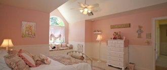
Beige shades in bedroom design
In the photo: Bedroom interior design in pastel colors
To create a pastel bedroom interior, a certain shade of beige is often taken as a basis. All beige variations can be divided into warm and cold, but it is the cold ones that are more preferable in a modern interior.
Today, the trend is gray, neutral, pink, even green, lilac and peach-beige shades. But cream, butter, peanuts and other “more yellow” ones are much less popular.
Living room decoration
All shades of beige, green, pistachio are suitable for decorating a living room. Such colors will help you quickly tune in to the general wavelength, promote calm communication and relaxation in the living room, where guests are received, family gathers, and various issues are resolved.
This color scheme combines all shades of wood on the floor, window frames, and furniture trim. Tablecloths, curtains, roller blinds are suitable in beige, green, red, burgundy tones. It’s good if the main colors of the interior are found in the design elements of the curtains, and the curtains or tulle themselves have some shine.
Pastel shades themselves may turn out to be boring if they are not supported by the overall design. But they allow you to decorate the room with your favorite paintings, family photographs; there can be multi-colored pillows on the sofas; against the background of light walls, all these items will not look tacky and intrusive.
Gray and off-white walls with plain furniture will help create a room in a minimalist style. Strict lines, a minimum of details, hidden lighting sources. Nothing extra. Maximum space for the play of light.
Cream walls with a pistachio sofa and armchairs may well become design elements of a room for a man if the laminate and tables are made of dark shades of wood.
What is pastel color scheme?
By the phrase “pastel colors” we mean light, bleached shades of colors. The peculiarity of pastel colors is that among them it is impossible to find truly warm colors. Even colors like red or yellow in pastel variations will look much cooler. Due to the fact that white is added to them.
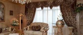
Spectacular living room in pastel colors
White color is a constant companion to any pastel shade. Because only on a white background can such a shade reveal itself and demonstrate its design potential. If you use bright colored spots in the living room in pastel colors, then you need to understand that attention will be concentrated on them. And no one will notice light shades. This and other points must be taken into account if you do not want to hopelessly spoil the design composition.
Living room in pastel colors with rustic motifs
Pastel shades in the bedroom
The pink color of the bedroom walls will look harmonious with gray furniture and silver chandeliers, candlesticks, vases, satin fabrics, panels based on cherry blossoms, and graphic panels. There is a lot of spring and romance in pink; it is important to maintain the style so that the room does not look like a children's room.
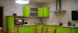
Kitchen design in gray tones with bright accents- How to choose the right kitchen
- Features of larch
A bedroom with lavender walls and cream furniture will look great; a vintage vase on the dressing table and a couple of knitted napkins will not be superfluous.
All disturbing thoughts will remain behind the threshold of a mint bedroom with dairy furniture, lace tulle and a light floor.
With pastel walls you can create an uplifting Mediterranean style. Light background and furniture in all shades of natural wood, blue pillows on cream sofas.
Living room in pastel colors
This room in any home is considered one of the main ones. It’s where you meet guests, relax, and spend evenings with your family. Naturally, such a room requires a beautiful design that would appeal to every family member. One of the good solutions is to decorate the living room in pastel colors. To make the room look dynamic and promote relaxation, it is necessary to take into account certain nuances.
What colors are pastel tones?
Author: Vladimir Manannikov
Light and soft pastel shades are a stronghold of femininity and tenderness. It doesn’t matter whether you use them in the interior, in your wardrobe or in makeup.
They help create visual lightness, youth and freshness and are an important part of a woman's wardrobe. Pastel colors fit perfectly into the design of a children's room and family bedroom. What colors can be classified as pastel?
How to identify pastel colors
All similar tones have the same features. They are less saturated, muted, light, quiet, hazy and slightly whitish. The main color seems to be mixed with white, so the derivative halftones have a delicate, creamy character.
Because of its visual softness, the entire pastel palette is considered girlish and feminine. However, many of these shades are suitable for men's shirts.
At the same time, pastel colors are not characterized by watercolor transparency, which is typical for simply light shades. These are definitely dense, thick, non-transparent colors.
But they look powdery and dusty. This is especially noticeable in pink and blue colors.
A good example of a pastel shade is the popular dusty rose, a color that represents a “rose in the dust.”
Another popular option is “Tiffany color” - a mix of white pigment and delicate turquoise.
By the way, they combine perfectly with each other: mint-pink duets are designers’ favorites.
Such different pastels: features of use
An interesting effect is observed if a rich, rich color is turned into pastel. Its temperature will remain the same, but will become cooler.
As an example, let's take a warm orange shade. Its pastel equivalent (close to peach) will not be as hot, the temperature will drop slightly. This happens due to mixing the base with a neutral white pigment.
Practical properties of pastel shades:
1. Like their main component (white), they all expand the space and add visual “air” to the room.
2. They do not tire the eyes, do not look flashy, and do not irritate. In a word, they have the properties of neutral tones.
3. They go perfectly together. Elegant pastel mixes are appropriate in shabby chic, Provence, country and even classical styles.
4. Pastel shades are lost against the background of rich colors. They “float”, their signature charm disappears. Therefore, pastels are rarely combined with rich tones. The best companion for her is white or light gray.
5. These halftones are highly dependent on light. In a well-lit room they look light, but in the dark they instantly become dark and thick.
Some of them take on a dirty appearance in the twilight. This should be taken into account when decorating the interior in pastel colors.
What colors are classified as pastels?
The name of pastel shades comes from pastel: these are artistic crayons, with the help of which very delicate, discreet, hazy drawings are created.
And today, any light, non-intense tone, covered with a milky veil, will bear this name.
Gray-blue, creamy mint, dusty turquoise, light pistachio, soft peach, powdery pink, creamy lavender... You already understand that all pastel colors are complex, composite.
They always contain a snow-white ingredient that dilutes the main tone. It is thanks to the light pigment that the powdery effect is achieved.
Some people find pastel colors boring and inexpressive, while others consider them exclusively childish.
Famous fashion designers will allow themselves to disagree: delicate “nude” shades conquer the catwalks, and variegated pastels fill all summer collections.
Pastel colors are unobtrusive and cozy in a good way.
Framed by textured materials (carpets, rugs, cotton pillows, silky fabrics, flowing organza) it looks majestic and impressive.
Many styles - from rustic and romantic Provence to luxurious classics - only benefit from the use of pastel colors in design.
dobro.pw