History of Pop Art style
The word prefix “pop” means “popular, mass”. Pop Art as an artistic movement originated in the 50s of the last century. Abstract Expressionism introduced a new way of dramatic, experimental paint application to the masses. This gave impetus to the search for new styles of self-expression not only in art, but also in everyday life.
America and Great Britain are considered the birthplace of Pop Art: countries that have experienced social upheavals, political upheavals, feminist movements and the promotion of free love. It turns out that you can express your individuality and commitment to certain ideas not only on a square with a banner, but also in your home or office.
How to create a pop art style in the interior: 4 professional tips
Hanging posters of Marilyn Monroe or a copy of an Andy Warhol painting on the walls, putting flowers in a can and hanging silk curtains on the windows does not mean creating an interior in pop style, this is very little. Professional designers recommend using 4 tricks.
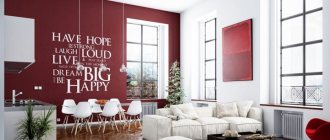
- Particular attention to the walls. The standard base is white paint, which must be decorated with decorative details. But a white base is a solution for only one wall; it is best if each wall is painted in a different color and has a different texture.
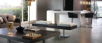
- Minimum furniture. In a room decorated in pop style, the space should not be cluttered with massive cabinets, cabinets and sofas; they should seem to blend in with the walls. An exception is upholstered furniture of an unusual shape in tandem with a glass or unusually shaped coffee table. The ideal furniture material is bright plastic and glass.
- Lighting – lamps, lamps and chandeliers of unusual shapes, with neon light.
- The floor can be monochromatic, or it can amaze with its unusualness. To do this, just lay a light laminate, and on top of it - a carpet with an animal or a bright abstract print.
There is no need to include decor in this list, since everyone who is planning to remodel a room in pop style knows all the details. For example, a true fan of pop art apartments does not need to be reminded that the style is characterized by absurd plastic figures, sparkling, and sometimes blinding details.
The floor in the room can be plain
A room decorated in pop style should have maximum free space.
To create a pop art design, follow the standard recommendations.
See also: Benefits of 3D interior visualization: photos, tips
Interior Pop Art: features and characteristics
The interior in the Pop Art style suggests that its owner is a creative, extraordinary person. There are no boring tones here, everything sets you up for a dynamic pastime. But what about the rest? Doesn't the owner of the house get bored with bright colors? This is exactly what's going on, and here's why:
- Homes in the Pop Art style are furnished independently or commissioned by young or creative people. Their lifestyle fully corresponds to the concept of housing - without stereotypes and templates.
- There is no oversaturation of color in the style. For a relaxing holiday, arrange a corner in a more subdued tone.
- For decoration, they usually select art objects that the owner likes and likes. In any case, they can be easily replaced with others.
In Pop Art, different materials coexist. The style cannot be called expensive: both mass-produced furniture and designer items are suitable. They can be made of glass, plastic, wood and metal, natural and artificial leather.
Features of pop art style:
- large posters;
- repeating elements of art: carpets with duplicate patterns, tiles, collages;
- portraits of celebrities of the 50s and 60s, although modern youth prefer modern idols;
- materials – paper, synthetics, plastic, metal;
- textiles are used everywhere - curtains, furniture upholstery and even walls, while choosing fabric of a rich acid color. They try to choose textiles with a simple texture that does not attract attention.
Interior design: interiors in pop art style Video: Interior design: interiors in pop art style
Signs of pop art style in the interior
To create a unique and at the same time very stylish pop art in the interior, it is not enough to simply “stuff” the room with objects of different styles, eras, and unusual products. You can determine that a room is part of shocking and cheerful art by the following signs.
- Bright, rich, acidic colors in the most daring combinations - purple with green, red with turquoise. Combinations of black and white in unusual textures are no strangers to pop-style interiors.
- An abundance of portrait images - posters, comics, newspaper clippings. They decorate not only walls in the form of paintings, but are used to decorate textiles and household items.
- The predominance of shiny parts - glossy surfaces of finishing materials and furniture. Textiles are also smooth - bedspreads, curtains made of silk and synthetic fabrics. The decor can sparkle thanks to a variety of rhinestones and stones.
- Illusionary space - created through many lighting points, neon lamps are used.
An interior in pop style is minimalism in terms of furniture - wardrobes should be built-in, beds should be pull-out, the rest of the furniture should be strictly “on point”. And, the main feature is the use of household items for other purposes. For example, a beer can can make a unique vase, or a beer barrel can make a toilet flush cistern.
Pop style uses minimal furniture
The pop style is characterized by a combination of bright colors
See also Art Deco style in the interior. Photo.
Lighting
Lighting helps highlight the unusual design. Colorful lampshades, modern LED devices, spotlights are planned in different color modes.
An interesting art effect is created using mirrors and objects with a reflective surface: vinyl records, discs. The play of light and shadow, glare on objects are a feature of the style.
We recommend reading:
5 modern trends in interior design;
10 common mistakes in interior design;
Unusual interior items.
Ceiling and floor
The decor of a room in pop style is sometimes an unusual, but harmonious combination of colors, textures and objects. Despite the presence of the experiment, the ceiling should be shiny and light. To decorate the ceiling, it is permissible to use various finishing materials: PVC film or fabric, drywall, paint. PVC film and fabric are materials for creating suspended ceilings; plasterboard structures are very similar to them. Paint is used only when the standard ceiling covering (plaster, concrete slabs) is smooth and without damage.
It doesn’t matter how the finishing material decorates the ceiling, the main thing is that it reflects the light. It is possible to create a flat canvas or a multi-level structure. The second option is more appropriate for pop-style rooms; LED strips with neon lighting can be placed in the formed ceiling niches. If the ceiling is being redone using plasterboard or simply painted, the paint must be glossy, like glass. It is best to use acrylic or latex based paints. They are carefully applied to the surface, easy to clean and have a long service life.
It is recommended to make the ceiling shiny and light
It is better to use ceiling paint with a reflective effect
A floor in this style can become a work of art. Suitable materials, their pros and cons are indicated in the table.
| Peculiarities Name flooring | Material advantages | Disadvantages of flooring when it is not recommended to use |
| Laminate | Withstands heavy loads, is easy to clean, parts can be replaced if damaged. You can also note the affordable price, provided that a high-quality laminate is used, it can last up to 20 years | The coating is slippery and requires strict installation conditions - the surface must be perfectly flat |
| Carpet, carpet tiles | Warm, body-friendly type of coating, does not require special installation conditions | Carpet needs regular dry cleaning |
| Self-leveling floor | The newest type of flooring in pop style, which is distinguished by its unusual design, high durability, and ease of maintenance. During installation, a continuous surface is poured, so there are no seams | The coating is characterized by high cost, complexity and duration (the self-leveling floor hardens in 5 days) of installation; it is impossible to hide utility lines under it |
Laminate is perfect for flooring
The floor in the room should match the style
A room in pop art style will look modern and beautiful
See alsoDark doors in the interior: advantages and disadvantages
Pop Art: The Revolutionary Style That Shaked Up Branding
Pop art is one of the most famous graphic design styles that emerged in Great Britain and the United States in the late fifties of the last century. Its appearance is associated with the development of the protest movement, whose representatives sharply criticized abstract expressionism. And a number of other styles that were popular in those days.
The term pop art first appeared in publications written by British critic Lawrence Alloway. But in 1966, the London native openly stated that he initially did not put much meaning into the concept he invented. As Lawrence clarified, the term was not intended to characterize any particular style of art, but all media products of those times. However, despite the Briton’s revelations, it was with his help that the concept of pop art finally came into use around 1957.
The first of the most famous works in the pop art style belong to Peter Blake, Joe Tilson and Richard Smith. The pioneers studied at the prestigious Royal College of Art in London.
Nevertheless, an extraordinary collage created in 1956 by British artist Richard Hamilton received the status of a style icon. The work was called “What makes our houses today so different, so attractive?” Hamilton's collage, which caused widespread excitement and surprise, is still considered the founder of pop art.
The well-known American artist Andy Warhol also became a follower of the growing pop art. In 1960, he worked for the Coca-Cola company and updated its bottle designs. The American's work created a sensation. And Andy himself quickly turned into a popular and extraordinary artist with unique views on art.
Paradoxically, pop art soon transformed from a revolutionary style, which was intended to criticize popularization in all its manifestations, into one of the main branding tools. Hollywood advertising played a significant role in this. For example, it is worth remembering the brightly colored images of Marilyn Monroe in four colored squares.
But the key driver of the popularization of pop art was not so much advertising as its visual means. The style was distinguished by bright colors and contrast, as well as the use of collage techniques, kitsch and comic book art. And the central characters of the works were often singers, actresses and even politicians. At the same time, the images used in pop art turned out to be simple and understandable. Although they were served with a sauce of undisguised irony. It is not surprising that in total this quickly attracted young people - the most active layer of society. As a result, she became the main audience of followers of the style.
Despite its rather respectable age, pop art continues to become more and more diverse. It is also reflected in graphic design. By the way, it was the designers who finally adapted the style to create interiors, packaging, logos and even entire advertising campaigns.
As in the middle of the last century, today pop art is most useful for attracting an active audience. Therefore, it is often used in the branding of companies focused on working with youth. And also for creating communities on social networks.
A striking example is the latest work of the Craft Group team, which decided to create a catchy pop art design for a sales group on VKontakte.
This is another clear proof that a style with more than sixty years of history is not only viable, but also quite in demand on the market. Back to blog Find out more
Features of works in pop art style
Images and icons that are popular in the modern world are used. These include portraits of celebrities, movie and music stars, items such as soft drinks, comic books, and any other logos and products that are popular in the commercial world.
- The painting uses bright colors, the technique of creating collages, and combines several logically unrelated objects in one image.
- Pop art canvases are hard to miss in the interior - they will become a bright accent in a room decorated in a modern style. Pop art style involves the use of different textures.
- The picture may include inscriptions, slogans, mottos - it resembles an advertising poster.
- To create the works, the techniques of photo printing, combination with real objects, and design were used.
- Aesthetic ideals were borrowed from popular culture popularized by the media.
- The artists borrowed techniques from industrial advertising.
Futurism as a style in painting
The style has been criticized several times. In 1962, the Museum of Modern Art in New York held a symposium on pop art. The famous critic H. Kramer insisted that it was necessary to resist the development of pop art, since it popularizes banality, vulgarity, and bad taste. According to the critic, pop art is ordinary advertising, which they are trying to dress up as an art form.
According to another critic, S. Kunitz, pop art is a product of propaganda, and is aimed at the formation of a conformist society pursuing purely consumer goals. All the symbolism and slogans, according to Kunitz, turned advertising posters into pseudo art.
The goal of pop art, which artists put into their works, was to return to reality, from which abstractionists retreated. The main element of creativity was the subject associated with industrial culture, cinema, print media, and television.
History of style development
It was one of the most significant and influential artistic movements in painting and other art forms of the 20th century, characterized by a specific selection of themes and techniques drawn from mass popular culture. The style is aimed at a wide audience, as it uses popular images. Thanks to its accessibility and simplicity, pop art was popular.
The movement was founded in the 1950s and peaked in popularity in the 1960s. The birthplace of pop art is Great Britain, but the movement reached its greatest development in the United States, where New York became the capital of this cultural movement. The founders and most famous creators of the pop art style were Andy Warhol and Jasper Johns.
Conceptualism as a style in painting
Independent group
The first steps of a new style in painting were associated with the activities of the “Independent Group” of artists and architects, founded in 1952 in London. They were the first to use modern technologies to create canvases with leading motifs of mass and urban folk culture. The basis for the study was American culture. The pioneers of the style, E. Paolozzi and R. Hamilton, studied the psychological influences of mass culture, its meaning, and linguistic content. First of all, I was interested in industrial advertising methods, modern advertising production technologies, and techniques for creating collages.
It's tomorrow
In 1956, the exhibition “This is Tomorrow” took place. The painters presented to the public paintings in the pop art style, which depicted Hollywood stars and enlarged stills from famous films. It was after the exhibition that many graduates of the art school joined the movement, inspired by the new style.
USA
In the USA the style developed and popularized. Here, much attention was paid to the aestheticization of the banal - packaging, consumer goods. The essence of American pop art: the objects that people consume make representatives of different social classes equal to each other. Thus, pop art is the art of social equality.
History of cubism in painting
As a term
The term used to define style appeared in 1955-1957, thanks to L. Alloway, a British critic. The author of the concept himself was surprised by the fact that the term began to be used to define an entire cultural movement. Alloway himself had in mind products with a commercial purpose, belonging to elements of the mass media.
Main features and features of the style
Despite the fact that pop art is a synthesis of several styles, it still has its own unique features:
- The color palette is rich and bright, and may seem defiant due to its “acidity” and shocking incompatibility;
- Interior decoration involves the use of various types of finishes and materials;
- And, yes - finishing materials, as a rule, do not depend on price - we use both natural and artificial. Oddly enough, cheap plastic may be held in high esteem;
- The pop art style does not accept a large amount of furniture, so we choose “stylish minimalism.” And forget what cabinets are - we can safely replace them with built-in furniture and shelving;
- Decoration is key! The flight of fancy is not limited to standard fashion “tricks”, handmade parts are also used (for those who like “crazy hands” there is something to do), as well as all kinds of previously used items: vinyl records, CDs...;
- The walls in this unusual style are decorated with posters depicting comic book heroes, shocking images of stars of those years, for example Marilyn Monroe. Particular attention is paid to the works of Andy Warhol and Roy Lichtenstein;
- Clarity and roundness of lines is the concept of interior style;
- Spaciousness is not an unimportant point, so we use mirrors to visually expand the living area;
- Objects in the interior can distort perception due to absurd shapes and sizes;
- LEDs and neon lamps add brightness to the lighting;
- Surfaces (no matter the ceiling or decorative objects) are often glossy.
Pop art is confusing: even a tin can is a work of art.
Current colors
The variety of the color palette is the main trump card of rooms decorated in pop art style, but when starting a remodel, it is important to remember that when using all the colors of the rainbow, there are shades that will not fit into a pop art interior. These are pastel, matte shades of different colors. For example, this applies to mint and coral colors. It is best to use a white base for the walls and combine it with bright colors - purple, red, ultramarine, emerald. The fresher and brighter the color, the better.
See alsoRules for using pistachio color in the interior
