For the convenience of choosing the most suitable color, we will provide a number of photos with ready-made countertops. The article gallery is divided into small subsections depending on the type of material. designer can be found in the comments to this article.
General recommendations:
- First of all, you should choose the material of the countertop;
- At the time of choosing a countertop, you must already understand what color the kitchen itself will be, as well as the size of the sink and hob;
- As a rule, the color of the working surface is selected in contrast with the color of the furniture.
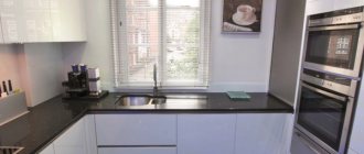
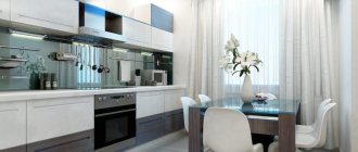
Choosing a tabletop to match the color of the set
As mentioned above, a contrasting color scheme for the countertop and the kitchen itself is considered more preferable. Here are some examples of the most successful combinations:
| Headset color | Tabletop color |
| White (cold palette). | Almost any color, but something contrasting or “wood-like” is best. |
| White (warm palette), beige, light sand. | Dark/light wood, brown, granite chips (not black), terracotta, dark ocher. |
| Olive, pistachio, light green. | Brown, wenge, dark woods, ocher, beige. |
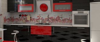
| Red, burgundy, garnet. | Light or dark gray, dark texture of the stone. |
| White top black bottom. | White, light mosaic or stone chips. |
| Gray, wet asphalt, ashy. | White or gray is darker than the color of the facades. |
You can choose which countertop color is best for your specific situation in the comments to this article.
Now let's talk about what color options will be available when you come to order your countertop.
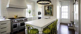
What can the color of the kitchen countertop be combined with?
When developing a design, a win-win solution is to combine the color of the tabletop with one or more key elements (apron, facade, window sill, floor covering, dining group). These are the main guidelines, the features of each of which should be given special attention.
Less often, the shade of the working surface is selected in accordance with the color of textiles and wall decoration. Moreover, this principle works in both directions.
For example, when choosing a cream-colored kitchen with a dark countertop, you can support this decision by purchasing a laminate that matches the shade (you can limit yourself to just baseboards), furniture, appliances, and splashback finishing elements.
Combination of tabletop shade with apron
Facades set
Depending on the design of the furniture, the facade of wall cabinets and floor cabinets can be the same or contrasting in color. This fact must be taken into account when choosing a countertop.
In addition, you should initially decide on the list of interior elements with which the product will be combined. Based on this, you can select good options for a façade that differs in tone from the working surface, matching the shade of individual furniture parts. Contrasting combinations also look impressive.
Apron
The color palette available when choosing an apron is virtually unlimited. Depending on the material of manufacture, you can purchase a product made of plastic, glass, or use ceramic tiles, artificial or natural stone, or porcelain stoneware to decorate this area. Often the work surface and the wall next to it are finished with the same texture, but in different shades.
When choosing a countertop and apron for the kitchen, the color combination can also be contrasting. This technique is especially in demand in a minimalist interior when using a neutral palette of shades. To form a structure that is integral in appearance, you can use one material.
Contrasting apron in the kitchen interior
Flooring
If the countertop is made in light or neutral colors, a win-win option is to choose a material for finishing the floor that will match in texture and color. The façade should be made bright and colorful.
The dark working surface of the table can contrast with the floor covering. In this case, it is better to use material of the same texture.
Lunch group
For the dining group and work surface, the set often chooses tabletops made of the same material. This technique helps make the kitchen interior look seamless, regardless of the features of the room. Such surfaces are practical and compatible with each other.
As a result, a large interior element will be formed, so you should not simultaneously use large-sized parts that match in color in the design.
Windowsill
The tabletop can be made of the same material as the window sill (or a different color from it). This technique is especially often used when the kitchen set is installed next to a window.
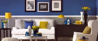
In contrast
A kitchen that uses contrasting color combinations looks especially impressive. At the same time, the question of how to choose the color of the countertops to match the kitchen set arises quite often. It can contrast with the apron, the facade or its individual elements, or the furniture in the room.
Color wheel for determining contrasting shades
MDF color variety
One of the most popular and most often chosen options in the CIS.
Their availability, good characteristics of resistance to water and mechanical damage made such countertops the optimal choice in the budget class.
Working surfaces made from this material probably have the widest range of colors. This is due to the wide possibilities for manufacturing MDF film.
Photo catalogs of possible designs, as well as MDF samples, will help you choose the ideal countertop color for your kitchen.
Classic colors never go out of style.
Textures with imitation wood and animal prints also look impressive.
Imitation of marble, granite or other stones.
Glossy surfaces look very impressive.
The relative cheapness of manufacturing and installation of such countertops allows you to painlessly replace the old surface with a new one of a different color or pattern for your budget.
What can it be made from?
Thanks to the right materials, the apron and countertops will not only become the main decoration for the kitchen, but will also help make life easier for their owners. The fact is that most often dirt, grease stains and other contaminants appear in the work area. In order for the work surface and apron to play a protective and decorative role, it must be made of materials that are easy to clean. Typically, backsplashes and countertops are made from the following components - ceramics, metal, artificial stone or glass.
Ceramics
Countertops and kitchen aprons for the work area, made of materials such as ceramics, are considered the most popular. The sizes and shapes of tiles can vary greatly from each other. Their size can vary from 10*10 cm to 25*40 cm. In addition, octagonal and hexagonal slabs have recently become popular. The working surface, which is decorated with ceramic tiles, has high mechanical strength, beautiful appearance, practicality, ease of use, resistance to sudden temperature changes and moisture, as well as a variety of patterns and colors. The tile covering can be smooth, embossed, or with a rough surface. The main advantages include the fact that it can quickly remove grease stains from the surface using any folk remedies or household cleaning chemicals. .
Glass
Finishing the work area with tempered glass is used for modern interiors such as minimalism, loft, and hi-tech. Their surface can be matte, transparent or patterned. Please note that tempered glass looks very unusual and original with LED backlighting. The advantages of such surfaces include the fact that they are convenient and easy to maintain. This option will not absorb odors, it is easy to wash and clean using various means, it will also not cause problems during installation and you can handle the installation of the glass surface on your own, and without the help of a specialist. An additional bonus will be the pleasant cost of the material.
Stone
A countertop made of stone is most often made of marble, granite or even acrylic. Strength characteristics and incredibly beautiful texture help make such materials in demand among designers. Working surfaces made of stone are solid slabs or individual parts, and their thickness is 2 cm. In addition, the material is resistant to high temperatures and chemicals, has a long service life and an incredibly beautiful appearance.
Metal
Kitchen work surfaces made of metal come in the form of galvanized steel, chrome plated or stainless steel. Their surface can be matte, polished, with engraving, imprinting and any other type of decoration. The advantages include resistance to mechanical damage (since metal is quite difficult to damage or scratch), resistance to temperature changes and high performance.
Artificial stone textures
As you know, at the moment there are two main types - acrylic and agglomerate. We have previously talked about the results of a comparison of countertops made of artificial stone.
In short, the first ones are good because acrylic can be used to make surfaces of almost any shape. Agglomerate, also known as quartz, is more reliable and has excellent resistance to acids, dyes and high temperatures.
Compared to the previous type, these work surfaces have a narrower range of possible colors and patterns. Unsurprisingly, the predominant pattern in this case is stone chips of different fractions against a background of different tones.
The palette itself in this segment of countertops is quite wide. Believe me, there is plenty to choose from.
You can find almost monochromatic options.
Non-standard colors are also possible.
The most popular surfaces today are deep black.
Possible tabletop colors
Their color does not affect the technical characteristics of the countertops in any way, but in general it is of decisive importance for the interior of the kitchen. The choice of the optimal color should be made based on the following melts:
- bright colored furniture looks most harmonious with light-colored materials;
- light facades go well with dark work surfaces;
- It is always important to make it from a material that matches the tone and texture of the floor covering in the room;
- the product can be the same tone as the wall near the work area (it is also called an “apron”) or made of a contrasting material.
In order for the kitchen design to meet your expectations, you should decide in advance on the choice of each of the key interior details. In this case, it is desirable that the tabletop matches the material and color with at least one (and preferably two or three) elements.
Colors and patterns of natural and artificial stone countertops
Drawings of marble countertops
The main argument in favor of choosing a stone countertop is its durability, ability to maintain its appearance throughout the entire period of use, and excellent mechanical characteristics. You can choose natural or artificial material for manufacturing. Modern technologies make it possible to achieve almost complete color and pattern matching.
The palette of available shades is determined by the mineral components that make up the stone and the characteristics of the selected rock. The following options are available:
- granite (scarlet, black, pink, gray, shades of beige and coffee);
- marble (on a white background there are veins of green, red, gray, chestnut);
- onyx (shades of brown, yellow, patterned beige, black or white);
- opal (bright or muted shades of blue, pink, gold, scarlet, milky, black, texture can be stone or wood);
- malachite (shades of green from turquoise to black with a transition between colors).
Color variety of MDF and laminated chipboard
Color palette of MDF and laminated chipboard
The technology for manufacturing furniture from MDF and laminated chipboard involves the use of PVC film. This allows manufacturers to offer a huge range of color solutions, many of which are not available when choosing a stone (for example, you can buy an eggplant, bright yellow, light green, blue, orange countertop).
At the same time, both monochrome materials and products with patterns imitating metal, fabric, wood, and stone surfaces are produced. Branched, metallized, patinated products, as well as those decorated with three-dimensional designs and embossing, have an interesting effect.
Wood textures
Wood textures
The main species used in this area of furniture production are oak, ash, and walnut. Birch, iroko, and wenge are less commonly used.
Materials may differ in tone, fiber pattern, degree of knotiness, and width of the beams. The photos in the manufacturers' catalogs show countertops in a wide range of colors from almost black to white with gray streaks.
The selected wood texture can become a bright accent detail in the interior. Especially if the material of the kitchen countertop and apron is the same color and texture and looks like a solid structure.
The rigor of natural stone
These countertops are extremely durable and strong. There is no fear of putting a hot pan on them or spilling coffee. Of course, such quality comes at a price, sometimes very, very high.
Here the range of color possibilities is even lower. We can say that you will be able to find no more than two or three dozen real, radically different drawings.
This is due to the small number of stone types and varieties that can be used as material for kitchen countertops.
The most common texture is red and gray granite.
Natural marble looks very reliable and solid.
Color selection options
In principle, there are no specific rules for selecting the color of a tabletop.
The main thing here is that the surface itself does not seem alien to the interior of the kitchen, and, therefore, it should be combined with surfaces such as the apron and facades. To avoid making a mistake, when purchasing, do not hesitate to combine a tabletop sample with samples from the facade catalogue, and if you decide in advance on the desired color scheme, the selection process will go much faster. There are plenty of possible options, and each of them is good in its own way. There are no good or bad schemes, you are free to choose what most appeals to you. If you choose a white kitchen, then a countertop in neutral colors that imitates the structure of stone or wood will suit it. In the first case, black or gray is preferred. Imitation wood should be light. Dark colors will put pressure on such a kitchen and deprive it of its grace.
yellow countertop dilutes the sterile white kitchen design