Important: This article is not for those who visit specialized sites for the sake of beautiful pictures and not for those who can afford to hire a highly qualified interior design specialist. The material was created by the editors of the StroyGuru portal for people with average incomes who dream of designing a large kitchen on their own.
A large kitchen is a dream for a woman. This is not just a room in which food is prepared, but the center of the apartment, where food is eaten, guests are greeted, and intimate conversations are held. This is a place where you can put and hang a huge number of cabinets for dishes and food, and install any kitchen appliances.
But creating a cozy, comfortable corner in an apartment or private house without knowing some basics of ergonomics and design is difficult, and in many cases impossible. In large rooms, different laws of layout, lighting, and color schemes apply than in small kitchens. Let's talk about all this in detail.
Big kitchen.
For information: the photo with the site logo was taken by the portal employees who carried out the repair work.
Rules for designing spacious rooms
Beauty is an abstract concept. And since there are no clear definition criteria, there should be no rules when designing any room. But this point of view is wrong. After all, only people with a subtle understanding of beauty on an intuitive level can build the ideal interior of any room.
Therefore, it is worth paying close attention to the principles of design, which are sometimes called “golden”. And with regard to a spacious kitchen, there is another set of rules that do not and cannot exist in residential premises: the rules of ergonomics. Let's start with them.
For information: ergonomics in design is aesthetics, practicality, and the greatest possible comfort.
Ergonomic rules
All work on developing the design of a large kitchen in an apartment or cottage should begin with determining the location of the refrigerator, hob and sink. Why? While in the kitchen, the housewife constantly moves between these objects:
- takes perishable food from the refrigerator and hides it again;
- washes and peels vegetables in the sink;
- cooks, fries, stews on the stove.
If you do not take this factor into account, the housewife or apartment owner will walk a considerable distance every day while preparing dinner. For some, this is a benefit - it replaces the gym, for others it is a problem. Therefore, experts in ergonomics have developed the rule of the “working triangle”: the sink, refrigerator and gas (electric) stove should be located in a large kitchen in the form of an elongated triangle with an optimal distance between the vertices of 1.2-2.5 m.
You can see how this looks in practice in the diagram below. Note that the arrangement is arbitrary. Only after determining the location of the main elements of kitchen appliances can further development of the design be carried out.
Important: for small rooms the triangle rule does not apply.
Work triangle: 1 - refrigerator, 2 - hob, 3 - sink.
In addition, there are other ergonomic requirements:
- Correctly selected height of the surface of the working area will help you avoid back problems when working in the kitchen - 14 cm below the arm, bent at the elbow at an angle of 90o. For the average height of a person, this is 90 cm. Editorial advice is to focus on the main cook of the family;
Attention: when choosing a kitchen set, you need to make sure that you can adjust the height of the countertop within the range of 75-110 cm.
- the tabletop is considered the main work area. Therefore, it should be located between the sink and the stove. We remind you of the principle of the triangle: onions or carrots are taken out of the refrigerator, peeled over the sink, chopped on the countertop, and fried on the stove. Optimal dimensions of the cutting table: length - 600-760 mm, width - 800-900 mm;
The classic work triangle.
- for right-handed people, from left to right there are: sink, countertop, hob. For left-handed people it’s the other way around;
Triangle diagram for left-handed people.
- in a large kitchen, an additional sink located on an island or peninsula would not be superfluous (see photo);
Additional sink on the peninsula.
- There should be a free space of at least 1 m near the main and additional sinks.
There are still many rules in ergonomics, but they do not directly apply to interior design.
Design Rules
There are several design rules that allow you to achieve harmony between the size of the room, the color of the walls and furniture, lighting and layout. Among them:
- symmetry. Filling the room with objects should be either symmetrical or asymmetrical. This is easily achieved if the room itself is of the correct dimensions. If the room does not have symmetry, then proceed as follows:
- the center point is determined. In the kitchen this is usually a window; in other rooms there may be a painting, a fireplace, etc. The interior is built relative to the focus: symmetrical or asymmetrical;
- Finally, it is advisable to break the resulting symmetry with a small stroke;
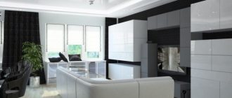
A fireplace in the kitchen-dining room, which became the central point of the interior design.
- color and texture. The main rule here is that the dominant color is diluted with the texture of the furniture to avoid monotony;
- lighting is the most important moment, after the working triangle, in the design of a large kitchen. With its help, you can create different zones, focus on a certain area, and beautifully complement the decoration of walls and furniture;
- the color of the kitchen set is dominant in its effect on the subconscious (not in volume, as discussed below). Therefore, choosing a color is a responsible task, because... the perception of the kitchen as a whole is set. The color scheme of the walls is secondary, it can be neutral;
- There must be connecting elements between different objects. If there are none, for example, between the leather sofa that the owner wants and the rest of the furniture, then the problem is solved by a variety of pillows that can combine colors and textures into a single scheme;
- The window is always the point on which the eye falls first. Therefore, close attention to its design. Here you need to choose a neutral color for curtains and curtains. Bright textiles are hung only if the emphasis of the design decision is transferred to the window, for example, with a two-row layout;
- It is advisable to make framed photos and paintings, if hanging on the wall, the main objects in the kitchen. The arrangement of furniture, lighting, and the color of the walls should emphasize the importance of these interior items;
- paintings and photographs should be hung at the eye level of an adult;
- Fresh flowers always fit organically into the interior and design of a spacious kitchen.
Recommendations for choosing design colors
Design experts usually say: the kitchen should have light, calm colors. Dark ones are impractical. Bright colors are always a risk. But the risk often pays off. This is confirmed by several examples where an unconventional approach to color schemes made the kitchen impressively beautiful.
From the above photos we can draw another unexpected conclusion: pure colors of furniture and decoration are not the best solution. It’s the “dirty shades” that win here, or more precisely, the softened ones. Then even the brightest color becomes appropriate.
If we move on to specific color solutions, then a joyful, upbeat mood should be expected from the following colors:
- white. From the housewife's point of view, a white kitchen is not entirely practical, especially if it is glossy. But we should not forget that the most valuable property of Total white is to soften any bright colors and balance the balance of shades. At the same time, sterile whiteness leads to headaches and eye strain;
- light gray. Interesting color. While preserving the advantages of white, it neutralizes its disadvantages;
- beige. The kitchen looks gentle, cozy, comfortable;
- creamy - perfect for cooking and eating;
- all the variety of yellow is the color of a great mood, happiness, a sunny day, even if it’s cloudy outside and the dull autumn rain is falling. Yellow cuisine stimulates a surge of strength, causes pleasant sensations, and stimulates the appetite. But it should be borne in mind that the rich yellow color has a negative effect on some people: it causes anxiety, tension, loss of strength;
- blue. Perfectly relaxes and calms the nervous system after a hard day at work. The effectiveness of therapeutic effects on the body and soul is comparable, according to doctors and psychologists, with a long bath or massage;
- pink. Pink cuisine calms, eliminates signs of anxiety, recharges with energy, gives a feeling of lightness;
- soft green - the most pleasing to the human eye. Psychologists say that green is associated with life, nature, and renewal. In the kitchen, green helps people with great physical or mental stress relax;
Calm, light colors in the kitchen.
The listed colors are suitable for almost all interior styles.
The following colors are taboo in the design of a large kitchen:
- poisonous acid - depresses, causes apathy and loss of strength;
- dirty gray - associated with dirt, sloppiness, bland food;
- brown - makes you want to quickly finish your meal and leave the room. Knowing this, many restaurants deliberately paint their walls brown. Suitable for those who want to lose weight;
- bright red - leads to overexcitation, disruption of perception of the surrounding world, which negatively affects food intake.
In conclusion, here is one color rule in design that is not advertised, but works flawlessly. It consists of three numbers: 60, 30, 10. This means that there should be 3 colors in the kitchen:
- 60% - the main color scheme, dominant in volume - walls;
- 30% - additional - kitchen set;
- 10% - accent - tabletop.
Color balance rule.
Violation of color proportions in the kitchen leads to unpredictable results. A striking example is in the photo below. I wonder who would agree to live in an apartment with such a kitchen.
I wonder how many people would like to cook and eat in a kitchen with such a design every day. Photo taken from open sources. Yandex. Images.
The color palette is a matter of taste, and therefore our recommendations are not the ultimate truth when designing the interior of a large kitchen. The main rule in choosing a color is to follow your own feelings and choose the color scheme that brings pleasure and gives a great mood to the owners of the house.
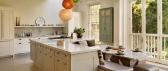
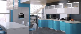
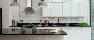
Photo examples
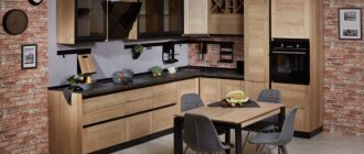
Option in a modern style. The island acts as a divider between the dining room and kitchen. The appliances are built into the side cabinet and kitchen unit. The TV in the photo is positioned so that it is convenient to watch from different zones without turning your head. Materials: plastic, metal and marble.
A more classic example of a large kitchen design. The island has a rustic design, made of wood with open cavities at the bottom and a built-in metal vanity frame. The rest of the kitchen is done similarly. The work surfaces in the photo are combined with the window sill. Lots of open shelves. The patterns on the chandelier and wall cabinets are reminiscent of ethnic ones.
You may be interested in: Fashionable design trends for the kitchen in 2021
An example of modernism with built-in modern appliances and soft transitions. Light colors prevail in the photo. No gaps. The bar counter separates the preparation area from the rest of the room.
Contrasting spacious kitchen for a private home. The classic triangle between the sink, refrigerator and hob. Modern metal appliances harmonize with the colors of the surfaces and contrast beautifully against the background of the wood colors of the finish in the photo. The tap is located by the window.
An example of distributed lighting in a large kitchen is in the photo. Not a single corner was left without light. The sink is located on a separate island. With the latter you can both cook and eat while sitting on a bar stool.
A cozy kitchen is the result of long planning and implementation of ideas. There are many of them over a large area. Use our developments so you don’t regret later about wrong design decisions.
Design styles for spacious kitchens
The design of a large kitchen in a private house or apartment can be decorated in different styles.
Classic
A site visitor who knows a little about art will immediately exclaim: there cannot be a classic style in the kitchen. After all, it does not fit, literally at all, with a refrigerator, microwave, dishwasher, cabinet door closers, i.e. with everything without which a modern kitchen is not a kitchen. All this is true. Modern technology destroys the image of old, respectable England, where this style came from.
For information: classicism in art originated in Ancient Greece. The first sprouts of the direction in architecture appeared in France, during the time of Louis XIV, in the interior of the classic, as a direction in design, it was formed in England. Therefore, the style is sometimes called English.
But you can use a microwave to imitate a wall cabinet, keep a food processor not on the countertop, but in a cabinet, close the dishwasher with an additional door, which has recently been done by all manufacturers of kitchen units, regardless of style, buy a gas stove, specially aged, disguise the refrigerator as a cabinet .
Classic style in the kitchen interior. Photo taken from open sources. Yandex. Images.
The main features of the classic kitchen style:
- the color is muted, not flashy. It can be white, beige, terracotta, mustard, dark red and green, faded blue;
- natural materials: copper, bronze, silver, wood, ceramics, glass, stone. Decorative fabrics: cotton, linen and silk go well with basic materials;
- no-frills decor: paintings with a simple still life or meal, family photographs in wooden, unpainted frames, various panels, embroidery, porcelain figurines, floor vases;
- floor - wooden or ceramic: tiles, porcelain stoneware. In this case, the tiles should be large in size;
- ceiling - white, matte with various plaster stucco moldings;
- walls - painted with stucco decor or covered with textile wallpaper. Additionally, you can sheathe the bottom with wood;
- furniture made of wood or “wood-like”, simple, good quality, reliable. A round table, chairs with soft seats and bent legs, a wooden set with panels;
- the light is warm, yellowish. Sources: chandelier with pendants and sconces. No built-in or hanging lights;
Classic chandelier.
- dishes - porcelain or metal, but aged.
Neoclassical
Neoclassicism is a style that does not exist in reality. The idea of large kitchen design mixing old and new originated in the USA, but quickly found imitators all over the world. Its essence is to combine royal style with modern materials and equipment. There is no longer any need to hide or disguise anything. On the contrary, modern kitchen equipment emphasizes the grandeur and monumentality of classics in decoration and furniture. Kitchens look modern and laconic.
Characteristic features of neoclassicism in the kitchen:
- symmetry and proportionality of the situation;
- elegant, but at the same time discreet decor;
- clear geometric shapes of the room, furniture and equipment;
- natural or natural materials in everything from finishing to furniture and flooring;
- table, chairs and cabinets, the same as in the classic kitchen;
- high ceiling;
- color palette of calm colors.
Neoclassicism in practice: beautiful and practical.
Loft
The design trend in the loft style originated in the USA, when plants and factories began to be actively moved outside the city. Vacant industrial buildings and warehouses began to be actively converted into housing and rented out. The new owners were not keen to invest in decoration. Therefore, the walls and ceiling had their original appearance: beams, pipes, communications, roof. This is where the loft style arose. Literally - attic, top floor or attic. Currently, there are varieties of style:
- industrial;
- glamorous;
- Bohemian.
Characteristic features of a loft style kitchen:
- brickwork;
- rough plastered walls;
- open utility network;
- high ceilings;
- any decor. It all depends on imagination and the amount of money;
- the furniture can be both antique and ultra-modern;
- floor - varnished boards, concrete or ceramic tiles with a texture imitating wood or concrete.
A tall plant in a pot will liven up the kitchen.
Color. White, gray, in small quantities black.
Ceiling. Plaster without grouting or leave in its original form. Beams made of wood or metal are attached below.
The walls are made of brick, white or red. They paint or plaster only if they want to separate the dining area from the workspace.
Kitchen set. Most often dark, plywood-like, with many metal inserts.
The decor on the walls is graffiti or posters from the last century.
Dishes. It can be any - there are no requirements.
Loft in the interior of the kitchen. Photo taken from open sources. Yandex. Images.
Country
Nostalgia for country life drives the desire to decorate the kitchen like your grandparents'. The main design elements in this direction:
- simple, rough furniture that imitates handicraft;
- natural materials: wood, textiles;
- an abundance of fabrics: tablecloths, napkins, waffle towels, covers for pillows and furniture, rugs knitted from fabric;
- a lot of embroidery - ornaments, floral patterns, checkered patterns;
- old dishes, including a samovar, large, pot-bellied teapots.
Country. Photo taken from open sources. Yandex. Images.
Provence
Provence is also country, only with French motifs. Distinctive features of a Provence style kitchen:
- pastel colors of walls, furniture, kitchen units;
- big windows;
- a lot of light, including due to lighting;
- old or artificially aged furniture;
- abundance of carvings;
- many indoor flowers;
- clay dishes;
- natural fabrics;
- many vases and figurines.
Provence style in the kitchen interior. Photo taken from open sources. Yandex.Pictures.
Minimalism
The essence of the style is in its name - nothing superfluous, only the most necessary, strict geometric shapes. Household appliances are built into the set. No more than three colors in the interior. Finishes of the highest quality. The walls are smooth and monochromatic. The apron is clear or colored glass.
Minimalism.
Planning methods
Before ordering a kitchen set, you need to draw up a plan for the arrangement of the elements of the triangle: refrigerator-sink-stove and each drawer, both floor-mounted and wall-mounted. It must be remembered that the refrigerator cannot stand in the center. Only on the edge or in the corner. Such requirements can be met by placing kitchen furniture objects:
- in a linear way;
- two-row;
- corner or L-shaped;
- insular (peninsular);
- U-shaped.
Linear arrangement
Triangle objects are placed in a line in two cases:
- the room is rectangular, very elongated;
- There are at least two standard or one large windows on one of the walls. In this case, a working area is placed near a blank wall, and a dining area is located near the windows.
Linear layout.
The linear arrangement of kitchen furniture is laconic and compact, does not clutter up the kitchen area, which can be divided into several zones: dining, relaxation, breakfast.
With this layout, the optimal place for the sink is in the middle, at a distance of 40-60 cm from the refrigerator (separated by the cabinet) and 60-76 cm from the hob (separated by the countertop). If necessary, utility lines are moved. The costs are small, but it's worth it. Additional cabinets can be installed on the side of the stove and refrigerator, or can also be hung.
In this option for placing drawers and objects of the “working triangle”, fittings play an important role - they complement design solutions, create comfort and coziness, and a countertop made of natural or artificial stone.
Double row placement
With a two-row arrangement of furniture, the set is placed along two walls. In this case, there must be two corners of the working triangle in one row, and one in the other. Based on ergonomic requirements, the sink and stove must be neighbors. Other combinations are allowed, but they are irrational from the point of view of the cook’s physical costs, as well as safety: the risk of getting burned when draining boiling water from spaghetti or moving a baking sheet with boiling fat from the stove to the sink increases.
The distance between the rows is 1.3-2.5 m. This means that nothing additional can be installed between them. The option is rare, because not suitable for combination with a dining room. It is mainly used if a passage from the end wall into an apartment or house is needed, or the designer uses it as an original idea to express the concept embedded in the interior. As an example, in the middle of one of the rows the tabletop is used as a dining table.
And now some practical tips:
- It is better to hang hanging cabinets on one wall - asymmetry appears. In this case, the room looks more aesthetically pleasing. If there are not enough of them to store food and dishes, it is better to make shelves on the opposite wall;
- The row with the sink and stove should be functional - less unnecessary movements. The opposite line of furniture is for storing food and dishes;
- The depth of the lockers in each row should be different. Asymmetry appears, the tunnel effect disappears;
- There should be beautiful curtains on the window - they are the center of attention. If the wall is blank, you need bright decor;
- It is better to remove or rehang the door so that it opens into the corridor.
A classic two-row layout, where all design recommendations are taken into account: the drawers have different depths, they hang only on one side, but the rules of ergonomics are ignored - the sink should be in the same row as the stove.
Corner layout
The L-shaped arrangement of the kitchen set is a classic of modern kitchens in cottages, private houses and large apartments, as well as in small Khrushchev-era kitchens. Corner installation allows you to create comfortable, but also practical conditions for being in this part of the home: it’s beautiful, “hot spots” are at hand, it’s easy to delimit the space into several zones.
Corner layout with a dedicated dining area: everything is at hand, a large cutting tabletop, classic delimitation of zones - different floor coverings.
But here you need to remember that an abundance of decor is not suitable for such a layout - it should be kept to a minimum so as not to clutter up the space. Corner sofas with a dining table, a large sink in the corner (precisely large so as not to constantly reach the hanging elements of the set with your head), and many hanging cabinets fit well into the decor.
Island
The island layout is a high-end kitchen design. It consists of a countertop, cabinets and even equipment (sink or stove) placed in the center of the room. For this layout you need:
- plenty of space - at least 15 m2, optimally - 20-25 m2;
- good lighting;
- free passages on all sides;
- When installing the hob, connect the hood.
The “island” fits well with the arrangement of the rest of the kitchen furniture in the shape of the letter “P” or “L”. The color scheme should either dissolve in the surrounding space or be a bright spot.
An island with an L-shaped layout where the island blends into its surroundings.
U-shaped layout
The latest fashion in the arrangement of kitchen furniture is the U-shaped layout, which is gaining popularity at a rapid pace. By using three walls, the owners receive convenience (plenty of places to store anything and everything) and beauty. At the same time, the compact arrangement allows you to free up a lot of space for other areas: lunch, breakfast and relaxation.
In this case, two rules must be strictly observed:
- do not space the corners of the working triangle far apart from each other;
- do not highlight other zones within the workspace, which is formed by a U-shaped layout.
U-shaped layout with successful solutions: the corners of the triangle are correctly located (the sink is near the window, the refrigerator destroys the symmetry due to its greater depth), a solid countertop made of natural stone, on one of the walls the cabinets are not hung to the end of the row.
Finally, a few tips from the professionals.
- Provide a functional purpose for each wall. One carries out the task of storing food; there is a refrigerator, hanging cabinets, and pull-out systems. The second is an area for washing fruits and vegetables and dishes if there is no dishwasher. The third is for the hob, microwave and oven. But you shouldn’t forget about ergonomics: the dryer is above the dishwasher, the oven is at chest level, and pots and pans are stored under the stove.
- The set will look light if you abandon wall cabinets on one or two walls. You can compensate for the lack of storage space with tall cabinets and pencil cases.
- The refrigerator and cabinet in the form of a column are placed at the ends of the legs of the letter “P”, along the edges of the set.
- If there is a window, then this is an ideal place for washing.
- Asymmetry can be achieved in two ways:
- reduce the depth of the cabinets;
- shorten one of the legs of the letter “P”.
Space zoning techniques
The division into zones in a large kitchen suggests the presence of working, dining and passage areas. The interior of each should be thought out and correlated with others, creating a harmonious space.
You can zone your kitchen using:
- lighting fixtures;
- finishing of walls, floors and ceilings;
- color accents.
Based on three basic methods, designers offer more diverse interior solutions related to zoning:
- Visual zoning - the use of furniture and wallpaper of different colors. The kitchen set should also be different in color from the dining set.
- Use of different floor coverings. Designers love to mix different textures and materials in the interior. It always looks interesting and stylish, the main thing is to be able to combine them. For the work area, a more practical covering that is not afraid of moisture and dirt is suitable - tiles or PVC. In the dining area you can lay carpet or laminate.
- The use of multi-level ceilings, LED strips or simply different lamps.
- The location of the dining and working areas is opposite each other. You can separate the kitchen from the dining room with a bar counter. This technique is often used by the owners of a large kitchen-gallery combined with a living room.
Zoning options
In a large kitchen, you can’t do without creating special zones. Allocation of areas according to purpose allows you to reveal the design idea, make the room beautiful and functionally comfortable. Mainly distinguished:
- work area - a space where there is a countertop, sink, hob, refrigerator and various cabinets for storing dishes and non-perishable products: coffee, tea, various cereals, flour, sugar and other necessary things. Here, ceramic and PVC tiles, moisture-resistant laminate or linoleum are placed on the floor, the apron is made of plastic or tiles, glass, MDF, and even the brick is varnished. Such precautions are necessary due to the fact that something is constantly spilled or splashed in this area;
In the work area, the floor and walls are protected from splashes of grease and spills of water or liquid products.
- dining area (dining room) - a place for family members and guests to eat. There is a dining table, chairs, and a bar counter on it. Here, fantasies regarding the layout and appearance of a table with chairs can only be restrained by the budget;
- a relaxation area is a space where you can leisurely drink coffee, chat with friends, read, or just lie down or sit with your eyes closed. Usually this is a corner sofa or a pair of armchairs with a small table. If there is a balcony adjacent to the kitchen, then this part of the apartment is the ideal place to relax. True, you will have to make efforts to turn the balcony into part of the living space: glaze, insulate, install a “warm floor”;
The seating area can be moved to the balcony.
- breakfast area - consists of a bar counter or a small table adjacent to the main set. Designed for quick meals alone, when “mother laziness” does not allow you to set the dinner table.
The breakfast area is highlighted by a bar counter.
There are many ways to highlight these zones. In this case, you can use one option or several at once.
Flooring is a simple way, accessible to every home craftsman, to highlight the boundaries of a zone: use laminate, linoleum, tiles or porcelain tiles. Different colors, shapes and textures of the floor allow you to visually divide the room into parts without cluttering the kitchen with partitions, cabinets and other furniture.
The work area is separated by floor covering.
Islands and peninsulas from a countertop or bar counter. They not only divide the room into two zones, but also serve as an additional work area or a place for a quick single meal (breakfast). In addition, this layout fits perfectly into the design of a large kitchen-living room in a private house.
The bar counter divides the room into two zones.
Multi-level ceilings, beams, beams, arches are another interesting solution for creating different zones. There are no restrictions here - only the imagination of the master, his skill and the availability of building materials.
Another way of zoning is light. Different brightness and height of lamps very effectively visually divide any room into parts. For example, the lighting above the work area should be bright. In contrast, you can install dim lighting above the dining area, enhancing the effect with low-low lamps. There are also rules here:
- Above each zone or semi-zone there should be a main lamp: a chandelier, a light bulb in a shade or lampshade, or without a lampshade at all. It must hang from the ceiling and fit perfectly into the style. For example, there should be no lampshade for classical or neoclassical;
There should be main lights above each zone.
- the main lamps cannot create the necessary luminous flux power, especially in the work area. And good visibility is not a whim, but a necessity. Therefore, in those places where you need to strain your eyesight to see some small details, additional, separate light sources are installed. In the work area it can be an LED strip, in the dining area - a table lamp, in the relaxation area - a floor lamp;
Additional lighting of the work area.
- Decorative lighting ties the finishing into one whole with the kitchen unit: LEDs in the ceiling, sconces, strips and backlights.
Decorative lighting.
How to ensure comfort
A large kitchen is the heart of the home, where people spend most of their time. The sooner you think about your comfort, the easier it will be to ensure it. It is better to start creating it at the stage of renovating a large kitchen in a private house. There are many questions: how to carry out communications, what to occupy the center of a large kitchen, where is it better to hang wallpaper and where to tile, how high should you hang cabinets? But first things first.
Furniture arrangement
Whatever the footage, there is no extra space in the kitchen. You need to install the basics - cabinets, equipment, a large dining table with chairs.
A few simple tips:
- Maintain a distance from the countertop to the cabinets - 45–60 cm, more than 70 cm to the hood. It is important that you do not feel cramped.
- We recommend a distance of 85–110 cm from the floor to the tabletop, depending on the height of the hostess. Do the same with a large dining table.
- Do not make the depth of the working surface of the headset less than 60 cm.
- Do not place a gas stove or outlets within a radius of half a meter from the sink. Splashes can cause a fire or explosion in the kitchen.
- Place the equipment as usual. For example, it is better to install the dishwasher to the right of the sink if you are right-handed, and everyone is used to seeing the trash can under the sink.
The main sign of an incorrectly chosen design is chaos in the room. It catches your eye. To avoid this, calculate everything. Think ahead, and if you have any difficulties, contact the designers.
Zoning options
Large rooms, unlike small ones, can be easily divided into zones. There are two of them in the kitchen - dining and working. They should be isolated from each other, but at the same time be within walking distance to carry food dishes. If possible, a third, leisure zone is added.
You may be interested in: Kitchen combined with a balcony: unusual ideas and tips for redevelopment
It is important to think about how to arrange the space in order to maintain the overall style of the house and correctly distribute the proportions of the areas. Use light, color, finishing materials, furniture, and artificial decorative structures as separators. Everything except furniture must be used before renovating the room.
The working area is determined by the supplied water, gas and ventilation. For the dining room, choose a bright place near the window. For relaxation, a small corner with a sofa and a large TV on the wall is better suited.
The triangle rule and accessibility
Three main steps when cooking: take it out, wash it, cook it. It is more convenient to move from point to point along the trajectory of a triangle. Professionals insist that the design of a large kitchen should be done accordingly - the sink, refrigerator and work area should be located on the tops of this geometric figure.
Design projects for large rooms necessarily use corner locations. They are more familiar, which means they save time on the owner’s movement.