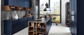
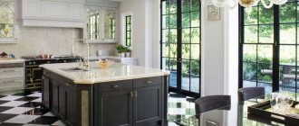
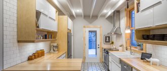
The combination of white and black colors is an eternal and unsurpassed classic. It has a special style, bright contrast, and moderate severity. For some rooms, a black and white palette may not be entirely acceptable, for example, a nursery or bedroom. However, it is perfect for the kitchen.
The black and white palette is suitable for the interior of any style and fits perfectly into both small and large kitchens
Pros and cons of a white kitchen with a black countertop
The harmony and effectiveness of the interior of a black and white kitchen depends largely on the proportion of colors and their shades. It is their correct use that guarantees a stylish and at the same time practical room.
A good balance of black and white helps to visually increase the space in a small kitchen
The black countertop is a universal component of the kitchen. It looks great in combination with a room of any color. However, black becomes the most contrasting and expressive in tandem with white. Such a bold design approach, namely a light kitchen with a dark countertop, has a number of positive and negative characteristics. This is explained, first of all, by the marginal contrast of the two colors. Let's look at them in more detail.
Advantages:
- Versatility. A black countertop is perfect for a kitchen in any style and color. It will also fit into any space shape: L-shaped, U-shaped or with an island surface.
- Visual increase in space. Due to the fact that the dark work surface is on a light (white, light beige or milky) base, it seems to float in the air. Such weightlessness looks very unusual. If the tabletop itself is also glossy, then the expansion effect becomes even more impressive.
- A bright accent in the interior. Whatever color the kitchen is made in, including the corner one, and especially if it is white, the black countertop will not go unnoticed. It will go perfectly with the decor of any shades and textures.
Flaws:
- Impracticality. As you know, on dark colors all dirt and damage become more noticeable. If the black countertop has a glossy finish, then maintaining it is even more difficult.
- Too much contrast. Not everyone will like the combination of a classic white kitchen set with a black countertop. The chosen colors are very contrasting. Therefore, you should carefully weigh all options, choosing between a spectacular and homely simple design.
- A fine line between harmony and dissonance. When working with black and white colors, you need to think about their quantity. A significant predominance of the first can negatively affect the perception of space: the room will seem smaller, the interior itself may look dull and uninviting. If the main role is played by white color, then the room will become somewhat cold.
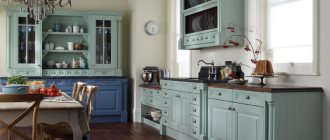
Not just white: a combination of brown or black countertops with other colors of the set
The color scheme of kitchen furniture puts the main emphasis on the overall style of the room. You should choose it carefully, taking into account the overall finish, the shade of the wallpaper, and other parameters. Among the common options:
- grey;
- beige;
- blue;
- black.
Grey
A gray kitchen set makes the room presentable, although many people consider the color boring. A rich dark countertop, contrasting details, a wooden floor - details that will make the kitchen original. Proper design will relieve the feeling of ordinary gray furniture.
Beige
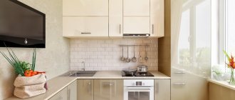
The color is less easily soiled and has many undertones, which is why many housewives prefer it. Beige adds coziness, warmth, and tranquility, while white adds coldness and sterility. The classic design is complemented by a brown tabletop, delicate curtains, and light flooring. Dark fittings match the beige surfaces of the furniture.
Blue
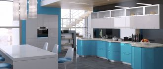
A blue kitchen set will stand out as a bright, contrasting spot among a snow-white kitchen, attracting the attention of guests. The design does not require additional elements, decor, selection of curtain colors, or flooring. It is not recommended to add too much blue.
The blue set accents the attention
Black
A dark kitchen set with the same countertop looks gloomy. A bright white apron and workplace lighting will help alleviate the feeling of discomfort. Black color makes the room dull, so it is better to choose cabinets with a glossy surface that will reflect the sun's rays.
Monochrome kitchen design is often used. You can eliminate the effect of sterility in the room by harmoniously incorporating a third color, complementing the interior with bright details, and choosing a warm shade of the floor covering. A white kitchen with a black countertop is a great option to avoid color mistakes.
White kitchen and black floor
An original design solution that can emphasize the individual style of a home is the use of black flooring. This approach is very popular and is one of the trends. The main feature of this flooring is its ability to transform any kitchen furniture. Both an expensive and a very simple set will look great on it.
Black self-leveling floor in a modern style kitchen
The dark color of the floor can visually reduce the space. To prevent this from happening, you need to choose a set of white or another light color. This will help balance the color ratio and make the room harmonious.
Like any other dark covering, a black floor, especially if it is glossy, needs constant thorough cleaning. Minor stains and small debris will be very noticeable on it. A solution to this problem can be the use of patterned or matte flooring.
An original approach would also be to use black and white or beige floor tiles in a checkerboard pattern. This option will allow you to diversify the color saturation and make the space not so monochromatic.
Diagonal laying of tiles will help visually increase the area of a small kitchen
Choosing a color for a combination of light and dark shades
Kitchen furniture, room decoration, decorative details - all this has not only an aesthetic, but also a psychological impact, which is why the choice of color is so important. Light shades visually expand the walls: white colors can make the interior light and translucent. The snow-white tone of the facades of the set allows you to move furniture, merge structures with walls, and expand the space.
The photo shows a solid white kitchen with dark details.
Creamy and creamy shades act a little differently. They are softer and warmer than white, as they have yellow notes in their palette. And therefore, such colors are more noticeable and independent, despite their neutrality. Dark brown shades - wood, chocolate, granite - will be harmonious with a light yellow color scheme.
Natural shades in light colors - blue, green, lilac - are harmoniously perceived. In a pastel palette, these colors have an amazing character: they calm, stabilize the functioning of the nervous system, and balance the situation. You can choose a countertop to match these shades in various tones:
- A set in green tones can also be complemented with a dark green tabletop. This could be an imitation of natural malachite or emerald.
- The blue design of the facades will be diluted by dark gray shades of both the tabletop, flooring, apron, and other details.
The photo shows a delicate blue kitchen with a dark countertop.
- The light pink facade of the kitchen furniture will be complemented by a dark brown wooden or chocolate countertop with an imitation of stone texture. A metal surface would also be appropriate here, which will allow you to combine strong masculine notes and a feminine romantic character in the interior.
Other interior details in white kitchen design
All components of the kitchen space are important in the holistic perception of space. To make everything look harmonious and original, you need to consider a number of tricks.
Colored accents diversify the excessive severity of a black and white interior
- If the set is straight, without additional decorative elements, you need to make an accent apron. It can be made in any shade or be a white relief canvas.
- If the white set is complemented by dark household appliances, then a “roll call” should be made, that is, decorative elements or the facade itself, made in the same color, should be introduced into the interior.
- If the interior of a white kitchen with a black countertop seems too monotonous, you can “revive” it with the help of gold, copper or other patina (special coating to give items a vintage look).
- For those who prefer a more homely atmosphere, there is a very original solution: wooden surfaces. They can be a tabletop, shelves or floor. This approach will make the kitchen more cozy and warm.
- Lighting in a white kitchen should not be too cold. Lamps with yellow light are best. They are able to create a warming effect.
Wooden splashes make a black and white kitchen more cozy and warm
Despite the prevailing opinion that a white kitchen looks cold and uncomfortable, there is no need to immediately give up. You just need to add a few bright elements correctly, and it will surprise you with its sophistication.
A black and white kitchen is a place where you can realize your creative experiments. Different styles, complementary colors, and interesting decor can make it a work of art. All you have to do is not be afraid and give free rein to your imagination.
White kitchen: which style to choose
A kitchen in white always demonstrates the housewife’s love for cleanliness, since it is difficult to find a purer and lighter color. But the snow color itself is perceived ambiguously, because it is associated with the sterility of operating rooms and hospitals in general. Interior style is essential:
- A classic white kitchen is carved furniture, overhead moldings as decor, monumental shapes and graceful lines. Such sets and dining sets look solemn and voluminous in themselves. There is no need to dilute the white color with other shades, but a clean monochrome interior tends to cause a feeling of discomfort. Therefore, a classic white kitchen can be diluted with a black countertop. In this case it will be a stone slab. The sink, floor, and apron trim can be made from the same material.
The photo shows a classic kitchen in snow-white tones with a dark countertop.
- A modern interior in snow-white tones has perfectly smooth surfaces, perhaps even glossy. The facades in such a kitchen are not always equipped with fittings - they can be hidden or the doors are equipped with special mechanisms for opening without handles. In this case, it is very important to dilute the monochrome design with dark or bright splashes. If your choice fell on a black and white duo, then you can and should make the surface of the table dark: with a black countertop and apron, a perfectly smooth kitchen will look geometric and clear, but also harmonious.
The photo shows a modern, functional white kitchen.
High-tech as a variety of modern styles still stands out against the general background of functional interiors. This is a high-tech interior with a clear structure and geometry, in which everything is subordinated to ergonomics and facilitating everyday processes. Extraordinary solutions are used here: original lamps, anatomical chairs, non-standard tables and sofas. Some cosmic nature of such an interior involves the use of streamlined forms, subordinated to human comfort. And here it’s not just white or dark color that usually predominates – metal and plastic dominate here. Therefore, the kitchen is equipped with a dark, but not always stone, countertop. It can be high-strength plastic or metal.
The photo shows a white and black interior in high-tech style.
