The meaning and psychology of burgundy color
A mysterious burgundy shade is formed from a combination of strong, bright, self-sufficient colors - black and red. The result of the combination is a multifaceted tone, alluring with its mystery.
The color was named after the famous French wine Bordeaux. Many compare the effect of contemplating the shade with a light, intoxicating haze that occurs after drinking a glass of an exquisite drink.
For interior design, burgundy is chosen by charismatic, self-confident people. They want to get an additional source of inner strength and create it themselves with the help of decor. Fans of this color strive to defend their positions, to be attractive, witty, and mysterious. The same goes for the interior - through the unusual design of rooms they want to gain admiration and approval from others. They succeed, because the stunning deep burgundy tone in the design leaves no one indifferent.
Bordeaux in the interior of the room
Features of using burgundy in interiors
You can introduce burgundy color into the interior of any room: dining room, kitchen, hallway, living room, bathroom, but in the bedroom and children’s rooms it should be used extremely carefully. The main condition is dosage.
To create a burgundy interior, it is not at all necessary to paint the walls this color; it is enough to fill the room with burgundy accessories. Very often the last option turns out to be the most successful. A large amount of this shade can disturb a person’s calmness and provoke attacks of aggression, so in the decor of living rooms it is used only in combination with other colors.
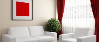
burgundy curtains in the living room interior
Shades of burgundy in the interior
So far no one has been able to fully unravel the mystery of the mysterious Bordeaux. But the designers managed to highlight several shades of color. In the table you will find the main variations.
| Shade name | Characteristic |
| Marsala | Garnet shade with a distinct brown undertone |
| Burgundy | Deep red-burgundy |
| Carmine | Rich dark red with brown notes |
| Merlot | Tone closest to brown |
| Brown | Muted shade with a predominance of brown |
| Sangria | Bright burgundy with pronounced red notes |
| Cardinal | Shade with leading bright red tones |
| Terracotta | Soft tone with pronounced reddishness |
However, the matter does not end with choosing a shade. The next step on the path to creating a stylish design project is to consider variations from the spectrum of light and dark tones.
Advice! You should not combine more than two shades of color in the interior of one room.
It is important that the tones relate to each other, create a game, and complement each other.
The use of burgundy in rooms
The use of burgundy color in the interior of residential premises should be approached with caution and knowledge. Although the fusion of red and brown has created an undeniably beautiful shade, it will not be equally appropriate everywhere.
Living room
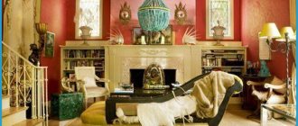
Representative and elegant, burgundy feels best in the living room interior. All special events and meeting of guests take place in the room, which means that the character of this shade is revealed most fully. Here you can not be modest and complement the rich wine color with decor typical of a palace style. Stucco molding, patina, natural wood furniture, soft velvet upholstery, textile wallpaper, mirrors and crystal will recreate the atmosphere of noble receptions. And to prevent the room from completely turning into a throne room, you should entrust its design to the hands of a talented designer who knows how to balance on the brink of past and present.
Bedroom
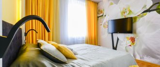
If flashy scarlet is in most cases prohibited from entering the bedroom, then this door is open to a calmer and more sophisticated burgundy. But with some conditions. An excess of bright wine shades can lead the bedroom interior towards vulgarity. To prevent this from happening, you need to remember the purpose of the room - to restore strength and relax. Color combinations here should be soft, contrasts should be smoothed. A combination of deep, impressive burgundy with delicate, youthful pink, milky yellow, ivory or light gray will look cozy and elegant.
Children's
When adding bright colors to the interior of a nursery, it is worth remembering their impact on the state of mind of the owner of the room. The psyche of children is at the stage of formation, so it is especially susceptible to outside influence. Being a descendant of red, burgundy can increase a child’s activity, cause anxiety and even aggression. Therefore, when decorating a nursery, it is better to limit yourself to a few accents, for example, purchase a burgundy chair or a chandelier.
Kitchen
Not all tones of aristocratic burgundy are good for kitchen decoration. And the point here is not at all about visual effects, but about improving the digestive process! Cold burgundy shades do not help increase appetite, which means that a kitchen made in these colors is unlikely to provide inspiration for culinary creativity. But warm burgundy, on the contrary, looks quite appetizing. It can become the main color of the kitchen set, be used as a shade of the walls, floor or ceiling (but only one) or appear in the form of catchy accents.
Bathroom and toilet rooms
Perhaps the most democratic premises, which in no way infringe on the imagination of designers or owners. Cold burgundy, soft marsala, delicate shade of sangria, and the bathroom is ready for any experiments. You can use a proven scenario and make it a corner of classicism with warm burgundy walls, a mirror in a gilded frame and a cast-iron bathtub with massive legs. Or you can be bold and pair juicy green, icy blue or sunny yellow with burgundy.
Hallway
Burgundy walls in the hallway are the choice of extraordinary individuals. Having decided on it, the modest size and lack of natural light will need to be compensated for with light-colored furniture and an abundance of spotlights.
Balcony
Despite the small area, the balcony area is a very good place to use burgundy color: good lighting and a large area of glazing, especially panoramic, dissolve the boundaries of the room. And if residents are engaged in growing indoor plants, choosing a burgundy shade will give a stunning combination of colors.
What colors does burgundy go with?
To create a design, it is not enough to choose your favorite shade - you need to determine which tones it will harmonize with. Let's consider options for successful companion flowers:
- Grey. This elegant neutral color does not draw attention to itself, but is considered an ideal base in combination with bright representatives of the palette. You can use all shades - from light to rich. The ensemble of gray and burgundy in the interior is good for spacious rooms.
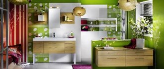
- Green. This is a natural shade that harmonizes with most other tones. If you are not afraid to make bold decisions, include it in the design of the room. A neutral third tone will look great in a green-burgundy interior. For example, beige, white, light brown.
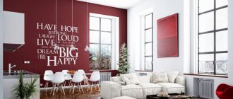
- White. This color visually expands the room, making it bright and attractive. The combination of white and burgundy will look unusual and elegant. And the main advantage of the combination is versatility. The ensemble is appropriate for any interior style.
- Brown. Brown can be an excellent companion for burgundy. These are related shades, but they harmonize perfectly. To make the room feel cozier, add a little white, beige or gray.
- Black. If you use color in doses, you will get a noble and luxurious interior. It is better to give black the role of an accent, highlighting several elements in the room with it.
- Blue. For some, an interior in blue and burgundy tones will seem strange. But this is one of the classic neighborhoods! It is important to choose a deep, rich tone without being too bright. When combining, designers recommend making one shade the main one, and the second one complementary. Then the design will “sparkle” and will not seem gloomy.
- Beige, light brown. These are neutral colors that can serve as a base in any interior. Want to highlight the richness of burgundy? There are simply no better options.
- Yellow. But this juicy shade is just right as the main one. There should not be a lot of burgundy elements - two or three bright details are enough to create color. You need to choose warm yellow - lemon in such an ensemble looks somewhat aggressive.
- Gold. A pompous option for classic interior styles. The burgundy and gold design is suitable exclusively for spacious rooms. In a small room, such a proximity will hide the space.
- Orange. Two rich bright colors in one room look bold and non-trivial. This duet is not suitable for all areas of design. Professionals often use a combination for an ethno style. The shades look good in approximately the same ratio.
Advice! Shades of crimson, pink, lilac and red in combination with burgundy are allowed only as a light addition. Designers categorically do not recommend combining them or using them as a base.
We invite you to look at the photo of burgundy color in combination with other shades in the interior. These examples are the embodiment of the best ideas of designers for decorating rooms in different styles.
Burgundy with gray
Burgundy and gold
Burgundy with green
Burgundy and white
Burgundy with black
Burgundy with blue
Burgundy compositions indoors
Burgundy color in the living room interior looks luxurious. Wallpaper with an elegant pattern will put your guests in a festive mood. Use burgundy shades sparingly, otherwise it will be difficult to stay in the room for a long time.
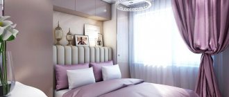
Use burgundy curtains in your bedroom interior if you want to create an intimate atmosphere. But in the nursery it is better to hang curtains of light colors.
Bright room design with a burgundy shade
Burgundy color combined with blue
When you decide to decorate your kitchen with burgundy shades, remember that this is one of the most important rooms. Small islands of burgundy against the background of white walls and large windows will make the kitchen more comfortable and elegant. There is also an opinion that wine color stimulates appetite and improves the functioning of the digestive system.
Dark blue color combined with burgundy in the interior
Burgundy tiles in the bathroom look quite bold. At the same time, such an interior will help you cheer up faster in the morning and get into a working mood.
In the bathroom, burgundy decorative elements will look good:
- soft rugs;
- terry towels;
- shower or bath curtains;
- toothbrush holders;
- mirror frames.
In the nursery, it is recommended to limit the use of burgundy. If possible, avoid purchasing wallpaper in burgundy shades. You can limit yourself to a few accessories, for example, a lampshade or a burgundy chair. The rest of the interior is best done in light colors.
Light room design with burgundy shade
Burgundy color in the interior
Bright kitchen design in burgundy color
In what interior styles is burgundy color appropriate?
The solemn burgundy shade used to occupy a place of honor in the interior of noble houses. Today, elegant tone is used mainly in classical styles. It will fit perfectly into such styles as Baroque and Empire.
There is another interior style that tends towards pomp and grandeur. We are talking about the modern direction of Art Deco. This design also uses a burgundy shade in combination with brown, black, and golden colors.
Color can act as a bright accent in pop art, hi-tech, retro, minimalism, and country interiors. It is better to use it in combination with laconic pieces of furniture and decorative elements. Excessive pretentiousness will lead to violations of the canons of style.
Burgundy interior details
When making successful color combinations in the interior, taking into account unobtrusiveness and lightness, choose lighter contrasting shades. For example, light green, beige, gray and pink - they always look very advantageous with burgundy in the interior. This is worth remembering if the design includes burgundy pieces of furniture or finishing materials in this color. It is important to combine colors correctly, favorably placing accents or delimiting the space of the room.
Burgundy wallpaper in the interior
When deciding to use burgundy wallpaper in the interior of a living room or other room, you should focus on the nature of the room’s lighting, its size and design details.
- When using burgundy as the main color, choose spacious rooms with good lighting, and under no circumstances use it in cramped spaces.
- This color is very demanding on proportions, so the main rule when using it is not to overdo it. Perhaps it would be better to decorate only one wall in this color.
- Burgundy color in any interior promotes concentration and restraint, so it is advantageously used in both residential and work spaces.
- It is not recommended to combine burgundy wallpaper with even darker shades, since in this case the room may lose the atmosphere of calm, coziness and comfort.
Burgundy ceiling in the interior
Burgundy is not a simple color that requires a skillful approach when using it in the interior design of any room. You also need to know in which rooms this color is more appropriate. For example, if a burgundy ceiling in a kitchen, especially a spacious one, will look very good, then a small bedroom with a ceiling of this color is a bad option.
For a successful design move, it is necessary to take into account the features of color and its combinations in different styles. So, a burgundy ceiling will be organic in a classic design style with gold accessories. It is important to remember about moderation in the use of this color and its shades. The burgundy color in the interior should be applied in doses, otherwise you can end up with an uncomfortable and overloaded room that will be depressing.
Burgundy floor
If you decide to choose a burgundy floor in the interior, then the rest of the finishing materials, accessories and furniture are automatically selected in shades that match burgundy. Depending on the size and illumination of the room, the tone and saturation of the combined parts are determined. To prevent the decoration of the room from merging with the pieces of furniture, you should not choose burgundy flooring and furniture in the same color. It is much more appropriate in this case to highlight the rich floor with light furniture.
Burgundy color in the interior is a complex color and requires special attention to all interior details. So, by choosing floors in this color, you can advantageously complement the interior with curtains, a chandelier, or a bedspread of the same color and its shades. When choosing pieces of furniture to match a burgundy floor, you should take into account the previously described color characteristics of shades that look more advantageous next to burgundy.
Burgundy curtains
When choosing burgundy tulle or curtains in the interior, it is important to think through the remaining details of the interior design of the room. Curtains themselves are considered a style-forming detail, so in any case they will require an organic selection of decor and finishing of the room. Designers recommend listening to the following tips for using burgundy curtains.
- Burgundy curtains in combination with brown would only be appropriate in the office.
- Wine-colored curtains look luxurious with gold.
- It is advisable to use black with burgundy in the bedroom, provided it is interspersed with light shades.
- If we talk about the pattern on burgundy porters, then combinations with cream, beige, milky and creamy are ideal.
Burgundy carpet in the interior
If it is not possible to make a burgundy floor in the interior of the room, especially if it is cramped, but you still want to decorate the interior with a burgundy bottom, then you can cheat. A burgundy-colored carpet will help to zone the space favorably and create contrast if the main floor decoration is made in light shades.
Do not forget about the size of the carpet, which should fit well into the overall space of the room. So, the darker the rug, the smaller the area it will appear to cover. As for the combination of a burgundy carpet with other furnishings, you can experiment endlessly, the main thing is to know exactly what you want to get in the end.
Burgundy furniture in the interior
When choosing a burgundy color in any interior, it is important to learn some features so as not to be disappointed in the final result. When choosing pieces of furniture in these shades, it is important to think about the finishing of the floor, walls and ceiling in order to select successful light and texture solutions that enhance the advantages of the color and gently smooth out its shortcomings. There are some features of using burgundy color in furniture design.
- If we consider pieces of furniture separately, then a burgundy sofa in the interior, armchairs and a wardrobe of the same color will look good with both basic light shades and dark ones.
- The appropriateness of such combinations depends on the room being designed, its functionality, lighting and footage.
- Dark pieces of furniture and light basic finishes are well suited for a bedroom, living room, or nursery.
- If you really want to fit burgundy furniture into a space with a dark finish, then it is recommended to choose a study, hallway and kitchen, especially if the footage and lighting allow it.
Accessories and wall decoration
The overall impression is always made up of details. Properly selected accessories will complement the completed design project. Don’t chase the amount of decor - the more accents, the more tasteless the interior.
Burgundy wallpaper
Most often, there are three wallpaper options on sale: plain, with laconic patterns, and with a light shiny coating. On such a surface, floral patterns look organic. It is better to paste wallpaper in a spacious room or highlight an accent wall with it. We invite you to explore beautiful design ideas
Burgundy wallpaper in the interior
Sofa pillows, blankets
In dark burgundy rooms, such products look out of place, but in light rooms they are perfectly perceived by the eye. Two or three plain pillows on the sofa will already be considered interior decoration. If you combine them with products of a different color, you get an amazing design composition.
You can cover the bed in the bedroom with a burgundy blanket. A small but significant detail will not hurt in any interior style.
Burgundy blankets and pillows in the interior
Furniture in burgundy color
Such products can easily be called the embodiment of modern chic. Even the most laconic item will look luxurious, but not defiant. We would like to introduce you to the popular “heroes” of the setting.
Sofas
Most often, burgundy sofas are upholstered in a matching shade. There are options in leather, velvet, textiles with a “carriage screed” decor. Specific examples from the catalog will tell you better than words. The La Rosa straight sofa with the aforementioned carriage screed upholstery definitely deserves a place in your living room. Pay attention to the more laconic Peterhof model. The third option is the Sydney sofa bed in a classic style.
buybuy
Sofa La Rosa
buybuy
Sofa Peterhof
buybuy
Sofa Sydney
Storage furniture
This category includes wardrobes, cupboards, chests of drawers, dressing tables, and cabinets. In the assortment of designer salons you can find products in one of the shades of burgundy, but most often such models are made to order. Therefore, they can become a detail that sets the tone for the interior.
Kitchen sets, tables, chairs
Burgundy kitchens are the embodiment of good taste and the desire for novelty. Models with a two-color design, such as white and burgundy, look especially original. To add a rich shade to the kitchen, in addition to the set, you can purchase bright Bordo chairs or stools.
buybuy
Stool Bordo
buybuy
Chair “Venus Diamond”
Burgundy tables are exclusive furniture models. Most often they decorate kitchens in modern styles.
Textiles in burgundy color
It’s rare that a house can do without textile decoration. If you decide to add burgundy colors to the rooms, you can consider just this option. Let's talk about two prominent representatives of the interior textile industry.
Carpets
The burgundy color on carpets is already considered a good tradition. There are products on sale with amazing patterns, high soft pile, geometric shapes, and laconic prints. Homespun rugs with woven burgundy threads and items decorated with Burgundy wine-colored fringe are extremely popular among designers. Such models look amazing in hallways, corridors, children's rooms, and ethnic living rooms.
Burgundy carpet with patterns
Burgundy plain carpet
Curtains
A refined wine shade is often present on curtains made of opaque fabrics. The products look strict and solemn, therefore they are suitable for such styles as art deco, baroque, and classic. It's better to hang them in the living room or bedroom. A good choice is plain drapes, curtains decorated with dark or golden patterns and large flowers. You can use tulle with them.
For a children's room, office and kitchen, light curtains in shades of terracotta or marsala are preferable. Curtains should let in natural light and play with a soft shine in the sun's rays.
Burgundy curtains can be used not only for window decoration. They are ideal for creating fabric partitions between areas of the room.
Burgundy curtains in the interior
Burgundy color in the interior of different rooms
We've come to the main thing - tips for decorating premises. Don't forget that creativity is always welcome in design. Recommendations from professionals and imagination will help you successfully express the facets of your inner world through decor.
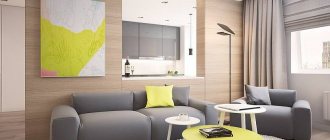
Living room in burgundy color
It is best to use burgundy here. This room is one of the most visited places in a house or apartment. If your interior is made in a classic style, the shade will be complemented by patina, stucco, and items made from natural materials. You can place furniture in the room with burgundy upholstery, such as a sofa or armchair.
In a modern style, furniture in a burgundy shade will also look appropriate. Laconic products with black trim look good.
If you are decorating the living-dining room in a modern style, you can complement the design with burgundy plastic chairs. The ideal ensemble with such items will be an ivory round table.
Feel free to use a burgundy tone to decorate the walls. There are several options - decorative plaster, wallpaper, panels. Mirrors in figured frames look amazing on bright walls.
Burgundy modern interior design
Kitchen in burgundy color
Bright kitchen is a fashionable trend in modern interiors. For this room, it is better to choose noble warm tones or an alluring shade of sangria with playful red notes.
There are three ways to radically integrate color into the design of a room - purchase a set with burgundy facades, or decorate the walls or ceiling. You shouldn’t get carried away and implement all the options at once, otherwise the furniture will simply get lost against the background of the design.
In a burgundy kitchen, you can experiment and add silver accents. This cool shade is most often present in decoration or fittings.
The ideal option for floor decoration is burgundy-colored tiles. It is better to leave the ceiling light.
Burgundy in kitchen design
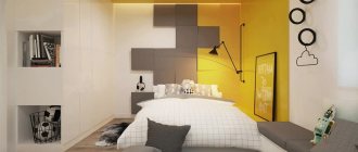
Bedroom
Wine shades are also welcome in bedroom decoration. Choose soft color combinations and place accents wisely. Textiles can play the main role: small decorative pillows, curtains, carpets.
Furniture in burgundy color also has the right to settle in the room. If you find an elegant burgundy chest of drawers, a stylish wardrobe or a soft pouf, do not hesitate to place them in the bedroom.
Shades of burgundy in the bedroom interior
Bordeaux in the nursery
The receptive child's psyche responds well to bright, slightly muted tones. Ideal shades of burgundy: sangria, terracotta, carmine. It is better not to give these colors priority in design, but to use them as accents. One piece of furniture or decorative element is enough.
Hallway
Bordeaux in the hallway is an atypical solution. Typically, shades of this color are rarely used due to the small size of the room. If you choose the right spot lighting and place light furniture, you will get an amazing combination. Another option is a burgundy floor or ceiling.
Burgundy color in the hallway interior
Bathroom
A bathroom in burgundy tones is a dream for connoisseurs of classicism. Any shades of color look organic in this room. They go perfectly with a massive cast-iron bathtub, mirrors in wooden frames, and wall lamps. A proven wall decoration scenario is burgundy tiles. You can make a monochrome design or add another rich color to the rich shade.
Burgundy color in bathroom design
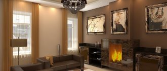
Cabinet
If your office is spacious, you can easily decorate it in burgundy colors. Interiors with leather sofas look solid. The abundance of bright details will play a bad joke - you simply will not be able to concentrate on work. Let the room be decorated with unexpected details that will attract the eye at moments when you need to escape from routine affairs and find inspiration.
Shades of burgundy in the interior of the office
Application in the interior
Burgundy goes well with the following collards :
In general, if you decide to use it for decoration, then give preference to a combination with pastel colors. Looks very stylish - combination with gold. This combination is appropriate for a living room in the VIP zone format, as well as for a bedroom in the Rococo style.
Combining with green is a very bold decision. But at the same time, rooms in this style will look bright. There is a small drawback, such a connection quickly becomes boring. That is why it is better to use it where you are not for so long, for example, in the bathroom or toilet.
It is considered traditional - with a chocolate tone . This option is suitable for decorating any room. To prevent it from appearing dark, you can dilute the decoration with ivory or gray accessories. In this case, the space is more peaceful and noble.
If we talk about its combination with shades of red , then cherry or tomato would be the ideal option. As an addition - beige and vanilla.
Marsala color in decoration looks beautiful and expensive. However, it has several limitations:
Burgundy is dark. That is why when choosing it, you need to take care of lighting.
- If you use only dark, it will not have a very acceptable effect on the human psyche. That is why it is advisable to dilute it.
- If we talk about a child’s room, then dark colors will be appropriate only as an accent.
- The first option is a combination with white. White always emphasizes the colors with which it is combined. That is why it looks even richer and more multifaceted. White is appropriate if you want to visually enlarge the space, make it light and connect several colors in the decor.
If you prefer wallpaper, you also need to choose light wallpaper. Also, the same curtains will look impressive.
Burgundy is a color that can visually reduce any space . That is why it is best used to create decoration in large rooms.
Particular attention should be paid to the floor and ceiling. If you want similar wallpaper for the walls, then the floor and ceiling should be light.
Kitchen in the interior: photo ideas
The most important task when choosing burgundy for the kitchen is its correct use. It goes well with classic and contrasting tones. We have prepared the most common combinations:
It would be great if the set is also Collera Bordeaux. In this case, it is advisable to choose a white option for the walls. This selection is an excellent option for creating a classic style. Countertops made from a material that imitates marble will look beautiful and interesting. The combination with white is often used to create a high-tech style.
It may seem that the space in this combination looks boring. But this is only at first glance. Add a few bright details to it, change the concept and then it will sparkle with new colors. You can hang the same curtains, which will add elegance
- You need to combine it with black carefully. When combining these palette options as the main ones, the space seems smaller than it actually is. In order to avoid such an effect, you can take white and burgundy as the main color, and as an accent. It looks very stylish and elegant. The configuration with black should not be used as a main caller.
- With gray. It is considered refined and aristocratic. If they are taken as the main ones, then gray must be very light, closer to white. Accessories should also be light. If we talk about dark gray, then it must be used with white details. Otherwise, you will get the same effect as with the connection with black.
- Symbiosis with beige looks very gentle. A room in this design looks warm and cozy. The combination with beige can be safely used as the main color. If you wish, you can add a few more details in light colors.
- With green. But, take it - soft and light green. These include the color of green tea or olives. Decorated in this combination it looks very original. If we talk about additional ones, then you can take blue. In this case, the main thing is not to overdo it. After all, blue can drown out all its beauty and brightness.
- Combination with orange or coral. This is a very brave decision on your part. If they are incorrectly used in tandem, then it looks boring and tasteless. But, if everything is done correctly, the apartment will sparkle with new colors. In this case, it is best to use beige and burgundy as the main ones, and orange for some details.
The kitchen is stylish and modern . The main thing is to know when to stop. There is no need to use only it for walls, but it is better to leave it for decorative elements and curtains.
Living room
Wallpaper in the interior
The living room is a space that is perfect for receiving guests and spending a pleasant family evening. In it, it is not used as often as in the kitchen, but it also looks very impressive.
Can be used in decoration accessories. But, you can take drastic measures - choose burgundy wallpaper .
We have already noted that using it in large quantities will make the space appear dark. To prevent this from happening, you can decorate only one wall in this option. You can see them using an example - photos can be found on the website.
It can also be used in decorative elements.
Such curtains in the living room will look very beautiful and elegant. Especially if there is a fluffy carpet of the same shade on the floor. This solution will emphasize the excellent taste of the home owner.
Burgundy always attracts attention. With its help, the design of the living room can be made stylish and bright. This decision is very often made by designers to create a modern style.
It is worth noting that a sofa or armchairs in this option . Pillows on furniture are good to have a distinctive color.
Bedroom
The bedroom is the place in the house where you can relax and unwind from a long day of work. You can relax in it both soul and body. That is why it is very important that the environment is conducive to this.
Practice with caution. This tone is present, by the way, in various decorative elements. There is no need to give preference to burgundy wallpaper, this will make it cold. This nuance is suitable for a bedspread . Also, curtains in the bedroom of this shade will look impressive.
So we've talked about burgundy in different spaces and how it works with other colors. The most successful options for using this shade are the kitchen, living room and bedroom. It is also worth noting that he loves large spaces. Do not forget that burgundy visually reduces space. That is why it is not used for small rooms. Also, you don’t need to pay attention only to this element when choosing wallpaper. Be sure to take additional colors in light colors.
decorator.guru