Is gray wallpaper boring or stylish?
What is gray color? This is the border between white and black. These concepts are completely opposite. Designers and decorators play on this: they connect the unconnected: finishing materials of different styles, furniture. Against a gray background, even laconic sofas with bright upholstery or a dark-colored slide become art objects.
Border between white and black
A room decorated in this color becomes interesting if you apply design tricks.
It is necessary to choose the right complement to the “capricious” color.
- Don't decorate all the walls in the same color, as this will cause boredom. Apply one of the three options described below.
- If you want the same wallpaper, choose a different texture.
- Plain walls become a good backdrop for bright details.
- Choose beautiful furniture (that attracts attention with color and shape).
Apply the law of color, proper lighting, decoration depending on the size of the room and the room will turn into a masterpiece.
The room becomes interesting if you apply design tricks
Interesting wall decoration:
- One wall is decorated with wallpaper with a large print. Choose a design in one color and different shades.
- Similar to the first option, but the drawing has a different color scheme. It becomes an art object. Don't decorate the entire wall; frame it with moldings or stucco. You can create a handmade painting.
- Three walls - smooth wallpaper and one with a large texture. In this case, variety is guaranteed, and textured options become an additional decoration of the room.
Don't decorate all the walls in the same color, it's boring
Advice Do not combine diametrically different styles: kitsch and empire, high-tech and baroque. Otherwise, the room will turn into a “hodgepodge”.
Gray is indispensable in offices. A business atmosphere will be ensured. If you combine gray with brown, the room takes on a solemn look. Choose smoky, steely shades that provide a sense of maturity.
A business atmosphere will be ensured
Shades of gray
Gray color is made by mixing white and black (regular grey). Already at this stage you can get many shades of gray from light gray to dark gray:
- light;
- silver;
- gray;
- steel;
- lead;
- graphite (graphite);
- carbonic.
It has a large number of different shades, which are obtained by adding a few other colors to the main one. Depending on the added tone that is mixed with the gray, there are three large groups of gray: warm and cool.
- Regular gray is a classic shade. It is the most versatile and goes well with all colors. Blondes should choose medium or dark shades of gray, while brunettes should choose light and medium shades.
- Warm gray - shades of this group are obtained by adding a very small amount of warm tones (red, yellow), the more additional warm color it contains, the “warmer” the shade of gray becomes. Warm options are especially suitable for girls with slightly dark skin, girls with “Spring” and “Autumn” appearance color types.
- Cool gray - formed by mixing with a small amount of blue. This group of shades is well suited for owners of the “Winter” and “Summer” color types.
In addition, there are many shades with different “undertones”, such as blue, pink, brown, yellow. Sometimes this tone is quite pronounced, and sometimes it is barely noticeable.
How to make a monochrome gray and white interior beautiful?
Don't be afraid of calm colors. The great Leonardo da Vinci said: “White is the first of the main ones.” But few people dare to choose a pure white interior. A large number creates a cold atmosphere, internal tension and memories of hospital wards.
For lovers of serene peace, a good option is the gray and white design of rooms with fragmentary inclusions of bright details. What could it be? Dark wooden furniture, picture frames, fresh green flowers, bright lighting fixtures or curtains.
“White is the first of the primary colors” Leonardo da Vinci
Such a basis for the interior becomes a “blank canvas” for other items. It charges with energy and gives purity of thoughts. The combination of two basic shades can be complemented with any others and it looks harmonious.
The use of materials of various textures:
- gray walls painted with decorative paint and furniture with glossy doors;
- white walls and gray furniture upholstery, gray and white carpet, anthracite facades and furniture tabletops;
- One of the walls is decorated with white, and it becomes the background for paintings, floor vases, upholstered furniture, and decorative shelves. The remaining three are in gray.
The combination of two basic shades can be complemented with any other colors and it looks harmonious
This interior is the easiest to transform and change. You can organize seasonal decor: in winter, add warm colors: red, orange, yellow pillows; in spring - green vases, bedspreads for sofas and armchairs; in summer - provide coolness with blue or blue; in autumn - pink or lilac tones.
Combination of gray with others
What colors goes best with gray in clothes? With everyone?!
Since gray has many shades, it is worth considering how a particular shade will look with a particular color paired. In addition, for gray, as for others, there are options for the most successful combinations.
If the gray shade has a warm undertone, then it is better to combine it with warm colors, if it is cold, with cold ones.
Gray + white
The combination of gray and white is a classic! A universal option, especially suitable for the office or business meeting. Any of the shades looks good with white, but the most elegant and attractive options are paired with light gray shades.
Gray + black
This option looks more strict compared to the previous one. To prevent this combination from being too conservative, combine light gray with black. You can also try to experiment with this pair by adding bright accessories, for example, a red or blue handbag, yellow shoes.
Gray + gray
The combination of shades of gray with each other looks interesting. Such images are aristocratic and sophisticated. Minimalism of color can seem boring, so you can add a small bright accessory to such a set, such as a necklace or handbag.
Gray + yellow
When it comes to pairing with other colors, there is no better pairing than any warm shade. A bright and positive shade of yellow in contrast with neutral gray sets a powerful color tone for the entire set.
Gray + orange
One of the most winning combinations of gray is with orange. This combination looks harmonious and bright, dynamic and stylish.
Gray + red
The red hue dominates any outfit and this option is no exception. Even a small detail in a gray look is enough and it will instantly attract all the attention.
Gray + pink
A combination of gray and pink will help highlight your appearance, make you more feminine and romantic. Pink can give a neutral shade of nobility, make it “warmer” and more pleasing to the eye. It is better to combine light pink shades with light shades of our color; pair a richer and brighter pink color with dark and medium gray. Adding white will make your outfit look even more delicate and soft.
Gray + blue, light blue, turquoise
For this combination with blue (cyan, turquoise), choose warm light or medium shades of gray.
A deep and rich dark blue looks impressive with light gray shades, but this option will only work if there is less blue.
Gray + purple, lilac
The purple and gray pair looks a little mysterious. To prevent your look from becoming boring, it is better to choose things in richer and brighter shades of purple or combine it with light gray shades. The combination with lilac is an office option, especially if you use light lilac and dark gray. Light shades together will look very gentle and natural.
Gray + green
So that green does not get lost in this pair, it must be quite bright and saturated. Green-yellow and light green shades look best with gray. However, for lovers of complex color combinations, the option with olive (khaki) and dark green is quite suitable.
Gray + mint
The most delicate combinations are obtained by combining light gray tones with light mint. The light color combination is the personification of femininity and tenderness.
Gray + brown, beige
Brown and gray next to each other can look boring and inexpressive, so to prevent this from happening, try to choose colors that differ from each other in lightness (dark and light), tone (gray should be cool shades, and brown with a yellow or orange tint) , dilute the set with white. The combination with beige is also one of the most successful. It is universal and suits absolutely everyone. Beige adds warmth and coziness to gray. You can combine several shades of gray with beige at the same time.
Gray is a universal color. You can mix and match it in thousands of ways. This color simply must be in any wardrobe, because it is simply irreplaceable for those who like to experiment with shades in clothes, for those who like neutral tones in their sets, for those who do not have time to select complex combinations.
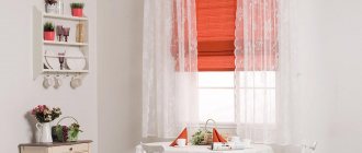
How do curtains change the appearance of a home?
Textiles transform rooms, emphasize the chosen style, balance the severity of laconic design, and protect the room from the environment. What do designers offer? Natural materials and their imitation:
- linen;
- cotton;
- silk;
- taffeta;
- velvet.
Gives you the opportunity to play with different textures
Consider the location of a particular room. For the north side, choose light shades; the south side needs good protection from the sun, so rich colors are quite appropriate. It does not distract from other interior items and becomes an addition rather than an accent detail.
This year's fashion trend is natural tones.
Gives you the opportunity to play with different textures. Thin curtains are chosen with the texture of linen and cotton fabrics. A satin or silk curtain with soft folds smooths out sharp corners. Unless you are decorating a room in a neoclassical style, forget about lambrequins. They have lost their positions.
Textiles transform rooms and emphasize the chosen style
Want to provide variety? Make three-layer curtains of different shades. You can cover the windows with light or dark canvases, thereby changing the appearance of your home.
Use tiebacks for draping. They provide soft, even folds. It is desirable that curtains and other textiles are in harmony with each other. This allows you to create your own comfortable atmosphere.
Beautiful combination
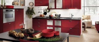
Sofas
Furniture needs to be fashionable and functional. Gray gives elegance and sophistication. It's the graphite leather upholstery that looks great, not black. We will consider two options: gray upholstery of sofas in interiors of other colors and colored furniture in gray rooms. Both options are possible.
For those who like experimenting, two sofas are installed in the living room: one gray, and the second white, black or brown. Variety and exclusivity are guaranteed.
Elegance and sophistication
A similar approach can be used for kitchen sofas in open-plan rooms. The upholstered furniture in the living area is large and gray, and the kitchen corner has bright upholstery. This approach balances the monochrome interior, but does not irritate with a riot of colors.
White, black, blue sofas with gray pillows and armrests decorate the interior and create a sophisticated atmosphere. This technique looks better than bright monochromatic models.
Furniture needs to be fashionable and functional
Tip Play with the texture of the upholstery: gray background with a dark gray pattern; plain seats and backrests with colored armrests can completely change the appearance of the environment.
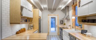
Kitchen doors, what color is fashionable?
Gray is often used in the design of kitchens and hallways. Why am I suggesting this color? Brown in various interpretations is already boring. Manufacturers come up with:
- unusual inserts with stones;
- sandblasting patterns;
- stained glass;
- bindings of various shapes.
A simple version of kitchen doors
If you want to quickly update the interior, but not renovate the entire apartment or house. Try installing gray doors. The effect will be amazing. The color range is extensive:
- pearl;
- light gray;
- smoky;
- ashen;
- graphite.
What is their advantage:
- Doors refresh a room and make it cozy.
- No visible dirt.
- Doors and floor coverings of these shades become the ideal background for green, cherry or black.
- Beige and gray options provide a warm, intimate environment.
- A door leaf with a bluish tint gives a refreshing chill and emphasizes cleanliness.
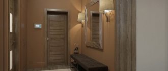
Gray is often used in the design of kitchens and hallways
Doors become the boundary between two rooms. Choose models in the same style, otherwise discomfort is guaranteed. For children's, bedrooms, and bathrooms, models with solid fabric are preferred. In living rooms and kitchens, door leaves with textured, colored glass look good.
In what interiors are they suitable? Smooth canvases with laconic moldings for modern houses and apartments. Imitation of aged light wood emphasizes country and Provence style. A silver palette, curly ornate panels, and decorative overlays complement the classic styles. Bindings with glass for eco styles, Japanese and minimalism.
Doors refresh the room and make it cozy
What should you avoid?
- Do not place a smooth door in a room with a neoclassical style. Otherwise, the interior loses its value and looks cheap.
- Graphite and anthracite tones are not acceptable for a small room. They visually steal space.
- Eclecticism and Empire style do not go well with gray doors.
Dark brown wall decoration and the same doors evoke negative emotions. But the interior with pastel walls becomes larger, and luxurious accessories and furniture acquire charm. The graphite door sets off the furniture in different shades of white: baked milk, ivory. Steel also supports elegant blue and light blue.
Model in a silver palette
What color are anthracite windows?
Anthracite is one of the shades of gray. It is not without reason that gray color has taken first place in the preferences of homeowners.
- Gray color is a transition from white to black; it successfully unites opposites and things that are incompatible at first glance. Gray is equally good in completely different styles, the main thing is to choose the right shade. It will be different in loft and Provence.
Photo: the range of gray shades in windows is extensive - from charcoal to pearl - and is suitable for any interior style
- Almost any color looks advantageous against a gray background, you just need to choose the same range - warm or cold shades of gray and another color. This is the ideal backdrop for bright upholstered furniture and fresh flowers.
Photo: for minimalist interiors, gray is generally irreplaceable, because it goes well with stainless steel household appliances, laconic interior items, natural wood furniture, stone walls and glass staircases
- Psychologists recommend gray color in the interior to create a calm and safe atmosphere in the home. In their opinion, gray color is chosen by confident people with a pragmatic mindset and high intelligence.
Photo: of course, a gray interior requires gray windows. The coolest anthracite windows will be made of aluminum, because the laconicism of the color will be emphasized by the shape of the material itself. Aluminum can be painted any shade of grey.
Photo: if aluminum windows do not fit into the construction budget, then gray plastic windows will be a worthy and affordable alternative
Photo: in the assortment of all manufacturers there is a profile painted gray in bulk, which allows you to achieve a complete imitation of aluminum windows even with the window open. The variety of colors of the laminating film makes it possible to choose any shade of gray, so much so that it is impossible to distinguish one from the other. Designer fittings, black handles and hinges help enhance the beauty of gray windows.
Bedrooms
It gives an atmosphere of peace in the rest rooms. Becomes a good background for other items and your life in general. It does not distract, but allows you to focus on yourself and your loved ones. Combines with pink and yellow. Gives positive energy.
Natural shade and fashion items
Well complements colors for environmental styles:
- green;
- brown;
- orange;
- blue.
This creates an oasis of peace, even in a smoky and noisy city. In long rooms, paint the short walls a tone darker than the long ones and you will see that the room has been transformed and visually acquired different parameters.
Natural shades and fashionable items, interior elements provide a harmonious combination of nature and modernity. This technique guarantees relaxation and a feeling of harmony.
Gives an atmosphere of peace in rest rooms
Advice Gray is important for children with hyperactivity. They need calm and an environment that will balance excess emotions. However, additional bright details are sure to be added to the nursery: bedspreads, tables, toy boxes, curtains.
Living room
To prevent the interior from seeming monochrome, it is enough to dilute it with contrasting objects or bright accents:
- floor lamps;
- sconce;
- lamps;
- vintage curtains.
In the interior of the living room
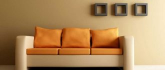
Gray and red are an unusual combination. But it is well suited for rooms facing north and northwest. Usually these rooms do not have enough light. Red acts as a pop of color and provides warmth. It is associated with classic Empire style interiors.
Tip If you have a large room, choose upholstery of upholstered furniture in this color, plus gray walls and the room will acquire a palace charm.
Note : Experiment by painting all the walls light gray and stenciling them in graphite or silver. You don’t have to select the required wallpaper pattern or waste time on pasting. With a minimum investment, the effect is amazing.
Gray and red - an unusual combination
For living rooms, color nuances help avoid a riot of colors and give peace, which is necessary for relaxation. Owners have a wide range of decor choices:
- paintings;
- vases;
- lighting fixtures;
- floor coverings.
It’s easier to choose textiles and change them according to your wishes.
Fans of Japanese style will love the combination of gray walls, flooring and furniture, finishing materials, and wooden doors. Anthracite-colored furniture with a laconic shape is also quite appropriate. In such interiors, all the details serve to help people listen to themselves, their feelings and enjoy the world around them.
Helps avoid a riot of colors and gives peace
Light shades of gray are needed for decorating small rooms. The same can be said about :
- fur capes;
- carpets;
- decorative pillows.
If you want to quickly change the interior, replace textiles, play with texture. There used to be satin, take a tapestry, replace the fur with linen. The world around you will immediately sparkle with new nuances.
Introduction of warm colors into the interior: yellow, orange give peace and a feeling of sunny mood. Use this technique in the fall and winter to prevent a depressive mood and not lose your sense of joy.
Light shades are needed for decorating small rooms
Combination of light gray with other colors
Light gray color is a neutral shade, so all other shades, when combined with it, come to the fore. It emphasizes their saturation, provides light or temperature contrast, but unlike white-gray it does not create a pastel palette, so the shades that are combined with this color are almost always different in lightness.
A combination of light gray and pink. This shade goes well with both warm and cool tones of pink. It increases the expressiveness of pink, provided that the shade is lighter or darker than the base color. So try combining light pink with shades such as royal pink, sunset pink, magenta, fuchsia, orchid.
A combination of light gray and red. Red color on a light gray background always looks more advantageous than on a darker one, due to the contrast in lightness, when a brighter or darker shade of red practically lights up against a gray background. Consider combinations of light gray and scarlet, garnet, bogryango, port wine and maroon.
A combination of light gray and orange. Due to the fact that the main shade is light, we can afford complex shades of orange, so that we can focus on their versatility and beauty. In this regard, coral-orange, fiery, red-orange, red, copper shades are suitable: bright and with moderate saturation.
A combination of light gray and yellow. This is a light and fresh combination, where it is advisable to choose yellow that is lighter than the main shade, which will create the illusion of sun glare. From the point of view of yellow, light gray “cools” this tone, bringing the composition to a neutral perception (not irritating to the psyche). The following shades are suitable for light gray: champagne, pale yellow, banana, yellow-orange, curry color.
A combination of light gray and warm green. It can be called affectionate, since its deep natural roots provide the basis: like stone and grass, trees and rain clouds, city and parks. Warm shades of green significantly enliven gray. Try using shades such as pistachio, light green, herbal, olive, marsh to combine with light gray.
A combination of light gray and cool green. If warm shades of green combined with light gray enhance their vitality, then dusty cool tones will look like a shadow of greenery, giving the combination sophistication and sophistication. To do this, try putting together light gray and wormwood, gray-green, light gray-green, emerald or malachite.
A combination of light gray and blue. Shades of blue deepen the cool feeling of light gray. Light blue tones add a certain crystalline quality to the composition, dark ones add austerity, and bright ones add an unexpected contrast, as if a storm were approaching a serene bright sea. Try combining a light gray tone with white-blue, aquamarine, topaz, royal blue, and indigo.
A combination of light gray and purple. If you take soft shades of purple, you can achieve a kind of retro composition based on the art deco principle, which is popular in fashionable interiors, for example. In this case, purple shades add notes of sophistication and unusualness to the gray tone, which is in no way related to this color. Try to combine such shades of purple as blue-violet, lavender, gray-violet, charoite, grape.
A combination of light gray and brown. In order for brown and gray to form a complete combination, the shades of the first must be contrasting with the second. Suitable colors for this include cinnamon, golden chestnut, chestnut, dark brown, dark chestnut. These colors are either much warmer than gray or darker, thereby standing out against its background.
Combination of light gray with neutral. Related neutral shades can also look good next to light gray due to the light and thermal contrast. Soft cream and milky colors will make the combination more delicate than the same color with white, beige shades (beige and dark beige) will add nobleness and gloss, and the color wet asphalt will make a classically contrasting pair with acceptable sharpness.
VIEW COMBINATIONS WITH SIMILAR SHADES (click on color)
One comment on “Light gray color and combination with it”
- Ruslan
November 5, 2021, 19:49
Hello
Please tell me what colors to add to the paint to make it an ash color
Gray-blue
Gray gets along well with blue, similar blue and turquoise. In the bedrooms and living rooms, pearl shades of decoration and blue furniture and textiles provide classic chic. These colors and shades are intertwined and complement each other.
For high-tech style, where chrome-plated metal is used, furniture facades with a neon tint, glass countertops are an acceptable choice. You don't have to think about flashy details. The room is calm, pleasant and not boring.
Gray gets along great with blue
The classic combination of blue + gray has its roots in Baroque palace interiors. This trend does not go out of fashion, since everything created in the past remains with us at the genetic level and includes the necessary strings of the soul. As a result, there is no explosion of colors, but there is nobility of lines and restrained fashionability. Turquoise upholstery and decorative pillows set the necessary accents and add cheerful notes.
Calm, pleasant and not boring room
Combination of gray with other colors in the interior
You need to choose a companion for gray depending on what result you want to get:
- Natural range. This includes natural colors and shades that are found in nature. Gray harmonizes best with them; the interiors are cozy and promote relaxation.
- Monochrome. This group includes similar shades (gray-beige, silver, gray-yellow) and others. It is important to use at least one dark and rich tone, otherwise all surfaces will merge into something inexpressive.
- Contrasts. Bright colors, as well as the classic black and white combination in tandem with gray, are an excellent solution for modern interiors. As a rule, gray serves as a background.
Gray-white – light nobility
Don’t like the explosion of color spots that fans of pop art and kitsch offer. But tired of the beige palette - the trend of recent years? Pay attention to the tandem: white and gray.
White color dilutes the main gray tone and provides a visual enlargement of the room. The fragmentary use of graphite or anthracite shades will help diversify the interior. It could be:
- frieze of ceramic tiles;
- door frames;
- window sills;
- bar counter.
Tandem: white and gray
This combination suits Scandinavian style décor. And this is not surprising: residents of northern regions with snow bring natural shades into their home design. They are needed for those who value the comfort of their home and inner peace. Remember the snowy plains, what peace they give with their pristine purity. Gray and white interiors give such sensations.
In north-facing rooms, use soft white shades:
- creamy;
- baked milk;
- cream.
They guarantee a soft transition and do not make the room cold. A winning option: anthracite flooring, neutral gray walls and snow-white furniture.
White color dilutes the main gray tone and provides visual enlargement of the room
Light gray color matches
- with a golden-copper color (2) creating a contrasting combination of warm and cold, dark and light and, of course, simultaneous contrast. Although golden copper and a soft shade of orange, it looks rich and attractive against the light gray.
- with olive color (3) - a combination of two calm and life-affirming shades gives a relaxing range, close to the natural colors of nature. And yet the lively green shade looks lively and playful next to the main one.
Complete the basic combination with shades such as orange, white and black.
What can linoleum give to the interior?
Wooden floors and tiles never go out of style. But linoleum flooring remains popular. The main advantage is the price, variety of patterns, versatility, and the ability to quickly replace the floor covering . Let's talk about color and pattern.
The advantage of such linoleum is the price
It is enough to go to construction stores or online sites to understand that linoleum imitates:
- stone;
- marble;
- tree;
- parquet;
- abstract drawing.
Compatible with other materials:
- tiles;
- parquet board;
- laminate
It is enough to purchase transition thresholds, the connection problem is solved.
This material helps you avoid making large financial investments and quickly change your interior. Small clarifications. For the hallway you need linoleum with good wear resistance. For living rooms, a foam or felt base is important. Otherwise, comfort is difficult to achieve.
Linoleum flooring is still popular
What do you need to consider?
What kind of floors are we used to seeing in interiors? Most will say: brown in different color and texture interpretations. This is why I suggest using gray. Don't be afraid to experiment. An updated home color scheme can radically change your life.
To decorate the floor, designers suggest using various materials. Let's figure out why they should be different. In living rooms, bedrooms, offices, children's rooms - warmth is needed. Kitchens, hygiene rooms, hallways are washed frequently. Based on this, take a look at the collections of building materials, take the best they offer in gray: linoleum, tiles.
A good, non-staining choice for flooring
Let's look at what gray materials are applicable in the interior:
- Wood is a wonderful stylish option.
- Ceramic tiles come in a wide variety.
- Linoleum is a budget opportunity to experiment.
- Self-leveling floors are an expensive option, but the effect will be amazing.
A seasoned, somewhat strict, yet elegant gray color for any material does not lose its properties. It gives peace, sophistication, exclusivity and does not irritate, unlike collections with bright, complex color patterns.
Tiles are best suited for the kitchen or hallway
An interesting effect is produced by a wooden board with a gray texture in different collections; it has the name: “Oak Ice White”, “Grabo”, “Rustic Oil”, “Cardamono”, etc. They complement the styles: Scandinavian, Colonial, Provence.
Let's talk about the practical side. This floor covering is easier to use. Water stains, abrasions, scratches, and dust are less noticeable. This makes life easier for homeowners.
This flooring base complements other items well:
- furniture;
- decorative things;
- textile.
The original appearance of the property is guaranteed.
Gives peace and sophistication, exclusivity and does not irritate
Dark gray color in clothes
Dark gray color refers to the basic shades: an item purchased in this tone, depending on the pair, can go into different styles. The tone increases the contrast of appearance, slims, and gives expensive charm. It can be strict, gothic, informal, sporty, elegant, urban, etc. This shade is a perfect match for bright colors: it does not enhance them, but they remain the center of attention. Let's look at how dark gray transforms in a wardrobe depending on the color combination.
Tile
Light gray tiles add coziness and emphasize cleanliness. The winning option is gray walls and bright tiles. Large print designs are on trend and well dilute the monochrome calmness of the main color.
In small rooms, play with texture and size.
Choose large tiles with a rough surface for the floor and glossy ones for the walls. The tile pattern should be similar or in the same style. Make the floors a little darker than the walls. Some collections offer such options. As a result, the combination of gray surfaces, snow-white plumbing fixtures, lamps, and mirrors makes the room large and elegant.
Light gray tiles add coziness and emphasize cleanliness
If you buy tiles of the same color, a console toilet, or a washbasin without a leg, the room loses its clear boundaries, which becomes advantageous in small hygiene rooms. This color masks stains, small debris, and dust. The housewife will not have to walk around with a rag all day long, as happens if the color chosen is black or white for the tiles.
Use natural materials with these shades. You will be surprised how life and family relationships begin to change. It’s no secret that what surrounds us creates our inner “I”, helps us move forward or “die of boredom,” create masterpieces or regret missed opportunities. Choose what you like, you will see a completely new tomorrow.
Make the floors a little darker than the walls
The basic rule is the harmonious introduction of color additions to various shades of gray. Now let's summarize.
Gray color has advantages: it gives calmness and becomes the base tone for decorative items and furniture.
Pairs well with a variety of colors. To provide variety, decorate the walls of individual rooms with different shades.
Shades of gray in large quantities are depressing. Creating a historical interior requires skills. Only in this case, adding gray pigment to the paint will give bourgeois luxury and the walls will not look dirty. The gray color in the nursery needs to be complemented by a large number of different colored pieces of furniture and interior design.
The basic rule is the harmonious introduction of color additions to various shades of gray
Dark gray color in the interior
Dark gray color in the interior as the creative power of individual design. First of all, this is the absence of a specific style - most often rooms decorated with dark gray are eclectic. The dark background of the walls emphasizes the richness of colors and the outlines of shapes, thereby highlighting the expressiveness of the accents. White and black colors are constant companions of this direction. Moderate natural light illuminating a room is absorbed by dark surfaces but reflected by light ones, so all light elements will “glow” in such an environment. An even distribution of such objects will give the necessary balance and distribution of light. Evening and night lighting is preferably of a warm spectrum, since fire and stone are long-familiar components filled with emotions. For the same reason, wood, iron and all natural fabrics will look advantageous. Decorate such rooms with green or live plants - this gives confidence and tranquility.
VIEW COMBINATIONS WITH SIMILAR SHADES (click on color)