Neutral wallpaper in the living room serves as the perfect backdrop for any interior style. Beige color is one of the most elegant, noble and at the same time universal solutions.
It is this tone that becomes the basis for functional and harmonious minimalism, technological high-tech style, sublime and aristocratic classicism. Shades of the beige palette are applicable in any design, so they will be appropriate in the bedroom, and even more so in the living room.
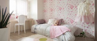
Living room in beige tones
Beige color will look perfect in any interior design:
- In the classics, this will be wallpaper with a large floral or abstract pattern , which in any case will be symmetrical and rhythmically organized.
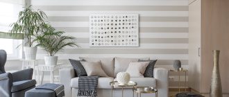
- Modern design trends - such as minimalism, hi-tech, functionalism - use monochromatic solutions in a wide color palette.
- Luxurious combinations of beige shades with any other colors allow you to achieve various effects from the composition - from peace and exceptional tranquility to a dynamic interior with an emotional component.
- In a beige design, it would be appropriate to have at least decorative details, or many of them – in the color of the main decoration.
A living room in beige tones in any style remains elegant and sophisticated. It fully reflects the worldview of the owners, corresponds to the stated composition, and allows you to realize literally any idea.
Such shades can be either an inconspicuous background or an independent design - with different textures, ornaments, a combination of matte and glossy surfaces, etc.
Beige wallpaper: warm colors for the hall and living room
When choosing beige wallpaper for a living room, usually the owners of an apartment or house pay attention to personal preferences, although style features, the intensity of natural light, and the geometry of the room all play a significant role in the formation of the composition.
As a rule, a beige palette is a warm and comfortable solution that excludes sharp contrasts and the overly active nature of a space created for relaxation too. When the living room is combined with a kitchen and/or dining room, you can choose cooler colors for these functional areas, but for the guest area, warm shades are most often preferred, which allow you to create a harmonious, comfortable and not boring space.
The beige palette is the ideal backdrop for exclusive decor, eye-catching accessories, and rich details. Against the backdrop of a warm environment, bright accents can be absolutely anything - in rich red, orange, light green, green or turquoise; in discreet chocolate or in pastel nuances of lavender, terracotta, emerald colors.
Interestingly, any tone of the beige palette will be organic with different accents - from light milky to deeper coffee with milk.
Choosing colors that go best with beige wallpaper
Any interior will be more harmonious and comfortable with the use of additional shades - no monochrome design can be organic without using different techniques. It can be other varieties - textured surfaces, relief coatings, plain materials, but different to the touch.
Although most often the accents become solutions that contrast with the main tone:
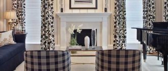
- The most popular is a combination of shades of brown and a combination of wallpaper in beige tones with furniture and other decorations in a beige-chocolate palette, as in the photo. This duet has a noble and balanced character, it is distinguished by restraint and elegance.
- If the decoration is of a combined nature - for example, the bottom of the walls is covered with darker wallpaper or panels, and the top is covered with light materials, you can select accents from the palette of patterns on the wallpaper.
- When the ceiling and floor are also covered with beige materials, the accents can also be quite bright - in a wide range of green from pastel light green to rich malachite, deep pink, lilac, red.
- When choosing darker floor coverings or unusual techniques for ceiling structures, it is advisable to choose several not too bright accents so as not to create excessive diversity.
When choosing companion colors, you should pay attention to the range of shades: with a lighter and neutral cool tone, you can use a metallic palette, gray accents, blue and blue. Similarly, with a warm palette of sand, caramel and cocoa colors, emerald, turquoise, and orange details will be harmonious. Of course, this is not an axiom, and there is always room for experimentation.
Combination of beige with other colors
When creating an interior in beige tones, the question often arises: what wallpaper is suitable for beige wallpaper? Beige harmonizes perfectly with everything, with the exception of poisonous tones.
Choosing suitable furniture
The choice of living room furniture in beige tones depends largely on the characteristics of the decor. When implementing them, of course, different techniques are used, which can also affect the selection of interior items.
Modern interior design usually involves simple and functional solutions. This is low upholstered furniture, walls without unnecessary patterns, a minimum of decor. Such styles are realized with the help of comfortable furniture: a modern room is equipped with comfortable sofas with low backs, wide canopies, and several sofa cushions.
In a functional room, plain walls are complemented with contrasting or restrained accents in other colors. And the furniture will either be in the general palette, or in a more saturated range of companion colors - chocolate, dark gray, emerald shade.
Classic design options with retro design use furniture with decorative elements. A sofa with a high back - carved or upholstered in rich textiles, tall cabinets with glass fronts, and elegant anatomical armchairs - would be suitable here.
Given the ornamental nature of the wall decoration, upholstery can also be patterned. As a rule, with the predominance of plain wallpaper and upholstery, a number of textile elements in the interior may contain patterns or stripes. This can be an ornament in the same beige palette or with more saturated tones.
The contrast of patterns looks original and harmonious when one background and color of the ornament are swapped in another upholstery, wallpaper or curtains.
Wallpaper and curtains: secrets of the “ideal duet”
Considering the beige palette as the main color in the interior, many begin to worry that such a design will be too boring. Some experts argue that a combination of beige wallpaper and textiles in a similar color will literally ruin even the most spectacular and thoughtful interior.
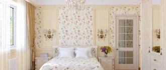
It’s really not worth creating a total “beige mood”. The only exceptions are cases when the curtains should blend into the walls (for example, blinds and Roman blinds). If you are setting up a living room, a combination of neutral walls and darker curtains is allowed. For the bedroom you can choose more delicate shades. For example, all heavenly shades go well with beige tones. You can also use blue wallpaper with a beige print and textiles in delicate cream tones.
In general, you can experiment as much as you like. The main thing to remember is the harmony of textures and the balance of light. Blue wallpaper is not the only suitable “partner” for a beige finish. Gray, chocolate, turquoise, emerald tones will show themselves perfectly. To make the living room or kitchen especially extravagant, accessories in orange and lemon shades are chosen as color accents. In the bedroom and children's room you can use “fuchsia” and “indigo”.
Choosing curtains for the living room with beige wallpaper
Curtains, which, in addition to being decorative, always have a practical purpose, are designed to support the composition of any interior style.
The choice of curtains for beige wallpaper for the living room can be completely different - depending on the style, cardinal direction, mood, and extravagance of the decor.
- Curtains in such interiors as hi-tech, loft, and minimalism are usually represented by roll models. Most often these are plain canvases, although the owners of such a living room sometimes look for ways to diversify the strict functional design. Then you can choose combined options - fabrics sewn lengthwise or crosswise from two main design shades, with a geometric or abstract pattern, combinations of transparent and dense fabrics. At the same time, beige will not always be dominant in such duets: the wallpaper remains the background, but accent tones will complement it.
- With transparent curtains, curtains for wallpaper in a classic-style room choose more traditional ones - thick fabrics with or without a pattern, if the design of the curtains involves the use of decorative frills, folds, and lambrequins. At the same time, beige as the main color can be present both in the decor and in the bulk of the fabric. Although a more dynamic solution would be a combination of shades - using an additional tone or color from the patterns in the design of the room.
- Often, curtains become an extension of the walls - they mask the windows, so they completely match the decoration. Then we select curtains that best match the beige wallpaper in the living room. They can match in color and pattern, or you can combine similar canvases with a number of decorative details in the interior: for this, color inserts are made horizontally or vertically, curtains are complemented with curtains in the color of the accents, and bright decorative elements are used.
To answer how to choose, which ones are suitable, which ones are chosen and which curtains will suit beige wallpaper, you can look through many photos of the living room in different styles at the end of the article.
Beige and white
- This mixture is a classic and will give the room restraint and elegance.
There are a lot of similar combinations, it all depends on the specific color and shades of its use. Almost any wallpaper fits beige wallpaper.
- When decorating rooms with beige wallpaper, it is almost impossible to go wrong.
- If you have a large living room, then using wallpaper with large patterns and vertical stripes will visually make the ceiling higher.
- Beige is a universal color and is appropriate in any room of the home.
- It is not aggressive, so it will not have a stimulating effect on the psyche, but it will bring peace to the house.
The use of beige-brown wallpaper is especially recommended. It is the color of chocolate, cinnamon and mocha. This is a classic combination; beige will visually enlarge the apartment, and brown will add warmth and comfort to the atmosphere.
The main thing is to use wallpaper with no more than 30% brown color, as it visually reduces the space. Such a combination indicates good taste.
Decorating a room with beige wallpaper creates a pleasantly peaceful atmosphere that promotes the development of dialogue. It is always pleasant to be in such rooms; such an interior decorated in beige tones of wallpaper is suitable for a person of any age, as everyone will find something for themselves in it.
At the same time, the room takes on a graceful and elegant look. A design with beige wallpaper can communicate to guests about the hospitality and cordiality of the owners of the house. According to Feng Shui, a beige palette is a sign of prosperity and success.
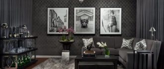
Beige wallpaper in the living room interior: photo selection
In our selection of photos, we have collected the most successful solutions for living rooms of different shapes and locations, because depending on the direction of the world and the geometry of the room, using wallpaper and its various combinations with furniture and curtains, you can qualitatively improve the parameters of the room.
For example, choosing a lighter palette will make the room feel more spacious; low furniture without decorative elements will serve the same purpose. A richer chocolate shade of sofas, floors, and patterns in curtains will be appropriate in large square-shaped living rooms.
In this selection of photos you can find interesting solutions for yourself that will allow you to make the interior of the hall individual, comfortable and at the same time original.
How to choose the color of wallpaper for the living room
Choosing wallpaper for the living room is a difficult and very responsible task. After all, the color of the walls directly determines how stylish and cozy the room will be.
The color of the walls should be combined with the floor, the ceiling, the furniture, and even the textiles. Not everyone can achieve the ideal combination; to do this, you need to know a lot of nuances and tricks, as well as have excellent taste and a sense of style.
It is not recommended to choose wallpaper for the living room in too bright colors
If you are not confident in your ability to successfully combine colors, you can contact a professional designer. However, if you use universal shades, then you should not have any difficulties.
You can use plain canvases and wallpaper with ornaments for decoration. It is especially interesting to look at the combination of two types of trellises.
For such a combination to be successful, the wallpaper must be made in the same style. The most common combinations are to use trellises of the same color, with one type being plain and the other having a pattern. You can also choose multi-colored canvases without a noticeable pattern.
Related article: How to use a laser level: instructions
To choose the color of the wallpaper in the living room, you need to draw up a design project in advance, taking into account the color of all the elements used in the interior. The color combination table will help you combine shades correctly.