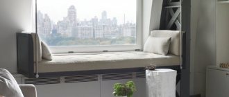
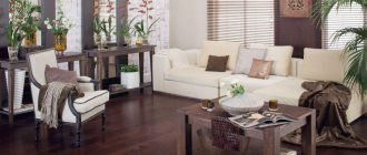
- 1 of 1
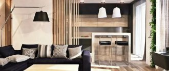
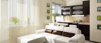
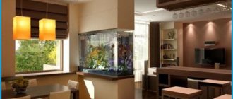
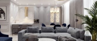
On the picture:
In the interior, individual objects should be logically related to each other, just like the elements in the painting.
designer - decorator Huseyn-zade Ulkyar
Functionality or comfort?
My home reflects my personality and serves as my place to relax, so functionality and comfort are woven together.
I love creating my own story and filling my home with items and accessories that reflect my mood. Rich colors, furniture with soft textures, many corners for work, large windows and high ceilings, a lot of air and light to create a feeling of lightness and freedom. Read more
Functionality or comfort?
My home reflects my personality and serves as my place to relax, so functionality and comfort are woven together.
I love creating my own story and filling my home with items and accessories that reflect my mood. Rich colors, furniture with soft textures, many corners for work, large windows and high ceilings, a lot of air and light to create a feeling of lightness and freedom. Hide
Composition is the connection of various parts into a single whole in accordance with some idea, together making up a certain form.
Let's imagine the room as a painting canvas and use the rules for constructing an artistic composition. “Dynamics” / “statics”, “ri”, “symmetry” / “asymmetry” - choose the concept you need about composition in the interior and use it when decorating the space.
Symmetry
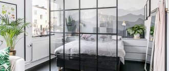
This is an equidistant arrangement of elements relative to the selected axis. A symmetrical composition in the interior is perceived by our eyes as orderly and harmonious. Agree that extravagant rooms with sharp corners, inclined walls and wavy surfaces put pressure on the psyche - after all, a person himself is initially symmetrical, and therefore strives for “mirroring”. Remember that a balanced interior does not have to look like two sofas facing each other: it is important not to forget about balance in tone and scale, because if one of the cabinets is as high as the ceiling, and the other is as tall as a chest of drawers, then there is no need to talk about any symmetry .
- 1 of 5
On the picture:
Symmetry can be expressed not only in the arrangement of furniture, but also in the arrangement of architectural details - doors, windows.
Contrasts and accents
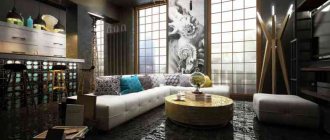
Objects in the interior can be “made friends” not only through “kinship”, but also through contrast. Contrast of colors and/or textures is one of the main expressive means of modern design. A smooth matte surface next to a rough concrete wall or brutal brickwork, an active print on an accent wall in contrast with a minimalist finish, contrasting color accents on a neutral background - there are many options.
The main thing here is not to overdo it; if there are too many contrasts, the eye will stop detailing them and turn them into one blurry spot.
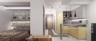
Zoning of a studio apartment 25–30 sq. m.
Euro-format apartments, where the living room is combined with a kitchen, are one of the most popular offers on the market today.
Studios are in particular demand. At the same time, the issue of dividing space into functional zones is quite acute. We will talk about the basic principles of zoning a studio apartment of 25–30 sq.m. Even with the same set of ingredients, you can prepare different dishes, depending on the sequence and proportions in which you use them. To ensure that the interior has a “balanced taste,” entrust the composition to a practicing designer.
#Decor #Furniture
Asymmetry
Its structure is the opposite of symmetry, which means it causes subconscious anxiety in any normal person. A residential interior is not a place for experimentation, so we highly recommend planning the space itself symmetrically, and creating asymmetrical compositions using decor. For example, you can play with scale (contrast large and small furniture), combine dark surfaces with light ones, and bright colors with muted ones. If you have deliberately chosen an asymmetrical arrangement of furniture for the room, do not forget to highlight the center of the composition - this could be a fireplace, an eye-catching painting, or a group of lamps.
- 1 of 3
On the picture:
An asymmetrical interior is most often determined by the architecture of the space (rounded walls, protrusions, etc.)
Rhythm
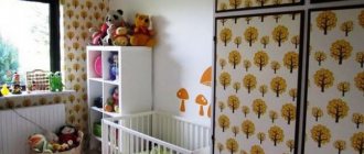
If symmetry is characterized by a calm balance of elements, then rhythm implies movement that can be extended indefinitely. The rhythm is set by repeated repetition: horizontal (cornices, friezes, belts) and vertical (columns, arches). In interior design, several pieces of furniture can set the rhythm. An interesting technique for composition in the interior is to “interrupt” the rhythm. Place several identical white chairs in a row, replacing one of them with a colored one.
- 1 of 2
On the picture:
When composing a rhythmic composition, it is important to remember that the rhythm will hardly be perceived if the color “fades away” as it moves away from the viewer.
Dominant
It is the visual center of the composition; it is the one that first attracts the eye, and only then does a person begin to look at other objects. The dominant can be color or scale. In both cases, the dominant object “subordinates” the others. The dominant must be connected with other elements of the composition in the interior (otherwise the image will “fall apart”). Therefore, it is recommended to support the chosen color dominant, for example, with shades in accessories or textiles.
- 1 of 3
On the picture:
The words “visual center” should not be taken literally, because the dominant object does not have to be located in the center of the room.
Laws of composition in interior design (compositional center, elements and their relationship)
Category: Architectural composition
Hello dear visitors of the studyas.com interior design school! Today I want to talk about architectural composition, why it is a very important component of a harmonious interior, and why, and most importantly, how to use it in interior design.
In general, knowledge of the laws of composition is not a specific stage of interior design (interior design steps) - it is the fundamental basis for successful work in any activity related to art, and as a result, interior design.
The process of interior design is closely related to knowledge of the laws of architectural composition. Without knowing the basics of composition, it is impossible to create a beautiful interior. The construction of interiors according to the laws of artistic composition is what distinguishes the interiors of professionals from the interiors created by amateurs.
For people who do not have an artistic education, composition causes great difficulties and misunderstanding of what it is needed for and how to work with it. However, there are people who intuitively feel the basic laws of composition, which allows them to dress or furnish their home with taste, but there are very few such people. The rest, including many eminent architects and designers, had and still have to comprehend the basics of composition, first in theory (training in various specialized institutions), and then improve it in practice.
It may also seem to beginners that architectural composition and its laws are something intangible and difficult to understand and explain, and what’s even worse: composition is complete nonsense, they say, everyone has their own taste and knows best how best to furnish their apartment or house. However, this is not at all the case, and “beauty” (and beauty is created according to the laws of artistic composition) has its own rules and laws by which it is created.
So, let's try to figure out this “composition” and find out what it is.
Architectural composition is a compositional relationship of composition elements arranged in a certain order, from an artistic point of view, and having certain quantitative and qualitative characteristics aimed at achieving overall harmony, integrity and expressiveness of an architectural work.
In relation to interior design, the room, as the main design unit, with all the furniture, equipment, and design elements located in it (paintings, lamps, candlesticks), is considered by interior designers to be nothing more than a composition. At the same time, the plan of floors, ceilings, and the layout of each individual wall of the room is its own separate composition, which must be worked on to achieve overall harmony of the entire composition of the room, apartment or house.
Now let's look at the basic rules for creating a harmonious composition:
1. Any composition must have a compositional center . This could be any piece of furniture, decorative panel, fireplace, etc.
The center of the composition (center of attention) should immediately catch your eye as soon as you enter the room or space. It must dominate and subjugate all other elements of the interior, and most importantly, organize the space of the room. And if there is a center in the composition, then, accordingly, there must be complementary elements subordinate to the center. Those. if there is one element in the composition, then the formation of a harmonious composition will not occur.
Now that you know what elements should be present in any composition, you need to know how these elements are positioned in relation to each other. Any composition has its own specific boundaries, be it a picture frame, a wall or the volume of the entire room. Accordingly, the center of the composition is usually located approximately in the center. The remaining (additional) elements of the composition are grouped around it (the center).
Elements around the center of the composition can be arranged (grouped) according to the laws of symmetry or asymmetry. When grouping elements of an architectural composition through symmetry, an axis is drawn through the compositional center. Elements subordinate to the center of the composition are grouped on both sides of the axis of symmetry. Moreover, the elements must be the same in shape and color, or at least similar to each other.
With an asymmetrical grouping of composition elements, it is impossible to draw a clear axis of symmetry. This composition is based on the principles of balance of elements. An asymmetrical grouping of composition elements looks like this:
In this case, the elements of the composition are always arranged in a certain rhythm (at strictly fixed distances from each other) or freely (without the same distance between the elements).
The asymmetrical arrangement of composition elements is considered a more complex way of grouping elements, and requires some training and experience, so at the first stage, master symmetry well. When you do not have experience in building symmetrical compositions, then it will not be difficult for you to create an asymmetrical composition in the interior.
2. The composition must be balanced. Ideally, all elements of the composition should be evenly distributed throughout the entire volume within their boundaries. There should be no bends in any one direction (one side is filled with elements, the other is empty). If the elements in a composition are unevenly concentrated, then its important requirements are correspondingly violated: balance and stability.
3. All elements of the composition must be interconnected. It should not contain random elements. This relationship is based on the similarity of elements . Elements can be similar to each other (identity), slightly different (nuance), and very different (contrast) from each other.
In practice, this can be achieved in several ways: by using one unifying color on different elements, uniformity in the shape of elements, and the use of similar and repeating elements.
4. Compositional contrast
Creating harmonious, aesthetically valuable interiors is based on the principle of combining compositional contrasts. This means that interior elements should be divided into main and secondary, elements that are richly decorated and laconic, elements with a complex and simple form.
Thanks to the use of the principles of compositional contrast, beautiful interiors are created.
And this concludes the lesson on architectural composition and its application in the interior. See you soon at the next lessons of the interior design school.
PS If you have any questions regarding the topic of today's lesson, ask them in your comments on this topic.
Related materials:
♥ If you liked this article, please click your favorite social network button:
Like
Comments
+5 Asanova Alena 05/17/2016 16:01 Hello. Thank you for the useful and interesting article! I would like to reveal and learn more about Architectural and artistic composition, since this is the basis of everything, can you please recommend good literature on this topic!
Quote
Update list of comments RSS feed of comments for this entry
Add a comment
Statics
Assumes the absence of diagonal lines and curved surfaces. This composition in the interior is based on the predominance of horizontal elements (low cabinets, heavy deep sofas) and gives a squat and stable appearance. Static interiors are described with terms such as “stability” and “balance.” Most often we are talking about spaces decorated in a classic style.
- 1 of 1
On the picture:
A “static” interior is not at all synonymous with boring! Experiment with decor and accessories.
Contrast in the interior, everything needs moderation
Contrast in the interior
Already in childhood we notice differences in surrounding phenomena. Contrasts in the interior most clearly when different objects are placed side by side. A tall thing seems even taller against the background of low ones. The simple next to the complex becomes even simpler. That is, contrast emphasizes the features of objects.
Contrast in the interior and nuances.
The opposite of contrast is nuance. The use of nuances (barely noticeable differences in color, shape, size, texture) allows you to avoid monotony and soften contrasting combinations. The interaction of contrasts and nuances gives the room a zest, creates a feeling of warmth and harmony.
Creating contrasts is successfully used in interior design. For example, in small apartments this technique helps to highlight zones (receiving guests, work, relaxation). If all the furnishings in a room fit together perfectly, then inevitably you may feel as if something is missing in the room, that everything is too smooth.
Compositions based on contrasts have pros and cons. They are well remembered and leave a lasting impression. But using contrasts too aggressively is mentally and physically tiring. You should not allow redundancy in contrasting design elements. Coming home, a person expects peace and wants to relax. Sharp transitions of colors and shapes (if there are too many of them) irritate, cause fatigue and emotional discomfort. Therefore, experienced decorators try to observe the measure, applying the effect of contrast. The artist's instinct shows them the boundary beyond which they do not need to cross. The use of empty areas of space (as a decorative element) also helps to maintain harmony.
Examples of using contrast in the interior.
An interesting solution would be to install a large modern TV on a wooden chest from the early twentieth century. The new apartment will immediately become a “house with history.”
A fireplace in Russian folklore style can be composed of elements of two different types: rectangular (artificial stone) and round (cuts of logs).
In the medieval style of the living room, it is good to add a bright spot of color, for example, a red ottoman.
A room without contrasting shapes and materials looks boring. She lacks dynamics. But to play with contrasts in the interior, the designer needs a special flair and subtle taste. Otherwise, harmony will disappear, and the interior will cause rejection. transitions of colors and shapes (if there are too many of them) irritate and cause fatigue.
