Monochrome in the interior is the design of a room in one color. There may be several shades in such an interior, but there should be one base color.
Almost everyone can decorate a room in a monochrome style. You just need to know how to properly distribute the shades in the room. In order to do this, you need to know the main rules of color solutions:
- The first rule is the correct arrangement of shades. The walls and floors in the room should be the lightest. The furniture in the room should be slightly darker than the walls and floors. The remaining attributes in the room being decorated are the darkest of all. By following this rule, you don’t have to worry that decorating a room in monochrome may not work out.
Advice! It’s best to go shopping and put aside the things you need for decoration. Think about how they will fit together, and only then shop.
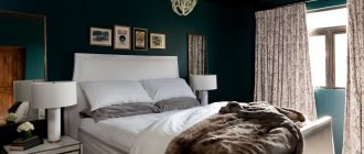
- The second rule is the correct arrangement of shades. If the room is decorated in light colors, then the walls should be darker than the furniture. If the interior of the room is planned to be decorated in dark colors, then choosing shades will be more difficult. You should only choose a dark room color if it will not make the room too dark. The salvation of such a room can be a light carpet. For this rule, it is better to use light shades, such as pink and yellow; they are well suited for bedrooms.
- The third rule for the correct arrangement of shades. This rule includes light shades that are similar to each other. These colors are well suited for rooms intended for relaxation or rooms with low ceilings. Such rooms look very light. The disadvantage of such an interior is the presence of fluidity of the image, since the room is decorated in almost the same color scheme . This is neither good nor bad. In order to reduce this fluidity, you can use several methods: add a stand-out color, use stripes, dilute your interior with wallpaper.
Related article: The main mistake of room design: monotony of colors
What is monochrome (according to the explanatory dictionary and Wikipedia), monochrome interior
Monochrome interior is an excellent choice for any home, regardless of the area, geometry of the premises, decor style, or budget.
This design option involves the use of one color (and its various shades) as the dominant one and several other auxiliary ones. There is a myth that monochrome in the interior is always black and white, which is not entirely true. Absolutely any color chosen by the designer and played with original combinations of shades, textures, and geometry can be dominant.
It sets the mood and overall impression, and can be duplicated in different versions and details. But it requires a competent layout with other colors and careful selection of elements. Despite its versatility, monochrome decor is quite demanding and if certain rules are not followed it can become a complete failure. But more on that later.
“Explanatory dictionary of the Russian language by Efremova T.F. says MONOCHROME
– this is a one-color object; a painting made using different shades of the same paint"
Wikipedia defines monochrome as one color and offers several interpretation options taking into account different areas of activity. In optics, monochromatic radiation is the name given to light emission in a narrow wave/frequency range. In photography, a monochrome image is a film/photograph made in shades of gray or any other (but one) color.
In painting, monochrome involves creating a canvas in a single color, but using different shades of it. This kind of painting is called “kamay” (from the English camaieu), but if the main color is gray, then it is grisaille.
In computer science, monochrome defines an image module in two colors: monochrome monitors reproduce images exclusively in black and white, black and red, black and green, and black and yellow.
In general, in short, monochrome is the use of one color and its shades. In the interior, these can be a variety of options - from standard gray to purple, red, black, etc. You can choose any one, focusing on personal preferences and wishes, color capabilities and mood, decor style and the designer’s idea.
Mathematics
Don't be confused by the prefix "mono". When we talk about a monochrome interior, we mean a color palette of several related shades, and not a single color that completely absorbs the space. Such an interior can also include other auxiliary shades: neutral or contrasting. The main thing is that one of the colors dominates the space. For the rest, the correct dosage is needed.
Danish design: heroes and their chairs
How did Danish designers create a style that transcends fashion and time, and why did the whole world love their chairs?
Let's turn to the classic color formula “60-30-10” (or “60-30-30”), which allows you to organically combine different shades in the interior. 60% of the visible space is occupied by the main color, 30% by an additional assistant shade, and another 10% (or 30%) receives a contrasting accent color, usually bright.
In the case of a monochrome interior, the assistant shades are close relatives of the main color, and the place of the accent color is usually taken by white, black or a neutral natural shade. It will not be possible to use exactly three colors in a space; some auxiliary tones will still appear in furniture, textiles, and decor. In a monochrome design, it is recommended to use no more than five shades.
Bright spaces where pastel shades dominate should be diluted with whitewash. If you want more clarity and dynamics, add black contrasts.
In order not to go beyond a mono color scheme, you need to pay attention to detail. The spines of books can be hidden in identical covers, household little things for which there was no place behind the facades of the storage system can be placed in plain decorative baskets or boxes.
What is a monochrome interior, what are its advantages
A monochrome interior involves creating decor using one main color and its various shades, as well as several auxiliary ones. Monochrome is not black and white, it is a much wider variety of original options.
Most often, calm pastel shades are chosen as the main one - beige, gray, dark brown, white, light pink, peach. They are always relevant, discreet and do not have a strong impact on the psyche (like, for example, red or black as the basis of decor).
Fans of spectacular, unusual and bright solutions in interior design choose monochrome green, purple, blue, and white colors. It is much more difficult to work with them and it is advisable to involve a professional designer who can play with the shades in such a way as to fulfill the assigned tasks and create an interior for a comfortable life, and not for a museum or a magazine photo shoot.
«MONOCHROME
the interior may involve either a combination of different options of one color, or the use of shades of a different range as contrasting or neutral accents"
A monochrome interior can significantly reduce visual noise and create a comfortable and pleasant space. Relevant for large and small rooms; if designed correctly, it helps correct deficiencies in the geometry of rooms, creating the desired mood and effect.
There are a lot of options and the gray monochrome interior in the photo is the simplest possible: just choose a gray color as a base, add (where necessary) a little white and black, dilute it with accent details, play with textures, etc.
I would call this decor a reference, which can be done without the involvement of an experienced designer, provided that you know the basic rules and are careful in execution.
Monochrome painting in the interior
In a monochrome interior you can do without furniture, but you cannot do without monochrome painting - the best decoration. Its intellectual and emotional impact is built on:
- contrast of realistic and blurry details;
- the flow of one shade of color into another;
- combination of light and shadow, plane and volume.
Artists specializing in such painting in Moscow, Korolev and other cities create modern canvases, which, in terms of texture, innovative technique and color scheme, will be a successful addition to a modern monochrome interior.
Similar articles:
Linocut
The definition of linocut is fully consistent with the name - it is an engraving made from linoleum. It appeared almost immediately with the invention of linoleum and is very close to the type of reproduction of engravings called woodcuts. Using a cutter, a pattern previously applied to the material through tracing paper is cut out on the foamed structure of linoleum, and then processed with special knives and chisels.
Read more…
Types of art paper
For an artist, paper has a sacred meaning. Its smell, texture, various shades, the ability to create a three-dimensional colorful image on a blank sheet of paper cannot leave the artist indifferent - not everyone is ready to exchange a sheet of white paper for a computer or graphics tablet. Paper has become close to the artist; it is an obedient and patient instrument. There are so many types of art paper that artists work in a variety of techniques, sometimes using paper not only as a base, but also as an art material.
Read more…
Painting bottles with acrylic paints
In a world where everything can be bought, handmade items are especially valued. To paint a bottle with acrylic paints, you don’t have to graduate from art school. You can find templates of ready-made drawings on the Internet or learn not very complex techniques for creating your own sketch from a painting textbook. Of course, your own imagination will be important, but listen to a few simple tips.
Read more…
Features of simple art pencils
Choosing a pencil is one of the most important preparatory stages in painting. Pencils are used primarily for sketching and sketching, but can also be used as a main drawing tool. The parameters that must be taken into account when purchasing a pencil will depend on the tasks that the artist sets for himself. If the master plans to draw with paints, and a pencil is needed only for the initial marking, then for these purposes the most optimal would be to use a hard lead. Read more…
Basic rules for creating a beautiful monochrome interior
Before starting a renovation, it is advisable to study all the features and nuances, carefully consider every detail, evaluate the compatibility of shades and textures, study the geometry of the premises and set the main tasks that the design should solve. When creating a monochrome interior, much depends on the dominant color and personal wishes.
Important rules and features of creating a monochrome interior:
1. Only one color should dominate.
To avoid the “flat interior” effect, it is important to use all shades of the selected color, but minimize the number of contrasting ones.
Example: if gray is chosen as the base, then the decor can contain all options from white to black, brown involves the use of shades from light beige to chocolate, yellow - from lemon to mustard, etc.
Monochrome interior: what color to choose as the main one?
Most often, in monochrome interiors, light, muted and restrained tones are chosen as dominant. Bright, saturated shades can negatively affect the psyche, stimulating and preventing relaxation, so they are usually used only as accents.
When choosing a color, first of all, you need to decide on the gamma - it can be warm or cold. The shades of the first group give a feeling of warmth and comfort, they are sunnier and less depressive. Cold ones are less bright, more refined and calm, fresh.
But when using shades (dominant and auxiliary) of an exclusively cold palette, the room can turn out to be uncomfortable and faded; only warm - too homely, “grandmotherly”, annoyingly bright.
"THE MOST SUITABLE OPTION
For residential premises, a choice of pastel, natural shades of both gamuts is considered.”
Light, uniform interiors are ideal for rooms with insufficient natural light, as they can create an airy and light atmosphere even with a minimum of sunlight. You can choose rich but natural shades as accent colors. Neutral colors will soften harshness and contrasts and help create a comfortable and pleasant space.
An example of a monochrome gray interior is shown in the photo in this post. For decor in brown tones, you can choose beige as the dominant one with a gradation of shades from cream to chocolate with auxiliary white, black, gray, blue, orange.
Features of different options for implementing a monochrome interior:
1. In light pastel shades
– such decor creates a feeling of airiness, tenderness, lightness, significantly expanding the space and adding light to the room. Ideal for north-facing rooms, as well as low and dark rooms.
But if you go too far with light and forget about bright accents, you can end up with a large, indistinct space, foggy and “floating”, where the eye will have nothing to “catch onto”. This can also be avoided through the use of active horizontals and verticals, dividing the room into zones (color, texture, interior elements, decoration), and the correct use of patterns and prints.
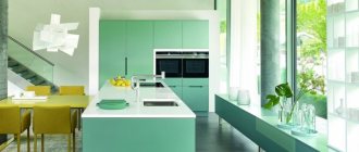
In light interiors, it is allowed to additionally use one or two more colors as the main ones, which will not just be bright accents, but also dominant. This way, using contrasting shades will make the room clearer, give it the desired geometry, and highlight/hide certain areas. In the interior in the photos posted in this post, gray and green were chosen as the main ones - an example of a harmonious combination, as for me.
When creating a light monochrome interior, textures and textures play a special role - many surfaces and types of finishes can be made in the same shade, but with completely different types of surface (glossy and matte, embossed and rough wallpaper, textiles, floors, furniture, etc. ).
2. In dark shades
– this option is only suitable for large rooms where the mink effect can be avoided. Usually they choose natural, saturated shades, moderately calm and restrained. Examples: gray, dark blue, mustard, all shades of brown, burgundy, lavender, ocher and earth shades.
You need to use dark shades carefully, as they tend to quickly tire and put pressure on the psyche, creating a not very pleasant and sunny mood. Therefore, it is better to choose such an interior for a well-lit large room, where people do not remain alone for a long time (not for a bedroom or children's room, but for a living room, billiard room, home theater).
In a dark interior, serious attention should be paid to the organization of lighting - usually at least 2-3 options are made (a large chandelier, a spotlight around the perimeter, separate sconces or lamps to highlight certain areas, illuminate reading areas, etc.).
3. In bright, pure shades
– for decorating walls, floors, ceilings, and large objects, this option is rarely chosen, since saturated active colors tire very quickly. The shades are suitable for accents and small details or functional spaces. For example, people spend little time in the hallway or bathroom, so bright blue or emerald will not get boring and cause a migraine.
Choosing colors for a monochrome interior:
White
– an ideal color for correcting a room: it helps to significantly expand the boundaries of the room and make it spacious. Most often, white is used in the design of small apartments. It is neutral, does not overload the interior, looks elegant, laconic, fresh and pleasant.
True, as a dominant color, bright white may not be a very good choice. It is better to stop at one of the shades and complement it with two or three neutral and the same number of contrasting colors. White color has the ability to connect other shades with each other and make the room complete and balanced.
Lighting for a white monochrome interior must be chosen correctly - yellow light will make the room cozy, highlight cream and caramel tones of white, and add depth to other colors and textures. Cold light will help create the effect of freshness and coolness, highlighting glossy surfaces and pure active colors in a simple decor.
White requires addition with dynamic colors, details, textures, which are implemented in decoration, accessories, and furniture.
Grey
- the most popular option for a monochrome interior, as it is easy to use and offers a huge palette of halftones. The shade is calm, ideal for residential premises, relevant for industrial, minimalism, Scandinavian style, hi-tech, loft. Combines with almost all colors of the warm and cold palette.
A classic monochrome interior in gray looks laconic, noble, and elegant. You can create subtle combinations, repeat shades in different textures, complement the decor with patterns, bright details, unusual materials (marble, metal, expensive types of wood, fabrics with thick pile).
White and gray colors go very well with natural wood, so floors and furniture are often made of wood, which makes the room cozy and comfortable, stylish and elegant.
Brown
– the color of the earth, calm and discreet, pleasant and suitable for decorating living spaces. You can choose any shade - from very light to dark chocolate. Any dominant color combines harmoniously with all other variants of brown and soft shades of white. Bright accents can be red, blue, green, yellow, orange, lavender.
Green
- an unusual bright option, which, nevertheless, has a beneficial effect on the psyche, and therefore can be chosen as the dominant one. There are many similar shades (swamp and mustard, shades of fresh foliage and moss, mint and bottle) and auxiliary colors (white, yellow, blue, dark blue, silver, golden, etc.). And in different combinations you can get any result - calm and soft decor, bright and cheerful, light and dark.
Green plays favorably on the contrast of textures - velvet and decorative plaster, gloss and matte surfaces set off the color and make the interior multifaceted, not flat.
Yellow
– thanks to a huge variety of shades and options, it can be designed and perceived in different ways. Most often, rich yellow is used for accent details and creating “bright” spots in white-black, gray minimalist interiors, but it is also good as a dominant color.
Yellow is the color of sunlight, warm and soft. Pairs well with green, grey, white, black, blue, green, gold and silver. Contrasting pastel shades can also be chosen as auxiliary shades, the main thing is that they are not too bright and do not conflict with the main one.
Violet
– complex and active, but chic and rich color. You need to work with it very carefully, because this cold shade can put a lot of pressure on the psyche and prevent you from relaxing. You can soften purple with light shades. The color is suitable for art deco, pop art, modern. Interesting, but less active options are lilac, lavender.
Black
– considered a classic, ideal for creating a simple and elegant style. When decorating a room in black, its shades (from light gray to graphite) and auxiliary colors play an important role. You can make soft smooth transitions or play on contrasts. Animal prints, original patterns, ornaments, and strict geometric lines are good in a black monochrome interior.
Peach
- at one time a color that set teeth on edge, which, nevertheless, still remains relevant and one of the most pleasing to the eye. The color is good as a base against which you can create any interior using similar or contrasting shades. Combines harmoniously with blue, tiffany, pink, beige, white, gray, black and all universal shades.
Red
– in a monochrome interior it is used as a dominant one quite rarely. Although, if we are talking about dark burgundy or muted shades, then the color is quite acceptable. Properly created decor in red will improve your mood, invigorate, and refresh the room. Goes well with gray, white, gold, brown, blue.
Color in design can significantly change the proportions and geometry of a room and create various visual effects.
A few examples of how color affects the perception of a room:
- Small room with high ceiling
- to correct it, it is enough to make the ceiling and floor dark, and the walls light. Visually, the ceiling and floor will move closer together, and the walls will, accordingly, visually move apart.
- Long narrow room
– can be visually expanded if you make the walls of the long side light and the short side dark, warm. In combination with light floors and ceilings, the effect is maximum. If you do the same with a square room, you will be able to make it visually rectangular. It is also important to choose the right lighting, highlighting the areas that need to be highlighted and darkening those that you want to hide.
- A large room
– if you want to make a spacious free room more comfortable, it is enough to paint the walls and floor in dark warm colors, and leave the ceiling light. The room will seem smaller than it actually is. Various dark textured panels on the walls and carpets on the floors narrow and structure a large room well.
Along with color, you can use other means to create visual effects - geometric shapes, patterns. Example: a vertical strip in light, monochromatic interiors will help structure the room, prevent it from blurring and make the ceiling visually higher. In rooms with low windows and ceilings with a lack of natural light, vertical stripes will add more volume and light to monochrome decor.
A monochrome interior is an excellent solution for any living space, provided that the simplest principles are followed and the correct choice of dominant and auxiliary colors is observed.
PS: And the most important rule:
a house should be cozy, pleasant and comfortable for those who live in it.
Even if the interior is created contrary to the recommendations of designers and decor magazines. L