What are posters and what is their fundamental difference from other various interior and other paintings?
The title of my article sounds somewhat ambitious, but no one really has yet given an intelligible answer to this question. Try typing the phrase “what is a poster” into a search engine and you will immediately see several sites that supposedly explain the essence of this printed product. In fact, they all only cite the English interpretation of this term from Wikipedia, which has long corresponded neither to the meaning nor to the form of a modern poster. And they do this only to advertise their products, and not to shed light on this issue. At the same time, even product manufacturers call it this and that. Either a painting or a poster.
What are posters and how do they differ from paintings?
You are probably reading this article not because you have no idea what a poster is. Most likely, lately you have simply stopped understanding what a painting is and what a poster is. And why are posters called paintings in stores? Maybe they are one and the same thing, just called that in a modern way?
Don't be disappointed if I tell you that there is no definitive answer to this question for the reason that the poster has now ceased to fulfill its original function.
And it consisted only of being an effective advertisement in the form of a bright, attention-grabbing poster. As you understand, now completely different products are called posters. But the posters remained posters.
But since there is still no concrete answer to the question “what are posters” in the modern understanding, let’s give it by thinking logically.
I suggest doing this by process of elimination. I will show you examples of different types of fine art, and we will answer the question whether one or another of them can be called a poster, or is it still something else.
Let's start with what is beyond doubt, namely, with authentic paintings by artists. Since we are talking about the original works of artists, it is stupid to come up with any other name for them other than a painting . It can be on canvas or paper, if we are talking, for example, about watercolors, but it is still a painting. Traditionally, they are stretched over a stretcher and placed in the frame.
Here are some examples of actual works by artists currently offered for sale. Just don’t think, please, that I’m advertising them. These are just examples. Now and in the future, I will indicate the order of prices so that you can indirectly understand what it costs and how one differs from the other.
Painting by N.D. Prokofiev "Seascape with fishermen" size 68x96cm. valued at 425,000 rubles.
Price of the painting by Proskurnin I.M. “Rocky coast” size 48x68cm. is 735,000 rubles.
This painting by A.N. Stepanov “Landscape with Cows” measures 58x80cm. valued at 950,000 rubles.
This authentic painting by S.S. Voroshilov “Hunting. Pskovitch" size 97x175cm. estimated at 2,000,000 rubles!
In addition to the original works of artists, there are also copies of these paintings, which can be made by both the authors themselves and other artists. All this is done by hand using the same technologies as the original painting. As a rule, this is done in order to obtain additional benefits. At the same time, sometimes even fairly famous artists did not consider it shameful to paint a copy of some very famous painting. After all, this also requires considerable abilities.
Here are some examples of copies of famous paintings.
This copy of Vasily Perov’s painting “Hunters at a Rest” is valued at only 8,750 rubles. In my opinion, she is not worth more. Below you can compare it with a good reproduction of this painting. And the choice, I think, will not be in favor of the copy.
For a copy of Yuri Neprintsev’s painting “Rest after the battle” they are asking 20,000 rubles.
A copy of Repin’s painting “Ivan the Terrible Kills His Son” is estimated at 25,000 rubles.
Copy of a painting by Cornelis Springer, size 60x40cm. (canvas, oil) is estimated at 46,000 rubles.
And so, we realized that in this case we are dealing with copies of paintings , and calling them posters also makes no sense.
In addition to copies of paintings, there are also reproductions of paintings. This is when a famous painting is photographed and printed on thick paper or a special canvas using so-called plotters. Modern plotters allow you to print reproductions of paintings with very high accuracy. In this case, a non-specialist will have difficulty distinguishing a reproduction from a real painting, especially if it is printed on natural canvas and treated with a special varnish and textured gel. But still it will be nothing more than a reproduction of a painting , and not a poster at all.
I would like to draw your attention to one very important point, in my opinion. In this case, a work of fine art created by the artist’s hand is replicated through printing. I’ll tell you why this is important a little later.
Here are some examples of painting reproductions.
Reproduction of Vasily Perov’s painting “Hunters at a Rest”. The average cost of such a reproduction on canvas measuring 50x33cm. about 3800r.
Reproduction of Pieter Bruegel's painting "Hunters in the Snow".
Reproduction of Van Gogh's famous painting "Starry Night".
How to choose decor for different rooms
What is fum tape
Each room in the house has a number of features that should be taken into account when choosing decor. First of all, they relate to the theme and format of the poster.
Kitchen
For the kitchen, images of food and eating are best.
It can be:
- delicious still lifes of fruits and vegetables;
- ready meals, dishes;
- scenes of feasts, cooking, harvesting;
- nutrition posters, grocery signs.
Not suitable for the kitchen:
- bloody plots, shocking scenes;
- aggressive motives, grinning predators;
- abstractions that evoke unpleasant feelings.
A small-sized kitchen corresponds to a small poster or polyptych of medium volume.
Hallway
Large paintings are rarely hung in the hallway.
The subject matter is preferably neutral-positive:
- hospitality posters;
- monotonous graphic type sketches;
- cool, witty drawings and photos;
- bright landscapes.
The best way to expand and lengthen the corridor is to choose a vertically oriented work or a composition of several paintings. If hung opposite a mirror, the reflection will create the illusion of depth in space.
Living room
The living room is the main room in the house. The best, most solid jewelry is located here.
Key points depending on the design:
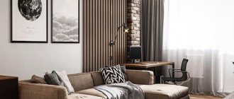
- printed posters are perfect for a living room in the latest style: loft, minimalism, hi-tech, cosmicism;
- The graphic image corresponds to eclecticism;
- traditional oil paintings will decorate a classic interior;
- watercolor paintings will add harmony to the country, boho-chic and Provence trends;
- Painting with acrylic paints diversifies the pop art and retro design room.
The best places to place large canvases are above the sofa area, low closet and fireplace. A composition of small images will fill a free wall, and one bright small picture will complete the decor of the shelves.
Bedroom
The bedroom is a room for rest and sleep.
In its design it is worth paying attention to three features:
- It is better to choose the themes and colors of the images soothing rather than exciting - a landscape, a peaceful scene, a pacifying avant-garde;
- this is, first of all, personal space, a corner for maximum self-expression - its decoration is guided by one’s own desires and taste;
- The decor of the bedroom demonstrates the owner’s hobbies - these could be beautiful illustrations from a book, a poster of a favorite movie, a silhouette of an animal or family photographs.
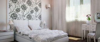
Medium-sized canvases without small details work well - the latter strain the eyes and interfere with rest. The ideal location is above the bed or opposite it.
Children's room
As a rule, a joyful, light and calming atmosphere is created in the nursery.
Some tips for choosing:
- colors - pastel, without flashy colors that irritate the eyes;
- be careful with bright red color - its excess can lead to nightmares;
- each picture is selected together with the child: you need to make sure that the picture does not scare him;
- Posters with your favorite cartoons, fairy-tale characters, cute animals, and images of nature are appropriate;
- Family photos will create the feeling of security that your baby needs.
A great idea is to hang the child’s own drawings and crafts in the nursery - it’s unique and economical.
Bathroom
For a bathroom, an excellent choice would be a marine theme - ponds, ships, sea voyages, the underwater world and its inhabitants, beaches, bathers. Clippings from old newspapers and magazines, children's drawings will look interesting - inexpensive and at the same time unusual. A geometric or cubic avant-garde would also work.
This room creates conditions that are unfavorable for the preservation of canvases, so you should take care of their design in glazed laminated boxes or closed, sealed frames. The canvas must be kept away from water so that it does not deteriorate.
How to properly decorate an office
The decor of the office should be solid, high-status and reflect impeccable taste.
Rules for selecting canvases:
- the choice of topics should be correlated with the direction of the office sector: “serious” areas - education, industry, law - are conservative, while creative ones enjoy more freedom;
- the status of the office owner also affects the design - the higher the position, the more expensive and solid the wall decorations;
- politics and corporate culture are expressed in the selection of the plot of the drawing - the social and charitable activities of the campaign are displayed in motivational posters, thematic images;
- classic theme of office painting - landscape and still life in neutral colors.
If it is not possible to purchase an original by a famous artist, it is better to buy a work by a novice artist who is popular in narrow circles.
What then should be called a poster?
To define this concept, let's first look at some examples of what is offered for sale in addition to everything that was listed above and what we have already decided on. Here are some examples.
The examples presented above are all very different both in style, genre, and performance technique. But they all have one very important property in common. Unlike copies and reproductions of paintings, the primary source for their images is not a work of fine art created by a human hand, but an electronic file obtained using one of the digital technologies. This can be a photo or video image, or a file obtained using computer graphics. It, in turn, is divided into raster, vector, three-dimensional and fractal. Each of them has its own advantages. For example, vector graphics are good because they allow you to increase the size of the source file practically without distortion or loss of quality.
3D graphics allow you to create unusual, impressive images. Fractal graphics are the most modern and promising. It is based on the principle of inheritance of object properties, therefore it provides very wide opportunities for creativity.
This property of the above products allows us to call them posters .
For the poster in its original form was also the brainchild of printing products, which most often did not use works of art as source files, but created stories using the technologies available at that time. Such, for example, as applied printed graphics.
Here is one of the surviving advertising posters for the film "Metropolis" (Germany, 1926).
Although this poster is over 90 years old, it is not much different from modern posters of this theme.
How and where to place posters
The placement of the poster depends on its type. If this is an advertising poster, then first of all it is placed on the street: special stands, walls of buildings, fences, bus stops - wherever it would be noticed by as many passers-by as possible
It is important that nothing around distracts from the poster or interferes with it. He should be the center of attention
In addition, advertising posters are published in print media.
The same applies to an information poster, for which the main thing is to reach a large audience.
Another thing is decorative posters. Here are some tips for placing them.
Posters look best on plain surfaces
And it doesn’t matter where exactly: in the living room, kitchen, bathroom or restaurant
In addition, posters can be placed on the wall in different ways.
Horizontal row.
This way you can fill any empty space.
Collage of four posters.
This placement is perfect for rooms with high ceilings.
Symmetrical arrangement.
If you have several posters of the same size, symmetry is for you. In addition, it will help visually balance the interior of the room.
Asymmetrical arrangement.
For such placement it is better to use posters of different sizes. Posters can be hung however you like.
What kind of posters are there?
Of course, nowadays the purpose of posters has changed significantly. There are still advertising posters, but the vast majority of them now serve a different purpose. They are used as interior paintings for decorating residential and public spaces.
Digital technologies, with the help of which modern posters are made, make it possible to create images of various topics, styles and genres. Therefore, the choice of posters is much larger than reproductions of paintings. This explains their wide distribution. And their price is quite affordable.
Conventionally, posters can be divided into several categories.
One of the popular categories is photo posters. These are posters created based on beautiful, rare, unusual high-resolution photographs.
In this group, you can separately highlight original posters or so-called prints.
In this case, the author of the photographs agrees to print only a certain, not very large number of prints, thereby increasing the cost and prestige of such a poster.
There are thematic posters dedicated to different sports, art, cars and motorcycles, and cities.
A separate group consists of retro and black and white posters. There is a demand for them too.
How posters are designed
There are several options for the external design of posters.
The most common of them is when the image is printed on photographic paper, pasted onto cardboard using mat and placed in a frame. This is a fairly cheap option.
A poster on paper using mat size 50x33 costs approximately 2300 rubles.
There is an even less expensive version of posters, when the image is printed on a special canvas and simply stretched onto a stretcher without using a frame.
This poster on canvas without a frame, size 50x33 cm, costs 1,350 rubles.
This option has another version, which received its own name. We are talking about so-called modular paintings or modular panels. In this case, the image is also printed on canvas and stretched onto a stretcher, but only first it is divided into separate segments. The look is quite original, but the price is slightly higher.
Since this article aims to answer the question of what posters are, I note that modular panels are also posters with an image divided into several fragments.
Such a modular painting on natural canvas measuring 75x50 cm will cost 3,000 rubles.
Well, the last option for the external design of a poster is to print the image on canvas, stretch it on a stretcher and place it in a frame. This option is relatively expensive.
Such a poster 50x33 cm on natural canvas and in a natural wood frame will cost 2800 rubles. And if you order a textured gel coating, the cost will be 3,700 rubles.
Creating an original office interior using posters
Gone are the days of Soviet offices with boring, uniform furnishings and rows of desks. Times have changed and so have offices. Clerks' workplaces have become more modern and comfortable, and the design of the premises allows them to make work more productive. One of the options for decorating modern interiors is office posters, which will diversify the office environment. Such design has a positive effect on the company’s image and team spirit.
Large posters with urban or industrial themes
Urban (urban) and industrial themes are ideal for interior design. Large format photo posters for the office wall depicting modern high-rise buildings, unusual architectural designs and city landscapes will perfectly complement the decor.
Motivational posters
Motivational posters are images with inscriptions calling for some specific actions. Such posters can not only call for something in a boring way, but also be a little humorous and lift your spirits, combining, so to speak, business with pleasure. Office premises are the best place to display motivational posters.
What determines the quality of a poster?
The quality of a poster mainly depends on several factors.
The first is the quality of the materials used. A high-quality poster is printed on natural cotton or linen canvas, stretched on a stretcher and placed in a natural wood frame. To protect against harmful external influences, the canvas is coated with a special protective varnish.
The quality of the source file is important. It must have sufficient resolution to produce clear, large-sized images.
It matters what equipment the products are printed on and what technology is used. A good option is eco-solvent technology, which produces a clear, durable image on canvas without any foreign odors.
The qualifications of specialists matter. If a serious company is engaged in the production of products, then they have modern equipment and a professional team that values its reputation. In this case, for obvious reasons, I do not consider Chinese companies, but Russian companies, for example, meet the described requirements, for example, Artwall.ru. By the way, it was their products that you saw in the previous section, where poster design options were described.
Summarize
First of all, I must remind you that I have given you my own, subjective version of what posters are. It seems to me that the arguments presented are not without logic. In any case, I don’t know of any other reasoned version on this matter.
And such a situation arose, I think, because the term “interior paintings” appeared, indiscriminately combining all types of these products, be they copies, reproductions of paintings or posters. Moreover, the modular panels that have become popular were for some reason called modular paintings, which also added uncertainty to this issue. As a result, many no longer understand anything and prefer not to bother with terms.
In addition to this article, information on the topic of paintings and posters is available here.
I will be glad if my reasoning turns out to be useful to you, and you will be able to more intelligently choose interior paintings for yourself, including posters. Moreover, they really are an excellent means for decorating interiors, giving them comfort, originality and some kind of semantic meaning.
If you consider yourself a creative person and are interested in paintings and posters, then perhaps
Posters for the interior - where to start?
So, you've been inspired by the idea of hanging a poster in your home. What will you choose? An abstraction, a reproduction of a painting, a landscape, or just a certain phrase on a plain background? In any case, the poster should not only fit into the setting, but also be in tune with your worldview.
Be sure to check who exactly is depicted on the poster and what is written there, if the inscription is in a foreign language.
There is another interesting type of posters - reprints of movie posters, posters and just stills from films. Such a poster must be chosen doubly carefully, because your favorite movie can say a lot about you. Plus, you should enjoy looking at it every day.
